File Upload
158
Simplify data entry with SaaS File Uploader patterns. Discover drag-and-drop zones, progress bars, and file-type validation UI designed for a frictionless upload experience.

A file-upload interface lets users bring local files into a SaaS product and understand when those files are accepted and ready to use. The journey includes choosing, checking, transferring, processing, and applying the result. A drop zone is only the beginning: good upload UX explains constraints, preserves useful context, and offers focused recovery when something fails.
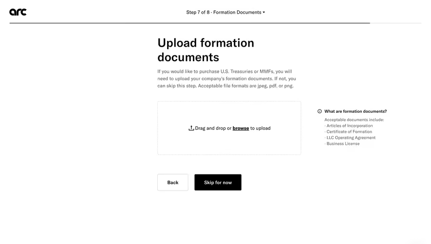
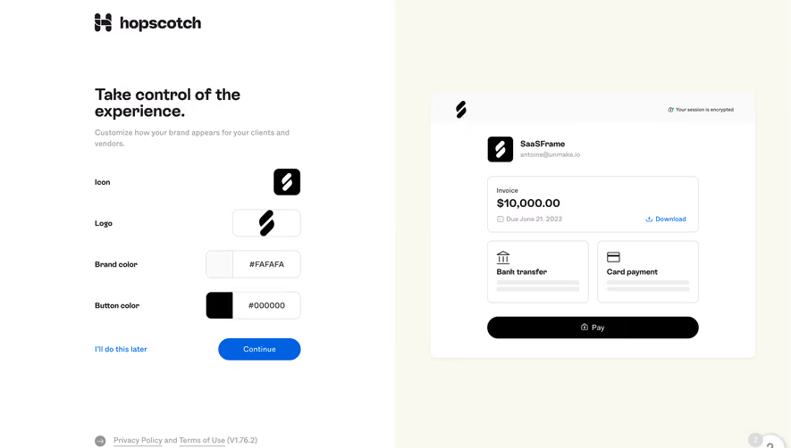
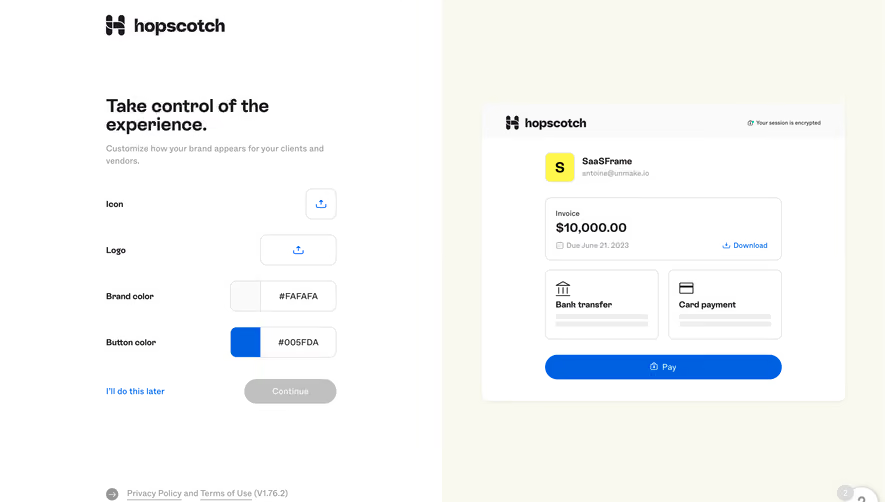
Butter's workspace-logo setup, Crew's profile-picture settings, and Abstract's onboarding upload screen illustrate different destinations for a file. A small identity image, a profile form, and a project source file need different guidance. These captures show selection entry points rather than the full transfer or processing behavior.
Start with the destination and purpose. Is the person replacing a profile image, adding an attachment, importing records, or creating a project asset? The answer determines which constraints and next steps matter.
Use action labels that identify the object, such as Upload logo or Add project files. “Upload” alone can be sufficient in a clear context, but a more specific label helps when several file controls appear on one page.
Explain consequential scope before selection. A workspace logo may appear to other members; a source file may become shared project material. If the upload creates a new version or replaces an existing asset, make that distinction visible rather than leaving it to the result.
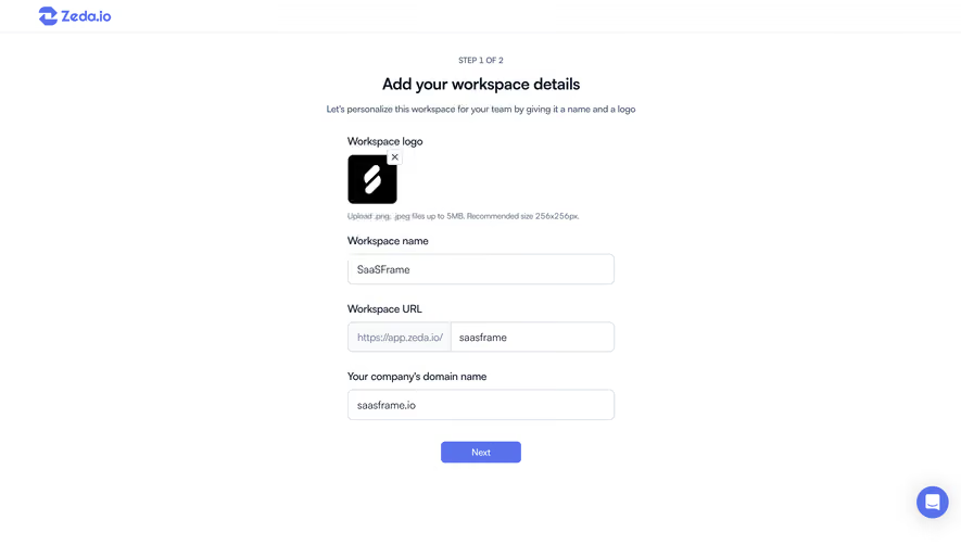
Butter's workspace setup labels the upload as a workspace logo and lists PNG or JPEG alongside a maximum size of 1200 by 1200 pixels. The action sits beside an initials-based placeholder within the setup form.
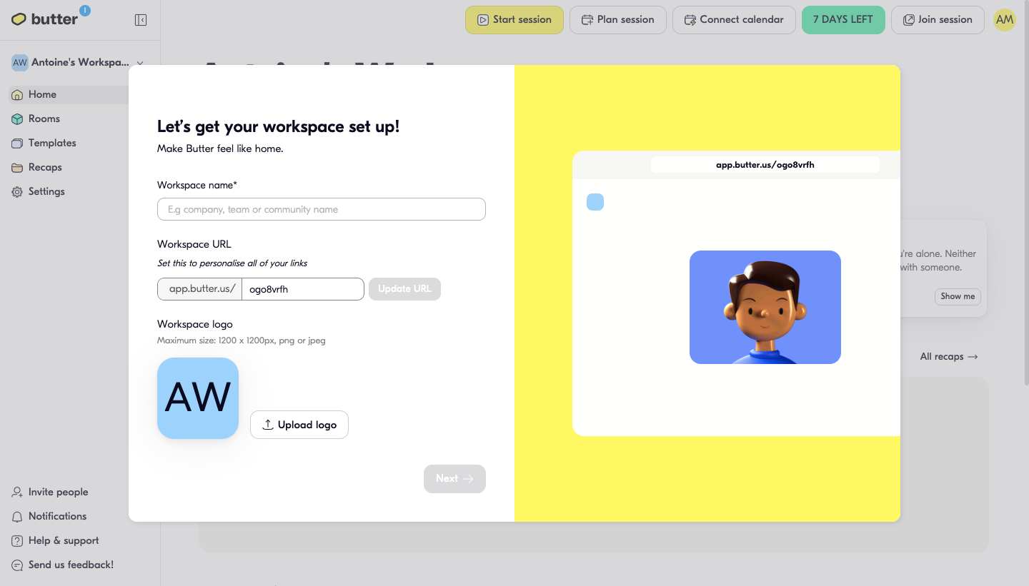
The captioned maximum in this screen is a pixel dimension rather than a file-weight limit. In your own interface, label those units explicitly. A maximum width and height, a maximum file size in megabytes, and a recommended aspect ratio describe different constraints.
Distinguish hard limits from recommendations. If a square image is recommended but other ratios are accepted, explain cropping rather than rejecting every non-square file. If a maximum is enforced, tell users how to correct a file that exceeds it.
A fallback identity can allow users to proceed without an image when the task permits it. Make optionality clear so a cosmetic upload does not unexpectedly block essential setup.
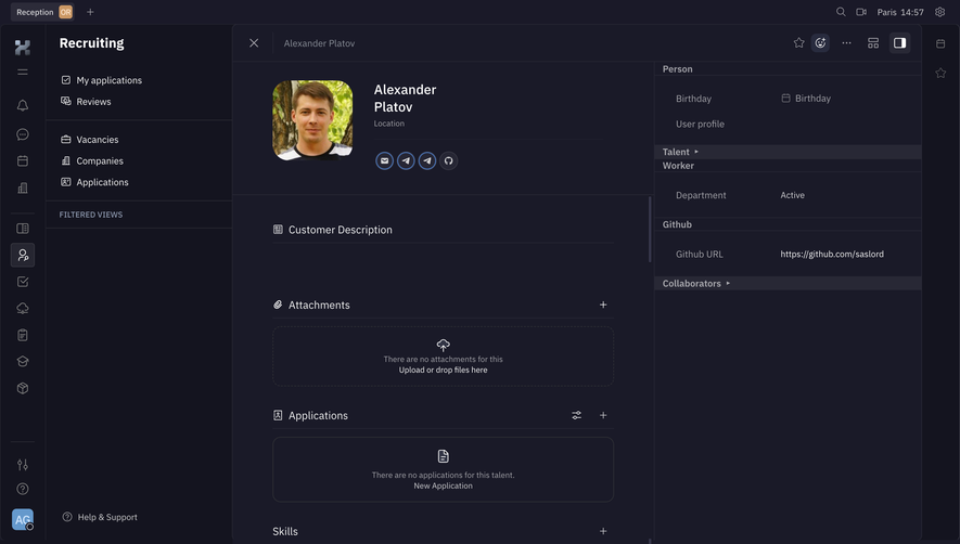
Crew's profile settings offer a dashed picture area with “Drop your profile picture here or browse.” The upload sits beside account fields and within a form containing Cancel and Update actions.
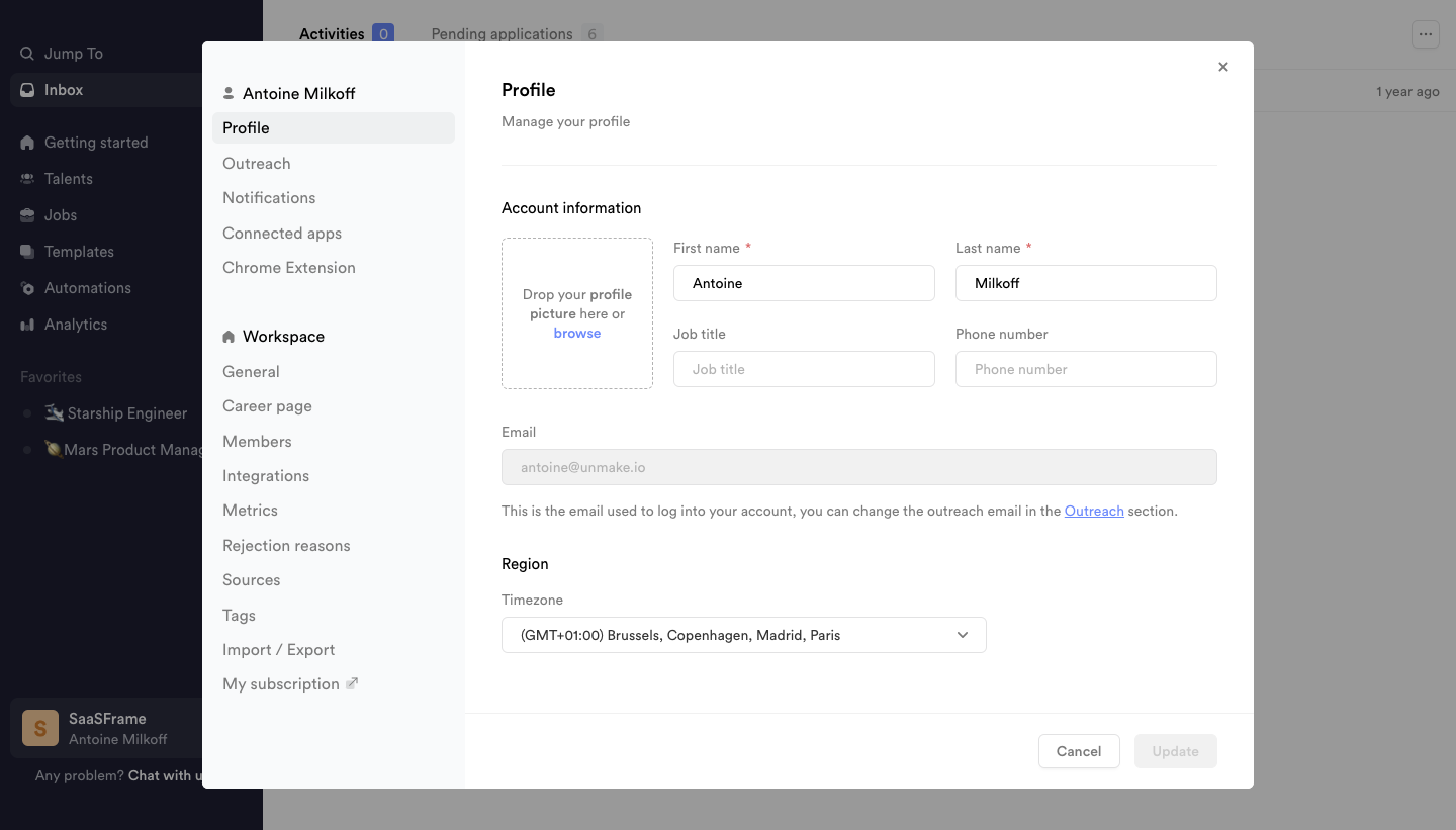
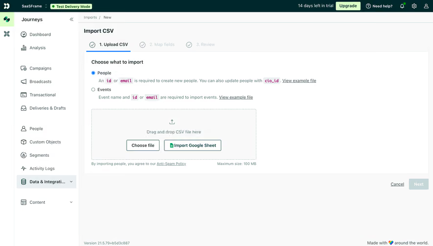
Dragging can be convenient for desktop users who already have a file visible. Browsing supports people using touch, a keyboard, or another file-selection workflow. Do not make drag and drop the only route.
Give the browse action clear focus and a meaningful accessible name. A large dashed area that only responds to a pointer is not a complete upload interaction. Keep instructions concise and ensure the active target is distinguishable from decorative framing.
The Update action also raises a persistence question. Selecting a local picture may create a pending preview, upload immediately, or wait until the whole form is saved. The screenshot does not establish which model Crew uses. Make that relationship explicit in your own flow.
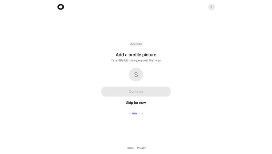
Abstract's onboarding screen is titled “Add files to Master” and explains the role of Master files within a project. Its drop zone states that Sketch files are supported and provides Browse files and New file actions. A neighboring illustration recommends files smaller than 50 MB.
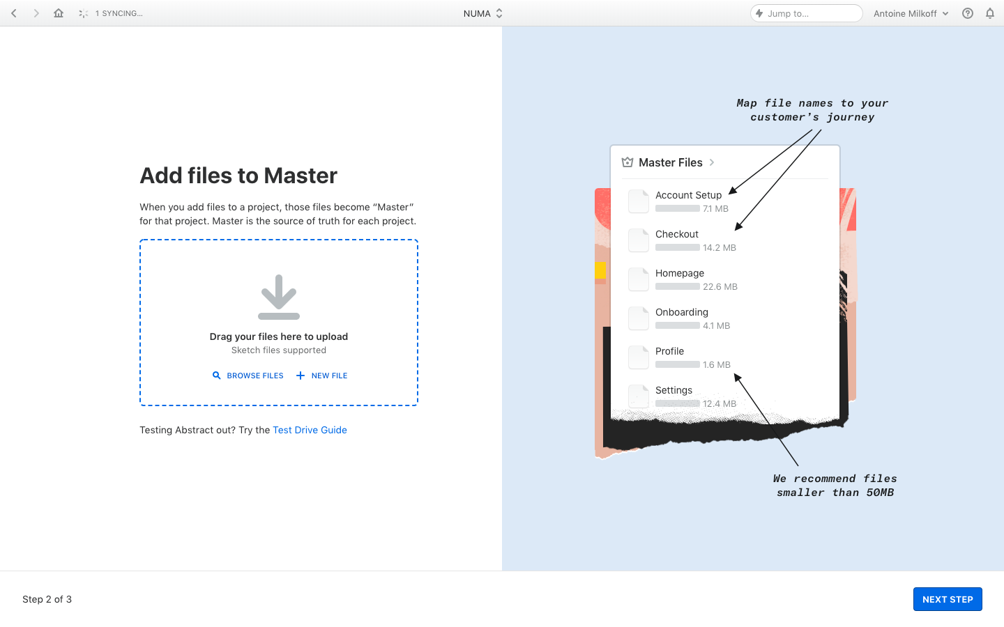
This example explains what the file becomes, not just how to choose it. That is valuable when users are new to a product-specific concept. Give enough context to prevent them from uploading the wrong kind of material.
A recommendation is not the same as a validated maximum. Preserve that distinction in copy and errors. A file over a recommended size might still be accepted with slower processing; a file above a hard limit needs correction before it can proceed.
Creating a new file and uploading an existing one are different routes. Keep their actions distinct and explain the resulting location when needed. The screenshot demonstrates the entry points, not the behavior of file creation or supported formats today.
Early checks can save time by catching obvious format, size, or count problems before transfer. Show a specific explanation and retain any other valid selections so users can correct only the affected files.
Selection hints and client-side checks are not proof that a file is accepted or safe. The actual upload path must enforce the product's rules. OWASP's upload guidance emphasizes validating file types and content rather than trusting a declared type alone.
Keep UX messages aligned with those checks. If a file passes local validation but is rejected later, describe the actual reason where useful and appropriate. Do not report every rejection as a network failure.
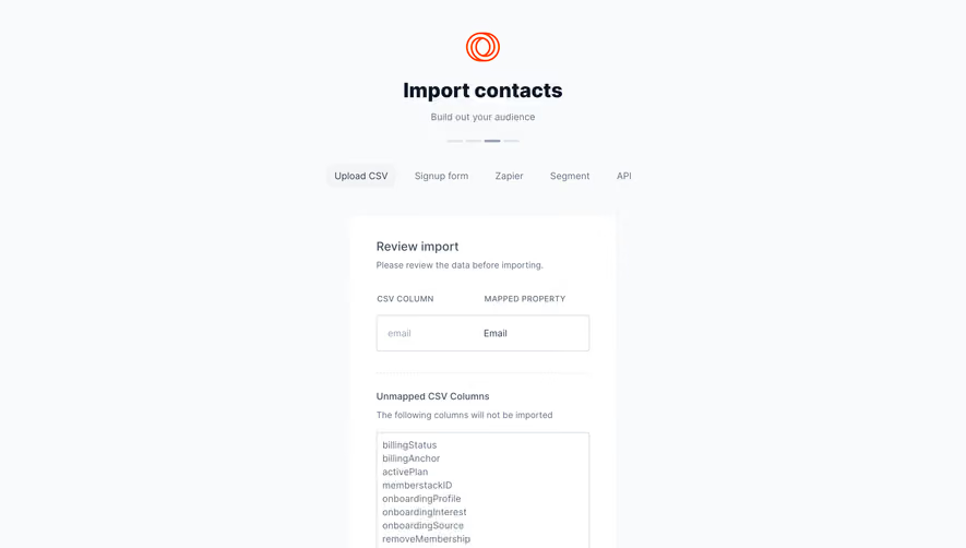
Some validation belongs after transfer, such as checking the contents of an import or preparing a supported asset. Name that stage so users understand why an upload can finish transferring without yet being ready.
A useful lifecycle can include selected, queued, transferring, checking, processing, ready, and failed, depending on the task. Avoid implying that every upload needs every stage, but distinguish the stages that change what users can do.
Use measured progress when a meaningful total exists. Bytes transferred can describe transport progress; records imported can describe another stage. A transfer bar at 100% should not silently imply that a video has finished processing or a dataset has been applied.
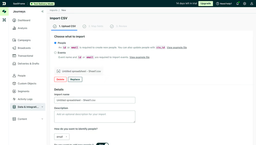
Show filenames and per-file states for multiple uploads. A single global spinner can hide which file failed or whether some assets are already available. Preserve completed items while giving pending and failed items an appropriate route forward.
If processing continues in the background, tell users where to find the result. Do not make a transient modal the only place to inspect a long-running job.
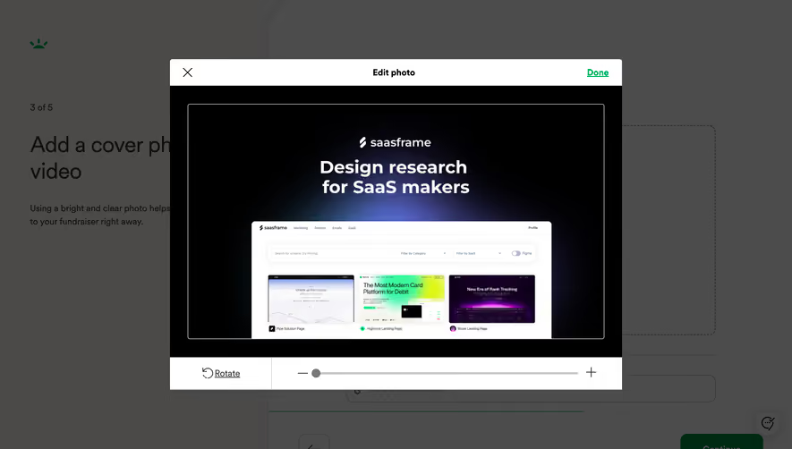
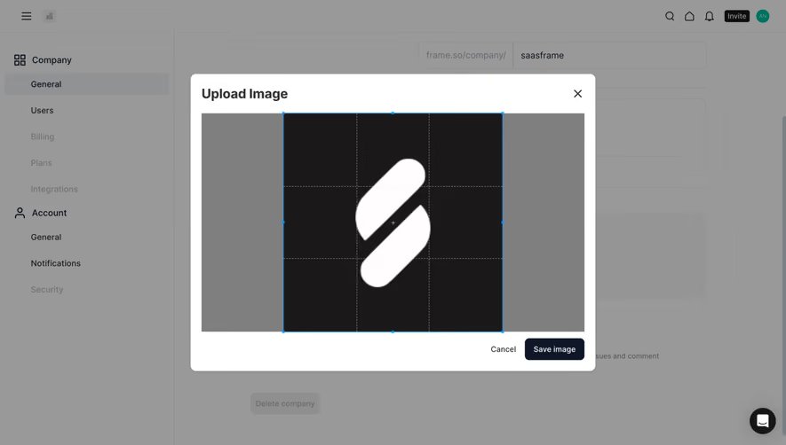
For images, a preview can help users verify that they chose the right asset. Show the shape and crop that will actually be used where those differ from the original. A portrait preview in a rectangular uploader does not establish how the image will appear in a circular avatar.
If cropping or resizing is supported, explain what changes and preserve a route to revise the choice. Avoid an automatic crop that removes the relevant subject without any indication.
For documents or datasets, meaningful verification may involve filename, type, size, page count, or an appropriate content preview. Choose the information that helps users detect the wrong file. Do not force an image-thumbnail model onto every format.
A local preview should not be labeled saved before persistence succeeds. Distinguish visual selection from the confirmed asset so users know whether it is safe to leave the form.
Replacing a logo or attachment can affect other people or existing references. Explain whether the new file overwrites the previous asset, creates a version, or changes only the current record's association.
Keep the old usable asset available until the replacement succeeds when that fits the product's model. A failed replacement should not leave a workspace without its original identity image merely because the user selected a new file.
Removal needs an explicit scope. Removing an attachment from a record differs from permanently deleting the underlying shared file. Use action labels and review proportional to the consequence.
If the product keeps versions, make the currently used version identifiable. A successful upload of a new file does not necessarily mean that every published or shared view has switched to it.
Users may select the wrong file, lose connectivity, or need to stop a large transfer. Explain whether cancellation removes the selection, stops transfer, or requests cancellation of a processing job. Those outcomes are different.
Retry should focus on the failed file or stage where possible. Avoid restarting successful uploads when only one file in the batch needs attention. Retain useful metadata and explain if local reselection is required.
For uncertain outcomes, help users check whether the file already exists before repeating the operation. A timeout can occur after the server received the file. Duplicate handling should be intentional rather than an accidental consequence of retry.
Do not claim resumable uploads unless the implementation supports them. A restart button and a resumed transfer are different capabilities, and the UI should set expectations accordingly.
Multiple files need a readable queue with names, states, and relevant actions. A selected-file count helps summarize the batch, but users still need to inspect rejected or failed items.
Define duplicate behavior. Two files can share a name while containing different content, and the same file can be selected twice. Explain whether the product renames, versions, rejects, or replaces rather than silently choosing a policy.
File-count and aggregate-size limits should be distinct from per-file limits. If a batch exceeds a total allowance, tell users what to remove or split. An error that only says “Too large” can leave them guessing which constraint applies.
Completion summaries should report mixed results accurately. “Eight files ready, two rejected” is more useful than a blanket success message or an error that conceals the accepted files.
Keep the destination project, folder, or workspace recognizable while users select and review files. A global uploader can be convenient but needs a clear target, especially when people belong to several environments.
Explain sharing scope where the file becomes visible to others. Personal profile images, team assets, and confidential documents have different audience expectations. Align the UI with actual access rules rather than assuming upload automatically means public sharing.
When permissions change during the operation, return a clear outcome. A file should not appear successfully added to a destination that the person can no longer access. Preserve an appropriate recovery route without exposing restricted details.
A screenshot cannot demonstrate storage, scanning, or authorization safeguards. Link to established implementation guidance when useful, and keep product claims grounded in verified behavior.
Label the control, provide a keyboard-operable selection route, and communicate constraints and errors near the file. Do not rely solely on an icon or drag-hover state to convey the purpose.
Announce meaningful transitions such as acceptance, completion, or failure without moving focus unexpectedly. For batch updates, avoid overwhelming users with every small progress increment.
Keep removal and retry controls associated with the relevant filename. Touch users need comfortable targets, and long names should remain inspectable when truncated. A mobile file picker may expose different source choices from a desktop one, so test the actual workflow.
Review zoom, slow networks, invalid files, mixed batches, and replacement failures alongside the ideal empty drop zone. The most important interaction problems often occur after selection.
No. Provide a browse route that works with touch and keyboard interaction, then support the validation and feedback stages after selection.
Only if the indicator represents the complete process. A file can finish transferring while validation, conversion, or another processing stage remains.
Keep enough information to explain the rejection and support correction. Preserve valid files rather than clearing the entire batch because one selection fails.
Usually the replacement should succeed before the previous usable asset is removed, where the product's model permits that. Explain the actual replacement and versioning policy.
Compare Drag & Drop for direct manipulation, Progress Indicator for measured work, Error State for recovery, and File Browser for finding stored assets. Consult OWASP's file-upload guidance when defining validation and handling requirements.