Master time-management UI with the best SaaS Calendar and Scheduling designs. Discover drag-and-drop event functionality, multi-view layouts (day/week/month), and color-coded event markers used by top productivity and HR software.
Browse 13 real SaaS Calendar with modern UI patterns and conversion strategies.
We sell SaaSFrame licenses on Gumroad, a secured online selling platform for creators.
What about future updates and versions?
SaaSFrame gets updated all the time! Every new update and version will immediately be made available to all SaaSFrame users.
I didn't receive my licence key, what should I do?
The licence key required to create your SaaSFrame account is send by Gumroad once you made your purchase. If this email is blocked by your email client, send me an email at antoine[at]unmake[dot]io so I can resend the licence key.
Can you send me an invoice?
You can generate an invoice on Gumroad once you purchased SaaSFrame. You will find the link in the order confirmation email.
Can I get a refund?
If you're not satisfied, you can ask for a refund within 7 days. Just send me an email at antoine[at]unmake[dot]io
Calendar Design Guide
A SaaS calendar places tasks, availability, events, or time-off information in a temporal structure. Its design should help users answer a specific question: when can something happen, what is scheduled, or how a period relates to their work. A month grid is only one possible presentation.
The SaaSFrame references show booking, leave management, and planning. These tasks need different relationships between dates, times, status, and actions. Captured dates and availability are historical examples, not live schedules.
Choose the temporal task before the view
Booking asks users to choose an available slot. Planning asks them to allocate work. Time-off management may need both a calendar and a request lifecycle. Start with the task rather than a preference for a month or week layout.
Decide what the user needs to compare. A month overview supports date orientation; a day timeline supports time allocation; an agenda can make dense event content easier to read.
Offer alternate views when they support a real difference in work. Changing views should preserve the relevant date and filters so users do not lose context each time they inspect the schedule differently.
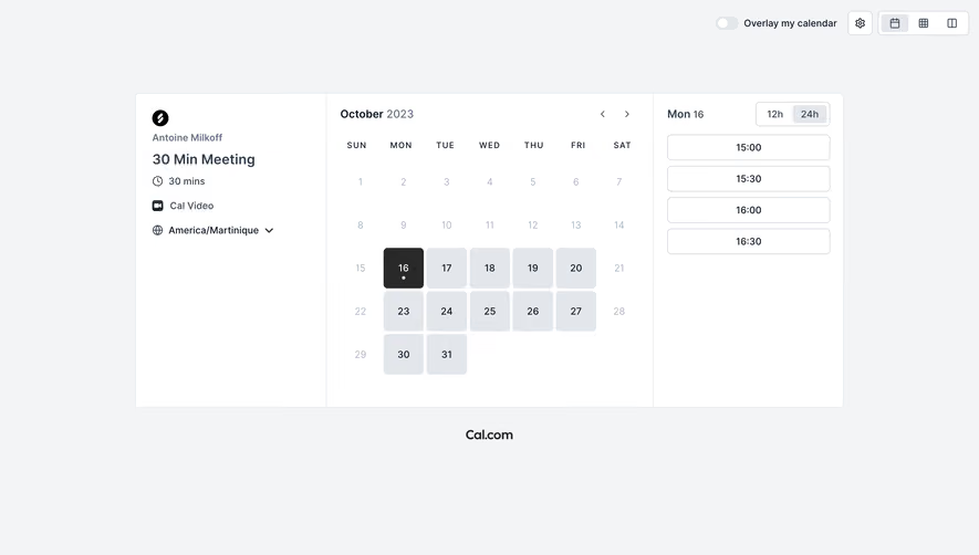
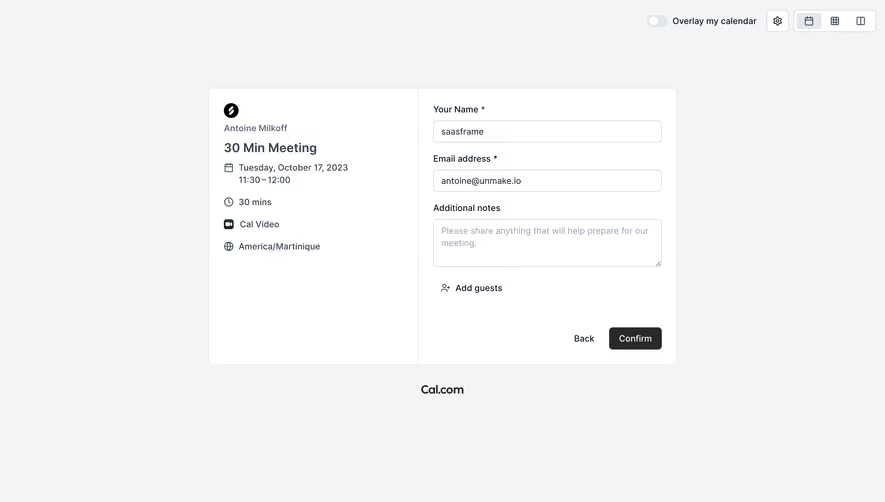
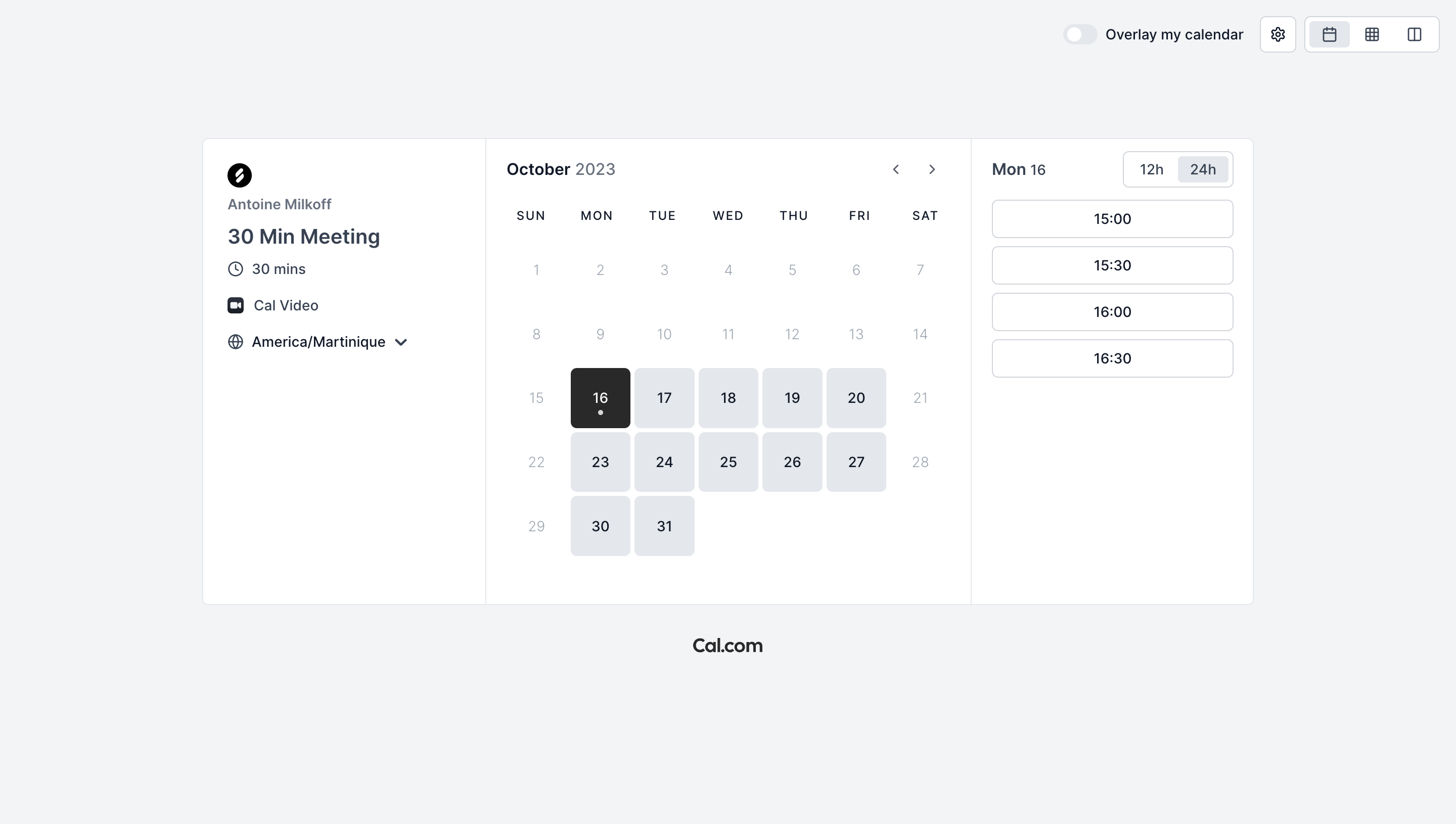
The Cal.com capture places meeting identity, duration, conferencing information, and a timezone control beside a month grid. Selecting a day is represented alongside a separate list of times and a twelve-or-twenty-four-hour display choice.
This divides the booking decision into date and time while keeping meeting context visible. The timezone matters because the same slot can have different local labels for the participants.
When adapting the model, make the timezone of the available times unambiguous. A browser-derived default can help, but users need to inspect and change it. A formatting preference such as twenty-four-hour time is different from the timezone itself.
Distinguish selected, today, and available states
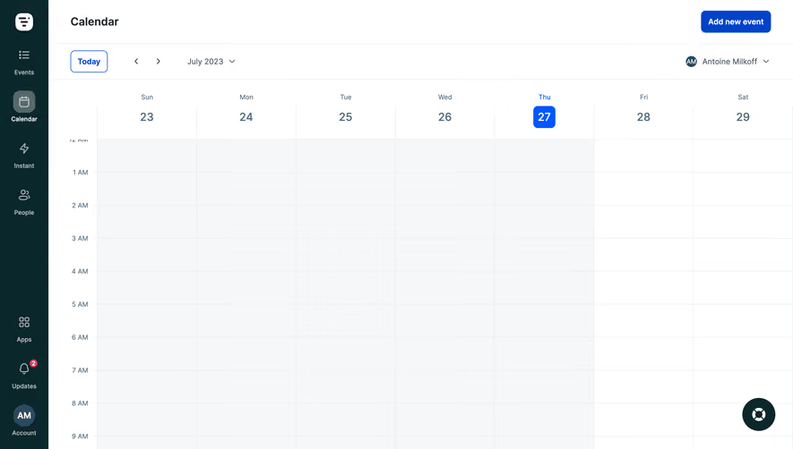
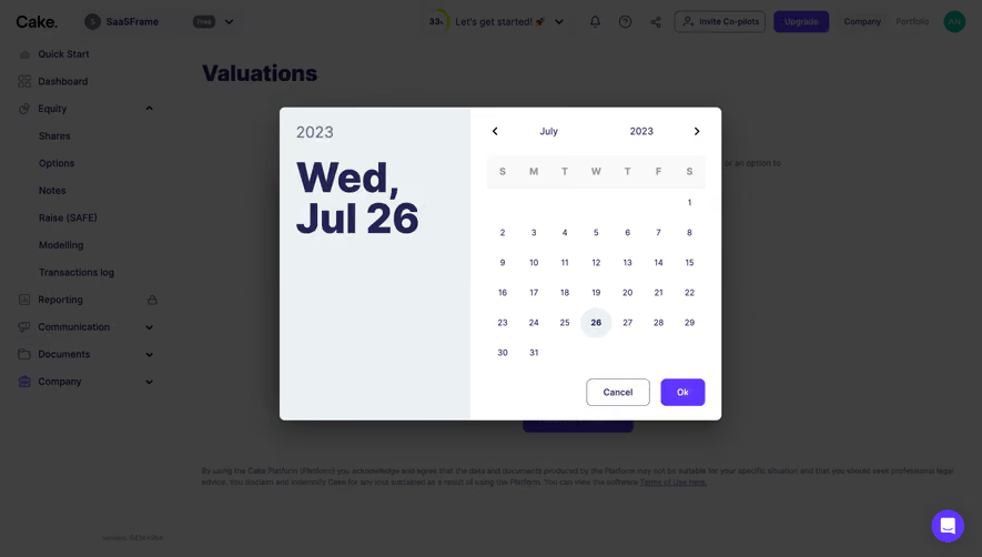
Today identifies the current date. Selected identifies the date being inspected. Available indicates that an action can be taken on a date or time. These states can coexist and need recognizable treatment.
Use text or accessible descriptions in addition to color. A light-gray date can mean unavailable, outside the current month, or simply unselected. The interface must establish the meaning.
Keep the selected date connected to the displayed detail. If a user changes months, do not leave a time list labeled with a different date without explanation. Selection and navigation are separate operations.
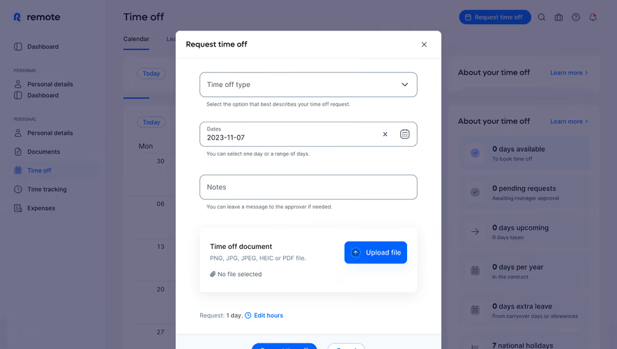
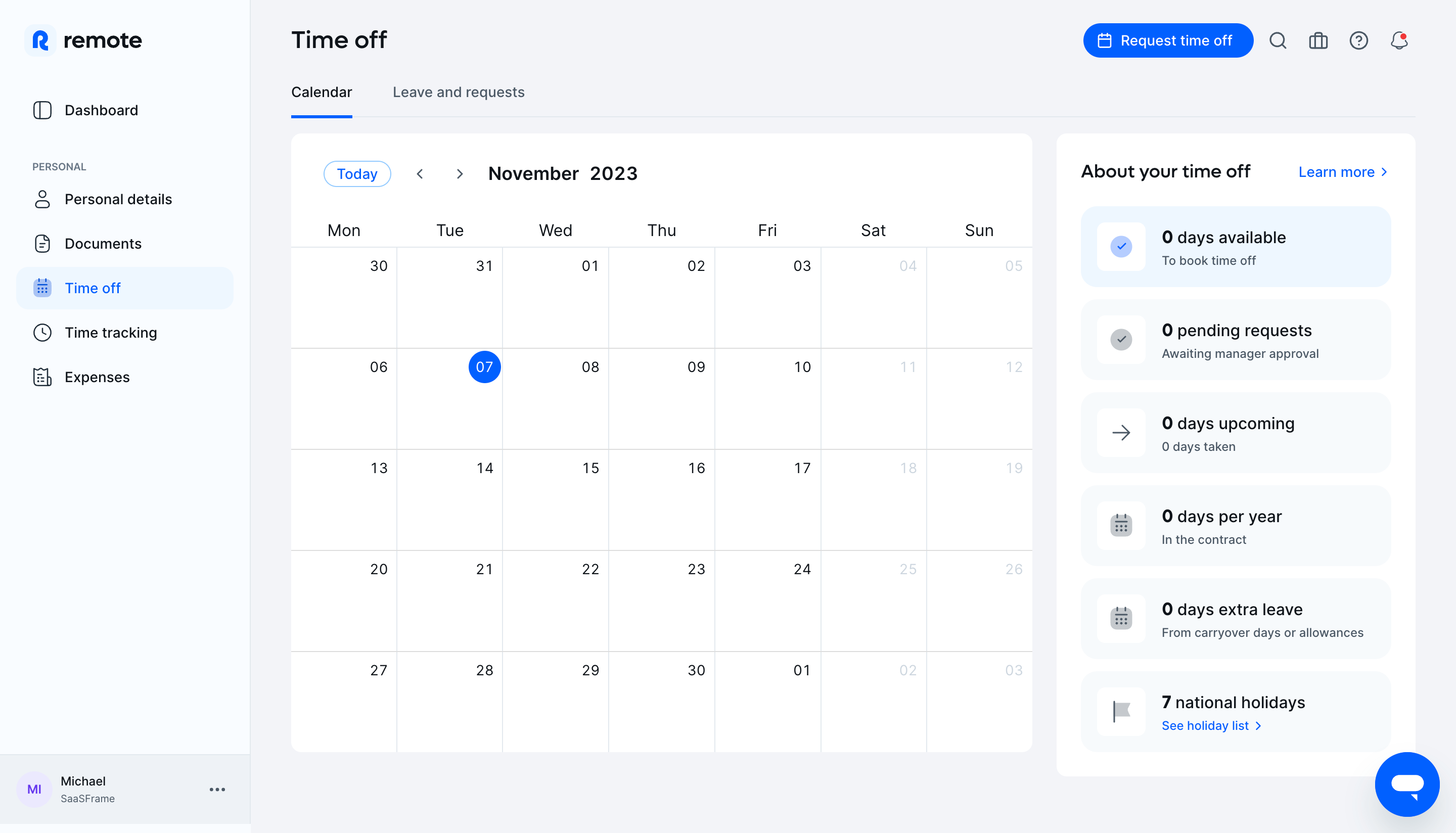
The Remote time-off capture places a month calendar beside a summary area for available days, pending requests, upcoming time off, taken days, and allowances. Tabs separate calendar viewing from leave and requests.
The calendar alone cannot explain a leave balance or approval state. The companion information gives users a view of the rules and lifecycle around the dates.
When adapting this relationship, keep balances and events consistent without conflating them. A requested date is not necessarily approved time off, and an available allowance is not an event already scheduled. Label each state according to the actual system.
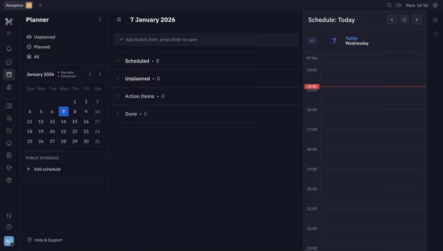
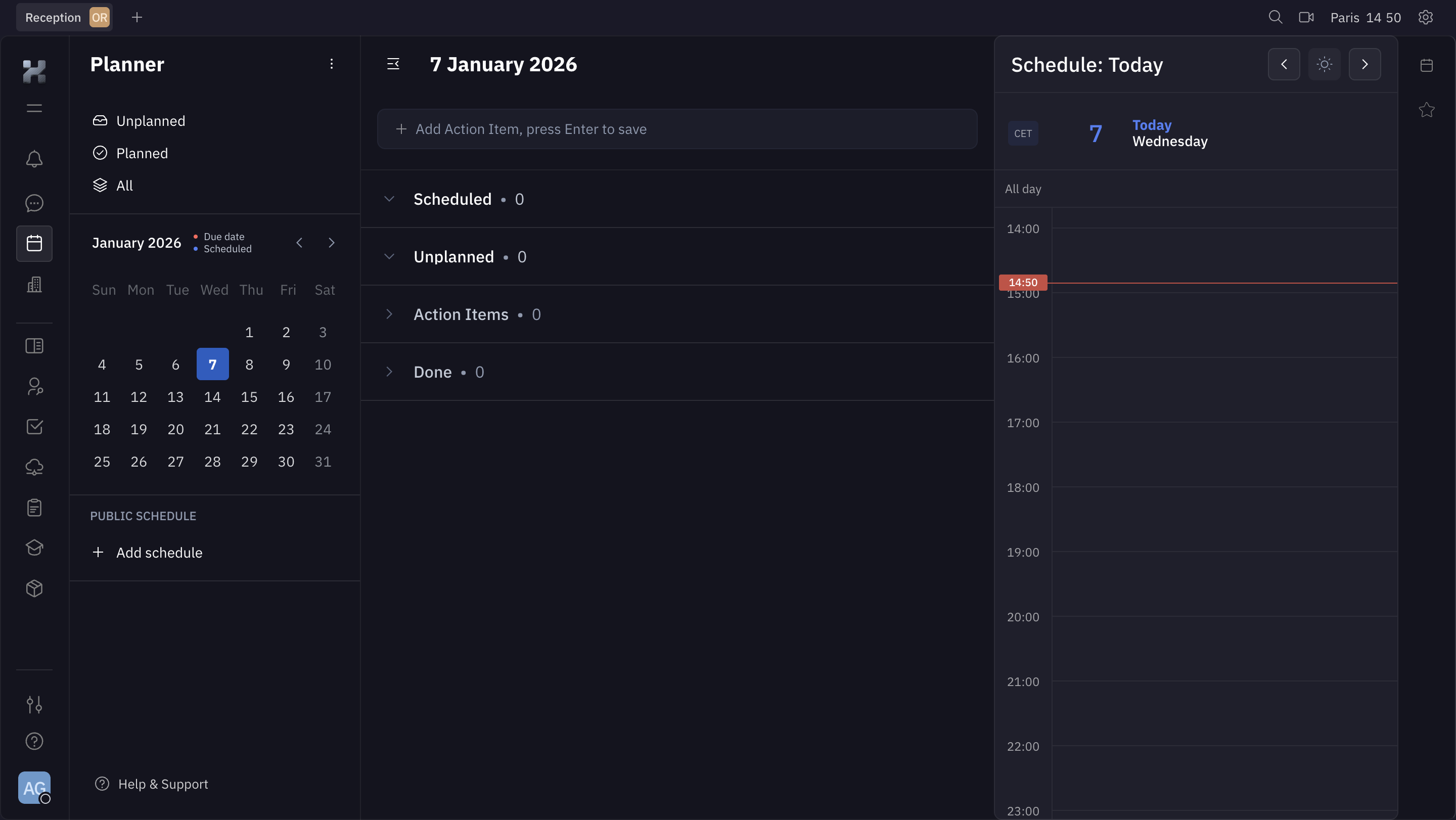
The Huly planner capture presents planned and unplanned work alongside due-date and scheduled concepts, a date selector, and a daily time area. This illustrates more than one relationship between an action item and time.
A due date describes a deadline; a scheduled block describes when work is intended to happen. Treating them as interchangeable can make an unfinished task disappear from the user's planning context.
For planning products, explain whether dragging a task onto the timeline changes its deadline, adds a work block, or both. Users should be able to inspect the resulting state and correct it without guessing.
Keep event identity readable in dense periods
A calendar can contain more content than a cell comfortably displays. Prioritize recognizable titles, timing, and state, then provide a route to inspect additional events. A count should identify what is hidden.
Use an agenda or detail panel where dense content needs more room. Avoid shrinking text until the calendar appears tidy but becomes unreadable. The purpose is to reveal temporal relationships, not preserve an empty-looking grid.
Long events and overlapping items need a clear presentation. A multi-day absence differs from several independent daily events. Show continuity without making users infer it from repeated labels.
Explain actions and their commitment stage
Selecting a date can open detail, start a request, or commit a booking. The interface should make the behavior predictable. A day click should not unexpectedly create a shared event.
For a booking or request, show a review stage when important details remain. Confirm the selected time, timezone, participants, or request scope as appropriate. A pending approval should not look like a completed booking.
Editing and cancellation need similarly clear consequences. Removing a personal planning block is different from canceling an event with other participants. The action label and feedback should reflect that difference.
Handle unavailable and changing slots
Availability can change after it is displayed. If a selected slot becomes unavailable, preserve the user's context and offer a relevant alternative. A generic error should not reset the person to an unrelated month.
Distinguish no availability from a loading or connection failure. An empty list of times can otherwise look like a confirmed closed schedule when the system has not fetched it successfully.
If availability depends on several calendars or resources, explain the scope where useful. Users may need to know which account or service determines the displayed options before they can troubleshoot a missing slot.
Make recurrence and time boundaries understandable
Recurring events need a rule users can inspect, not merely an icon. When editing one occurrence or the series, identify the scope before applying the change. The consequences can differ substantially.
Date boundaries, daylight-saving transitions, and all-day events need deliberate handling. The interface should preserve the intended local meaning rather than expose unexplained shifts after saving.
For cross-region teams, provide the timezone context needed for comparison. A global label at the top may be insufficient if different event details use different local times.
Preserve accessible navigation
Calendar grids need an understandable keyboard model and visible focus. Users should be able to reach dates, times, view controls, and event detail without precise pointer gestures.
Provide a usable alternative to dragging for schedule changes. A form or contextual action can support people using keyboards, touch devices, or assistive technology.
On small screens, an agenda or focused day view may be more useful than a compressed month grid. Keep the selected date and main action visible, and preserve a clear route to broader orientation.
Test realistic time states
Include empty schedules, dense days, overlapping events, unavailable selections, pending leave, multi-day items, and recurring series. Test different timezones and display formats.
Ask users to identify the selected date, explain a pending event, and predict what an edit changes. These tasks reveal ambiguity between date navigation and commitment.
Measure completed scheduling or planning work alongside calendar engagement. Repeated view switching can reflect useful exploration or an inability to find the relevant event.
Frequently asked questions about SaaS calendars
Should every calendar start with a month view?
No. Choose the view that supports the main task. Booking, daily planning, and dense event review may benefit from different defaults.
Is a due date the same as a scheduled time?
No. A deadline and a planned work block have different meanings. Keep their labels and editing behavior distinct.
What should appear when no times are available?
Show a confirmed no-availability state and a relevant route forward. Identify loading or connection failure separately so users do not confuse missing data with a closed schedule.