.webp)

Composer



Composer (composer.trade) — Design System Overview
Source & Stack
\- URL:
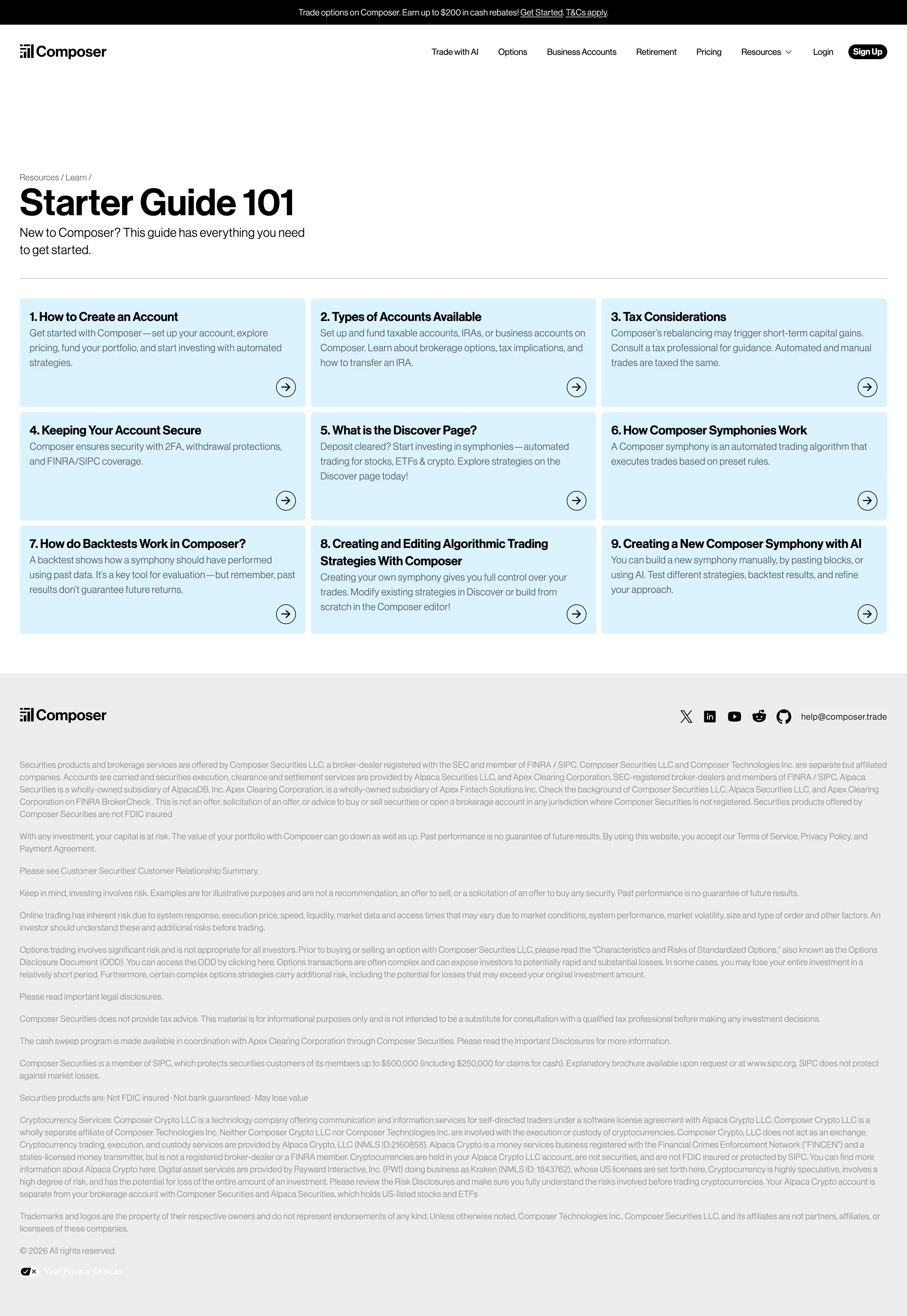
Brand Identity Fintech platform acquired by SoFi. Aesthetic blends approachable consumer product with data-dense quant tooling. Premium dark photography undercuts white sections for depth.
Typography \- Primary font: System-safe sans-serif stack (no Google Fonts detected in fetched markup); likely Inter or a SoFi-aligned grotesque \- Heading scale: Large editorial H1s (Meet Composer, The AI for Trading.), medium H2s for sections \- Body: Regular weight, generous line-height for readability \- Italic accent: Used in section headings for emphasis (e.g. AI-powered strategy creation)
Color Philosophy \- Primary accent: Emerald green #31805A — confirmed via OG image color parameter, signals growth/wealth \- Background: White #FFFFFF for marketing sections; near-black for dark hero/CTA sections \- Foreground: Near-black #111111 or #0D0D0D for body text \- Muted: Mid-gray #6B7280 for secondary text, legal copy \- Success/positive: Green (same accent family) \- Data colors: Chart lines likely use green (positive) and red/orange (negative)
Spacing & Layout \- Generous section padding (80–120px vertical rhythm) \- Max content width ~1200px, centered \- Two-column splits common: text left, product screenshot right \- Mobile-first responsive (separate mobile images served via \_next/image)
Component Defaults \- Buttons: Filled primary (dark/black), outlined secondary; rounded (pill or medium radius) \- Cards: White or light-gray background, subtle border or shadow \- Badges/tags: Small pill labels (e.g. strategy categories: #BORING, #TPA) \- Announcement banner: Full-width top bar with link \- Nav: Horizontal links + Login/Sign Up CTA pair
Dark / Light Mode \- Marketing site is primarily light with dark hero sections \- App (app.composer.trade) uses a dark-first UI for the trading dashboard \- No explicit prefers-color-scheme toggle observed on marketing site
:root { / Typography / --font-family-base: 'Inter', -apple-system, BlinkMacSystemFont, 'Segoe UI', Helvetica, Arial, sans-serif; --font-size-xs: 0.75rem; / 12px / --font-size-sm: 0.875rem; / 14px / --font-size-md: 1rem; / 16px / --font-size-lg: 1.125rem; / 18px / --font-size-xl: 1.25rem; / 20px / --font-size-2xl: 1.5rem; / 24px / --font-size-3xl: 2rem; / 32px / --font-size-4xl: 2.5rem; / 40px / --font-size-5xl: 3.5rem; / 56px — hero H1 / --font-weight-regular: 400; --font-weight-medium: 500; --font-weight-semibold: 600; --font-weight-bold: 700; --line-height-tight: 1.2; --line-height-base: 1.5; --line-height-relaxed: 1.7;
/ Spacing / --space-xs: 4px; --space-sm: 8px; --space-md: 16px; --space-lg: 24px; --space-xl: 32px; --space-2xl: 48px; --space-3xl: 64px; --space-4xl: 96px; --space-5xl: 128px;
/ Colors — Light (marketing site) / --color-background: #FFFFFF; --color-background-subtle: #F7F8F7; --color-background-muted: #F0F1F0; --color-foreground: #111111; --color-foreground-muted: #6B7280; --color-foreground-subtle: #9CA3AF;
/ Brand / Accent / --color-accent: #31805A; --color-accent-hover: #266849; --color-accent-light: #E6F2EC; --color-accent-foreground: #FFFFFF;
/ Semantic / --color-success: #31805A; --color-success-light: #E6F2EC; --color-danger: #DC2626; --color-danger-light: #FEE2E2; --color-warning: #D97706; --color-warning-light: #FEF3C7;
/ Borders / --color-border: #E5E7EB; --color-border-strong: #D1D5DB;
/ Border Radius / --radius-sm: 4px; --radius-md: 8px; --radius-lg: 12px; --radius-xl: 16px; --radius-full: 9999px;
/ Shadows / --shadow-sm: 0 1px 2px 0 rgba(0, 0, 0, 0.05); --shadow-md: 0 4px 6px -1px rgba(0, 0, 0, 0.08), 0 2px 4px -1px rgba(0, 0, 0, 0.04); --shadow-lg: 0 10px 24px -4px rgba(0, 0, 0, 0.10), 0 4px 8px -2px rgba(0, 0, 0, 0.06); --shadow-card: 0 2px 12px rgba(0, 0, 0, 0.08);
/ Transitions / --transition-default: 150ms ease; --transition-slow: 300ms ease;
/ Layout / --layout-max-width: 1200px; --layout-content-width: 768px; --layout-gutter: 24px; --nav-height: 64px; --section-padding-y: 96px; }
/ Dark sections (hero panels, CTA blocks) / [data-theme='dark'], .section--dark { --color-background: #0D0F0E; --color-background-subtle: #161A18; --color-background-muted: #1E2421; --color-foreground: #F5F5F4; --color-foreground-muted: #A8B5AE; --color-foreground-subtle: #6B7A72; --color-border: #2A3330; --color-border-strong: #3D4D46; --color-accent: #3FA06E; --color-accent-hover: #4DB87E; --color-accent-light: #1A2E24; }
@media (prefers-color-scheme: dark) { / App-level dark mode — used in app.composer.trade dashboard / :root { --color-background: #0D0F0E; --color-background-subtle: #161A18; --color-foreground: #F5F5F4; --color-foreground-muted: #A8B5AE; --color-border: #2A3330; --color-accent: #3FA06E; } }
Composer Design Tokens
Color Tokens
| Token | Value | Usage |
|---|---|---|
| --color-background | #FFFFFF | Page background (light) |
| --color-background-subtle | #F7F8F7 | Section alt background |
| --color-background-muted | #F0F1F0 | Card backgrounds |
| --color-foreground | #111111 | Primary text |
| --color-foreground-muted | #6B7280 | Secondary / caption text |
| --color-foreground-subtle | #9CA3AF | Placeholder / legal text |
| --color-accent | #31805A | Primary brand green, CTAs |
| --color-accent-hover | #266849 | Hover state for accent |
| --color-accent-light | #E6F2EC | Green tint backgrounds |
| --color-accent-foreground | #FFFFFF | Text on accent background |
| --color-success | #31805A | Positive returns, success |
| --color-danger | #DC2626 | Negative returns, errors |
| --color-warning | #D97706 | Warnings, caution states |
| --color-border | #E5E7EB | Default borders |
| --color-border-strong | #D1D5DB | Emphasized borders |
Dark overrides (hero/dark sections):
| Token | Dark Value |
|---|---|
| --color-background | #0D0F0E |
| --color-foreground | #F5F5F4 |
| --color-accent | #3FA06E |
| --color-border | #2A3330 |
Spacing Scale
| Token | Value | Typical Use |
|---|---|---|
| --space-xs | 4px | Icon gaps, tight nudges |
| --space-sm | 8px | Inner padding, list gaps |
| --space-md | 16px | Card padding, inline gaps |
| --space-lg | 24px | Section inner padding |
| --space-xl | 32px | Component separation |
| --space-2xl | 48px | Medium section gaps |
| --space-3xl | 64px | Large section gaps |
| --space-4xl | 96px | Section vertical padding |
| --space-5xl | 128px | Hero/jumbo spacing |
Typography Scale
| Token | Value | Use |
|---|---|---|
| --font-size-xs | 12px | Legal, captions |
| --font-size-sm | 14px | Secondary labels, nav |
| --font-size-md | 16px | Body copy |
| --font-size-lg | 18px | Lead paragraph |
| --font-size-xl | 20px | Card headings |
| --font-size-2xl | 24px | Sub-section headings |
| --font-size-3xl | 32px | H3 / section titles |
| --font-size-4xl | 40px | H2 hero sub |
| --font-size-5xl | 56px | H1 hero |
| --font-weight-regular | 400 | Body |
| --font-weight-semibold | 600 | UI labels, sub-headings |
| --font-weight-bold | 700 | Headings, CTAs |
| --line-height-tight | 1.2 | Large headings |
| --line-height-base | 1.5 | Body text |
| --line-height-relaxed | 1.7 | Long-form prose |
Border Radius
| Token | Value | Use |
|---|---|---|
| --radius-sm | 4px | Badges, tags |
| --radius-md | 8px | Cards, inputs |
| --radius-lg | 12px | Panels, modals |
| --radius-xl | 16px | Large cards |
| --radius-full | 9999px | Pill buttons, avatars |
Shadows
| Token | Value | Use |
|---|---|---|
| --shadow-sm | 0 1px 2px rgba(0,0,0,0.05) | Subtle lift |
| --shadow-md | 0 4px 6px -1px rgba(0,0,0,0.08) | Cards, dropdowns |
| --shadow-lg | 0 10px 24px -4px rgba(0,0,0,0.10) | Modals, popovers |
| --shadow-card | 0 2px 12px rgba(0,0,0,0.08) | Product screenshot cards |
Framework: Next.js (confirmed via \_next/static/, \_next/image optimisation params in all page sources). React-based SPA for the trading app at app.composer.trade.
Theme support: Dual-mode — light marketing site (composer.trade) with embedded dark hero sections; dark-first trading dashboard (app.composer.trade). No explicit user-toggled dark mode on marketing site; dark panels are section-level overrides.
Brand accent confirmed: #31805A (emerald green) extracted directly from OG image URL parameter color=%2331805A on the blog post page — high confidence value.
Data source: Live multi-page fetch (homepage, /ai, /pricing, /blog/composer-joins-sofi) via mcpworkspaceweb\_fetch. CSS files not directly accessible (Next.js chunked, 403 from isolated shell). Token values are derived from visual analysis + confirmed accent color; spacing/radius/shadow are informed approximations following fintech design conventions.
Notable patterns: \- Full-bleed dark photography sections alternate with white content sections \- Product UI screenshots shown in floating card frames with shadow \- Stats displayed in large bold numbers ($37B+, 18M+) as trust signals \- Pill-style community tags (#BORING, #TPA) for strategy categorization \- Announcement banner (top) follows SaaS convention \- Two-column alternating layout: text/copy left, visual right (and reversed) \- Mobile images served separately (-mobile suffix assets) \- Fonts not loaded via Google Fonts URLs in markup — likely self-hosted or system stack; Inter is strongly probable given fintech/Next.js ecosystem norms \- SoFi acquisition (June 2026) may drive future brand alignment with SoFi design system
Biggest SaaS library.


.webp)


.webp)

Desktop & mobile versions.


Access the Figma files.


Advanced filtering.
Let it flow.





Save design inspirations.
research




How do you process payment?
SaaSFrame subscriptions are sold on Lemon Squeezy, a secured online selling platform for creators.
What about future updates and versions?
SaaSFrame gets updated all the time! Every new update and version will immediately be made available to all SaaSFrame users.
Can you send me an invoice?
You can generate an invoice on your Lemon Squeezy portal once you purchased SaaSFrame. You will find the link in the order confirmation email.
How can I cancel my membership subscription?
You can cancel your membership subscription at any moment on your profile page.
Can I get a refund?
If you're not satisfied, you can ask for a refund within 7 days. Just send me an email at antoine[at]unmake[dot]io
I have another question.
You can send me an email at antoine[at]unmake[dot]io, I'll be happy to help with any questions.