 SaaSFrame
📝 Blog Post
Enhance readability and dwell time with high-performing SaaS blog post templates. This collection features optimized typography, sidebar layouts for lead generation, and sticky navigation bars that ensure a seamless reading experience across all devices.




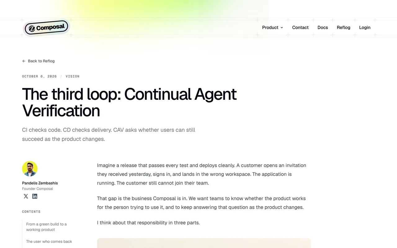
Index of all 81 Blog Post examples
- Caveman Blog Post
- Parallel Blog Post
- Composal Blog Post
- Latent Blog Post
- Privacyboard Blog Post
- Rox Blog Post
- AskAiRank Blog Post
- Slash Blog Post
- Unabyss Blog Post
- Voiceflow Blog Post
- Respan Blog Post
- Datashake Blog Post
- Privy Blog Post
- Pivot Blog Post
- Dub Blog Post
- Koyeb Blog Post
- Lightdash Blog Post
- Dust Blog Post
- Span Blog Post
- Searchable Blog Post
- ParityDeals Blog Post
- Solidroad Blog Post
- Hyperline Blog Post
- FullEnrich Blog Post
- Composer Blog Post
- Forest Admin Blog Post
- Paddle Blog Post
- Visitors Blog Post
- Unkey Blog Post
- Prelude Blog Post
- Hume AI Blog Post
- Reducto Blog Post
- Payhawk Blog Post
- Atlas Blog Post
- Checkout.com Blog Post
- Anchor Blog Post
- Steep Blog Post
- OpenAI Blog Post
- Oku Blog Post
- Hyperline Blog Post
- Dimension Blog Post
- Albato Blog Post
- Duffel Blog Post
- Alloy Blog Post
- Supabase Blog Post
- Linktree Blog Post
- Resend Blog Post
- Conduktor Blog Post
- Cohere Blog Post
- Surfe Blog Post
- Sketch Blog Post
- Qatalog Blog Post
- Café Blog Post
- Libeo Blog Post
- Specify Blog Post
- Skiff Blog Post
- Highnote Blog Post
- Junip Blog Post
- Reveal Blog Post
- Vercel Blog Post
- Logsnag Blog Post
- Folk Blog Post
- Fiberplane Blog Post
- Narrative BI Blog Post
- Raycast Blog Post
- Officevibe Blog Post
- Equals Blog Post
- Copy.ai Blog Post
- Dynaboard Blog Post
- Rally Blog Post
- PlanetScale Blog Post
- Qovery Blog Post
- June Blog Post
- Mapbox Blog Post
- Producter Blog Post
- Burb Blog Post
- Payload Blog Post
- Unflow Blog Post
📝 Blog Post: design guide
Short answer
A SaaS blog article template should make a long argument easy to read. Put the title, author and date before secondary actions, use headings that advance the explanation, support code, tables and images without breaking rhythm, and place product calls to action where they fit the content.
In the libraryas of November 2026
- Screens
- 82
- SaaS products
- 80
- Last added
- Nov 2026
Common patternsBlog Cards 10Related Items 4Call to Action 2Newsletter Signup 2Download Call to Action 1
Recently addedArcadeCubeLightfieldParallelCaveman
A SaaS blog article template should make a complete argument readable while keeping authorship, supporting media, and related material easy to find. The template must support varied article types without forcing every post into the same promotional rhythm.
What belongs at the top of a blog article?
Show a specific title and useful authorship or publication context. Readers should understand what the article will explain before encountering a signup prompt.
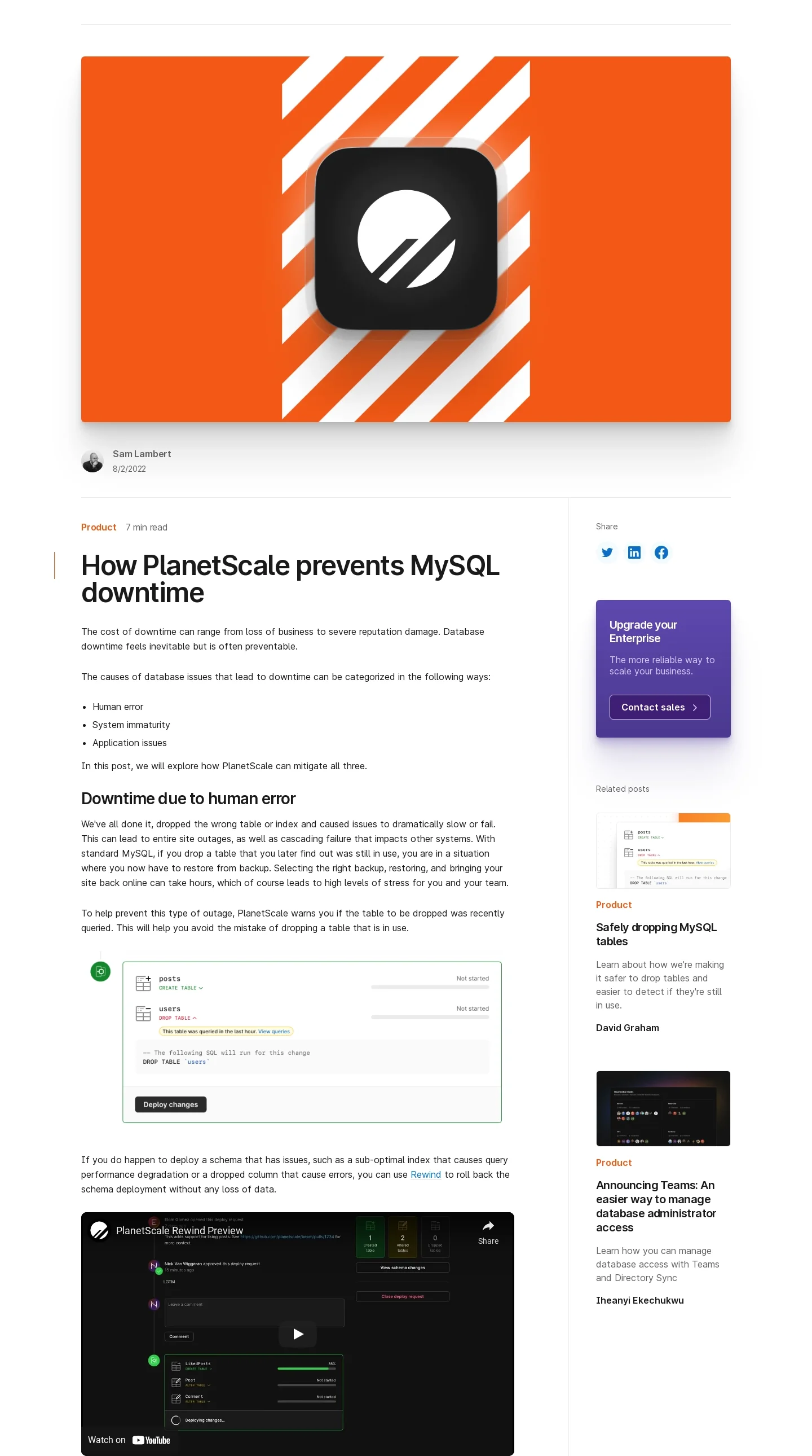
The PlanetScale reference places a large lead image above an article with author context, section headings, code-related media, and a secondary sidebar. Related material and a product action sit alongside or after the reading task.
This allows a technical article to carry several content formats. The layout should preserve a clear reading column so supporting actions do not compete with the argument.
Let headings advance the explanation
Use headings to name a question, cause, decision, or step. A reader scanning them should understand the article's progression rather than encounter repeated topic keywords.
Keep sections substantive. A screenshot or code block needs nearby explanation that tells readers why it matters and what they should notice.
The template should handle short and long headings without awkward spacing or a broken hierarchy.
Support an article-specific visual rhythm

The Resend launch-week article uses a dark reading surface with a sequence of day-specific sections and related product images. The repeated section structure suits a chronological recap.
That rhythm works because it matches the article's organizing idea. A different article may need comparisons, procedures, or a continuous argument rather than a fixed image after every heading.
Provide flexible content components while preserving consistent typography and spacing. Authors should not need decorative media to fill a predetermined layout.
Keep technical and visual content readable
Code samples, tables, and screenshots have different width needs. Give each a useful presentation and a way to understand it on smaller screens.
Use meaningful image descriptions and captions where context is needed. Do not rely on a screenshot alone to convey an essential instruction.
For embedded video, preserve enough surrounding explanation that the written article remains useful when the player is unavailable.
Place product invitations where they fit
A relevant product route can follow a demonstrated problem or appear after the conclusion. Keep its promise connected to the article's subject.
A persistent sidebar action should not interrupt reading or obscure content on narrow screens. Related articles should be selected for the next likely question rather than simply filling available slots.
Avoid repeating a conversion prompt between every section. The article earns attention through useful explanation.
Preserve editorial context as content changes
The template should support source links, corrections, and update context where appropriate. Publication and update dates need clear meaning.
Check older posts when components change. A new template should not make an existing table, long code sample, or caption unreadable.
Test a text-heavy article, a media-heavy recap, and a technical tutorial. Those cases reveal whether the structure supports the publication's real content.
Study article templates as reading systems
Use SaaSFrame's blog-template references to compare reading columns, media treatment, and related routes. Choose the layout around the argument and its supporting evidence.
Blog template questions
Should every article use the same section pattern?
No. Keep visual consistency while allowing structure to follow the article's purpose.
Where should promotional CTAs appear?
Place relevant actions after supporting context or at a natural reading boundary, with secondary treatment where appropriate.
What should be checked on mobile?
Review typography, media, code, tables, captions, and sidebar behavior. A desktop reading column does not establish mobile readability.