 SaaSFrame
📇 Sign Up Flow
Convert visitors into users with high-converting SaaS Signup and Registration flows. This gallery features social auth options, multi-step forms, and value-reinforcing sidebars that reduce friction during the initial sign-up.
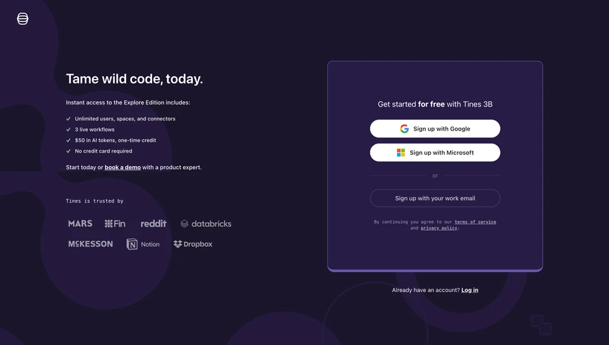


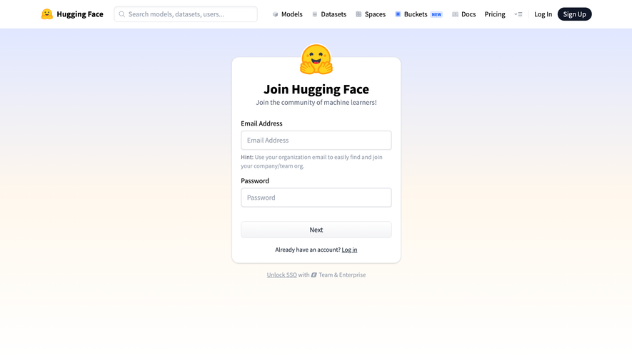

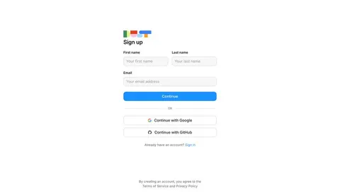
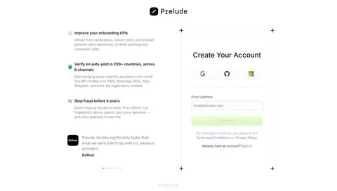
Index of all 192 Sign Up examples
- Profound Create Account
- Dust Signup
- Prelude Signup
- Unkey Signup
- Visitors Signup ID
- FullEnrich Signup
- Huly Signup
- Hume AI Signup
- Wise Signup
- Customer.io Password Setup
- Customer.io Create Account
- Superlist Sign Up With Email
- Superlist Signup
- Steep Signup
- Wiza Signup Page
- OpenAI Email Signup Page
- OpenAI Signup Page
- Mintlify Signup Page
- Latitude Signup Page
- Intercom Signup
- Oku Signup Page
- Uvodo Uvodo Signup
- Uvodo Uvodo Signup
- Uvodo Uvodo Signup
- Remote Employee Signup
- Remote Signup
- FlowMapp Signup Page
- Hyperline Signup
- Copperx Signup
- Copperx Signup
- Cal.com Signup
- Dock Signup
- Audienceful Signup Loader
- Audienceful Signup
- Vidzflow Signup
- Frame Signup
- Sandhill Markets Signup
- Rise Signup
- Albato Signup
- Expertpage Signup
- Sellx Signup
- Plausible Analytics Signup
- Duffel Signup
- Meiro Signup
- Meiro Signup
- Loops Signup
- Zeda.io Email Signup
- Zeda.io Signup
- Supabase Signup
- DataPulse Signup
- Livestorm Signup
- Cake Equity Signup
- Tona Signup
- Linktree Set Password
- Linktree Signup
- Linktree Signup
- Arc Signup
- Arc Signup
- MonSpark Signup
- Popwork Signup
- Hopscotch Signup
- Assembly Signup
- Conduktor Signup
- Conduktor Signup
- Current Signup
- Folio Signup
- Folio Signup
- Folio Signup
- Clay Signup
- WorkOS Signup
- WorkOS Signup
- Resend Signup
- Dokably Signup
- Raycast Signup
- Reflect Signup
- Reflect Signup
- Front Signup
- Front Signup
- Lettria Signup
- Mercury Signup
- Phantombuster Signup
- Phantombuster Signup
- Formcarry Signup
- Luma Signup
- Cohere Signup
- Makelog Signup
- Height Signup
- Height Signup
- Height Signup
- Plain Signup
- Daybridge Signup
- Olvy Signup
- Surfer SEO Signup
- SavvyCal Signup
- Klu Signup
- Pirsch Analytics Signup
- Pirsch Analytics Signup
- Zencal Signup
- Surfe Signup
- Better Stack etter Uptime Signup
- Twingate Signup
- Blobr Signup
- Qatalog Enter Email Address
- Qatalog Enter Email Address
- Qatalog Sign Up Page
- Logbook Signup
- Dub Signup
- Bento Create Account
- Café Signup
- Coherence Signup
- Libeo Signup
- Cycle Password Setup
- Cycle Signup
- Attio Signup
- Specify Signup
- Skiff Signup
- Help Kit Signup
- Testimonial.to Signup
- MentionFunnel Signup
- Senja Signup
- Campsite Signup
- The Org Signup
- The Org Signup
- Flowrite Signup
- June Signup
- Butter Signup Page
- Fernand Signup Page
- Crew Signup Page
- Crew Signup Page
- Crew Signup Page
- Evervault Signup Page
- Reveal Signup Page
- Vercel Signup Page
- Slite Signup Page
- Mixpanel Sign Up Flow
- Clearbit Signup Page
- Avocode Signup Page
- Mixpanel Sign Up Flow
- Mine Sign Up Flow
- Folk Signup Page
- Arcade Signup Page
- Vowel Signup Page
- Air Signup Page
- Billflow Signup Page
- Typedesk Signup Page
- Supernotes Signup Page
- Pitch Signup Page
- Abyssale Signup Page
- Hotjar Signup Page
- Linear Signup Page
- VideoAsk Signup Page
- Shortcut Signup Page
- Hey Signup Page
- Teachable Signup Page
- SeedLegals Signup Page
- Drip Signup Page
- Numbro Signup Page
- Hugo Signup Page
- Deel Signup Page
- ConvertKit Signup Page
- Mangools Signup Page
- Monday Signup Page
- EmailOctopus Signup Page
- Matter Signup Page
- Melio Signup Page
- Basecamp Signup Page
- Reply Signup Page
- Bonsai Signup Page
- Maze Signup Page
- Help Scout Signup Page
- Miro Signup Page
- Groove Signup Page
- Guru Signup Page
- ProductBoard Signup Page
- Abstract Signup Page
- Sprout Social Signup Page
- Hiver Signup Page
- Proof Signup Page
- Clearbit Signup Page
- Station Signup Page
- Twist Signup Page
- Fellow Signup Page
- Close Signup Page
- Avocode Signup Page
- Loom Signup Page
- Baremetrics Signup Page
- Segment Signup Page
- Fullstory Signup Page
- Asana Signup Page
📇 Sign Up Flow: design guide
A SaaS signup flow helps a prospective user create the identity needed to begin using a product. Its interface should make account-creation methods, required information, and the next step understandable without confusing registration with the setup that follows.
The SaaSFrame references below show provider-only entry and forms that combine provider and email routes. They illustrate visible choices; a static capture cannot establish the full authentication implementation or the subsequent activation journey.
Keep account creation distinct from onboarding
Signup creates an identity or account relationship. Onboarding may then configure a workspace, connect data, invite collaborators, or guide a first task. Naming the boundary helps users understand what they are committing to at each stage.
Avoid asking for every future setup detail in the first form unless it is required to create the account. Additional information can be gathered where its purpose becomes clear.
The primary action should describe the immediate outcome. If the next step is verification rather than product access, give users a coherent transition rather than an unexpected stop.
Explain a constrained provider choice
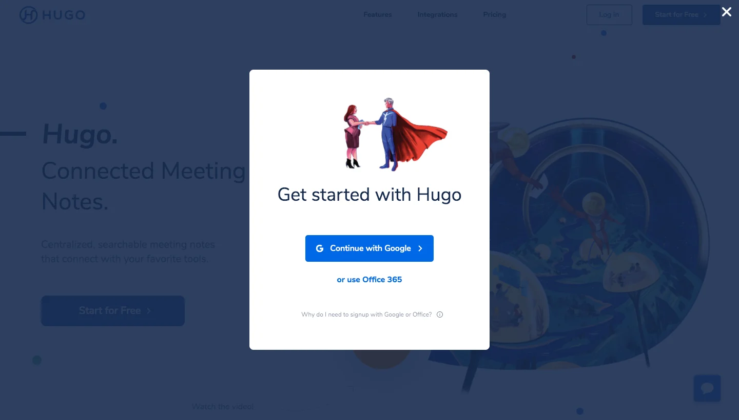
The Hugo signup reference presents Google and Office 365 routes with a help link explaining the provider requirement. The modal remains visually connected to the marketing page beneath it.
A restricted method choice can fit a product that depends on an associated service, but users need to understand the reason. Explain requirements at the decision point rather than making provider selection look like an arbitrary obstacle.
Do not infer permissions from the presence of a provider button. Authentication and access to a connected service can involve separate consent decisions that need their own accurate explanation.
Give email and provider routes a clear relationship
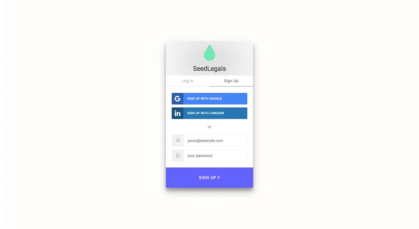
The SeedLegals capture offers Google and LinkedIn options above an email-and-password form. Separate login and signup tabs identify the active account task.
This accommodates different preferences, but a larger method set can create uncertainty for returning users. Keep the existing-account route visible and make it clear which controls create an account.
When users return through a different method, the system's linking behavior needs a coherent explanation. The interface should not casually imply that any matching email will merge identities unless that is the actual implementation.
Keep the form compact and labeled
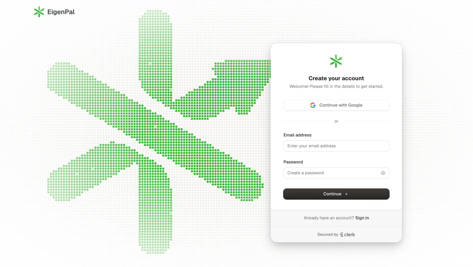
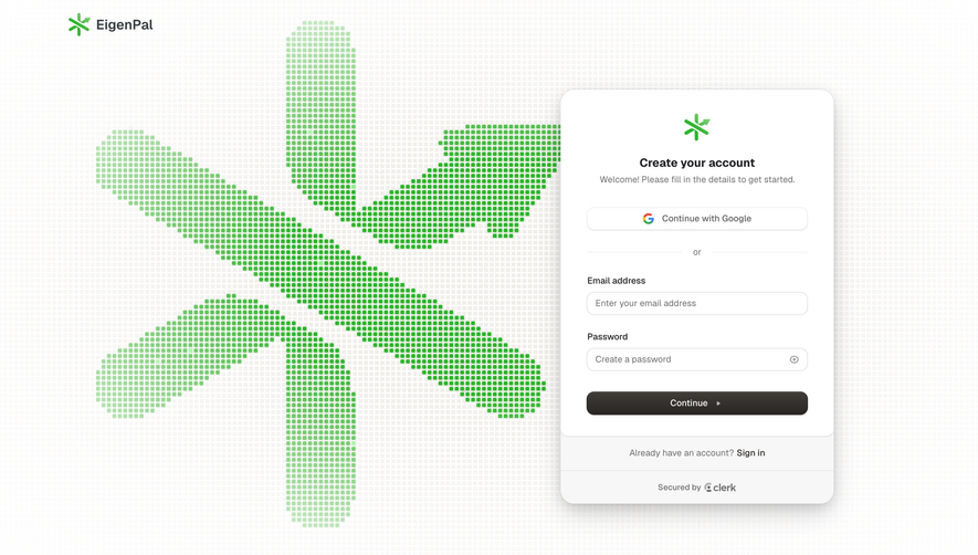
The EigenPal account-creation capture combines a Google route with labeled email and password inputs. A separate sign-in link below the primary action provides a route for existing users.
The form limits the initial visible task while branding occupies a larger area beside it. That division can maintain product identity without forcing promotional copy into every field explanation.
Check the hierarchy on smaller screens. The form and its recovery routes should remain easy to find when decorative content moves or the software keyboard opens.
Explain input requirements at the right time
Use persistent labels and specific validation. If a password has requirements, communicate them before or during entry rather than revealing a new rule after every failed submission.
Validate email format without presenting format acceptance as proof that a mailbox exists. Verification is a separate step and should be described as such.
Preserve useful input after errors. A temporary service failure should not require users to re-enter unrelated information or guess whether an account was created.
Connect verification to the pending account
When email verification is required, show the destination, expected action, and recovery options. Users need to correct a typo or request a new message without losing the registration context.
Explain code expiry or link invalidity through the actual rules. A verification message being requested does not mean the identity is confirmed.
After confirmation, resume the intended signup journey. Do not make users find the product again from a generic marketing page if the account setup is still incomplete.
Make terms and consequential choices readable
Present relevant agreements and consent choices clearly, with accurately labeled links. Keep optional communication preferences distinct from requirements for creating the account where the product model calls for that distinction.
Avoid preselecting an unrelated preference merely to reduce visible effort. The user's decision should remain understandable and consistent with the implemented behavior.
Do not use a design reference as authority for legal wording. Required disclosures and consent behavior need to match the product's own terms and applicable requirements.
Handle existing identities coherently
A prospective user may already have an account, belong to an invited workspace, or have begun registration earlier. Provide a useful route for those situations rather than repeating the same generic error.
An invitation context should survive signup when the user needs a new identity to accept it. Creating an account and joining the intended workspace remain separate outcomes worth confirming.
Consider provider cancellation and uncertain submission results. Give users a way to retry or return while avoiding claims that registration succeeded when the state is unknown.
Review the transition into first use
Test email registration, each provider route, validation errors, existing accounts, verification, and interruption. Confirm the actual account state and next destination after every successful route.
Evaluate whether users understand the required information and what happens next. Form completion alone does not prove that they reached useful product activity.
Use SaaSFrame's signup references to compare method hierarchy and the boundary between registration and setup. Choose a flow that explains the first commitment and leads naturally to the next task.
Signup design questions
Should every product offer provider signup?
No. Support methods that fit the account model and audience. Explain a constrained choice when a provider relationship is required.
Is signup complete when the form is submitted?
Not always. Verification, identity creation, and workspace setup may have separate pending and completed states. Name the actual outcome.
Where should existing users go?
Provide a clear sign-in route beside the registration task and handle already-existing identities coherently after submission.