 SaaSFrame
Dropdown Menu
Organize actions with efficient SaaS Dropdown Menu patterns. From simple select fields to complex 'Mega Menus' with icons and descriptions, find the right way to nest your navigation.

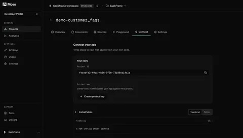
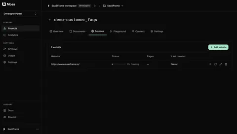
Index of all 195 Dropdown Menu examples
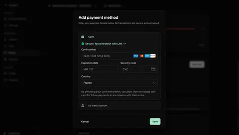
- Moss Add a payment card
- Moss Connect an index to your app
- Moss Website crawl in progress
- Moss Add a website crawl source
- Moss Preview a sample index dataset
- Moss Choose data for a new index
- Tines AI Model & Spend Settings
- Tines Personal Preferences
- Tines Account Profile Setup
- Lightspark Invite Team Member
- Lightspark Payout Amount & Details
- Lightspark Issue Virtual Card
- EigenPal Configure workflow output
- Hugging Face Storage bucket settings
- ReflexAI AI persona traits editor
- Cloudflare AI Crawl Security
- Cloudflare Transfers List
- Cloudflare Domains List
- Lightdash AI Analysis
- Profound Content Brief
- Profound Content Configuration
- Profound Content Dashboard
- Profound Select Region
- Profound Create Account
- Rankfender Content Preferences
- Rankfender Review Brand Book
- Claude Privacy Controls
- Claude Logs
- Claude Connector Details
- Claude Connectors Settings
- Claude Capabilities Settings
- Claude Usage Settings
- Claude Privacy Settings
- Claude Account Settings
- Claude General Settings
- Claude Create New Project
- Dust Workspace Settings
- Dust Drive Connected Data
- Dust Connections List
- Dust Add Connection
- Dust Connections Admin
- Dust Settings
- Prelude Integrations Settings
- Prelude Messages Configuration
- Prelude Region List
- Prelude Add Number
- Prelude Generate Key
- Unkey Create Identity
- Unkey Audit Log
- Unkey Create New Permission
- Unkey Create New Role
- Unkey Rate Limites Settings
- Unkey API Settings
- Unkey Edit External ID
- Unkey Manage Role And Permissions
- Unkey API Table
- Unkey Create New API
- Unkey Billing Settings
- Visitors Security Settings
- Visitors Usage Settings
- Visitors Project Settings
- Visitors Add Project
- Visitors Manage Account
- FullEnrich Enrich Work Email
- FullEnrich New Enrichment
- Huly Cards
- Huly Add Schedule
- Hume AI Account Settings
- Hume AI API Keys
- Hume AI New Voice Set Up
- Hume AI Generating New Voice
- Hume AI Voice Design
- Reducto Extract Document
- Reducto Split Document
- Reducto Parse Document
- Atlas Add Widget
- Atlas Add Dataset
- Wise Settings
- Wise Select Conversion Amount
- Wise Select Conversion Amount
- Wise Convert Money
- Wise Send Payment Request
- Wise Request Money
- Wise Add Money With Card
- Wise Add Money
- Wise Select Transfer Recipient
- Wise Search Transfer Recipient
- Wise Add Transfer Recipient
- Wise Select Transfer Frequency
- Wise Schedule A Transfer
- Wise Send A Payment
- Pitch Analytics Links Overview
- Customer.io Segments Table
- Customer.io Activity Logs
- Customer.io CSV Import Review
- Customer.io Add A Contact
- Customer.io Campaign Review
- Customer.io Campaign Goals Settings
- Customer.io Campaign Review
- Checkout.com Team Permissions
- Checkout.com Set Up API Keys
- Checkout.com Intelligent Acceptance
- Checkout.com Add Chart To Board
- Checkout.com Create New Board
- Checkout.com Generating Report
- Checkout.com Create New Report
- Superlist Integrations Settings
- Superlist Subscriptions Settings
- Superlist Features Settings
- Superlist Profile Settings
- GoFundMe Account Settings
- GoFundMe Foundraiser Setup
- Steep Workspace Settings
- Steep Targets
- Wiza Billing Settings
- Wiza Account Settings
- Wiza Profile Settings
- Wiza Create A List
- Wiza Contacts Table
- OpenAI New Assistant Created
- OpenAI Create New Assistant
- OpenAI Create New Assistant
- OpenAI API Key Created
- OpenAI Create API Key
- Mintlify Add Custom Domain
- Mintlify Settings
- Latitude Create New Project
- Intercom Install Messenger
- Intercom Content Table
- Intercom Article Settings
- Intercom Empty Content List
- Intercom Articles List
- Intercom Workflows Table
- Intercom Users Table
- Oku Settings
- Uvodo Brand Settings
- Uvodo Brand Settings
- Uvodo Add A Team Member
- Uvodo General Settings
- Uvodo Inventory Table
- Uvodo Products Table
- Uvodo Product Settings
- Uvodo Uvodo Create Virtual Card
- Uvodo Uvodo Create A Link
- Uvodo Uvodo Create A Link
- Remote Company Settings
- Remote Time Off Summary Table
- Remote Time Off Requests Table
- Remote Time Tracking
- Remote Hire & Onboarding Table
- Remote Add A New Hire
- Remote Add A New Hire
- Remote Add A New Hire
- Hyperline Create A New Customer
- Hyperline Company Setup
- Copperx Create A Payment Link
- Audienceful Upload CSV File
- Frame Account Setup
- Frame Account Setup
- Zeda.io Invite Team Members
- Tona Account Setup
- Ruul Select Client Country
- Mercury Transfer Recipient
- SavvyCal Account Setup
- Better Stack etter Uptime Create An Hearthbeat
- Logbook Project Settings
- Logbook Location Settings
- Logbook Select Country & Timezone
- Café Create An Event
- Café Create An Event
- Café Settings
- Café Schedule Setup
- Café Interests Setup
- Café Interests Setup
- Libeo Signup
- Specify User Onboarding
- Specify User Onboarding
- Specify Company Details
- Skiff Schedule Message
- Campsite Invite Team Members
- Pipe Sign Up Flow
- Fernand Invite Team Members
- Fernand Invite Team Members
- Crew Workspace settings
- Crew Profile settings
- Crew Signup Page
- Crew Signup Page
- Abstract Sign Up Flow
- Abyssale Sign Up Flow
- Abstract User Onboarding
- Asana Sign Up Flow
- Arcade Appearance Settings
Dropdown Menu: design guide
A dropdown menu reveals choices from a compact trigger, keeping an interface manageable until users need more detail. In SaaS products, that visual treatment can support several different tasks: selecting a form value, choosing a command, opening a destination, or filtering a long collection of options. The shape of the popup alone does not determine the interaction.
Effective dropdown design starts with the meaning of the choice. Does selection update a field, immediately perform an action, or start another workflow? This guide compares captured interfaces from Zeda.io, Ruul, and SavvyCal to show how descriptive role choices, searchable country options, and calendar connection actions require different decisions. The screenshots document visible layouts, not their keyboard implementation or current product capabilities.
Decide whether the dropdown chooses a value or performs an action
A form selector needs to communicate its label and current value after the popup closes. An action menu needs to communicate the operation it starts. Treating both as a generic list can hide an important distinction: exploring a value should not accidentally execute a consequential command.
For a field such as country, the selected value belongs to the form and may be saved later. For an action such as connecting a calendar account, the choice can initiate authentication or another setup step. Explain that transition through the trigger and option labels. Avoid presenting an immediate operation as if it were a harmless preference.
A navigation dropdown has another contract: selecting a destination moves the user elsewhere. Preserve normal link behavior when appropriate. Do not make ordinary navigation depend on custom command semantics simply because the links appear in a floating panel.
The visual category is useful for finding inspiration, but implementation should follow the underlying task. Choose a native select, an accessible combobox, a menu button, or a disclosure containing links according to behavior rather than appearance.
Zeda.io explains permission choices inside the role dropdown
The captured Zeda.io Invite Team Members screen places email fields beside a Role control. The expanded role list contains Admin, Creator, and Collaborator, with descriptions beneath each name. The Collaborator option also carries a Free badge in this historical capture.
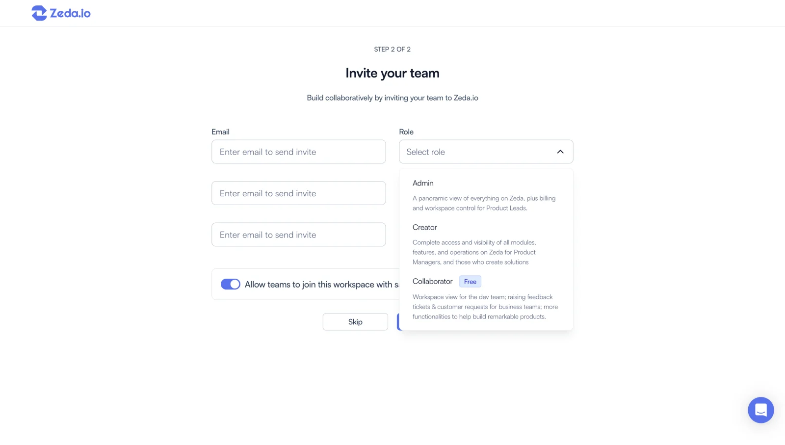
The descriptions make this more than a compact list of job titles. Users can compare the visible scope of each role, including billing and workspace control for Admin and a narrower collaborative purpose for Collaborator. That information belongs at the decision point because the role name alone may not explain access.
Descriptive options introduce a space tradeoff. The expanded panel covers part of the surrounding form and lower controls. Keep descriptions concise enough to compare without turning every option into an essay. If the differences require a substantial permissions matrix, provide a separate explanation rather than forcing it into a popup.
The Free badge is visible evidence about the capture, not a claim about current pricing. In an implementation, distinguish commercial information from permission scope. A cheaper role may be attractive, but users still need to understand whether it supports the work their teammate must perform.
Repeated invitation rows also need clear associations between each email and role. A wide popup should not make users uncertain about which recipient it applies to. After closing, show the selected role on the correct row. See Invite Team Members for the broader invitation workflow.
Ruul adds search when the option collection is long
The Ruul Select Client Country capture shows an Add Client page with a wide Select Country trigger. Its expanded panel contains a search field followed by an alphabetical list beginning with Albania, Algeria, Andorra, Angola, and other countries. The list extends toward the bottom of the captured screen.
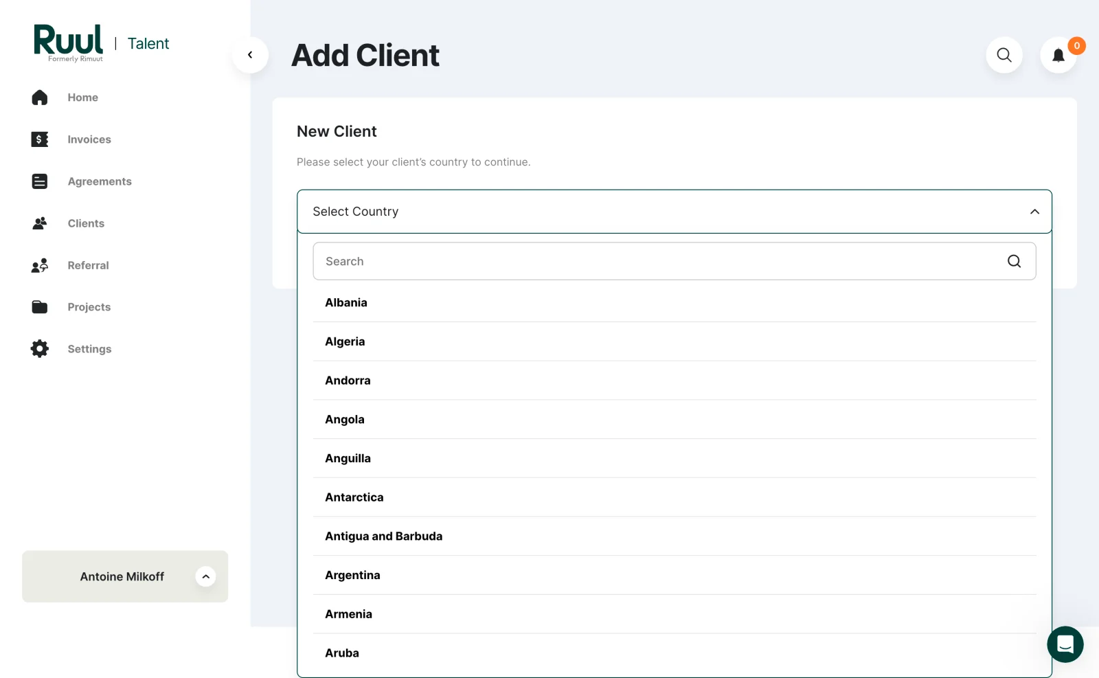
Country selection is a discovery problem: users generally know the target and want to locate it quickly. Search can reduce scanning through a long alphabetical collection. Keep the field label tied to the client's country so users do not confuse it with their own location or the workspace's billing country.
The screenshot shows an empty search input, so it does not establish matching rules or a filtered result state. When designing the interaction, define whether users can search by localized name, common alternate name, or country code. Use consistent naming in the closed value and the option list.
Typing a query and selecting a value are separate states. If the user searches and closes the popup without choosing, preserve the previous selection. Do not silently treat arbitrary search text as a valid country. If no result matches, keep the query editable and explain how to revise it.
A long list also needs predictable scrolling. The visible panel should not extend beyond the usable viewport or force users to scroll the whole page to reach its last option. Test placement near the bottom of a form and with a mobile keyboard open.
SavvyCal uses the dropdown to start a connection workflow
The captured SavvyCal Account Setup screen explains calendar connection above an empty connected-calendar area. Add a calendar account opens a short list containing Google Calendar, Microsoft Outlook, iCloud Calendar, and Fastmail Calendar. A highlight is visible near Microsoft Outlook.
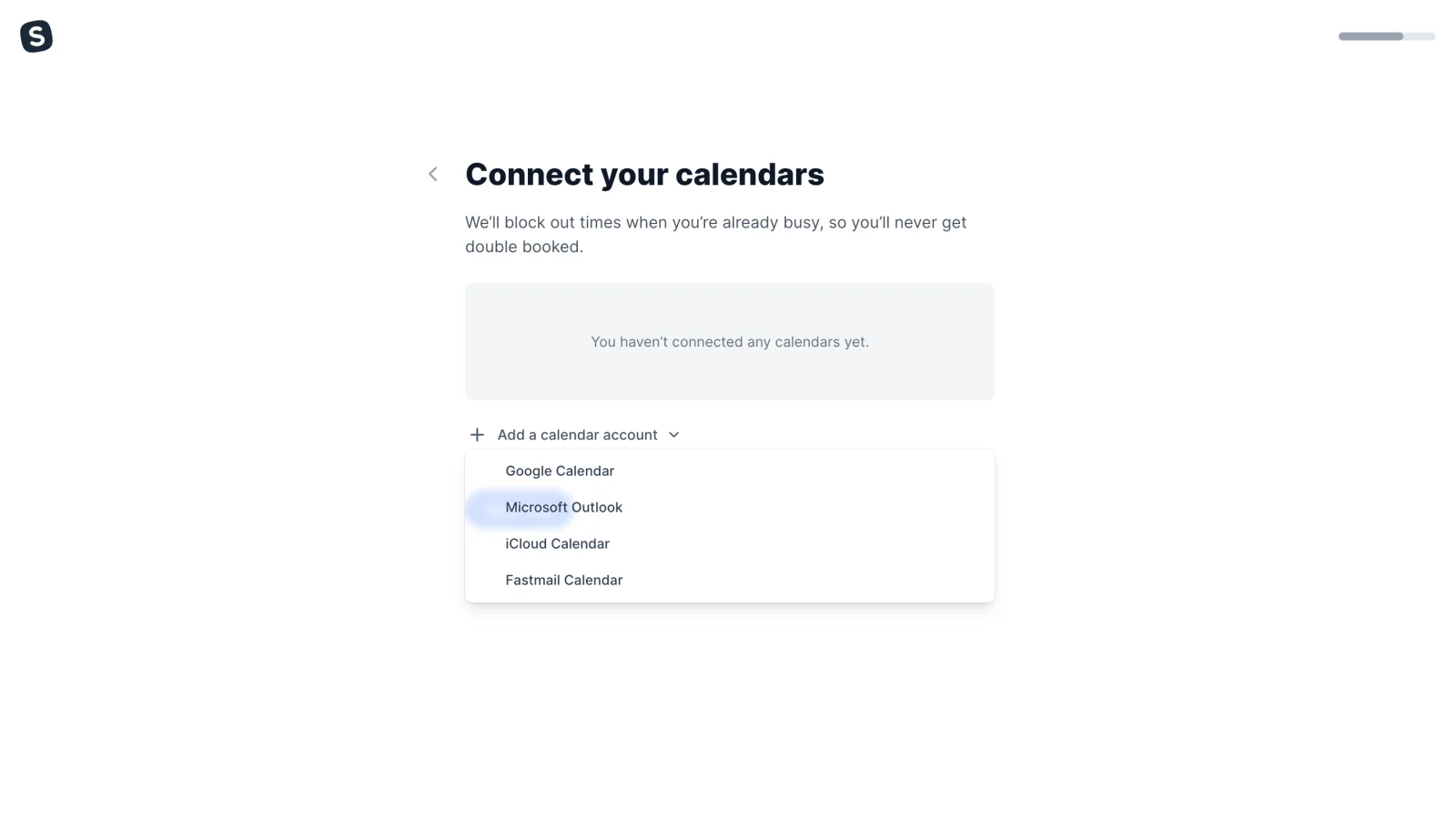
These choices describe the provider for an operation rather than a stored form value. The trigger names the operation, while each option completes the phrase by identifying the provider. This is an effective label relationship to preserve when adapting the pattern.
The highlight is a visible state, but the screenshot does not prove whether it reflects hover, keyboard focus, or selection. Make those states distinguishable in the actual product. A focused option should not appear already connected before the user completes authorization.
After choosing a provider, explain the handoff and preserve the setup context if the user returns without completing it. A cancelled connection should leave a clear retry path. Successful authorization should update the connected-account area with an understandable result instead of merely closing the dropdown.
The provider names are historical screenshot contents. They illustrate how a short action list can work without search; they are not a guarantee of present-day integration availability.
Choose between visible options and a collapsed list
A dropdown saves space but hides alternatives until opened. For a small set of important choices that users must compare, radio buttons or choice cards can make the decision easier. Use a dropdown when compactness has a practical benefit and the trigger still explains what is available.
A frequent action may deserve a visible button even when secondary actions are placed in a menu. Hiding everything behind an overflow icon can make the main workflow harder to discover. Conversely, exposing every rare action in a table row can crowd the content users need to scan.
Consider how much information each option needs. Short provider names fit a compact list. Role descriptions need more room. A collection with hundreds of entries needs a retrieval strategy. Do not choose the same dimensions and content structure for all three simply to keep components visually uniform.
Make the trigger understandable before users open it
The trigger should communicate its purpose, current state, and availability. A field label should remain visible after a selection replaces the placeholder. Select role is useful guidance before choosing; it is not a replacement for the persistent Role label.
A chevron can suggest expansion, but it cannot explain the subject of the dropdown. Icon-only overflow buttons need an accessible name and enough contextual placement to identify the affected item. Repeated triggers in a table should each refer to their own row.
Show a selected value distinctly from a prompt. If users have not made a required choice, do not display the first option as if it were deliberately selected unless that default is appropriate and explicit. For sensitive access choices, a casual default can create a consequential misunderstanding.
When the control is unavailable, explain the reason nearby where useful. A muted trigger without explanation leaves users guessing whether they need permission, another field, or a different plan. Keep the explanation outside the inaccessible popup.
Organize options around recognition and consequence
Use labels that users can recognize quickly. Country collections often benefit from alphabetical order; action menus may benefit from grouping related operations. Role choices need their scope explained. The ordering principle should serve the task rather than reflect an internal database sequence.
For commands, separate destructive operations from routine ones and name the consequence precisely. A dangerous action should not sit where users habitually select a harmless command without enough distinction. If confirmation is needed, the confirmation should explain the resource and impact.
For selected values, use a persistent indicator and readable text. Do not rely on color alone to show which option is selected. When both focus and selection appear in the list, ensure users can tell which value is already stored and which row they are currently exploring.
Avoid mixing unrelated actions, navigation, and form values in one unstructured popup. If an option such as Create new belongs alongside existing records, make its different consequence obvious. It starts a creation task rather than selecting an existing value.
Define search, loading, and empty states explicitly
A searchable dropdown needs feedback while options are loading and when a query has no match. No matching options is different from a failed request or an empty source collection. Give each state an appropriate recovery path without erasing the current selection.
When fetching options remotely, ensure an older response cannot replace results for a newer query. Keep the displayed list aligned with the visible search text. Users should not select an option from a stale result set while the input suggests another query.
If the selected record is no longer available, show an understandable unavailable state and let users choose a replacement. Silently substituting another value can be harmful in recipient, role, or configuration fields. Preserve enough identity to explain what changed.
For a failed action, return feedback to the task rather than leaving users unsure whether the operation happened. Reopening the dropdown is not proof that the command failed. Communicate accepted, pending, and unsuccessful outcomes where the surrounding workflow can support them.
Match keyboard behavior to the control's meaning
W3C's menu button guidance describes opening a command menu from a button with Enter or Space and communicating its expanded state. Apply that pattern to an actual menu, rather than assigning menu semantics to every visually similar popup.
The W3C combobox guidance distinguishes a control that chooses a value from one that performs menu actions. It describes editable and select-only variants, their popup relationship, and relevant keyboard behavior. Choose the variant that matches the field.
Keep the label, current value, focused option, and expanded state understandable to assistive technology. Preserve normal text editing in a searchable input. Provide a predictable way to dismiss the popup and return to the trigger or field without accidentally committing a different value.
Test the complete interaction with keyboard and screen reader use. The captured chevrons, highlights, and list layouts cannot establish accessible names, focus management, or announced selection. A visually polished popup still requires direct interaction testing.
Keep the popup usable in constrained layouts
Place the list where its important options remain reachable. Near a viewport edge, the popup may need to open above the trigger or adjust its position. Keep the visual relationship to the trigger clear so users understand which control expanded.
Long descriptions need wrapping that preserves the option boundaries. Long selected values need an understandable closed presentation rather than indistinguishable truncated labels. Consider whether adjacent options differ only at the end of their names.
On touch screens, the interaction should work through tapping rather than requiring hover. Provide comfortable targets and enough space to avoid selecting adjacent rows accidentally. Searchable lists must accommodate the software keyboard and keep the query and relevant results reachable.
When a dropdown appears inside a modal or a scrollable panel, test clipping and focus together. A popup rendered outside its visual container should still belong logically to the control. Avoid solving an overflow problem by breaking the parent task's keyboard behavior.
Review dropdowns by the decisions they enable
- Purpose: Is each option a value, action, or destination?
- Trigger: Can users understand the choice before opening the list?
- Scope: Is the affected row, recipient, or resource clear?
- Comparison: Are descriptions sufficient for consequential choices?
- Retrieval: Can users find a known item without excessive scanning?
- State: Are focus, selection, loading, and failure distinguishable?
- Commitment: Does selection save a value or start an operation predictably?
- Dismissal: Can users leave without an accidental change?
- Layout: Are all options reachable on small screens and at zoom?
Test a user who knows the desired option and another who needs to compare alternatives. These are different tasks. Observe incorrect selections, repeated reopening, difficulty finding options, and uncertainty after a command. A fast selection is useful only if it produces the intended result.
Frequently asked questions about SaaS dropdown menus
Is every dropdown a menu button?
No. Dropdown describes a visual presentation. A form value selector, searchable combobox, command menu, and navigation disclosure can look similar while requiring different semantics and interaction rules.
When should a dropdown include search?
Add search when users must locate a known option in a collection that is cumbersome to scan. Ruul's country selector illustrates that case. A short provider list like the captured SavvyCal example may be easier to inspect directly.
Should options contain descriptions?
Use descriptions when names alone do not communicate meaningful differences. Zeda.io's role selector provides scope explanations. Keep them concise and move extensive comparison material outside the popup.
Should choosing an option immediately save it?
That depends on the task. A form field may be saved with the rest of the form; an action menu may execute immediately. Make the rule clear and avoid using the same visual selection treatment for an operation whose consequence users would not expect.
What should happen when a searchable dropdown has no results?
Keep the query editable, explain that no options match, and preserve any previously selected value. Distinguish a genuine no-match state from loading or a failed request so the recovery action makes sense.
Compare the captured role, country, and calendar controls by what users must decide, not just their shared popup shape. A dependable dropdown makes the choice easier to find, understand, and complete while keeping its consequence clear.