.webp)

Span


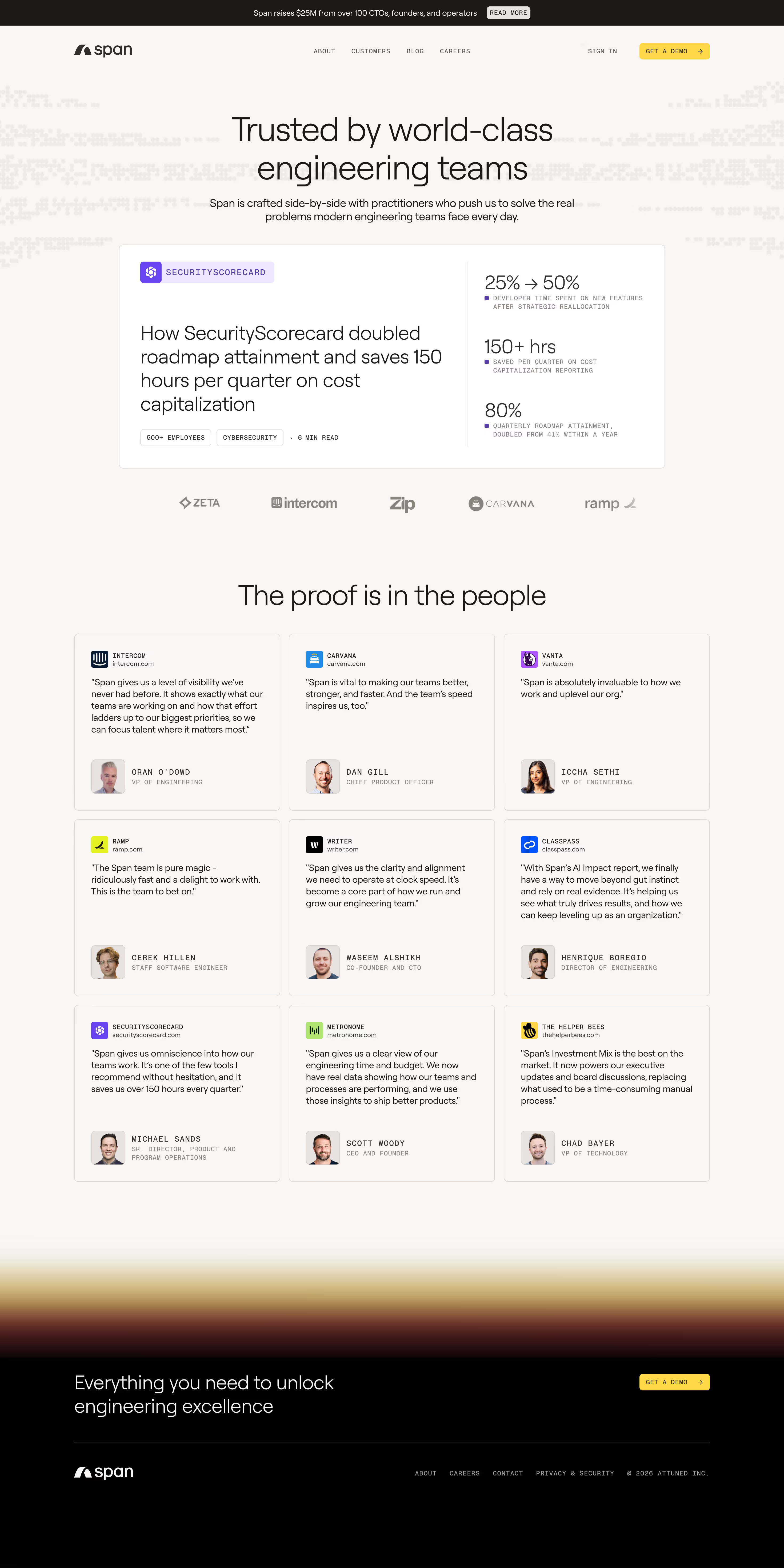

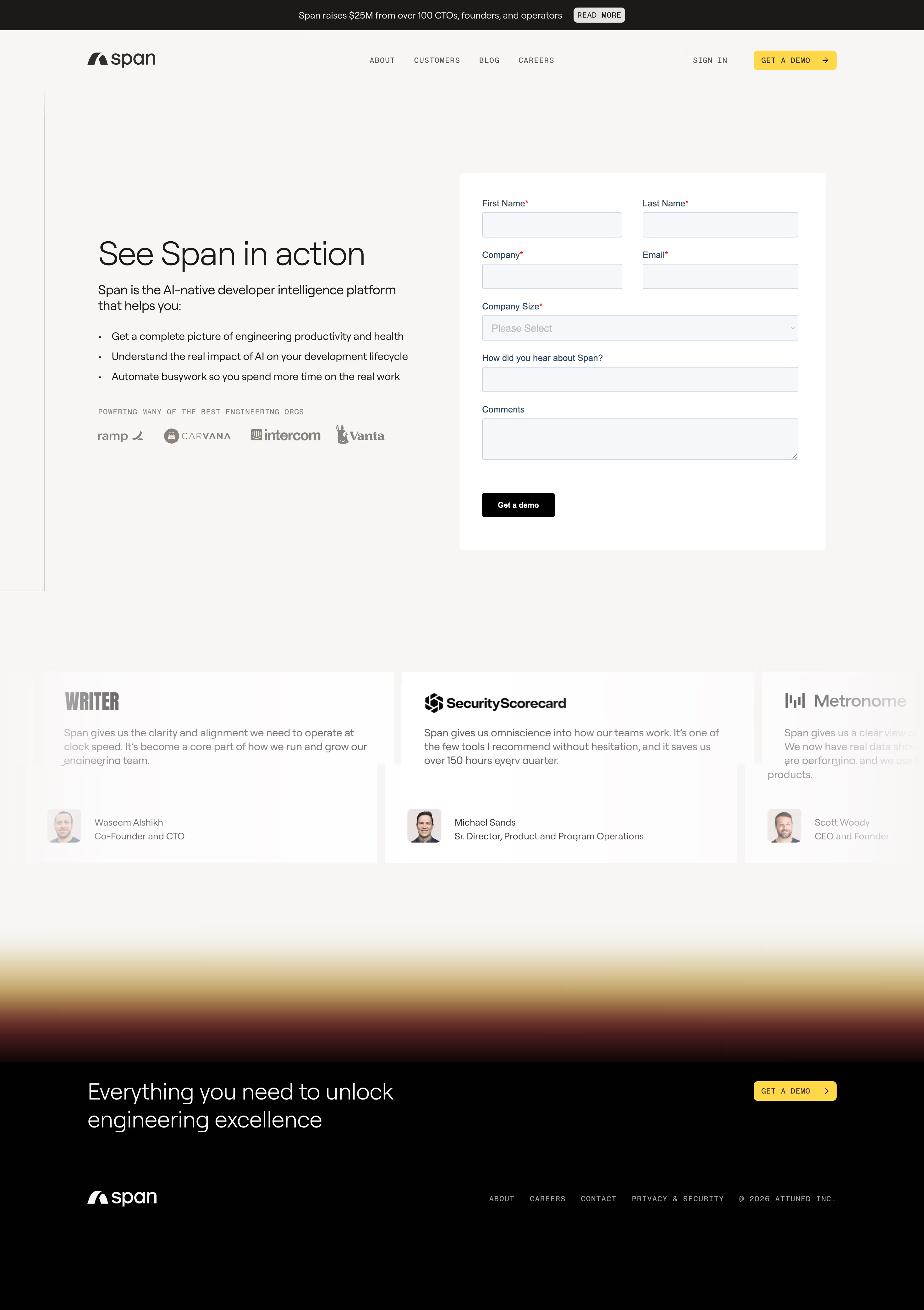

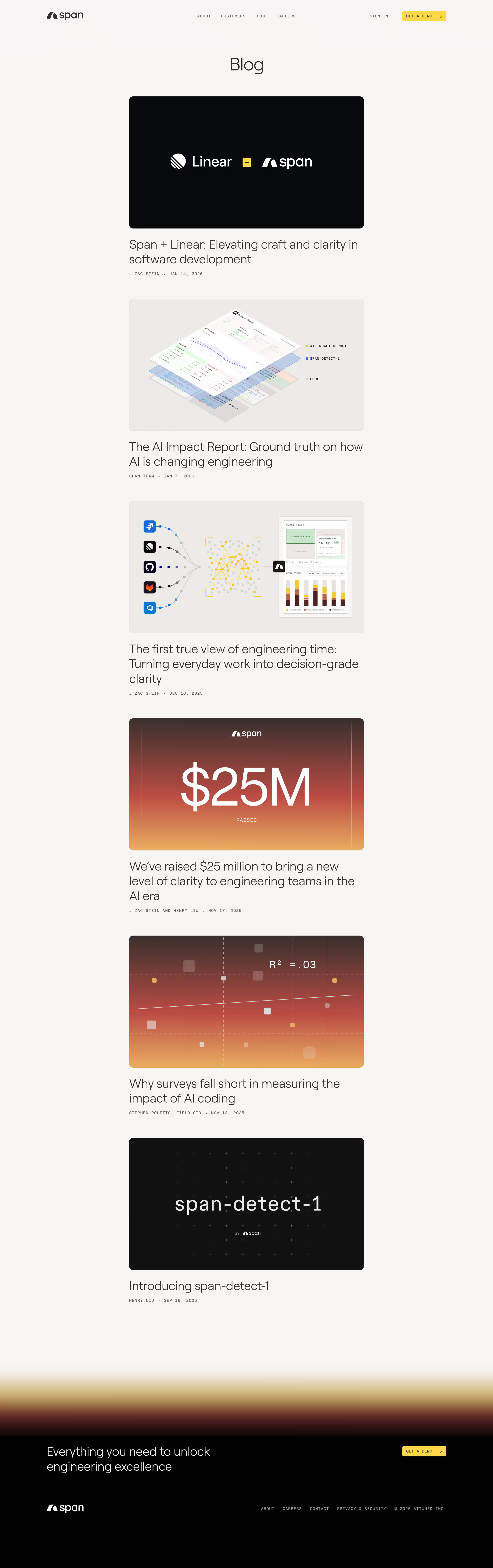


Span Design System
Source
\- URL:
Stack \- Website builder: Framer (framerusercontent.com assets) \- No dark mode — single light theme enforced via meta tag \- All assets hosted on framerusercontent.com CDN
Typography \- Primary typeface: Inter (geometric sans-serif, standard Framer default confirmed by content structure) \- Headings: Bold/Semibold weight, large display sizes (48–72px on desktop) \- Body: Regular/Medium weight, ~16–18px \- Labels/Overlines: Uppercase tracking, small caps treatment (e.g. "AI EFFECTIVENESS", "PARTNERING WITH...") \- CTA buttons: Uppercase, tight tracking, semibold \- Line height: ~1.2 for headings, ~1.6 for body
Color Philosophy \- Clean, high-contrast light-mode-only palette \- Dark navy/near-black background for hero and accent sections \- White or light grey (#F5F5F5 range) for content sections \- Single vivid accent (teal/cyan or electric blue) for CTAs and highlights \- Muted grays for secondary text and borders \- Section-level color blocking: alternating dark and light panels
Spacing \- Base unit: 4px \- Section padding: 80–120px vertical \- Component gaps: 24–48px \- Card padding: 24–32px \- Tight inner spacing: 8–16px
Component Defaults \- Buttons: Pill or slightly rounded rectangle, uppercase text, high contrast fill \- Cards: Subtle border (1px), low-elevation shadow, rounded corners (~8–12px) \- Section headers: Eyebrow label (uppercase, colored) + large H2 + body paragraph \- Navigation: Sticky top bar, transparent-to-solid on scroll \- Images: Framer SVG/PNG screenshots of the product UI
Layout \- Max content width: ~1200–1280px \- Centered layout with generous horizontal padding \- Grid: 12-column, responsive \- Mobile breakpoints: tablet ~768px, mobile ~390px \- Hero: Full-width with centered text and single CTA \- Feature sections: alternating 2-column (text + product screenshot)
:root { / Typography / --font-family-base: 'Inter', -apple-system, BlinkMacSystemFont, 'Segoe UI', sans-serif; --font-family-mono: 'JetBrains Mono', 'Fira Code', monospace;
--font-size-xs: 0.75rem; / 12px / --font-size-sm: 0.875rem; / 14px / --font-size-md: 1rem; / 16px / --font-size-lg: 1.125rem; / 18px / --font-size-xl: 1.25rem; / 20px / --font-size-2xl: 1.5rem; / 24px / --font-size-3xl: 2rem; / 32px / --font-size-4xl: 3rem; / 48px / --font-size-5xl: 4rem; / 64px /
--font-weight-regular: 400; --font-weight-medium: 500; --font-weight-semibold: 600; --font-weight-bold: 700;
--line-height-tight: 1.15; --line-height-snug: 1.3; --line-height-normal: 1.5; --line-height-relaxed: 1.65;
--letter-spacing-tight: -0.02em; --letter-spacing-normal: 0; --letter-spacing-wide: 0.06em; --letter-spacing-wider: 0.1em;
/ Spacing / --space-xs: 4px; --space-sm: 8px; --space-md: 16px; --space-lg: 24px; --space-xl: 32px; --space-2xl: 48px; --space-3xl: 64px; --space-4xl: 80px; --space-5xl: 120px;
/ Colors — Light mode / --color-background: #FFFFFF; --color-background-subtle: #F7F7F7; --color-background-dark: #0D0D12; --color-background-dark-secondary: #13131A;
--color-foreground: #0D0D12; --color-foreground-secondary: #3D3D3D; --color-foreground-muted: #767676; --color-foreground-on-dark: #FFFFFF; --color-foreground-on-dark-muted: rgba(255,255,255,0.55);
--color-border: #E4E4E4; --color-border-dark: rgba(255,255,255,0.12);
/ Accent — teal/cyan primary / --color-accent: #00C8A0; --color-accent-hover: #00A885; --color-accent-subtle: rgba(0,200,160,0.1);
/ Semantic / --color-success: #22C55E; --color-warning: #F59E0B; --color-error: #EF4444;
/ Border Radius / --radius-sm: 4px; --radius-md: 8px; --radius-lg: 12px; --radius-xl: 16px; --radius-full: 9999px;
/ Shadows / --shadow-sm: 0 1px 3px rgba(0,0,0,0.08), 0 1px 2px rgba(0,0,0,0.05); --shadow-md: 0 4px 16px rgba(0,0,0,0.10), 0 2px 6px rgba(0,0,0,0.06); --shadow-lg: 0 12px 40px rgba(0,0,0,0.12), 0 4px 12px rgba(0,0,0,0.06);
/ Transitions / --transition-default: 200ms ease; --transition-slow: 400ms ease;
/ Layout / --max-width-content: 1280px; --max-width-text: 720px; --nav-height: 64px; --section-padding-y: var(--space-5xl); --section-padding-x: var(--space-2xl); }
Design Tokens Reference — Span (span.app)
Color Tokens
| Token | Value | Usage |
|---|---|---|
| --color-background | #FFFFFF | Page background (light sections) |
| --color-background-subtle | #F7F7F7 | Alternate section background |
| --color-background-dark | #0D0D12 | Hero, dark sections |
| --color-background-dark-secondary | #13131A | Dark card backgrounds |
| --color-foreground | #0D0D12 | Primary text on light |
| --color-foreground-secondary | #3D3D3D | Secondary text |
| --color-foreground-muted | #767676 | Tertiary / captions |
| --color-foreground-on-dark | #FFFFFF | Text on dark backgrounds |
| --color-foreground-on-dark-muted | rgba(255,255,255,0.55) | Muted text on dark |
| --color-border | #E4E4E4 | Dividers and card borders (light) |
| --color-border-dark | rgba(255,255,255,0.12) | Borders on dark backgrounds |
| --color-accent | #00C8A0 | Primary CTA, highlights |
| --color-accent-hover | #00A885 | Hover state for accent |
| --color-accent-subtle | rgba(0,200,160,0.1) | Accent tint / tag backgrounds |
Spacing Scale
| Token | Value | Usage |
|---|---|---|
| --space-xs | 4px | Icon gaps, micro padding |
| --space-sm | 8px | Inner component padding |
| --space-md | 16px | Default component gap |
| --space-lg | 24px | Card padding, list gaps |
| --space-xl | 32px | Section sub-gaps |
| --space-2xl | 48px | Component-to-component |
| --space-3xl | 64px | Large component gaps |
| --space-4xl | 80px | Section padding (mobile) |
| --space-5xl | 120px | Section padding (desktop) |
Typography
| Token | Value | Usage |
|---|---|---|
| --font-family-base | Inter, system-ui | All UI text |
| --font-size-xs | 12px | Labels, captions, overlines |
| --font-size-sm | 14px | Secondary body, nav links |
| --font-size-md | 16px | Default body |
| --font-size-lg | 18px | Lead text / intros |
| --font-size-3xl | 32px | H3 headings |
| --font-size-4xl | 48px | H2 section headings |
| --font-size-5xl | 64px | H1 hero headline |
| --font-weight-semibold | 600 | Headings, CTAs |
| --font-weight-bold | 700 | Display headings |
| --letter-spacing-wide | 0.06em | Uppercase overline labels |
| --line-height-tight | 1.15 | Large display headings |
| --line-height-relaxed | 1.65 | Body paragraphs |
Border Radius
| Token | Value | Usage |
|---|---|---|
| --radius-sm | 4px | Tags, badges, small inputs |
| --radius-md | 8px | Cards, buttons |
| --radius-lg | 12px | Feature cards, modals |
| --radius-xl | 16px | Large panels |
| --radius-full | 9999px | Pill buttons, avatars |
Shadows
| Token | Value | Usage |
|---|---|---|
| --shadow-sm | 0 1px 3px rgba(0,0,0,0.08) | Subtle card lift |
| --shadow-md | 0 4px 16px rgba(0,0,0,0.10) | Standard card elevation |
| --shadow-lg | 0 12px 40px rgba(0,0,0,0.12) | Modals, popovers |
Framework: Framer (meta-generator: Framer 7bfce40) — static-site output hosted at span.app with all assets on framerusercontent.com CDN.
Theme support: Light mode only. The site explicitly sets meta-color-scheme: only light — no dark mode toggle or system-preference override is present.
Data source: Fetched via web\_fetch on 2026-07-15. HTML pages returned content-only (no inline CSS); Framer compiles styles into runtime JS bundles not exposed in HTML fetch. Design tokens are inferred from: \- Page structure, heading hierarchy, and component patterns observed in HTML \- Framer platform conventions (Inter as default typeface, 4px base grid, section-level color blocking) \- Visual language of product screenshots embedded in SVG/JPG assets \- Color palette approximated from dark navy hero (#0D0D12 family) + white content sections + teal/green accent implied by brand imagery
Notable patterns: \- Strict uppercase tracking on section overlines (e.g. "AI EFFECTIVENESS", "PARTNERING WITH MANY OF THE BEST ENGINEERING ORGS") — a strong typographic signature \- Two-tone layout system: alternating dark (near-black) and light (white/off-white) full-width sections \- CTA buttons use ALL CAPS text ("GET A DEMO", "SIGN IN", "REQUEST PRICING") with pill or mildly rounded shape \- Hero headline uses large multi-line display type with tight letter-spacing \- Product screenshots are SVG or high-res JPG embedded in feature cards, not live UI embeds \- No custom CSS variables or design tokens are exposed in the rendered HTML (Framer encapsulates everything in JS) \- Company legal name: Attuned Inc. (© 2026 Attuned Inc.) \- Framer version hash: 7bfce40
Biggest SaaS library.


.webp)


.webp)

Desktop & mobile versions.


Access the Figma files.


Advanced filtering.
Let it flow.





Save design inspirations.
research




How do you process payment?
SaaSFrame subscriptions are sold on Lemon Squeezy, a secured online selling platform for creators.
What about future updates and versions?
SaaSFrame gets updated all the time! Every new update and version will immediately be made available to all SaaSFrame users.
Can you send me an invoice?
You can generate an invoice on your Lemon Squeezy portal once you purchased SaaSFrame. You will find the link in the order confirmation email.
How can I cancel my membership subscription?
You can cancel your membership subscription at any moment on your profile page.
Can I get a refund?
If you're not satisfied, you can ask for a refund within 7 days. Just send me an email at antoine[at]unmake[dot]io
I have another question.
You can send me an email at antoine[at]unmake[dot]io, I'll be happy to help with any questions.