.webp)

Profound







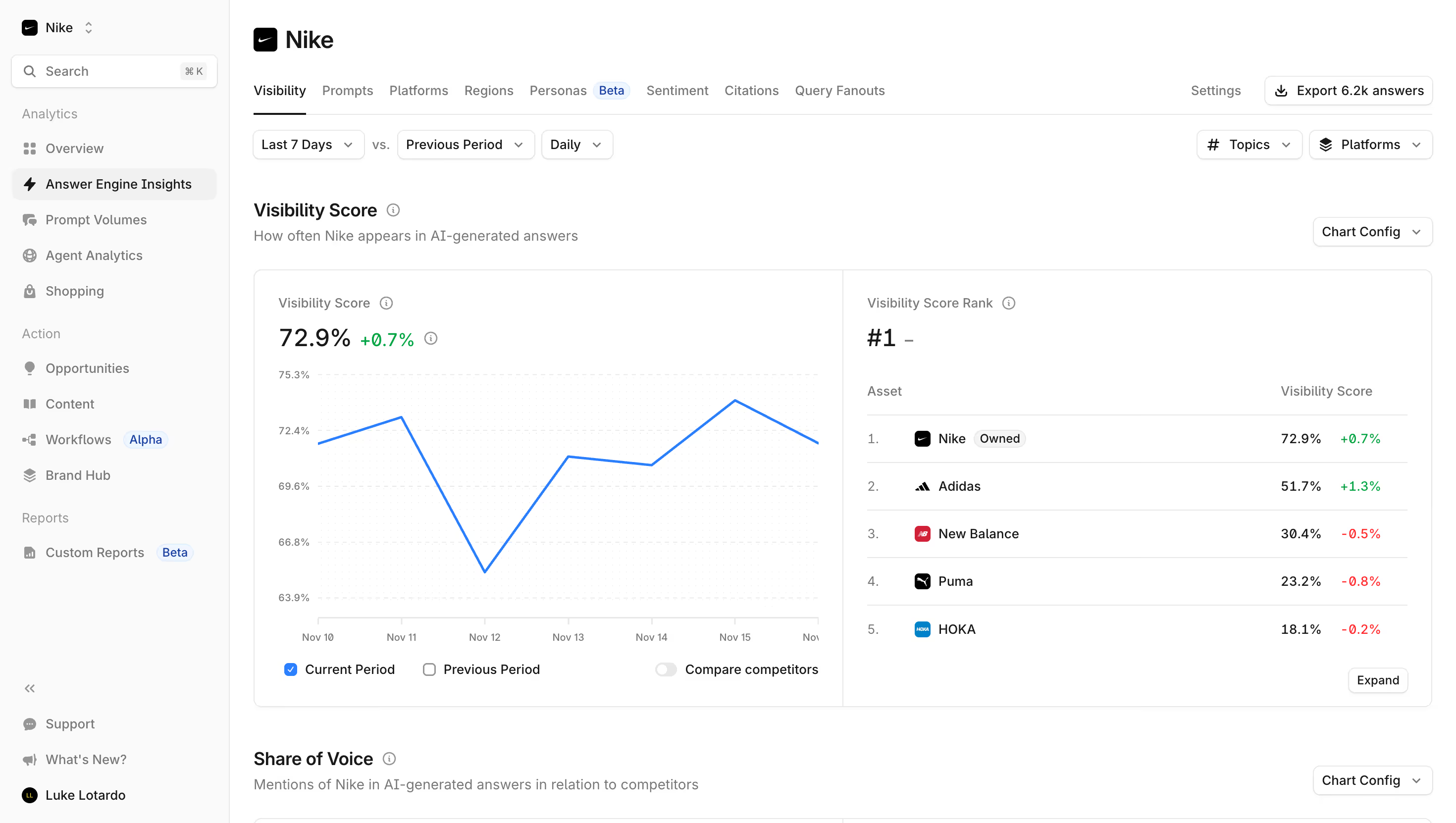
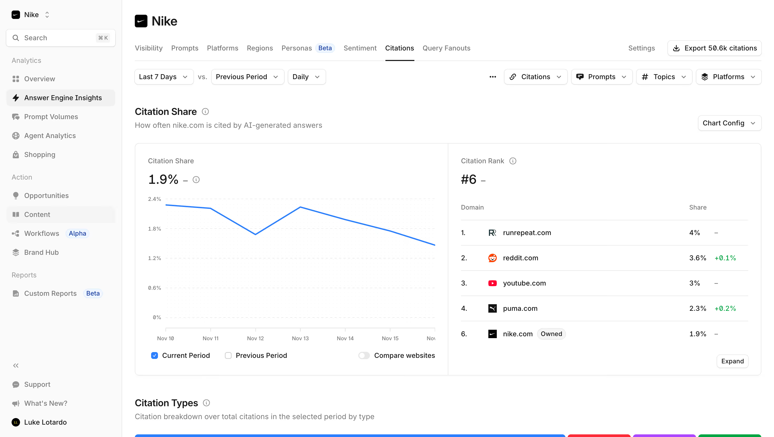


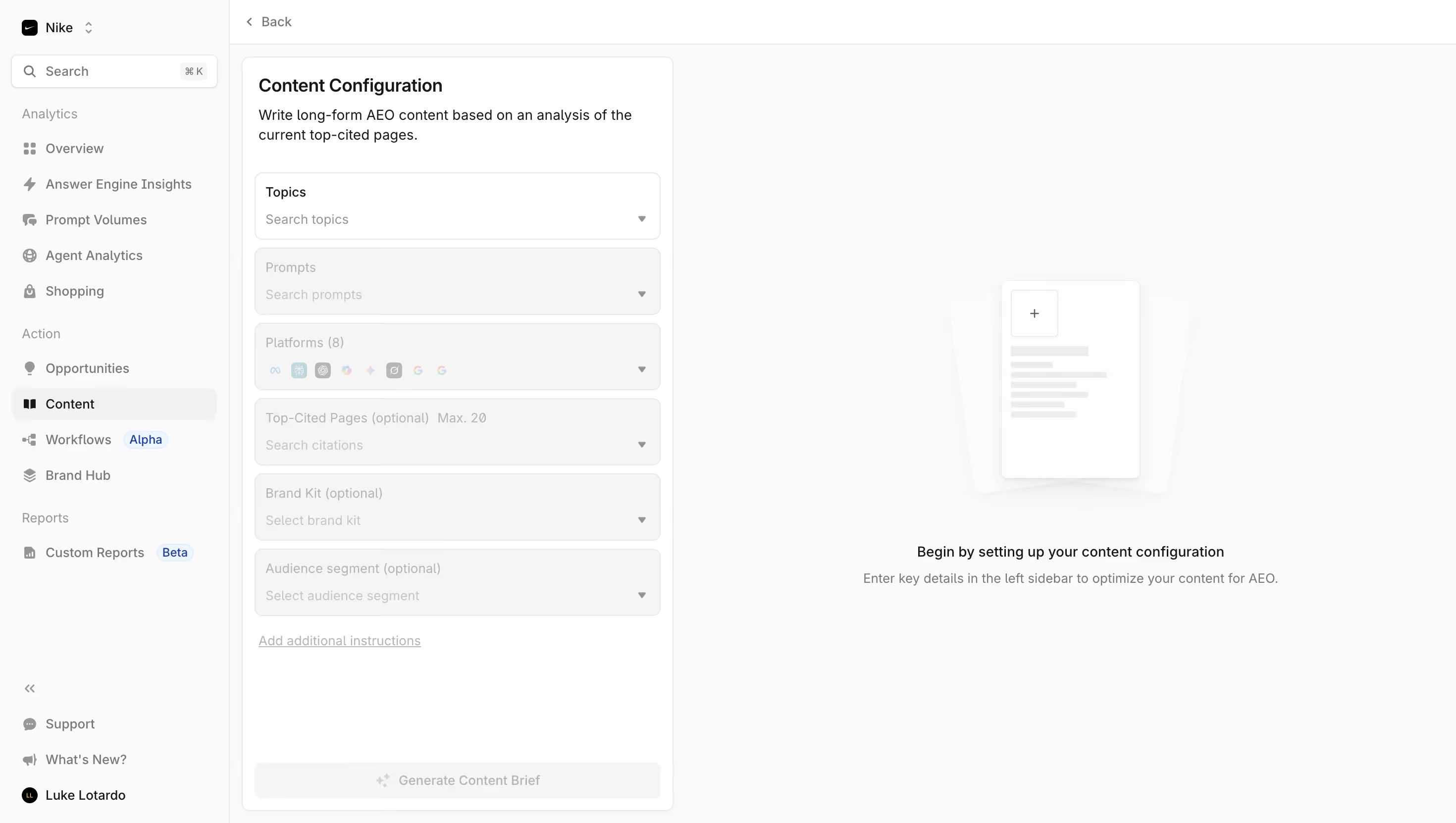

Profound Design System
Source:
Brand Philosophy Profound uses a bold, high-contrast monochromatic identity — black and white as primary marketing colors, symbolizing simplicity and elegance. A single electric blue accent (#376CFF) carries all interactive weight.
Color Palette \- Background: #08090A (near-black, confirmed via meta-theme-color) \- Foreground / Light: #FFFFFF \- True Black: #000000 (brand asset backgrounds) \- Brand Blue (accent/CTA): #376CFF (RGB 55, 108, 255) \- Dark mode only — no light mode variant detected
Typography \- UI Framework: Next.js 14+ (App Router, \_next/static asset pattern) \- Font: Likely a custom or licensed geometric sans-serif (Inter or similar); no Google Fonts link detected — likely self-hosted via next/font \- Type scale: Large editorial headlines (hero ~56–72px), section heads ~32–40px, body ~16px, small/caption ~13–14px \- Weight range: 400 (body), 500 (nav), 600–700 (headlines, CTAs)
Spacing System \- 4px base grid (standard for Next.js/Tailwind stacks) \- Generous section padding (~80–120px vertical on desktop) \- Card/component internal padding: ~16–24px \- Tight component gaps: 8–12px
Border Radius \- Buttons: ~6–8px (slightly rounded, not pill) \- Cards/panels: ~12px \- Badges/chips: ~4–6px
Shadows \- Minimal — dark theme relies on border strokes and background contrast rather than drop shadows \- Subtle glow/border on interactive cards: ~1px border with low-opacity white
Layout \- Max content width: ~1200px centered \- Nav: fixed top, full-width with blur backdrop \- Sections: full-width with centered content container \- Grid: 12-column, responsive breakpoints at ~768px and ~1280px
Component Defaults \- Primary CTA: filled blue (#376CFF) button, ~40px height, ~8px radius \- Secondary CTA: ghost/outline white button \- Nav links: white text, no underline, hover opacity change \- Dark mode: site is exclusively dark-themed
:root { / TYPOGRAPHY / --font-family-base: 'Inter', -apple-system, BlinkMacSystemFont, 'Segoe UI', sans-serif; --font-size-xs: 0.8125rem; / 13px / --font-size-sm: 0.875rem; / 14px / --font-size-base: 1rem; / 16px / --font-size-md: 1.125rem; / 18px / --font-size-lg: 1.5rem; / 24px / --font-size-xl: 2rem; / 32px / --font-size-2xl: 2.5rem; / 40px / --font-size-3xl: 3.5rem; / 56px / --font-size-4xl: 4.5rem; / 72px / --font-weight-regular: 400; --font-weight-medium: 500; --font-weight-semibold: 600; --font-weight-bold: 700; --line-height-tight: 1.1; --line-height-snug: 1.3; --line-height-normal: 1.5; --line-height-relaxed: 1.7; --letter-spacing-tight: -0.03em; --letter-spacing-normal: 0em; --letter-spacing-wide: 0.05em;
/ SPACING (4px base grid) / --space-1: 0.25rem; / 4px / --space-2: 0.5rem; / 8px / --space-3: 0.75rem; / 12px / --space-4: 1rem; / 16px / --space-5: 1.25rem; / 20px / --space-6: 1.5rem; / 24px / --space-8: 2rem; / 32px / --space-10: 2.5rem; / 40px / --space-12: 3rem; / 48px / --space-16: 4rem; / 64px / --space-20: 5rem; / 80px / --space-24: 6rem; / 96px / --space-32: 8rem; / 128px / --space-xs: var(--space-2); / 8px / --space-sm: var(--space-4); / 16px / --space-md: var(--space-6); / 24px / --space-lg: var(--space-12); / 48px / --space-xl: var(--space-20); / 80px / --space-2xl: var(--space-32); / 128px /
/ COLORS — dark theme (site is exclusively dark) / --color-background: #08090A; --color-background-secondary: #0D0E10; --color-background-elevated: #111316; --color-background-subtle: #1A1C1F; --color-foreground: #FFFFFF; --color-foreground-secondary: rgba(255, 255, 255, 0.72); --color-foreground-tertiary: rgba(255, 255, 255, 0.45); --color-foreground-muted: rgba(255, 255, 255, 0.28);
/ BRAND / --color-brand-blue: #376CFF; --color-brand-blue-hover: #4d7fff; --color-brand-blue-active: #2a5ce0; --color-brand-white: #FFFFFF; --color-brand-black: #000000;
/ SEMANTIC / --color-primary: var(--color-brand-blue); --color-primary-hover: var(--color-brand-blue-hover); --color-text: var(--color-foreground); --color-text-secondary: var(--color-foreground-secondary); --color-text-muted: var(--color-foreground-tertiary); --color-border: rgba(255, 255, 255, 0.10); --color-border-subtle: rgba(255, 255, 255, 0.06);
/ STATUS / --color-success: #22C55E; --color-warning: #F59E0B; --color-error: #EF4444; --color-info: #376CFF;
/ BORDER RADIUS / --radius-xs: 4px; --radius-sm: 6px; --radius-md: 8px; --radius-lg: 12px; --radius-xl: 16px; --radius-2xl: 24px; --radius-full: 9999px;
/ SHADOWS — minimal; dark theme uses borders over shadows / --shadow-sm: 0 1px 3px rgba(0, 0, 0, 0.4); --shadow-md: 0 4px 16px rgba(0, 0, 0, 0.5); --shadow-lg: 0 8px 32px rgba(0, 0, 0, 0.6); --shadow-glow-blue: 0 0 24px rgba(55, 108, 255, 0.35); --shadow-card: inset 0 0 0 1px rgba(255, 255, 255, 0.08);
/ TRANSITIONS / --transition-fast: 100ms ease; --transition-default: 200ms ease; --transition-slow: 350ms ease; --transition-spring: 300ms cubic-bezier(0.34, 1.56, 0.64, 1);
/ LAYOUT / --container-max-width: 1200px; --container-padding: var(--space-6); --nav-height: 64px; --section-padding-y: var(--space-xl); }
Color Tokens
| Token | Value | Usage |
|---|---|---|
| --color-background | #08090A | Page background (confirmed meta-theme-color) |
| --color-background-secondary | #0D0E10 | Slightly elevated bg |
| --color-background-elevated | #111316 | Cards, panels |
| --color-background-subtle | #1A1C1F | Hover states, dividers |
| --color-foreground | #FFFFFF | Primary text, icons |
| --color-foreground-secondary | rgba(255,255,255,0.72) | Body text, descriptions |
| --color-foreground-tertiary | rgba(255,255,255,0.45) | Placeholders, captions |
| --color-foreground-muted | rgba(255,255,255,0.28) | Disabled states |
| --color-brand-blue | #376CFF | CTAs, links, accents (official brand) |
| --color-brand-white | #FFFFFF | Brand logo light variant |
| --color-brand-black | #000000 | Brand logo dark variant |
| --color-border | rgba(255,255,255,0.10) | Card borders, dividers |
| --color-success | #22C55E | Positive sentiment indicators |
| --color-warning | #F59E0B | Warning states |
| --color-error | #EF4444 | Error states |
Spacing Tokens
| Token | Value | px |
|---|---|---|
| --space-xs | 0.5rem | 8px |
| --space-sm | 1rem | 16px |
| --space-md | 1.5rem | 24px |
| --space-lg | 3rem | 48px |
| --space-xl | 5rem | 80px |
| --space-2xl | 8rem | 128px |
| --space-1 | 0.25rem | 4px |
| --space-2 | 0.5rem | 8px |
| --space-4 | 1rem | 16px |
| --space-6 | 1.5rem | 24px |
| --space-8 | 2rem | 32px |
| --space-12 | 3rem | 48px |
| --space-16 | 4rem | 64px |
| --space-20 | 5rem | 80px |
Typography Tokens
| Token | Value | Notes |
|---|---|---|
| --font-family-base | 'Inter', system-ui, sans-serif | Likely self-hosted via next/font |
| --font-size-xs | 0.8125rem (13px) | Labels, legal |
| --font-size-sm | 0.875rem (14px) | Captions, meta |
| --font-size-base | 1rem (16px) | Body copy |
| --font-size-lg | 1.5rem (24px) | Card headings |
| --font-size-xl | 2rem (32px) | Section headings |
| --font-size-2xl | 2.5rem (40px) | Sub-hero headings |
| --font-size-3xl | 3.5rem (56px) | Hero headline (desktop) |
| --font-size-4xl | 4.5rem (72px) | Max display size |
| --font-weight-regular | 400 | Body |
| --font-weight-semibold | 600 | Subheadings, CTAs |
| --font-weight-bold | 700 | Headlines |
| --letter-spacing-tight | -0.03em | Headlines |
| --line-height-tight | 1.1 | Large display text |
| --line-height-normal | 1.5 | Body text |
Border Radius Tokens
| Token | Value | Usage |
|---|---|---|
| --radius-xs | 4px | Badges, tags |
| --radius-sm | 6px | Inputs, small buttons |
| --radius-md | 8px | Buttons (primary CTA) |
| --radius-lg | 12px | Cards, panels |
| --radius-xl | 16px | Feature blocks |
| --radius-2xl | 24px | Large containers |
| --radius-full | 9999px | Pills, avatars |
Shadow Tokens
| Token | Value | Usage |
|---|---|---|
| --shadow-sm | 0 1px 3px rgba(0,0,0,0.4) | Subtle lift |
| --shadow-md | 0 4px 16px rgba(0,0,0,0.5) | Cards, dropdowns |
| --shadow-lg | 0 8px 32px rgba(0,0,0,0.6) | Modals, overlays |
| --shadow-glow-blue | 0 0 24px rgba(55,108,255,0.35) | CTA button glow, accent highlights |
| --shadow-card | inset 0 0 0 1px rgba(255,255,255,0.08) | Card border-as-shadow pattern |
Implementation Notes — Profound (tryprofound.com)
UI Framework \- Next.js (App Router) — confirmed by \_next/static/ asset paths and meta-next-size-adjust tag \- Likely using Tailwind CSS or a custom CSS-in-JS setup (no raw stylesheet was accessible) \- No public GitHub repositories; GitHub org archived May 2025
Theme Support \- Dark mode only — the site has a single dark theme; no light/dark toggle detected \- meta-theme-color: #08090A confirms the near-black base across all pages \- No [data-theme='light'] or prefers-color-scheme: light override detected
Source of Data \- Background color: confirmed (#08090A from meta-theme-color on every page) \- Brand colors: confirmed from official brand guidelines page (/brand): White #FFFFFF, Black #000000, Blue #376CFF (RGB 55, 108, 255) \- Typography, spacing, radius, shadows: approximated based on visual inspection of page content, product screenshot imagery, and standard Next.js/Tailwind conventions — values are approximate \- CSS files were not directly accessible (Next.js bundles CSS into hashed chunks; the web\_fetch proxy returns rendered text, not raw HTML with tags)
Notable Patterns \- Monochromatic identity: Brand guidelines explicitly state black and white are primary marketing colors; blue (#376CFF) is the sole accent used for CTAs and interactive elements \- Border-over-shadow pattern: Dark backgrounds make traditional drop shadows invisible; Profound uses thin semi-transparent white borders (rgba(255,255,255,0.08–0.10)) to define card edges \- Electric blue glow: The brand blue at reduced opacity likely appears as ambient glow on key CTAs and hero elements \- Editorial type scale: Hero copy is very large (est. 56–72px) with tight tracking (-0.03em), giving a premium editorial feel \- Content CMS: Blog/resource content served via Sanity (cdn.sanity.io image URLs detected) \- Image format: Product screenshots and feature images use .webp with Next.js Image optimization (/\_next/image?url=...&w=3840&q=75) \- Section rhythm: Heavy vertical spacing (~80px) between sections creates a premium, airy layout despite the dark palette \- Navigation: Sticky/fixed top nav with blur backdrop effect (standard for dark-themed Next.js marketing sites)
Biggest SaaS library.


.webp)


.webp)

Desktop & mobile versions.


Access the Figma files.


Advanced filtering.
Let it flow.





Save design inspirations.
research




How do you process payment?
SaaSFrame subscriptions are sold on Lemon Squeezy, a secured online selling platform for creators.
What about future updates and versions?
SaaSFrame gets updated all the time! Every new update and version will immediately be made available to all SaaSFrame users.
Can you send me an invoice?
You can generate an invoice on your Lemon Squeezy portal once you purchased SaaSFrame. You will find the link in the order confirmation email.
How can I cancel my membership subscription?
You can cancel your membership subscription at any moment on your profile page.
Can I get a refund?
If you're not satisfied, you can ask for a refund within 7 days. Just send me an email at antoine[at]unmake[dot]io
I have another question.
You can send me an email at antoine[at]unmake[dot]io, I'll be happy to help with any questions.