.webp)

Uvodo








Stack
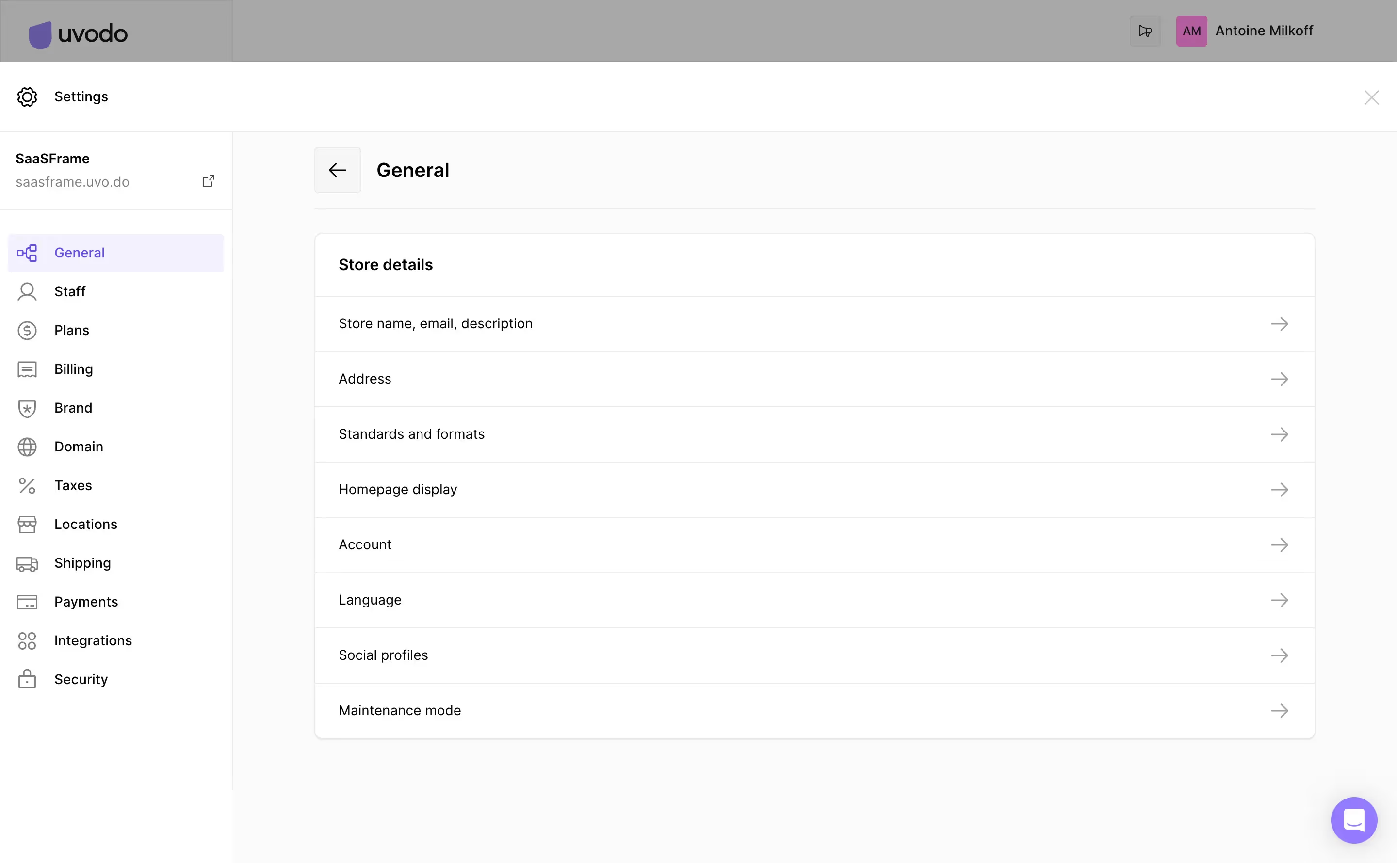
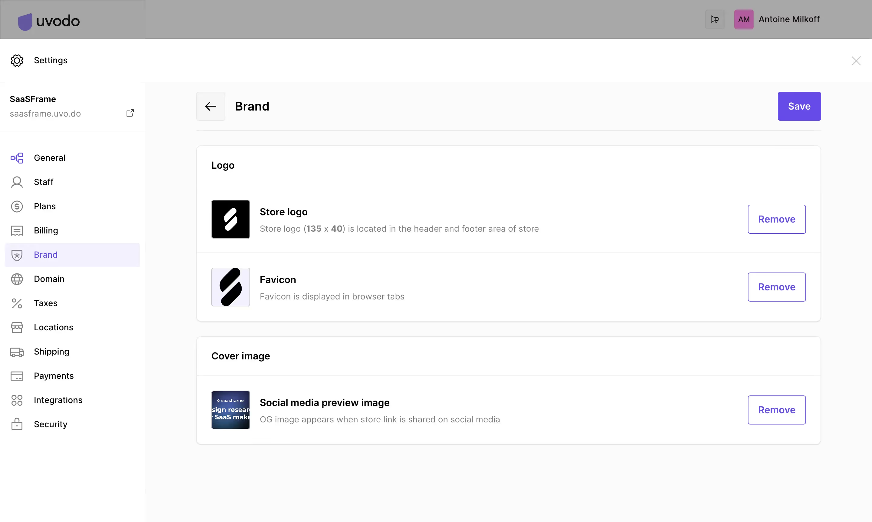
Uvodo's marketing site and product UI are built on a React stack. The component library — Planum (npm: @uvodohq/planum) — is powered by Stitches (CSS-in-JS with near-zero runtime), Radix UI primitives for accessible components, React Aria for keyboard/a11y, and Turborepo for monorepo management. Build tool is tsup (esbuild-based). Current version: 6.9.0.
Typography
Single font family: Inter, with a system-font fallback stack (-apple-system, BlinkMacSystemFont, 'Segoe UI', 'Roboto', sans-serif). The type scale uses rem units anchored to a 16px base:
- min — 0.75rem (12px) — captions, labels
- xs — 0.875rem (14px) — body small
- base — 1rem (16px) — body default
- sm — 1.25rem (20px) — lead text
- md — 1.5rem (24px) — h4/h3
- lg — 1.75rem (28px) — h3/h2
- xl — 2.25rem (36px) — h2/h1
- xxl — 3rem (48px) — display/hero
Font weights: bold (700), semibold (600), medium (500), regular (400). Line heights range from 1.333 (xs) to 2 (xxl).
Color Philosophy
Uvodo uses a structured semantic token system layered over a raw palette. The brand primary is purple (#8979e8 at 500, #624ce0 at 600). Secondary accent is pink (#ff8ae8). Tertiary is yellow (#ffde68). Semantic roles include: success (green), info (blue), warning (orange), danger (red). Surface/neutral tones use a "black" scale (black25–black900) from near-white (#fdfdfd) to true black (#000000), plus a warm "seashell" (#f9f5f2) background variant. The philosophy prioritizes clear hierarchy: brand purple leads CTAs, surface neutrals dominate backgrounds, and utility colors are strictly semantic (never decorative).
Spacing
4px-base scale with explicit named steps (not arbitrary multiples). Values: 0, 1px, 4px (0.25rem), 8px (0.5rem), 10px, 12px, 16px, 18px, 24px, 28px, 32px, 40px, 48px, 64px, 120px. The same scale is shared between space and sizes tokens. Shorthand utilities (px, py, mx, my, p, m) are baked into the CSS-in-JS layer.
Component Defaults
- Border radius: sm (0.25rem), md (0.5rem), lg (1rem), pill (9999px)
- Shadows: 6-step elevation scale using rgba(0,0,0,0.1) with increasing offset and blur
- Scrollbars: Custom thin scrollbar (4px) with surface300 thumb color, transparent track
- Animations: Spin (rotate) and fadeIn keyframes provided as primitives
- Gradients: 5 brand gradients at 254.09deg (blue, orange, lightBlue, pink, green)
Layout
Responsive breakpoints (mobile-first): mobile (≥0px), largeMobile (≥425px), tablet (≥640px), laptop (≥768px), desktop (≥1024px). Grid and flex layout is handled via Stitches utility props (dflex, d). No fixed max-width container token is defined in the component library — layout width is managed at the page/marketing layer.
/\* Uvodo / Planum Design System — CSS Variables
   Source: @uvodohq/planum v6.9.0 (Stitches tokens mapped to CSS custom properties)
   Prefix: --planum-\* in production builds
\*/

:root {
  /_ ---- PALETTE ---- _/
  --color-white: #ffffff;
  --color-seashell: #f9f5f2;
  --color-gray-500: #060606;

  /_ Purple (Primary) _/
  --color-purple-25: #f9f9fe;
  --color-purple-50: #f3f2fd;
  --color-purple-100: #e7e4fa;
  --color-purple-200: #b8aef1;
  --color-purple-300: #a99dee;
  --color-purple-400: #998beb;
  --color-purple-500: #8979e8;
  --color-purple-600: #624ce0;
  --color-purple-700: #5341be;
  --color-purple-800: #4939a8;
  --color-purple-900: #403192;

  /_ Pink (Secondary) _/
  --color-pink-25: #fffcff;
  --color-pink-50: #fff9fe;
  --color-pink-100: #fff2fc;
  --color-pink-200: #ffe5fa;
  --color-pink-300: #ffd8f8;
  --color-pink-400: #ff8ae8;

  /_ Yellow (Tertiary) _/
  --color-yellow-25: #fffefc;
  --color-yellow-50: #fffdf8;
  --color-yellow-100: #fffbf1;
  --color-yellow-200: #fff7e3;
  --color-yellow-300: #fff3d4;
  --color-yellow-400: #ffde68;

  /_ Green (Success) _/
  --color-green-25: #fafefa;
  --color-green-50: #f4fcf4;
  --color-green-100: #e8f9e8;
  --color-green-200: #c7efc6;
  --color-green-300: #a2e5a1;
  --color-green-400: #77db79;
  --color-green-500: #51d258;
  --color-green-600: #20c934;
  --color-green-700: #0db92a;
  --color-green-800: #00a61b;
  --color-green-900: #007500;

  /_ Blue (Info) _/
  --color-blue-25: #f8fdff;
  --color-blue-50: #f0faff;
  --color-blue-100: #e1f5fe;
  --color-blue-200: #b3e5fc;
  --color-blue-300: #81d4fa;
  --color-blue-400: #4fc3f7;
  --color-blue-500: #29b6f6;
  --color-blue-600: #03a9f4;
  --color-blue-700: #039be5;
  --color-blue-800: #0288d1;
  --color-blue-900: #01579b;

  /_ Orange (Warning) _/
  --color-orange-25: #fffef8;
  --color-orange-50: #fffcf0;
  --color-orange-100: #fef8e1;
  --color-orange-200: #fdecb3;
  --color-orange-300: #fddf82;
  --color-orange-400: #fcd450;
  --color-orange-500: #fbc92a;
  --color-orange-600: #fbc00d;
  --color-orange-700: #fbb205;
  --color-orange-800: #fba003;
  --color-orange-900: #fa7000;

  /_ Red (Danger) _/
  --color-red-25: #fffafb;
  --color-red-50: #fff5f7;
  --color-red-100: #ffebee;
  --color-red-200: #ffcdd2;
  --color-red-300: #ef9a9a;
  --color-red-400: #e57373;
  --color-red-500: #ef5350;
  --color-red-600: #f44336;
  --color-red-700: #e53935;
  --color-red-800: #d32f2f;
  --color-red-900: #b71c1c;

  /_ Black/Neutral Scale _/
  --color-black-25: #fdfdfd;
  --color-black-50: #fbfbfb;
  --color-black-100: #f6f6f6;
  --color-black-200: #eaeaea;
  --color-black-300: #dcdcdc;
  --color-black-400: #c7c7c7;
  --color-black-500: #a2a2a2;
  --color-black-600: #808080;
  --color-black-700: #424242;
  --color-black-800: #212121;
  --color-black-900: #000000;

  /_ ---- SEMANTIC ALIASES ---- _/
  --color-primary: var(--color-purple-500);      /_ #8979e8 _/
  --color-secondary: var(--color-pink-400);      /_ #ff8ae8 _/
  --color-tertiary: var(--color-yellow-400);     /_ #ffde68 _/
  --color-success: var(--color-green-500);       /_ #51d258 _/
  --color-info: var(--color-blue-500);           /_ #29b6f6 _/
  --color-warning: var(--color-orange-500);      /_ #fbc92a _/
  --color-danger: var(--color-red-500);          /_ #ef5350 _/
  --color-white-base: var(--color-white);        /_ #ffffff _/
  --color-surface: var(--color-seashell);        /_ #f9f5f2 _/
  --color-black-base: var(--color-black-900);    /_ #000000 _/

  /_ Text tokens _/
  --color-text-dark: var(--color-gray-500);      /_ #060606 _/
  --color-text-medium: var(--color-black-800);   /_ #212121 _/
  --color-text-brand: var(--color-purple-600);   /_ #624ce0 _/
  --color-text-light: var(--color-black-600);    /_ #808080 _/
  --color-text-disabled: var(--color-black-500); /_ #a2a2a2 _/
  --color-text-success: var(--color-green-500);  /_ #51d258 _/
  --color-text-danger: var(--color-red-500);     /_ #ef5350 _/
  --color-text-info: var(--color-blue-400);      /_ #4fc3f7 _/

  /_ ---- GRADIENTS ---- _/
  --gradient-blue:       linear-gradient(254.09deg, #624CE0 0%, #03A9F4 100%);
  --gradient-orange:     linear-gradient(254.09deg, #FBB205 0%, #EF5350 100%);
  --gradient-light-blue: linear-gradient(254.09deg, #29B6F6 0%, #0288D1 100%);
  --gradient-pink:       linear-gradient(254.09deg, #8979E8 0%, #EF5350 100%);
  --gradient-green:      linear-gradient(254.09deg, #29B6F6 0%, #51D258 100%);

  /_ ---- TYPOGRAPHY ---- _/
  --font-sans: "Inter", -apple-system, BlinkMacSystemFont, "Segoe UI", "Roboto", sans-serif;

  --font-size-min:  0.75rem;   /_ 12px _/
  --font-size-xs:   0.875rem;  /_ 14px _/
  --font-size-base: 1rem;      /_ 16px _/
  --font-size-sm:   1.25rem;   /_ 20px _/
  --font-size-md:   1.5rem;    /_ 24px _/
  --font-size-lg:   1.75rem;   /_ 28px _/
  --font-size-xl:   2.25rem;   /_ 36px _/
  --font-size-xxl:  3rem;      /_ 48px _/

  --font-weight-regular:  400;
  --font-weight-medium:   500;
  --font-weight-semibold: 600;
  --font-weight-bold:     700;

  --line-height-xs:  1.333;
  --line-height-sm:  1.428;
  --line-height-md:  1.6;
  --line-height-lg:  1.66;
  --line-height-xl:  1.714;
  --line-height-xxl: 2;

  /_ ---- SPACING ---- _/
  --space-0:   0px;
  --space-1:   1px;
  --space-4:   0.25rem;  /_ 4px  _/
  --space-8:   0.5rem;   /_ 8px  _/
  --space-10:  0.625rem; /_ 10px _/
  --space-12:  0.75rem;  /_ 12px _/
  --space-16:  1rem;     /_ 16px _/
  --space-18:  1.125rem; /_ 18px _/
  --space-24:  1.5rem;   /_ 24px _/
  --space-28:  1.75rem;  /_ 28px _/
  --space-32:  2rem;     /_ 32px _/
  --space-40:  2.5rem;   /_ 40px _/
  --space-48:  3rem;     /_ 48px _/
  --space-64:  4rem;     /_ 64px _/
  --space-120: 7.5rem;   /_ 120px _/

  /_ ---- BORDER RADIUS ---- _/
  --radius-sm:   0.25rem;  /_ 4px   _/
  --radius-md:   0.5rem;   /_ 8px   _/
  --radius-lg:   1rem;     /_ 16px  _/
  --radius-pill: 9999px;

  /_ ---- SHADOWS ---- _/
  --shadow-xs:  0px 1px 1px rgba(0, 0, 0, 0.1);
  --shadow-sm:  0px 2px 4px rgba(0, 0, 0, 0.1);
  --shadow-md:  0px 4px 6px rgba(0, 0, 0, 0.1);
  --shadow-lg:  0px 6px 8px -2px rgba(0, 0, 0, 0.1);
  --shadow-xl:  0px 8px 12px -4px rgba(0, 0, 0, 0.1);
  --shadow-xxl: 0px 12px 18px -6px rgba(0, 0, 0, 0.1);

  /_ ---- BREAKPOINTS (reference only, use in @media) ---- _/
  /_ mobile:      min-width: 0px    _/
  /_ largeMobile: min-width: 425px  _/
  /_ tablet:      min-width: 640px  _/
  /_ laptop:      min-width: 768px  _/
  /_ desktop:     min-width: 1024px _/
}

/\* Dark mode — Uvodo does not ship an official dark theme in Planum v6.9.0.
   The following overrides are inferred from semantic token intent
   and should be validated against any future dark theme release. \*/
@media (prefers-color-scheme: dark) {
  :root {
    /_ Backgrounds _/
    --color-surface: #1a1825;
    --color-white-base: #111019;
    --color-black-base: #ffffff;

    /_ Neutral scale (inverted) _/
    --color-black-25: #1e1c2a;
    --color-black-50: #232132;
    --color-black-100: #2a2838;
    --color-black-200: #363444;
    --color-black-300: #4a4860;
    --color-black-400: #6b6980;
    --color-black-500: #9896aa;
    --color-black-600: #c0bece;
    --color-black-700: #dbd9e6;
    --color-black-800: #eeecf8;
    --color-black-900: #f5f4ff;

    /_ Text (inverted) _/
    --color-text-dark: #f5f4ff;
    --color-text-medium: #dbd9e6;
    --color-text-light: #9896aa;
    --color-text-disabled: #6b6980;

    /_ Primary stays vibrant on dark _/
    --color-primary: var(--color-purple-400);  /_ #998beb _/
    --color-text-brand: var(--color-purple-300); /_ #a99dee _/
  }
}
Color Tokens
| Token | Value | Usage |
|---|---|---|
--color-primary | #8979e8 (purple-500) | Primary CTA buttons, links, focus rings |
--color-purple-600 | #624ce0 | Hover state for primary, brand text |
--color-secondary | #ff8ae8 (pink-400) | Secondary accents, highlights |
--color-tertiary | #ffde68 (yellow-400) | Tertiary badges, tags, decorative |
--color-success | #51d258 (green-500) | Success states, confirmations, badges |
--color-info | #29b6f6 (blue-500) | Info messages, tooltips |
--color-warning | #fbc92a (orange-500) | Warnings, caution states |
--color-danger | #ef5350 (red-500) | Errors, destructive actions |
--color-surface | #f9f5f2 (seashell) | Page background warm tint |
--color-black-100 | #f6f6f6 | Card backgrounds, subtle dividers |
--color-black-200 | #eaeaea | Borders, dividers |
--color-black-400 | #c7c7c7 | Placeholder text, disabled borders |
--color-text-dark | #060606 (gray-500) | Primary body text |
--color-text-medium | #212121 (black-800) | Headings, strong text |
--color-text-light | #808080 (black-600) | Muted / secondary text |
--color-text-disabled | #a2a2a2 (black-500) | Disabled labels |
--gradient-blue | linear-gradient(254.09deg, #624CE0, #03A9F4) | Hero sections, brand gradient CTAs |
--gradient-green | linear-gradient(254.09deg, #29B6F6, #51D258) | Success/growth gradient accents |
Spacing Tokens
| Token | Value | Usage |
|---|---|---|
--space-4 | 0.25rem (4px) | Icon gaps, tight padding |
--space-8 | 0.5rem (8px) | Input padding, chip gap |
--space-12 | 0.75rem (12px) | Small component padding |
--space-16 | 1rem (16px) | Default padding, card inner |
--space-24 | 1.5rem (24px) | Section gaps, modal padding |
--space-32 | 2rem (32px) | Card padding, section spacing |
--space-48 | 3rem (48px) | Large section breaks |
--space-64 | 4rem (64px) | Hero padding, page-level gaps |
--space-120 | 7.5rem (120px) | Marketing section top/bottom margins |
Typography Tokens
| Token | Value | Usage |
|---|---|---|
--font-sans | "Inter", system fallbacks | All text — single typeface system |
--font-size-min | 0.75rem (12px) | Captions, labels, helper text |
--font-size-xs | 0.875rem (14px) | Small body, table data |
--font-size-base | 1rem (16px) | Default body text |
--font-size-sm | 1.25rem (20px) | Lead paragraphs |
--font-size-md | 1.5rem (24px) | h4, card titles |
--font-size-lg | 1.75rem (28px) | h3, section headings |
--font-size-xl | 2.25rem (36px) | h2, page headings |
--font-size-xxl | 3rem (48px) | h1, hero display text |
--font-weight-regular | 400 | Body copy |
--font-weight-medium | 500 | UI labels, nav items |
--font-weight-semibold | 600 | Subheadings, button text |
--font-weight-bold | 700 | Headings, emphasis |
--line-height-xs | 1.333 | Large display headings |
--line-height-md | 1.6 | Body text (comfortable reading) |
--line-height-xxl | 2 | Small captions, relaxed layout |
Border Radius Tokens
| Token | Value | Usage |
|---|---|---|
--radius-sm | 0.25rem (4px) | Inputs, small tags, chips |
--radius-md | 0.5rem (8px) | Cards, modals, dropdowns |
--radius-lg | 1rem (16px) | Large cards, feature panels |
--radius-pill | 9999px | Pills, badge chips, toggle switches |
Shadow Tokens
| Token | Value | Usage |
|---|---|---|
--shadow-xs | 0px 1px 1px rgba(0,0,0,0.1) | Subtle lift, focused inputs |
--shadow-sm | 0px 2px 4px rgba(0,0,0,0.1) | Cards at rest |
--shadow-md | 0px 4px 6px rgba(0,0,0,0.1) | Hovered cards, dropdowns |
--shadow-lg | 0px 6px 8px -2px rgba(0,0,0,0.1) | Modals, popovers |
--shadow-xl | 0px 8px 12px -4px rgba(0,0,0,0.1) | Command palettes, overlays |
--shadow-xxl | 0px 12px 18px -6px rgba(0,0,0,0.1) | Highest elevation: drawers, toasts |
Framework: Uvodo's product UI is built on React with Stitches (CSS-in-JS, near-zero runtime) as the styling engine. Components use Radix UI primitives (accordion, avatar, and more) for accessibility, and React Aria (Adobe) for keyboard interaction on inputs, buttons, checkboxes, radio, and search fields. The package manager monorepo runs on Turborepo with tsup as the TypeScript bundler.
Theme support: The Planum library (v6.9.0) ships a light-mode-only theme. No official dark theme is exported from the package — darkTheme is not present in the distributed bundle. Dark mode variables in the cssVariables field are inferred from semantic token structure and palette intent, not from source. Any dark mode implementation on the marketing site is likely handled independently at the page layer.
Data confidence: High for all token values — the full token set was extracted directly from the published npm package (@uvodohq/planum@6.9.0, dist/index.mjs). Color palette, font families, font sizes, weights, line heights, spacing, radii, and shadows are all sourced from src/theme/tokens/ files compiled into the bundle. No reverse-engineering or approximation was needed for light-mode tokens.
- Single typeface: Inter is the only font — no display or mono variant is defined in the token system.
- Gradient angle: All 5 brand gradients use the same angle (254.09deg), creating a distinctive diagonal direction that unifies the visual language.
- Warm neutral: The
seashell(#f9f5f2) background tint gives Uvodo's UI a warmer feel than pure white, softening the overall contrast. - Semantic layering: Colors are aliased in three layers — raw palette (purple500), semantic role (primary), and contextual usage (textBrand) — enabling clean theming without magic strings.
- Scrollbar styling: Custom 4px scrollbar with surface300 thumb and transparent track is defined globally, showing attention to cross-browser polish detail.
- No container token: Max-width / page container width is not part of the component library's token set — managed at the marketing/page level, likely via Tailwind or custom CSS on the public site.
- Social auth colors present: Google (#4285F4), Facebook (#1877F2) and Apple brand colors appear in the bundle, indicating OAuth social login flows are a core product pattern.
Biggest SaaS library.


.webp)


.webp)

Desktop & mobile versions.


Access the Figma files.


Advanced filtering.
Let it flow.





Save design inspirations.
research




How do you process payment?
SaaSFrame subscriptions are sold on Lemon Squeezy, a secured online selling platform for creators.
What about future updates and versions?
SaaSFrame gets updated all the time! Every new update and version will immediately be made available to all SaaSFrame users.
Can you send me an invoice?
You can generate an invoice on your Lemon Squeezy portal once you purchased SaaSFrame. You will find the link in the order confirmation email.
How can I cancel my membership subscription?
You can cancel your membership subscription at any moment on your profile page.
Can I get a refund?
If you're not satisfied, you can ask for a refund within 7 days. Just send me an email at antoine[at]unmake[dot]io
I have another question.
You can send me an email at antoine[at]unmake[dot]io, I'll be happy to help with any questions.