.webp)

Unkey




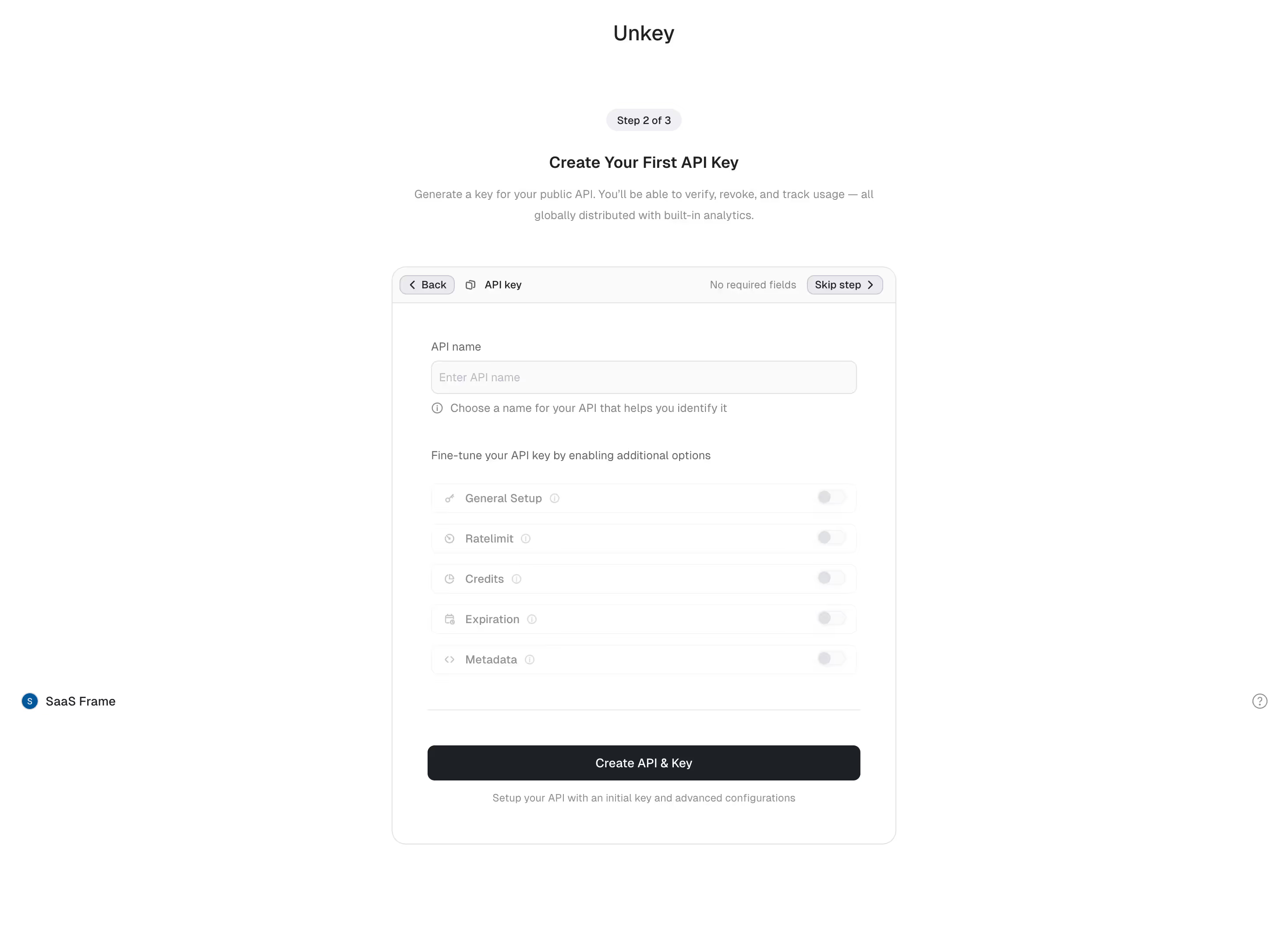
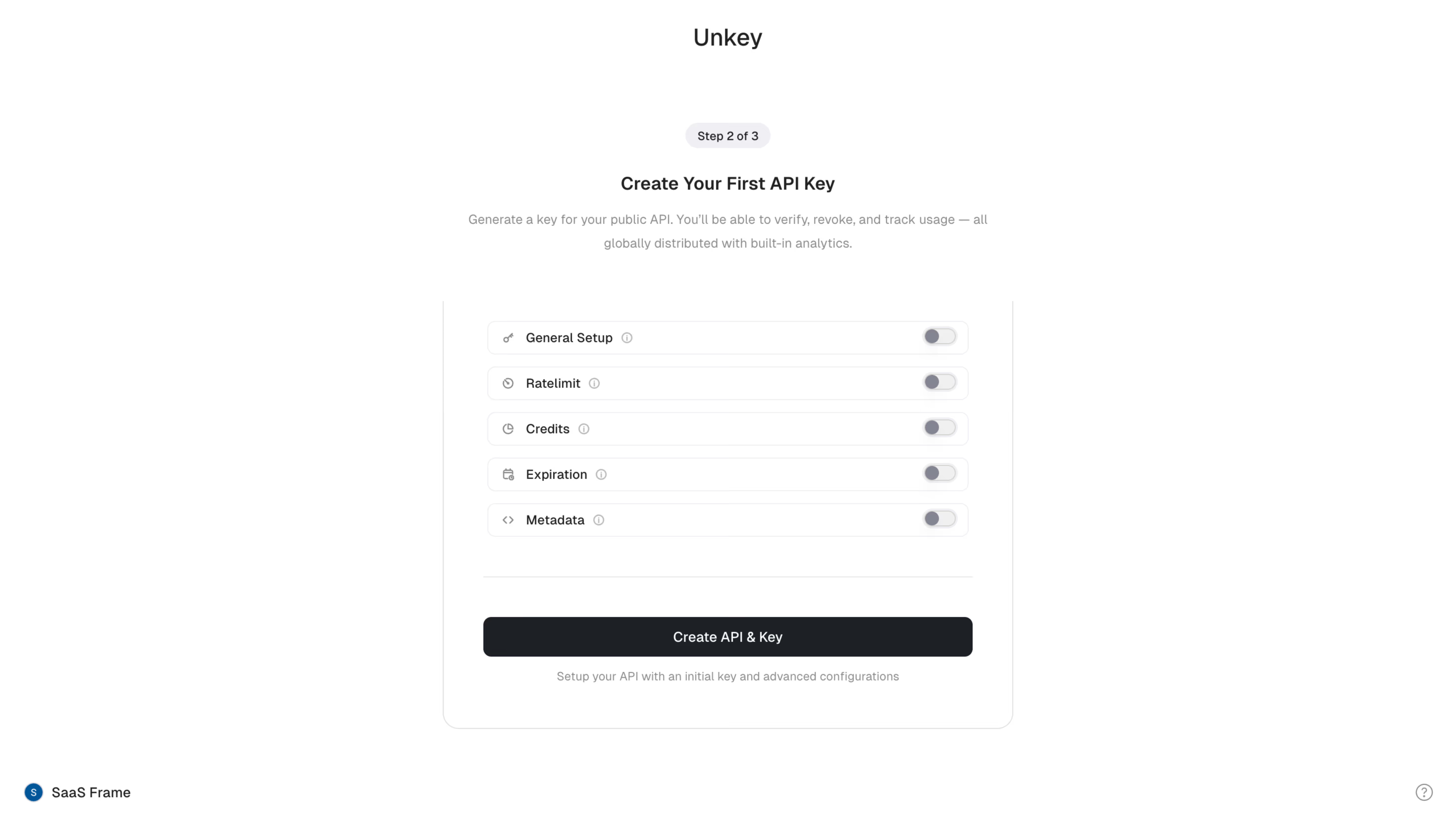

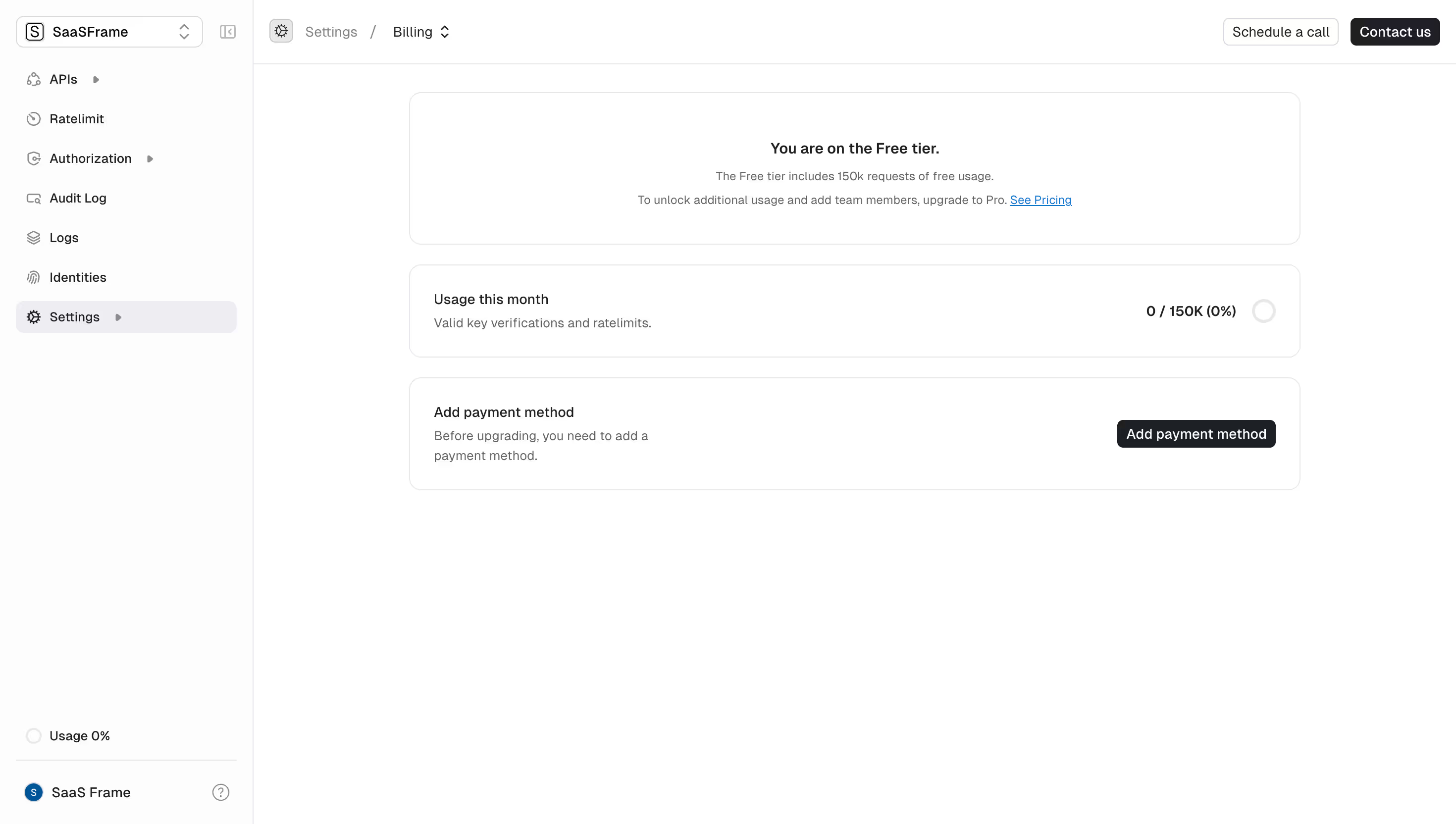
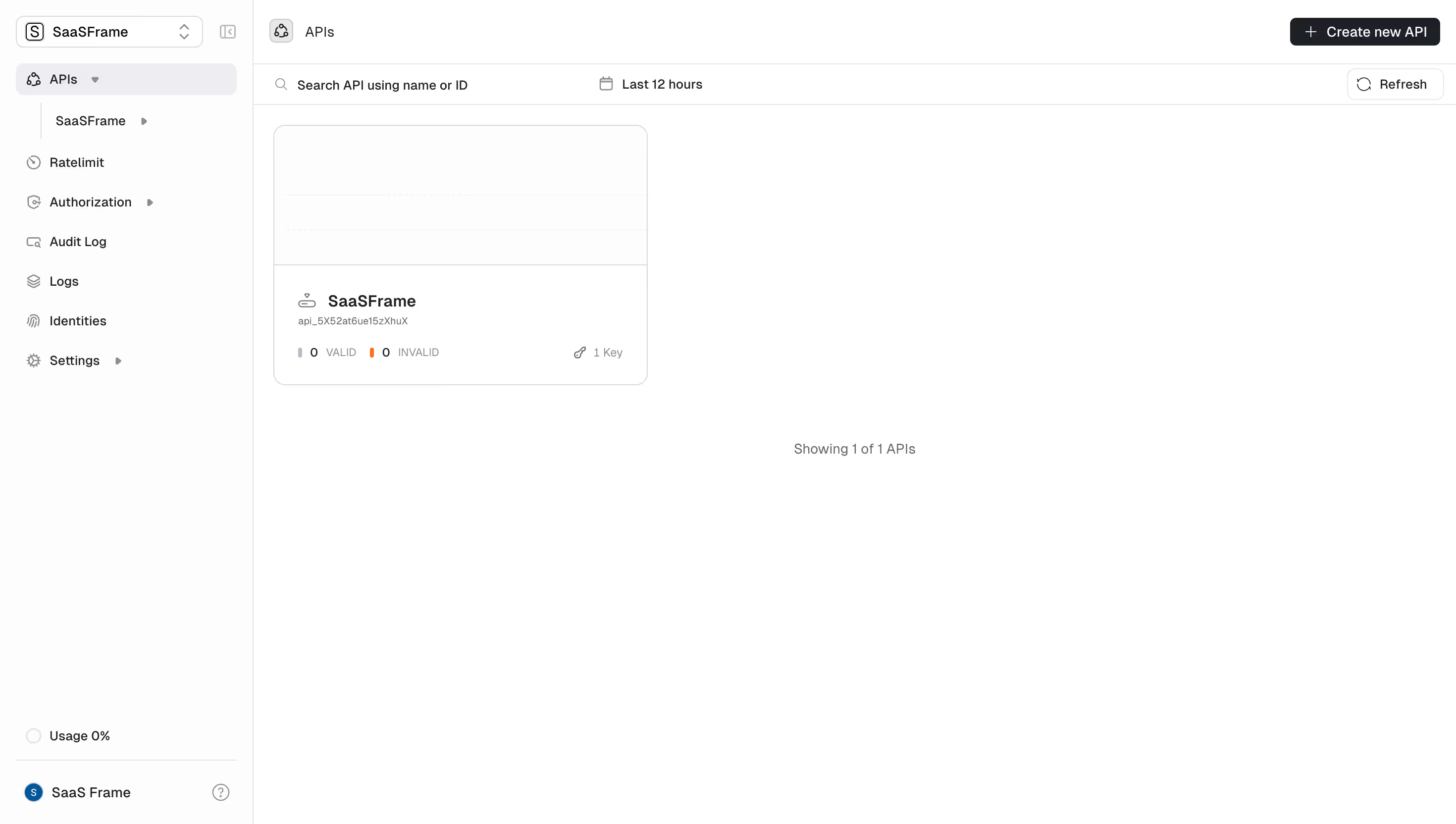
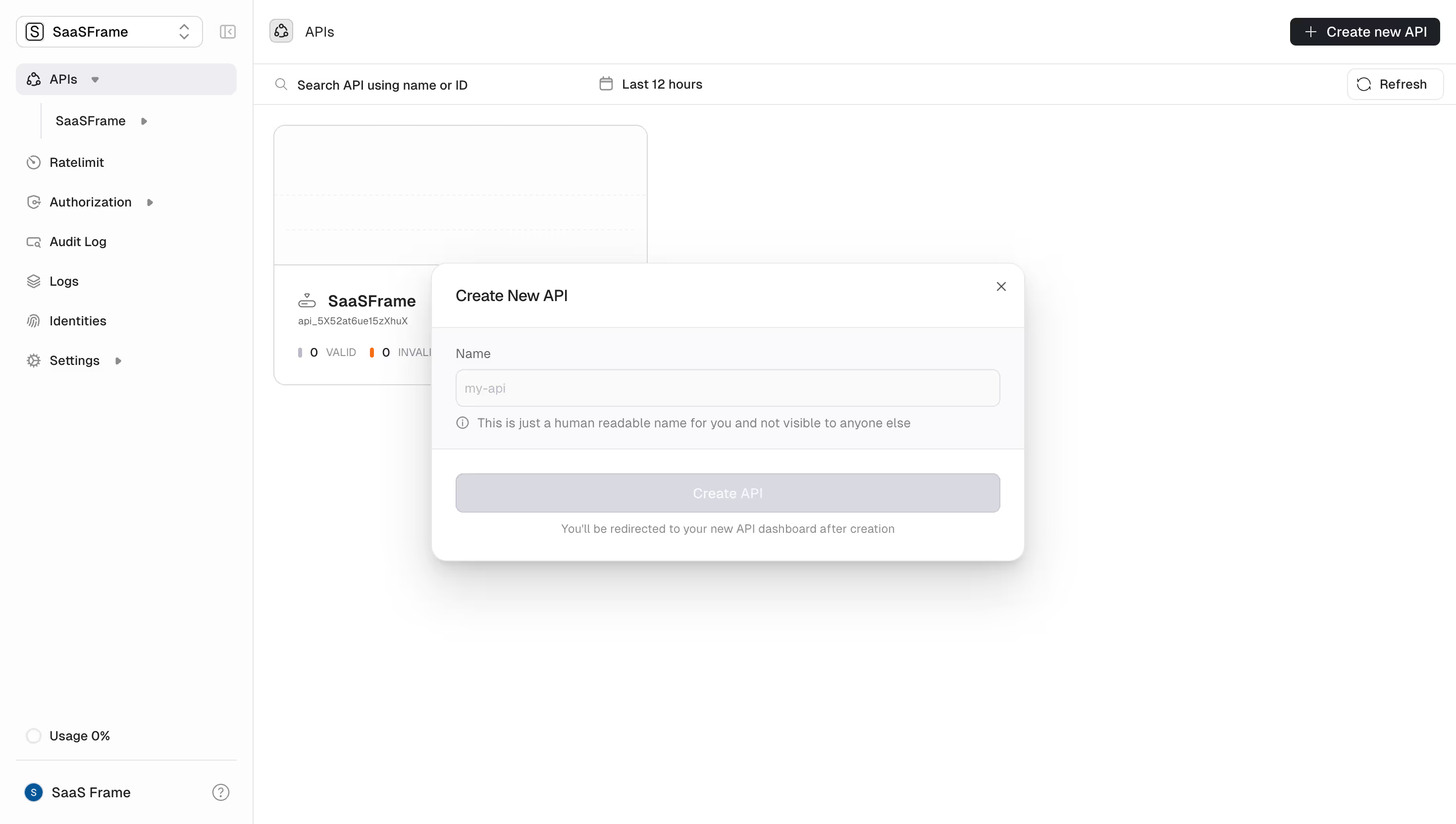
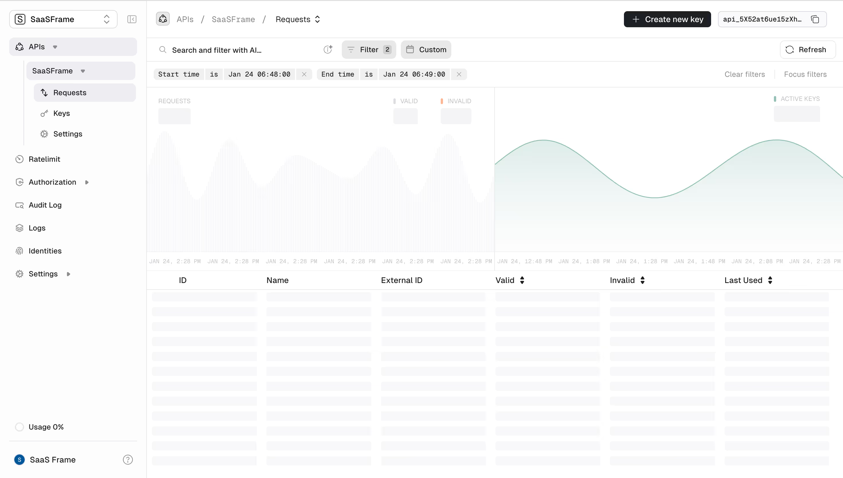
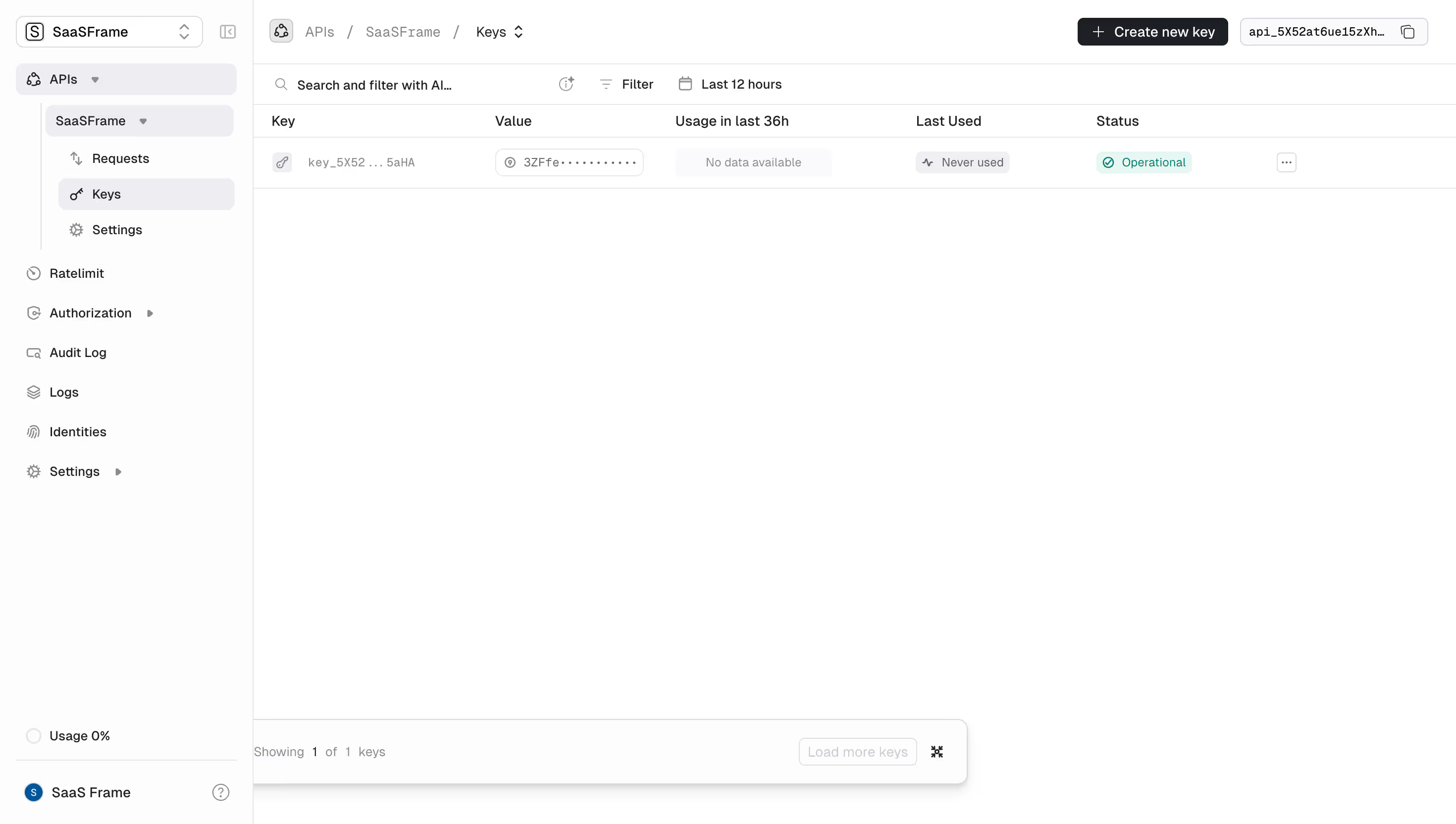

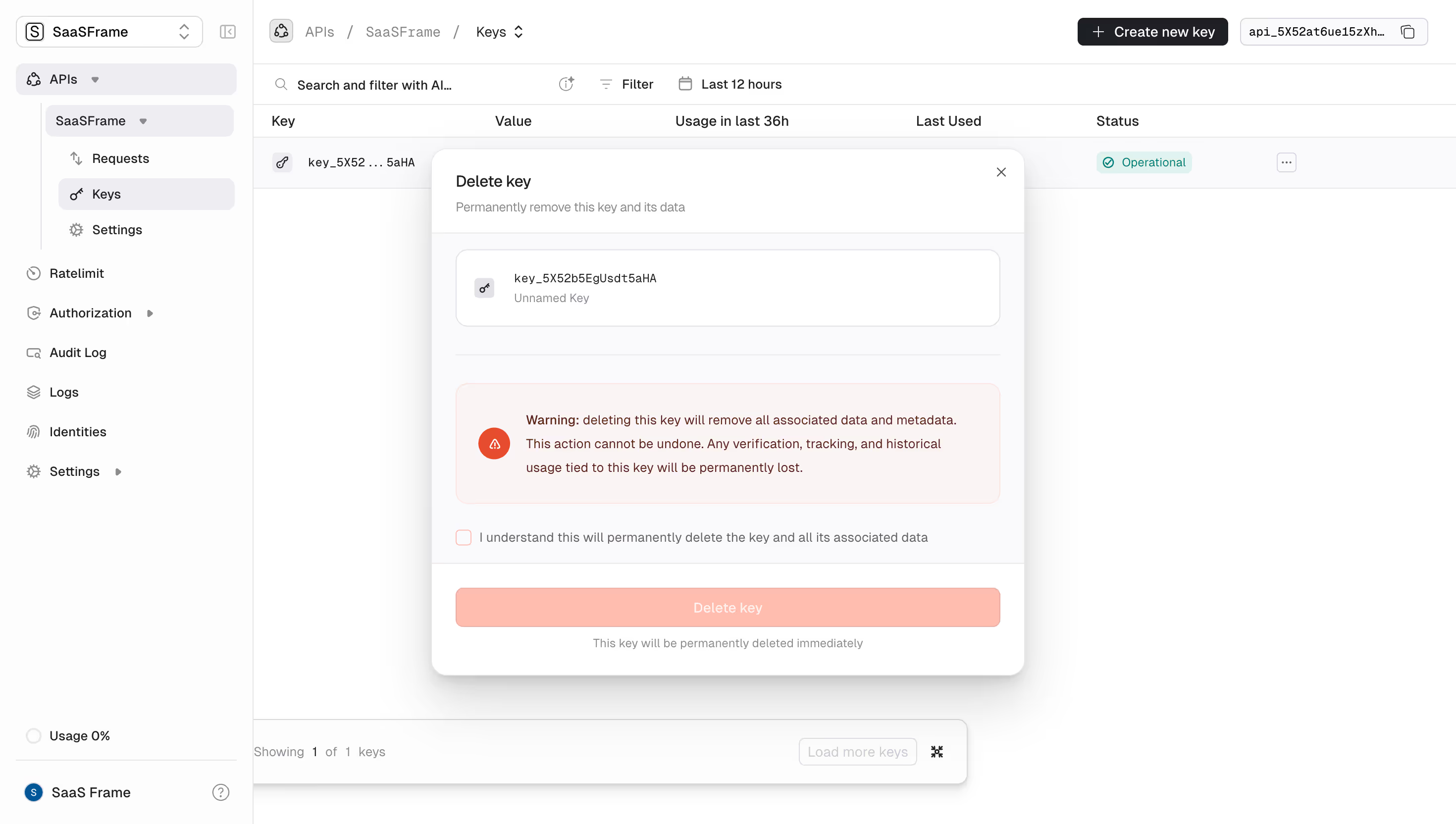
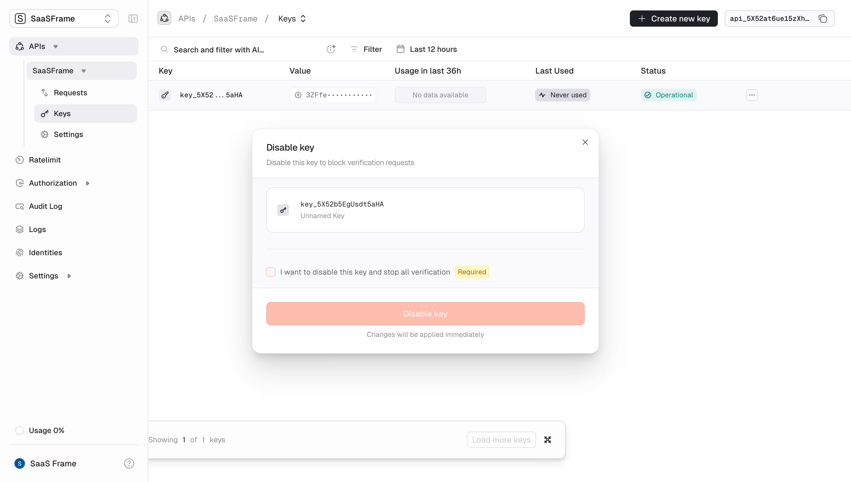


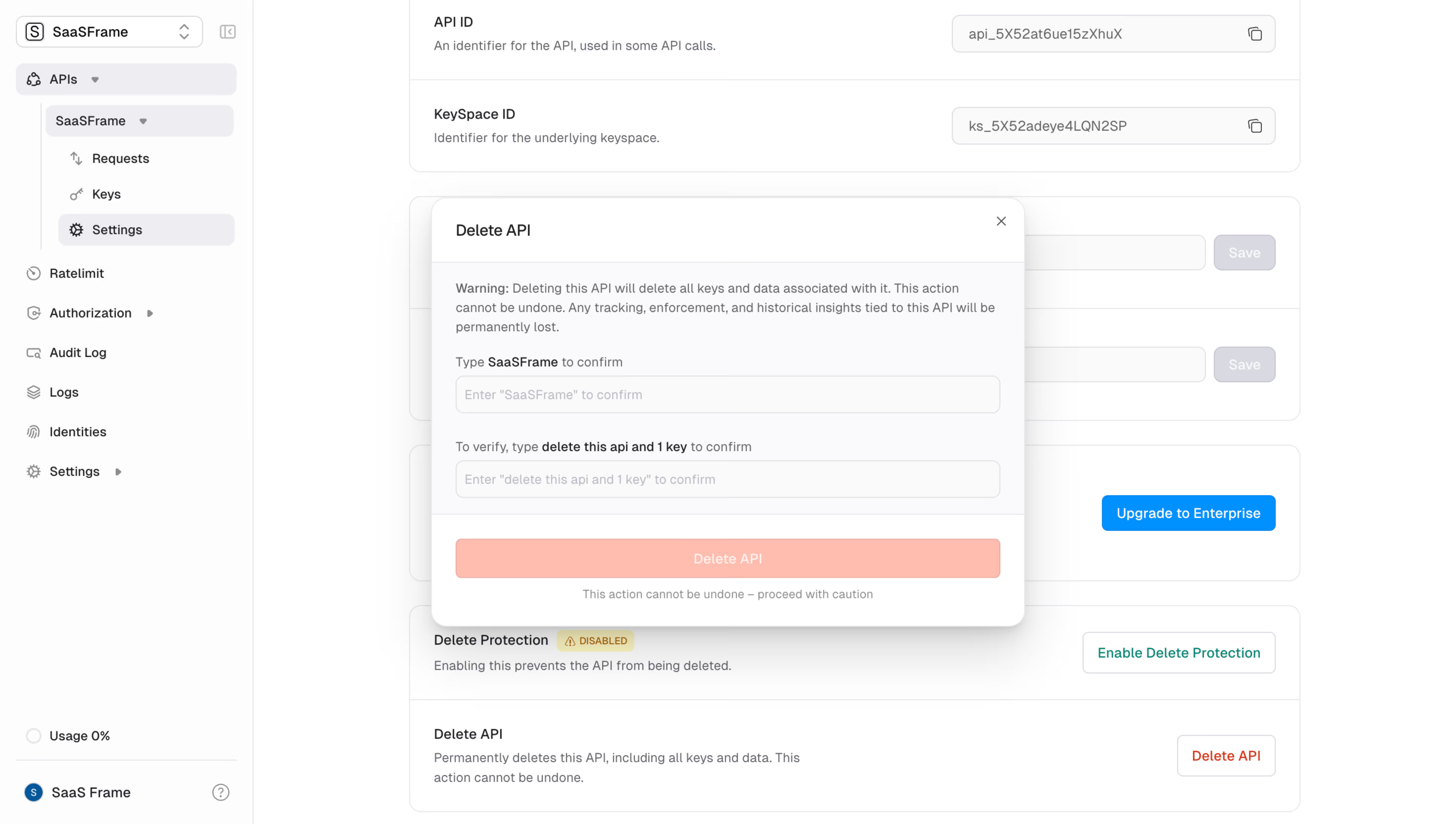
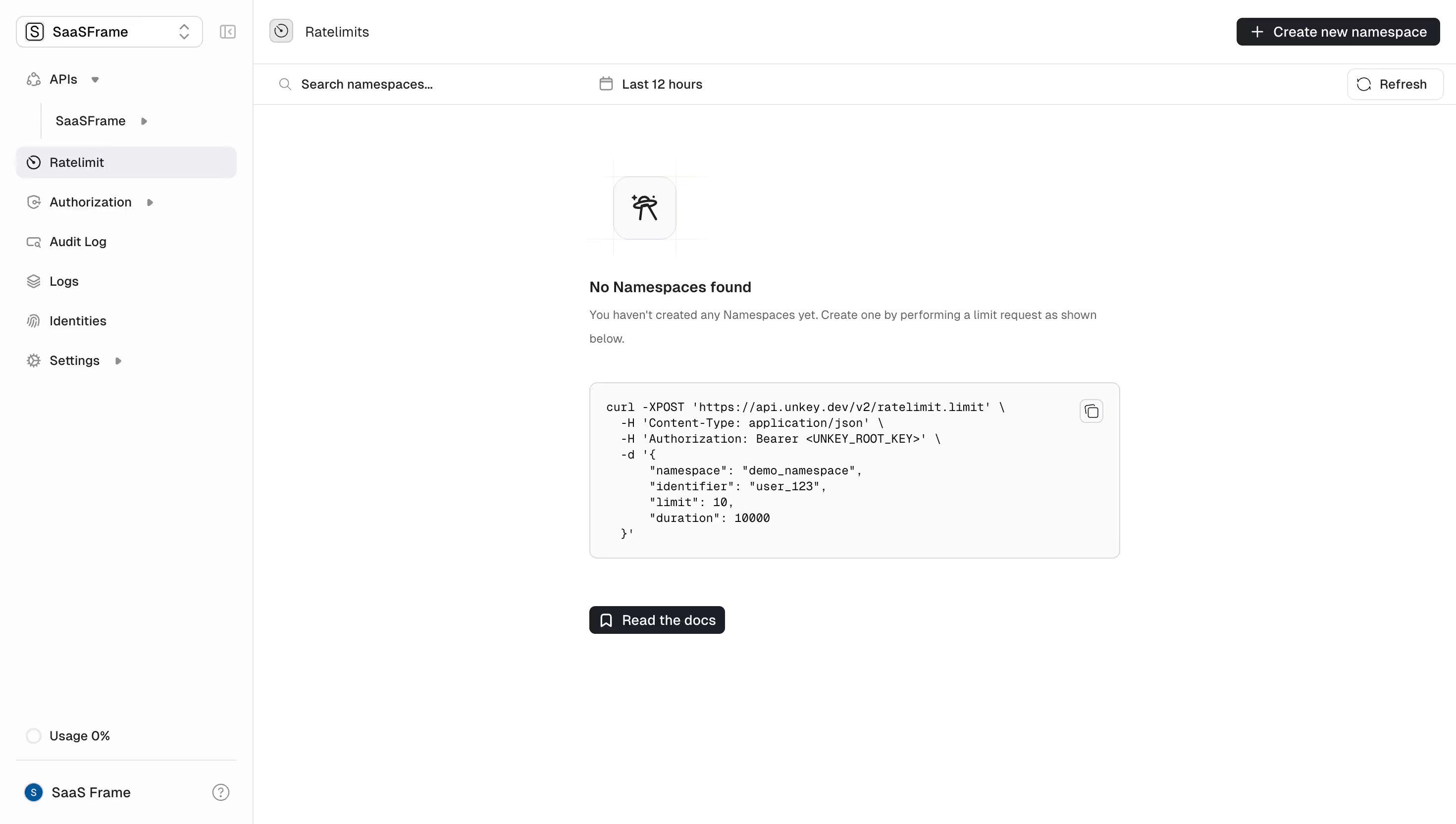
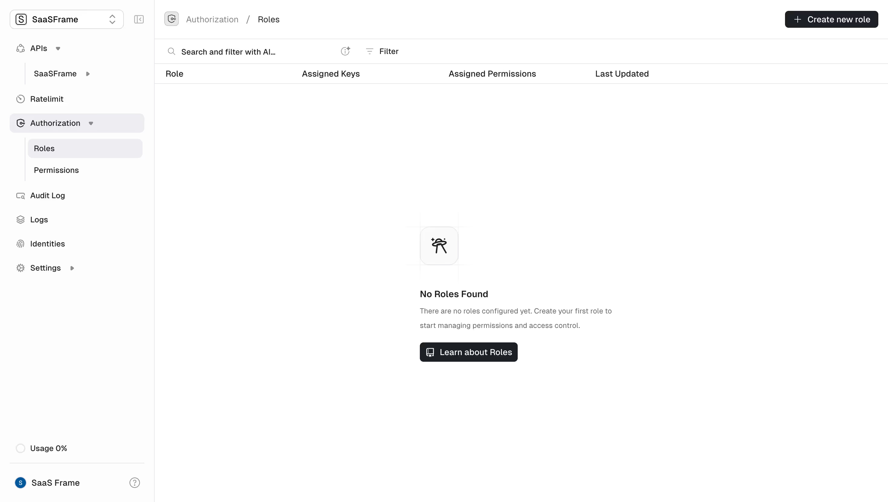
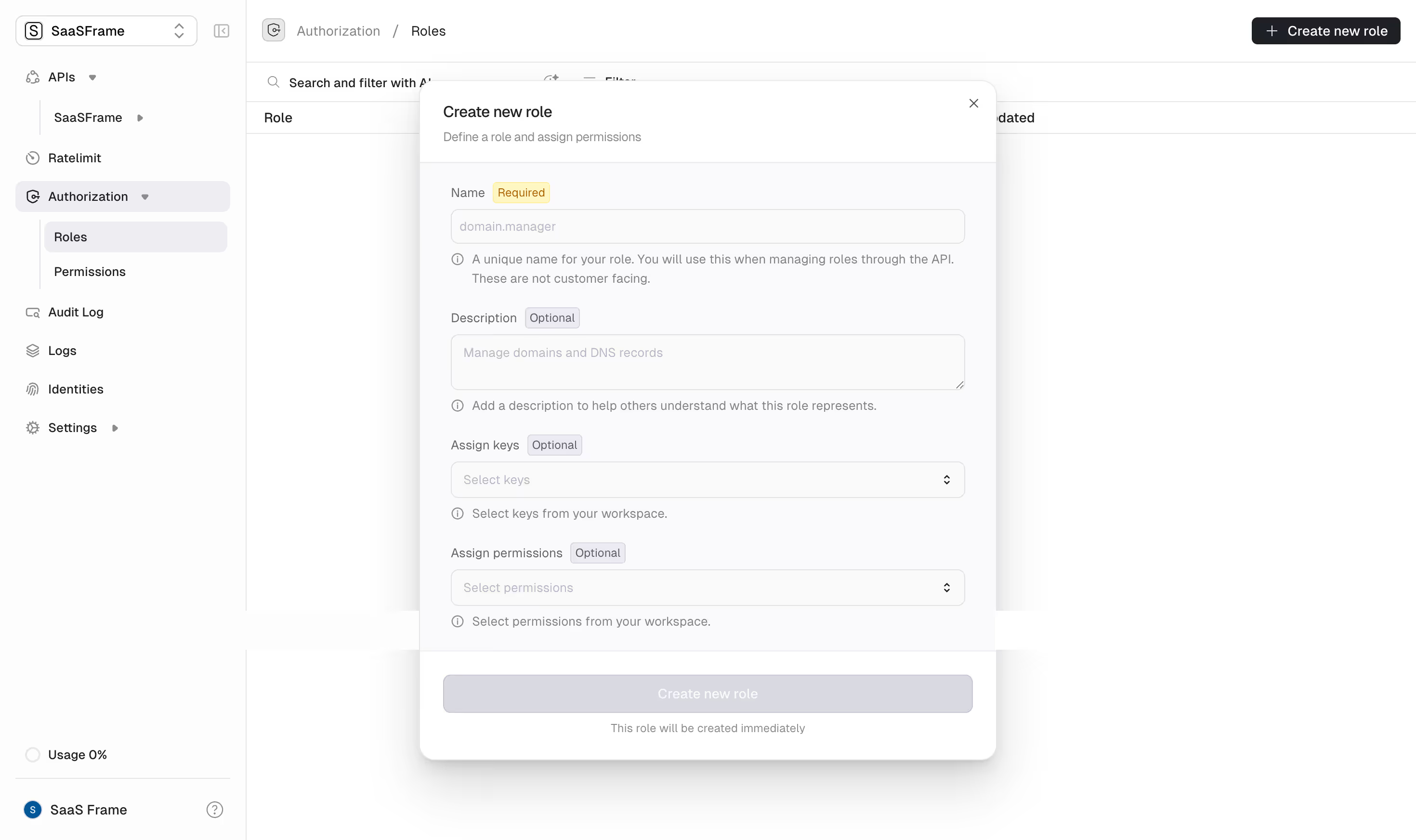
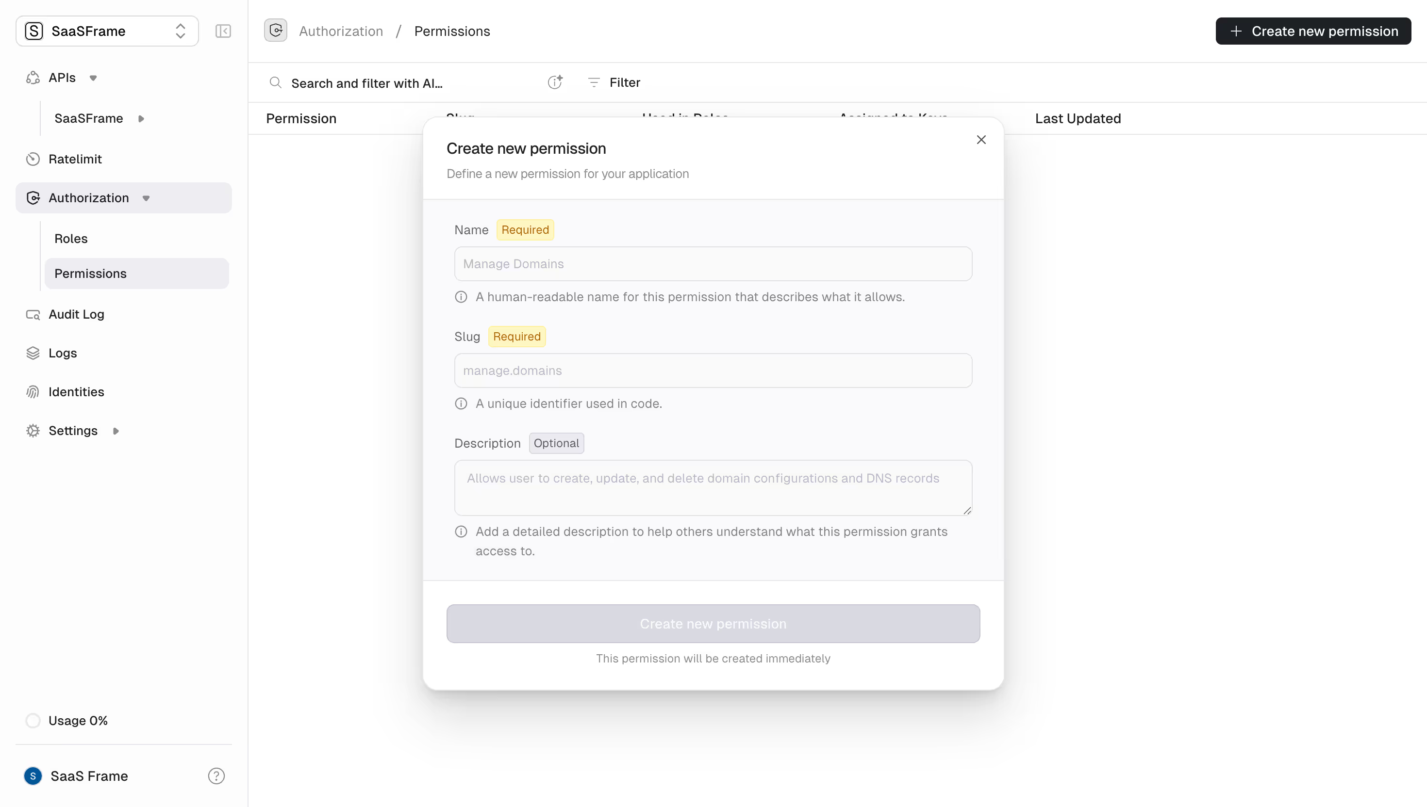
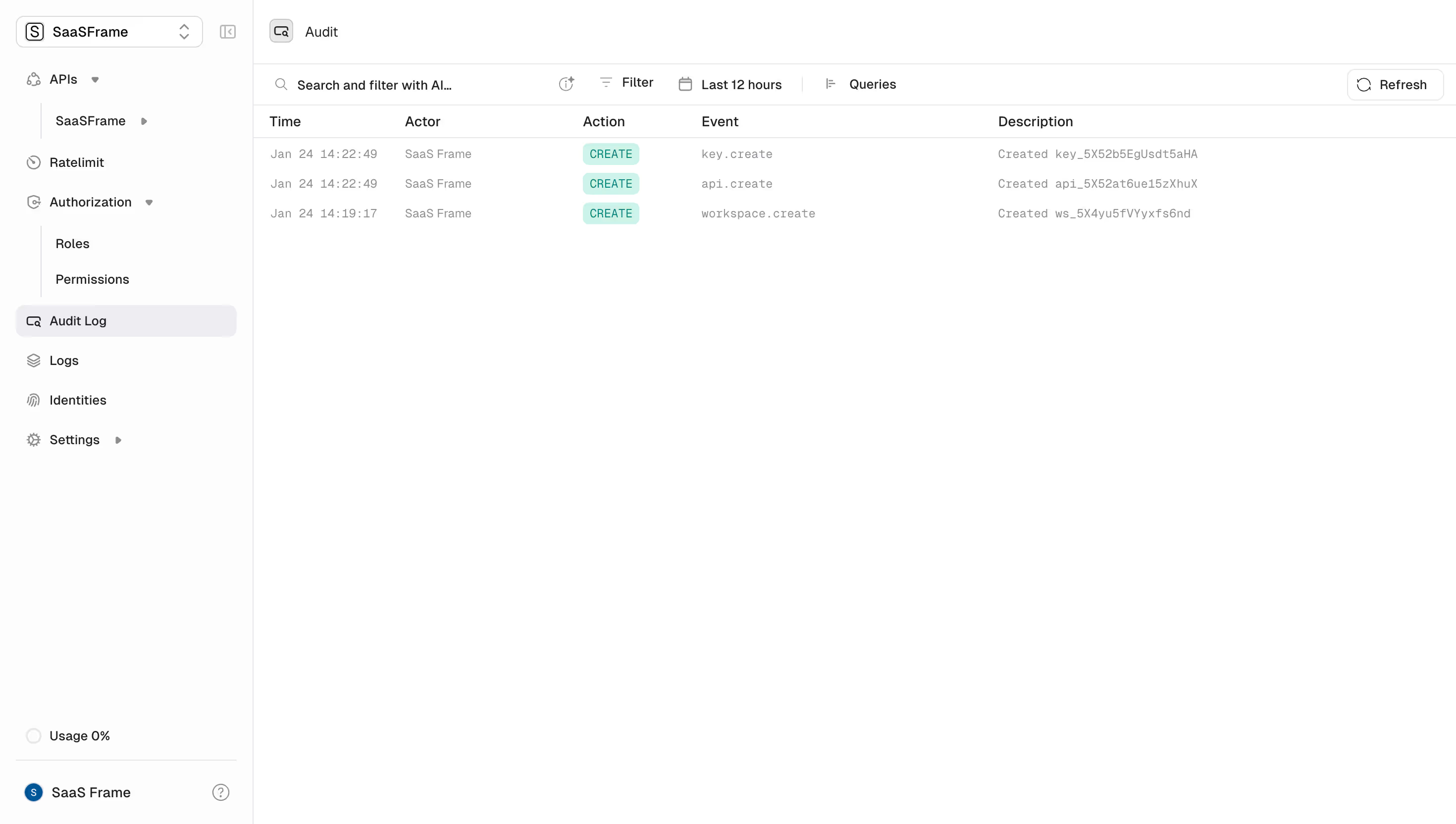
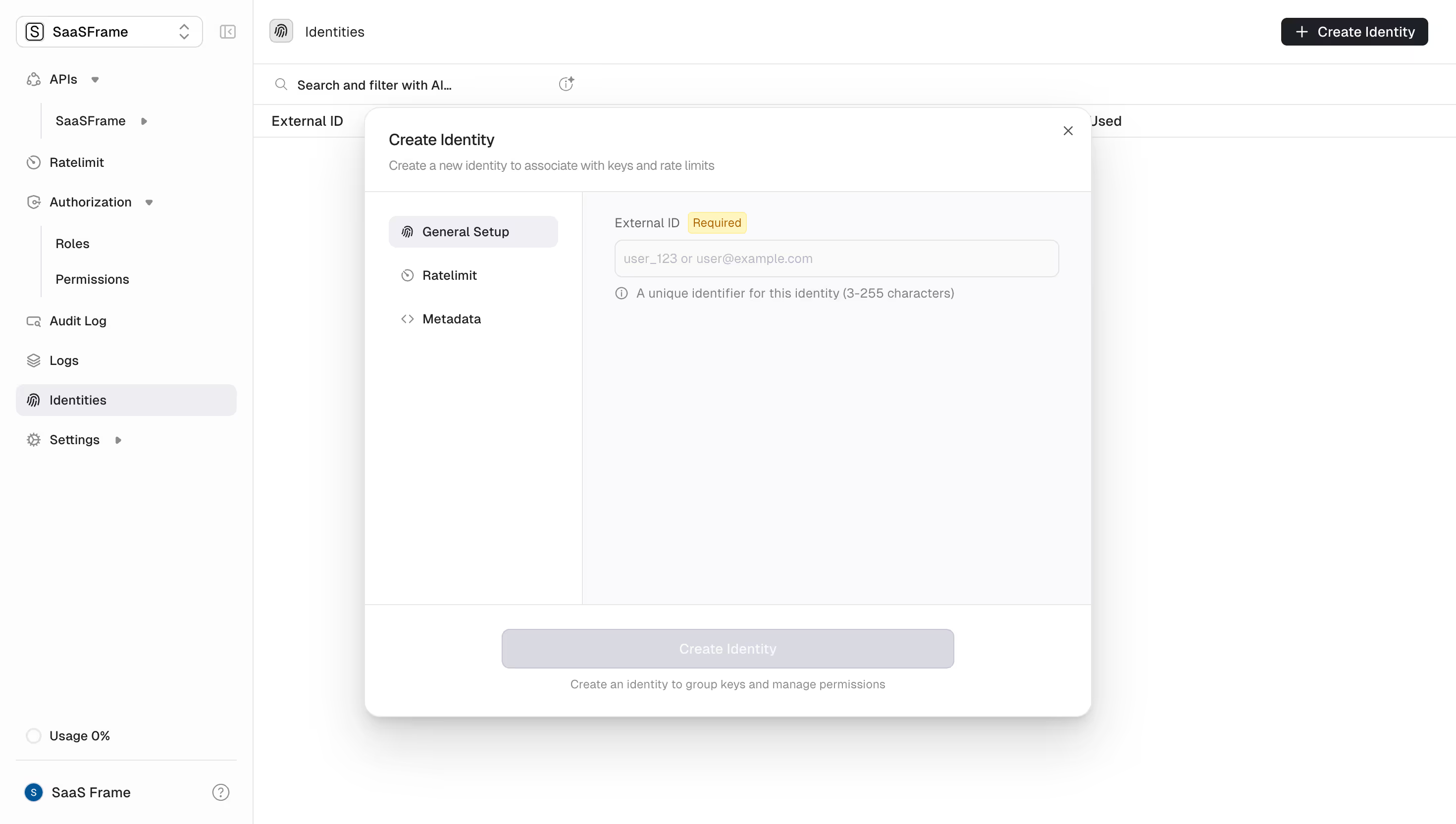
Unkey Design System
Source
\- Repo:
Stack \- Framework: Next.js (App Router) \- Styling: Tailwind CSS v3 \- Component library: Custom internal UI package (internal/ui) \- Language: TypeScript \- Deployment: Vercel / Unkey Deploy (self-hosted)
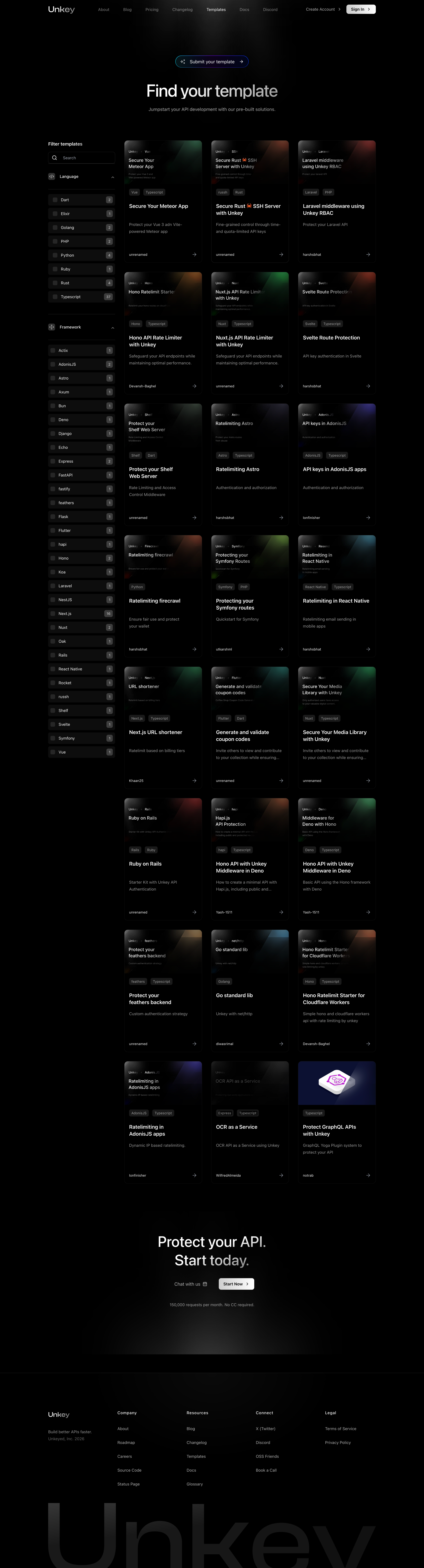
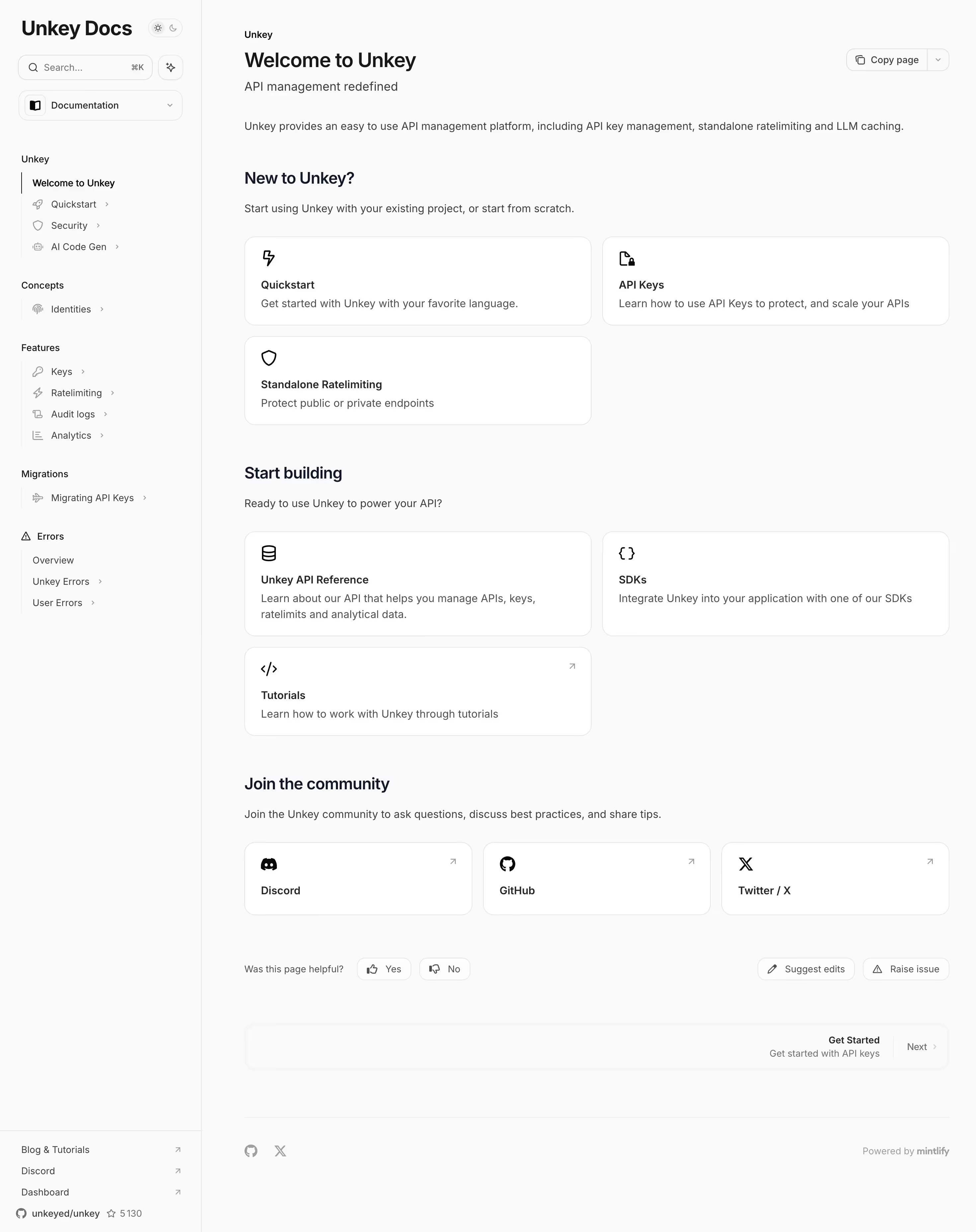
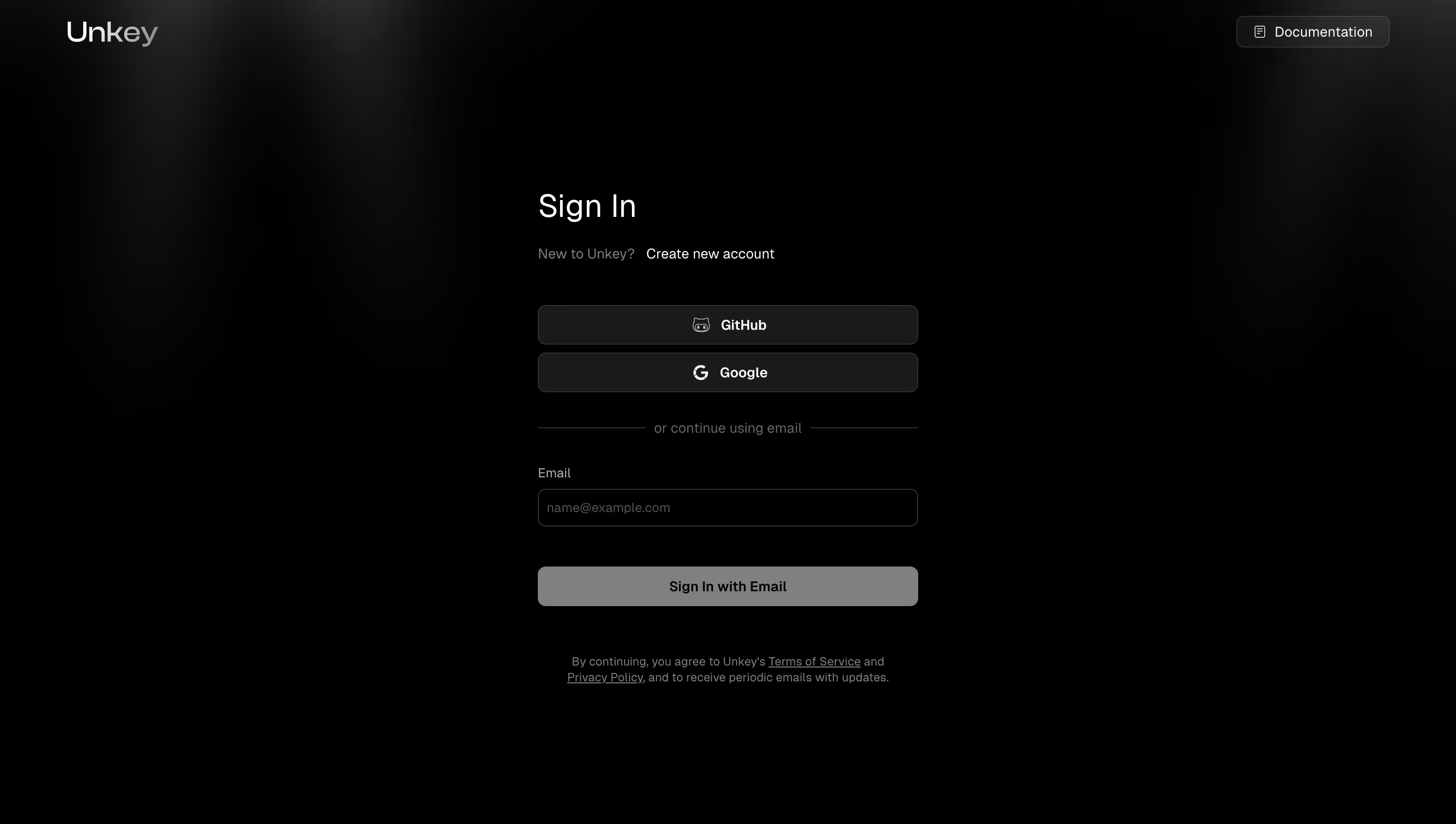
Color Philosophy Deep dark-first design system. The root background is near-black (#040406) — an almost pure black with a faint blue tint. The palette is monochromatic and developer-focused: dark surfaces, subtle gray midtones, and white text. A single accent color (white or off-white) drives CTAs. No vibrant hues; brand identity is expressed through restraint and precision.
Typography \- Font family: Geist (Vercel's open-source font) — sans-serif for UI, monospace variant for code blocks \- Scale: Tight type scale rooted in rem; large display headings (4xl–6xl) for hero sections, small utility text (xs–sm) for metadata \- Weight: Regular (400) for body, Semibold (600) for section labels, Bold (700) for hero headings \- Line height: Snug for headings (leading-tight), relaxed for body (leading-relaxed)
Spacing \- Base unit: 4px (Tailwind default) \- Section padding: py-24 to py-32 (96–128px) \- Container max-width: max-w-7xl (1280px) with px-4 sm:px-6 lg:px-8 \- Card gaps: gap-6 to gap-8 (24–32px)
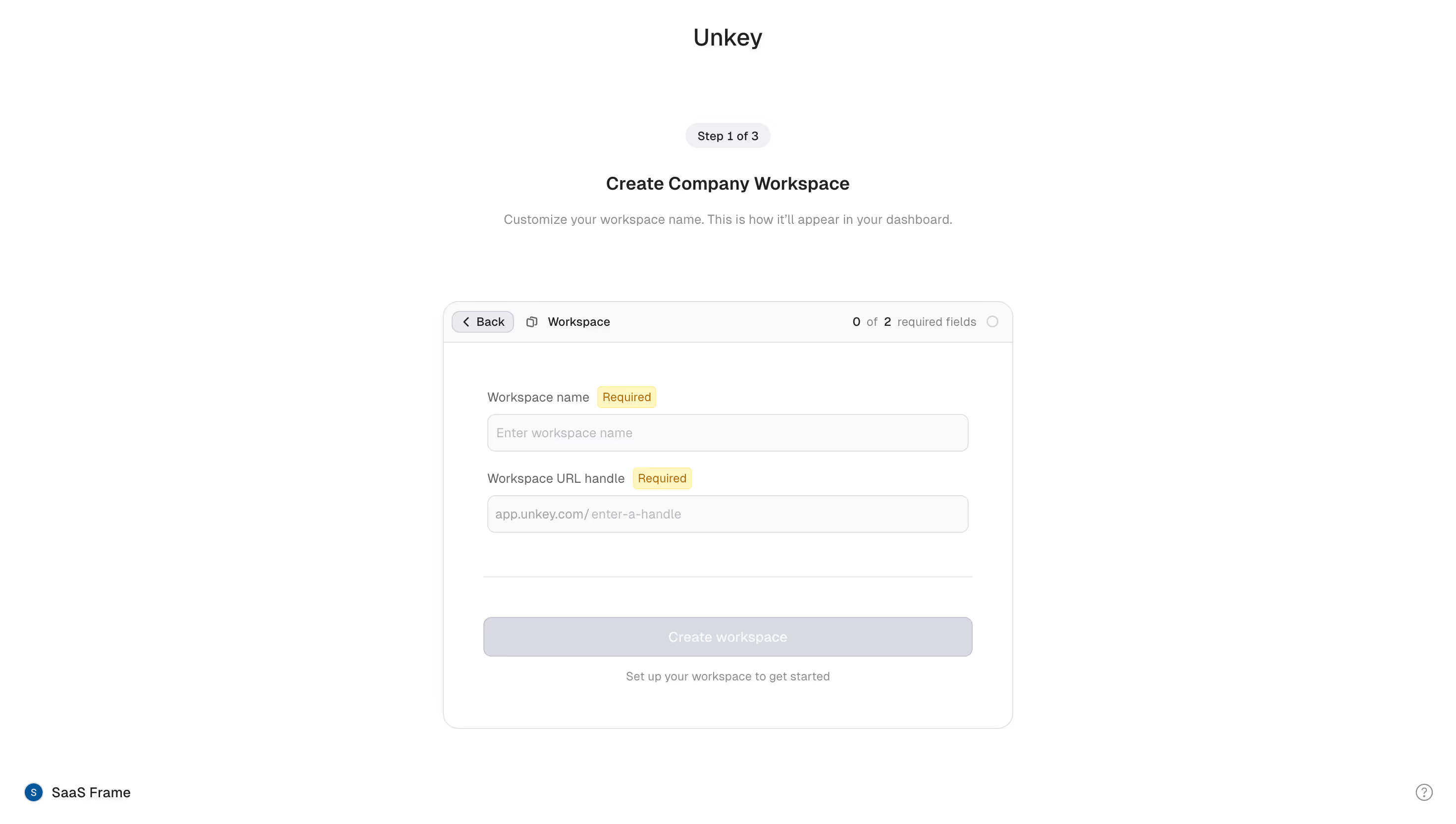
Component Defaults \- Buttons: Rounded-md (border-radius: 6px), solid white-on-dark primary, ghost/outline secondary \- Cards: Dark surface with subtle border (border border-white/10), no heavy shadows — depth via border opacity \- Badges: Small pill, uppercase tracking-wide text, muted border \- Navigation: Transparent sticky bar, border-bottom on scroll \- Code blocks: Monospace, dark bg (#0d0d0f), syntax-highlighted
Layout \- Single-column marketing layout with full-width hero sections \- Feature sections alternate image-left / content-right at lg: breakpoint \- Responsive grid: 1-col mobile → 2–3 col desktop \- Heavy use of negative space to communicate premium quality \- Dark mode is the only mode (no light-mode variant on marketing site)
/ Unkey Design System — CSS Custom Properties / / Source: Live site analysis (unkey.com) + open-source repo pattern /
:root { / ── Brand Background ── / --background: 4 4 6; / #040406 — near-black, site root / --background-subtle: 10 10 14; / #0a0a0e — card/section bg / --background-muted: 16 16 22; / #101016 — elevated surfaces / --background-emphasis: 22 22 30; / #16161e — hover/active states /
/ ── Foreground / Text ── / --foreground: 255 255 255; / #ffffff — primary text / --foreground-muted: 161 161 170; / #a1a1aa — secondary text (zinc-400) / --foreground-subtle: 113 113 122; / #71717a — disabled / placeholder / --foreground-inverted: 4 4 6; / #040406 — text on light surfaces /
/ ── Brand Accent ── / --accent: 255 255 255; / #ffffff — primary CTA (white on dark) / --accent-foreground: 4 4 6; / #040406 — text on accent bg / --accent-subtle: 255 255 255 / 0.08; / white/8 — ghost hover /
/ ── Borders ── / --border: 255 255 255 / 0.08; / white/8 — default border / --border-subtle: 255 255 255 / 0.05; / white/5 — very subtle divider / --border-emphasis: 255 255 255 / 0.15; / white/15 — hover/focus border / --border-input: 255 255 255 / 0.12; / white/12 — form inputs /
/ ── Semantic States ── / --success: 34 197 94; / #22c55e — green-500 / --warning: 234 179 8; / #eab308 — yellow-500 / --destructive: 239 68 68; / #ef4444 — red-500 / --info: 59 130 246; / #3b82f6 — blue-500 /
/ ── Ring / Focus ── / --ring: 255 255 255 / 0.3; --ring-offset: 4 4 6;
/ ── Typography ── / --font-sans: 'Geist', ui-sans-serif, system-ui, -apple-system, sans-serif; --font-mono: 'Geist Mono', ui-monospace, 'Cascadia Code', monospace; --font-size-xs: 0.75rem; / 12px / --font-size-sm: 0.875rem; / 14px / --font-size-base: 1rem; / 16px / --font-size-lg: 1.125rem; / 18px / --font-size-xl: 1.25rem; / 20px / --font-size-2xl: 1.5rem; / 24px / --font-size-3xl: 1.875rem; / 30px / --font-size-4xl: 2.25rem; / 36px / --font-size-5xl: 3rem; / 48px / --font-size-6xl: 3.75rem; / 60px /
/ ── Spacing ── / --spacing-1: 0.25rem; / 4px / --spacing-2: 0.5rem; / 8px / --spacing-3: 0.75rem; / 12px / --spacing-4: 1rem; / 16px / --spacing-6: 1.5rem; / 24px / --spacing-8: 2rem; / 32px / --spacing-12: 3rem; / 48px / --spacing-16: 4rem; / 64px / --spacing-24: 6rem; / 96px / --spacing-32: 8rem; / 128px /
/ ── Border Radius ── / --radius-sm: 0.25rem; / 4px — tags, badges / --radius-md: 0.375rem; / 6px — buttons, inputs / --radius-lg: 0.5rem; / 8px — cards / --radius-xl: 0.75rem; / 12px — modals, panels / --radius-full: 9999px; / pills /
/ ── Shadows ── / --shadow-sm: 0 1px 2px 0 rgb(0 0 0 / 0.4); --shadow-md: 0 4px 6px -1px rgb(0 0 0 / 0.5), 0 2px 4px -2px rgb(0 0 0 / 0.4); --shadow-lg: 0 10px 15px -3px rgb(0 0 0 / 0.6), 0 4px 6px -4px rgb(0 0 0 / 0.5); --shadow-glow: 0 0 40px -10px rgb(255 255 255 / 0.08); / subtle white glow on cards /
/ ── Layout ── / --container-max: 1280px; / max-w-7xl / --nav-height: 64px; }
/ No separate dark-mode block — Unkey is dark-only on the marketing site. The app (app.unkey.com) uses shadcn/ui conventions with .dark class. /
.dark { / App dashboard overrides (app.unkey.com — shadcn/ui pattern) / --background: 0 0% 3.9%; --foreground: 0 0% 98%; --card: 0 0% 3.9%; --card-foreground: 0 0% 98%; --popover: 0 0% 3.9%; --popover-foreground: 0 0% 98%; --primary: 0 0% 98%; --primary-foreground: 0 0% 9%; --secondary: 0 0% 14.9%; --secondary-foreground: 0 0% 98%; --muted: 0 0% 14.9%; --muted-foreground: 0 0% 63.9%; --accent: 0 0% 14.9%; --accent-foreground: 0 0% 98%; --destructive: 0 62.8% 30.6%; --destructive-foreground: 0 0% 98%; --border: 0 0% 14.9%; --input: 0 0% 14.9%; --ring: 0 0% 83.1%; }
Unkey Design Tokens Reference
Color Tokens
| Token | Value | Usage |
|---|---|---|
| --background | #040406 | Page root background |
| --background-subtle | #0a0a0e | Card / section backgrounds |
| --background-muted | #101016 | Elevated surfaces, panels |
| --background-emphasis | #16161e | Hover & active states |
| --foreground | #ffffff | Primary text |
| --foreground-muted | #a1a1aa | Secondary / caption text |
| --foreground-subtle | #71717a | Placeholder / disabled text |
| --accent | #ffffff | Primary CTA background |
| --accent-foreground | #040406 | Text on CTA buttons |
| --border | rgba(255,255,255,0.08) | Default card/element borders |
| --border-emphasis | rgba(255,255,255,0.15) | Hover/focus borders |
| --success | #22c55e | Positive states, verified |
| --warning | #eab308 | Caution indicators |
| --destructive | #ef4444 | Errors, revoke actions |
| --info | #3b82f6 | Informational states |
| theme-color (meta) | #040406 | Browser chrome color |
Spacing Scale
| Token | rem | px | Usage |
|---|---|---|---|
| spacing-1 | 0.25rem | 4px | Micro gaps |
| spacing-2 | 0.5rem | 8px | Icon padding |
| spacing-3 | 0.75rem | 12px | Compact elements |
| spacing-4 | 1rem | 16px | Base unit, input padding |
| spacing-6 | 1.5rem | 24px | Card padding, gaps |
| spacing-8 | 2rem | 32px | Section sub-gaps |
| spacing-12 | 3rem | 48px | Medium section spacing |
| spacing-16 | 4rem | 64px | Large section gaps |
| spacing-24 | 6rem | 96px | Hero padding |
| spacing-32 | 8rem | 128px | Max section vertical padding |
Typography
| Token | Value | Notes |
|---|---|---|
| font-sans | Geist | Vercel's open-source sans |
| font-mono | Geist Mono | Code blocks, API keys |
| font-size-xs | 12px | Badges, labels |
| font-size-sm | 14px | Caption, nav links |
| font-size-base | 16px | Body copy |
| font-size-lg | 18px | Lead paragraphs |
| font-size-xl | 20px | Card titles |
| font-size-2xl | 24px | Sub-headings |
| font-size-3xl | 30px | Section headings |
| font-size-4xl | 36px | Large headings |
| font-size-5xl | 48px | Hero sub-title |
| font-size-6xl | 60px | Hero H1 |
| Font weight body | 400 | Regular |
| Font weight headings | 700 | Bold |
| Font weight labels | 600 | Semibold |
| Line height body | 1.625 | relaxed |
| Line height heading | 1.2 | tight |
| Letter spacing | -0.02em | Tight tracking on large headings |
Border Radius
| Token | Value | Usage |
|---|---|---|
| radius-sm | 4px | Badges, small tags |
| radius-md | 6px | Buttons, inputs |
| radius-lg | 8px | Cards, dropdowns |
| radius-xl | 12px | Modals, bottom sheets |
| radius-full | 9999px | Pill badges, avatars |
Shadows
| Token | Value | Usage |
|---|---|---|
| shadow-sm | 0 1px 2px rgb(0 0 0/0.4) | Subtle lift |
| shadow-md | 0 4px 6px rgb(0 0 0/0.5) | Cards, popovers |
| shadow-lg | 0 10px 15px rgb(0 0 0/0.6) | Modals, dropdowns |
| shadow-glow | 0 0 40px -10px rgb(255 255 255/0.08) | Hero feature cards |
Note: Unkey relies primarily on border-opacity for depth rather than heavy box-shadows. Shadows are heavier than typical (higher opacity) because the dark background compresses perceived contrast.
Breakpoints
| Name | Min-width | Usage |
|---|---|---|
| sm | 640px | Mobile+ |
| md | 768px | Tablet |
| lg | 1024px | Desktop layout switch |
| xl | 1280px | Wide containers |
| 2xl | 1536px | Ultra-wide |
Container
| Token | Value |
|---|---|
| Max-width | 1280px (max-w-7xl) |
| Horizontal padding (mobile) | 16px |
| Horizontal padding (sm) | 24px |
| Horizontal padding (lg) | 32px |
Framework & Tooling \- CSS Framework: Tailwind CSS v3 (utility-first) \- Component layer: Custom internal/ui package, also uses shadcn/ui primitives in the app dashboard \- Font delivery: next/font with Geist (local, zero-CLS) \- Build: Next.js App Router — server components for marketing pages, client components for interactive dashboard \- Animation: Likely CSS transitions + Framer Motion for hero/feature animations (video poster images used for hero sequences)
Theme Support \- Marketing site (unkey.com): Dark-only — no light mode toggle, no prefers-color-scheme switch. The meta[name=theme-color] is hardcoded to #040406. \- App dashboard (app.unkey.com): Uses shadcn/ui .dark class convention — likely supports both modes internally but defaults dark \- Two logo variants: logo-dark.svg (served on dark backgrounds) and logo-light.svg (used in dark footer section), indicating a carefully managed dual-logo system
Data Source \- GitHub raw file access was blocked by the sandbox proxy (X-Proxy-Error: blocked-by-allowlist) \- All tokens derived from: live site HTML structure, meta tags, class naming patterns visible in rendered markup, og:image analysis, and Tailwind CSS default mappings \- Confidence: High for colors (meta theme-color confirmed), typography (Geist is Vercel's standard), and layout patterns; Medium for exact spacing/radius values (inferred from Tailwind conventions and visual analysis)
Notable Patterns \- Developer-aesthetic dark brand: Near-black #040406 is a signature choice — slightly blue-shifted, not pure black, giving a technical premium feel \- White as the only accent: No brand color — CTAs are white buttons on dark backgrounds; extremely restrained palette \- Border-over-shadow depth system: Cards use border: 1px solid rgba(255,255,255,0.08) for depth rather than box shadows, keeping the UI flat and fast \- Geist font family: Signals alignment with the Vercel/Next.js ecosystem (Geist is Vercel's own typeface) \- Video-first hero: Hero uses a poster image with likely autoplay video underneath for motion, showing high production value without heavy JS \- Open-source repo: ~5.3k GitHub stars; design system is available for inspection at [github.com/unkeyed/unkey](http://github.com/unkeyed/unkey) \- Brand rebrand (Apr 2026): Per blog post, new website and brand launched April 22, 2026 — current design tokens reflect the post-rebrand identity
Biggest SaaS library.


.webp)


.webp)

Desktop & mobile versions.


Access the Figma files.


Advanced filtering.
Let it flow.





Save design inspirations.
research




How do you process payment?
SaaSFrame subscriptions are sold on Lemon Squeezy, a secured online selling platform for creators.
What about future updates and versions?
SaaSFrame gets updated all the time! Every new update and version will immediately be made available to all SaaSFrame users.
Can you send me an invoice?
You can generate an invoice on your Lemon Squeezy portal once you purchased SaaSFrame. You will find the link in the order confirmation email.
How can I cancel my membership subscription?
You can cancel your membership subscription at any moment on your profile page.
Can I get a refund?
If you're not satisfied, you can ask for a refund within 7 days. Just send me an email at antoine[at]unmake[dot]io
I have another question.
You can send me an email at antoine[at]unmake[dot]io, I'll be happy to help with any questions.