 SaaSFrame
 Cloudflare
 React
 Vercel
Websites 5
All websites
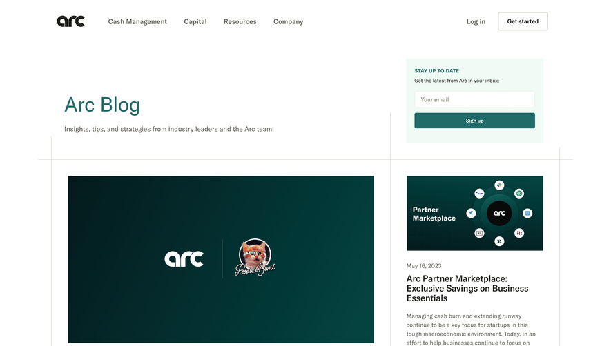
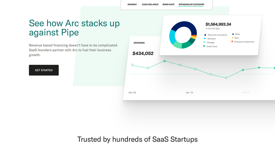
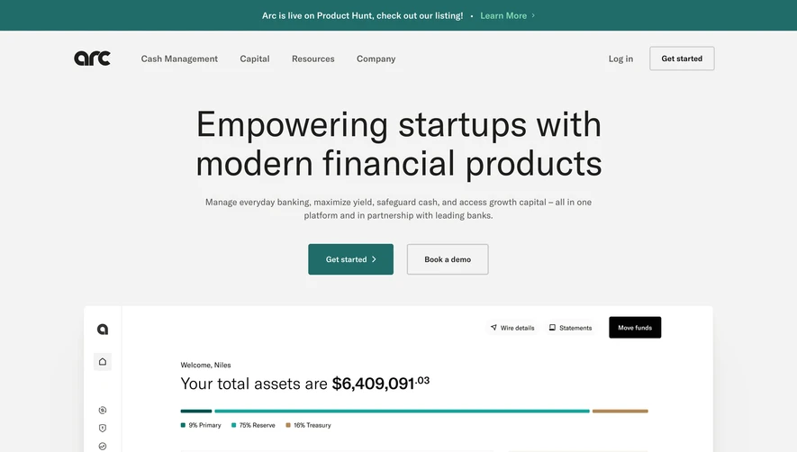
Index of all 5 Arc websites examples
Products 23
All products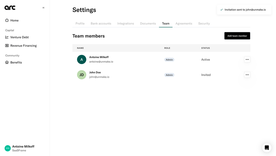
Index of all 23 Arc products examples
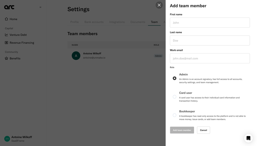
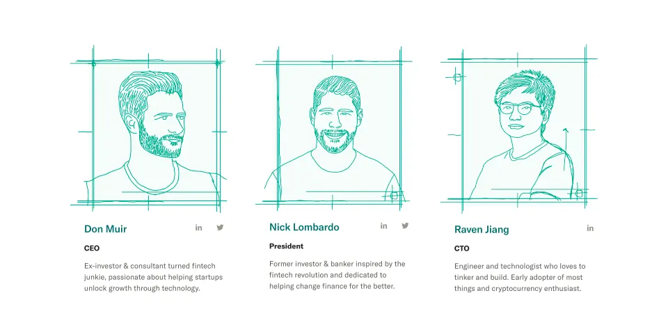
- Arc Team Members
- Arc Pending Approval Dashboard
- Arc Success
- Arc Loading Screen
- Arc Account Setup
- Arc Account Setup
- Arc Account Setup
- Arc Account Setup
- Arc Account Setup
- Arc Account Setup
- Arc Account Setup
- Arc Account Setup
- Arc Account Setup
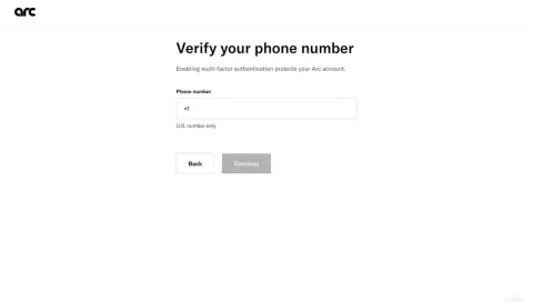
- Arc Verification
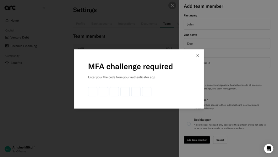
- Arc Setup MFA
- Arc Setup MFA
- Arc Verification
- Arc Choose MFA Method
- Arc Signup
- Arc Signup
Flows 3
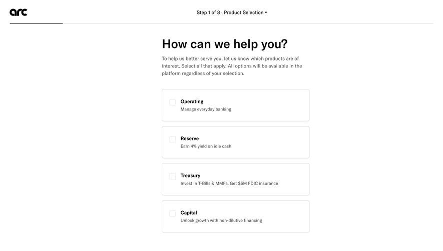
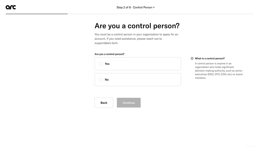
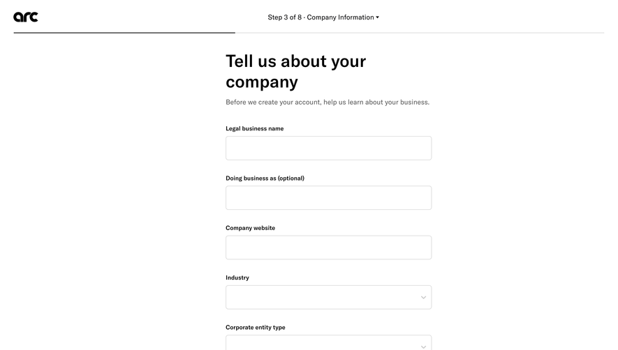
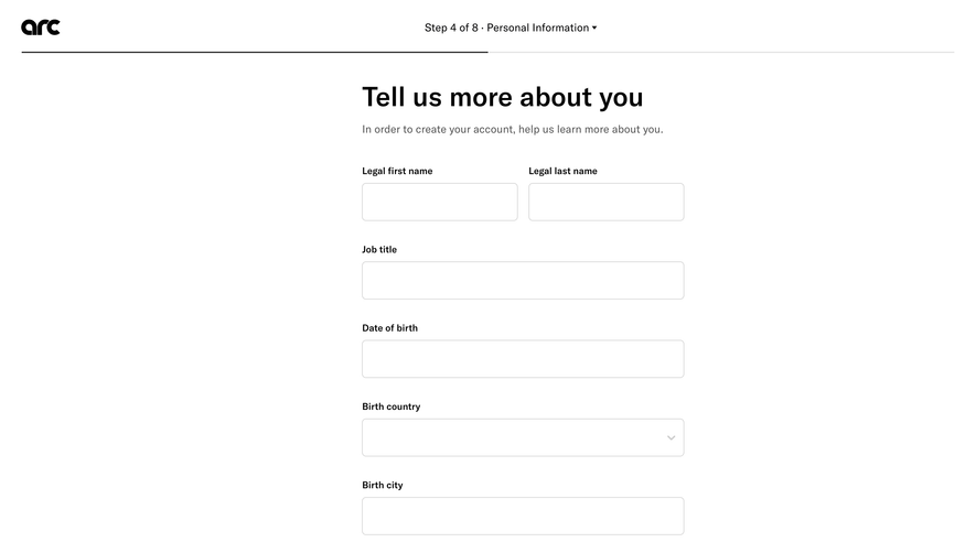
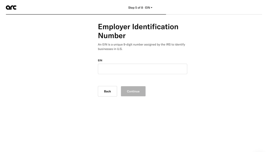
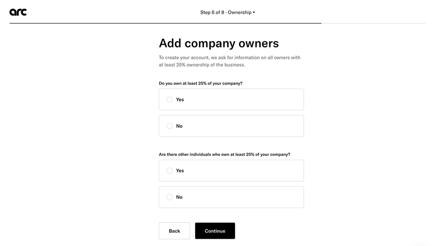
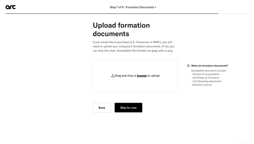
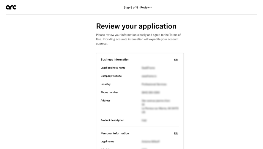
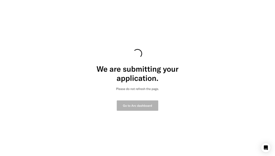
 Arc Legal Application
11 screens



Website sections 3

Design reference
Arc — design reference
Source: https://www.joinarc.com/. Extracted 2026-10-14. Scope: public marketing website CSS; declared styles, not computed browser values. This is an observed inventory, not an official internal design system.
Typography
font-family: gt-america,sans-serif,-apple-system,blinkmacsystemfont,Apple Color Emoji,Segoe UI,Segoe UI Emoji,Segoe UI Symbol— selectorbuttonfont-family: gt-america— selector.treasuryHero form .checkboxDropdown .slideTrigger,.treasuryHero form input:not([type=checkbox],[type=submit]),.treasuryHero form select,.treasuryHero form textareafont-size: calc(.875rem + (16 - 14) _ ((100vw - 320px) / (1260 - 320)))— selector.p,pfont-size: .875rem— selector.p,pfont-size: 1rem— selector.p,pfont-size: calc(.75rem + (14 - 12) _ ((100vw - 320px) / (1260 - 320)))— selector.p small,.p.p--small,p small,p.p--smallfont-size: .75rem— selector.p small,.p.p--small,p small,p.p--smallfont-size: calc(2.5rem + (64 - 40) _ ((100vw - 320px) / (1260 - 320)))— selector.h1,h1font-size: 2.5rem— selector.h1,h1font-weight: 400— selectorbuttonfont-weight: 700— selector.p .strong,.p strong,p .strong,p strongfont-weight: 500— selector.h5,h5font-weight: 300— selector.treasuryHero**headingfont-weight: 600— selector.NewsletterHero**form input[type=email]line-height: 150%— selector.p,pline-height: 110%— selector.h1,h1line-height: 115%— selector.h2,h2line-height: 120%— selector.h3,h3line-height: 125%— selector.h5,h5line-height: 130%— selector.h6,h6line-height: 1rem— selector.buttonline-height: .875rem— selector.hero .hero**overlineTag,.hero .hero**overlineTag _letter-spacing: -.015em— selector.h1,h1letter-spacing: .1em— selector.platinumHero**eyebrowletter-spacing: .02em— selector.featureBlock**bodyListItemHeading
Colors and surfaces
color: #53524b— selector.p,pcolor: #206d69— selector.h1,h1color: #fafaf9— selector.button,.button**textcolor: #000— selector.button.style--outlinedcolor: #000!important— selector.button.theme--gold:hover:not(:disabled)color: #fff— selector.header.theme--green-300 .header**secondaryNavItems .button.style--outlinedcolor: #fff!important— selector.header.theme--dark .header**secondaryNavItems .buttoncolor: #1e1e1c— selector.hero .hero**overlineText,.hero .hero**overlineText _background-color: transparent— selectorbuttonbackground-color: #1e1e1c— selector.buttonbackground-color: #206d69— selector.button:hover:not(:disabled)background-color: #70e0b4— selector.button.theme--primarybackground-color: #cbb46c— selector.button.theme--goldbackground-color: #68b9d9— selector.button.theme--gsbackground-color: #a89355!important— selector.button.theme--gold:hover:not(:disabled)background-color: #4a9bbb!important— selector.button.theme--gs:hover:not(:disabled)
Components and layout
border-radius: .25rem— selector.buttonborder-radius: 5px— selector.hamburgerButton _border-radius: .5rem— selector.treasuryHero**dashboardborder-radius: .625rem— selector.treasuryHero**formColumnInnerborder-radius: 2.5rem— selector.goldHero**figure-optionborder-radius: 20px— selector.partnerHero**rewardsCardborder-radius: 8px— selector.partnerHero**figureborder-radius: 50%— selector.FormHero svgbox-shadow: 0 100px 80px rgba(0,0,0,.03),0 41.7776px 33.4221px rgba(0,0,0,.022),0 22.3363px 17.869px rgba(0,0,0,.018),0 12.5216px 10.0172px rgba(0,0,0,.015),0 6.6501px 5.3201px rgba(0,0,0,.012),0 2.7673px 2.2138px rgba(0,0,0,.008)— selector.treasuryHero**dashboardbox-shadow: none— selector.partnerHero--useForm .partnerHero**figuremax-width: 4.125rem— selector.header**navLinkContainermax-width: 3.125rem— selector.header**navLinkContainermax-width: 33.5rem— selector.hero .hero**contentColumnmax-width: 5rem— selector.hero .hero**overlineImageWrappermax-width: 4rem— selector.hero .hero**overlineImageWrappermax-width: none— selector.hero .hero**imagemax-width: calc(5% + 50rem)— selector.hero:not(.withImage) .hero**contentColumnmax-width: 33rem— selector.hero:not(.withImage) .hero**bodypadding: unset— selectorbuttonpadding: 1.125rem 1.875rem— selector.buttonpadding: .9375rem 1.5625rem— selector.button.size--smallpadding: .75rem 1.25rem— selector.header**secondaryNavItems .buttonpadding: .25rem .75rem— selector.hero .hero**overlineTagpadding: .1875rem .6875rem— selector.hero .hero**overlineTagpadding: 0 1%— selector.treasuryHero**graphicpadding: 2.5rem— selector.treasuryHero**formColumnInnergap: 1.5rem— selector.treasuryHero**ctasgap: 1rem— selector.treasuryHero**ctasgap: 60px— selector.treasuryHero**logoCallout.opticallySizeImages .treasuryHero**logoCalloutLogosListgap: .625rem— selector.platinumHero**eyebrow-wrapgap: .75rem— selector.platinumHero**eyebrow-wrapgap: .875rem— selector.platinumHero**eyebrow-wrapgap: .5rem— selector.platinumHero**featuregap: 48px— selector.partnerHero--widerImage .partnerHero**figure-wraptransition: all .2s ease— selectora,a:hovertransition: fill .2s ease— selector.header**navLinkContainer .navLogo pathtransition: background-color .2s ease,border-color .2s ease,color .2s ease,fill .2s ease,background-position .2s ease— selector.buttontransition: background-color .3s ease,opacity .3s ease,top .3s ease,transform .3s ease,visibility .3s ease— selector.hamburgerButton \*transition: opacity .75s ease-in-out,transform .75s ease-in-out— selector.treasuryHero**eyebrowtransition: opacity 1s ease-in-out,transform 1s ease-in-out— selector.treasuryHero**dashboardtransition: transform 2s cubic-bezier(.77,0,.175,1)— selector.treasuryHero**bartransition: opacity 1s ease-in-out— selector.ReserveHero\_\_video
Responsive rules
(max-width:320px)
(min-width:1260px)
(max-width:48rem)
print
(max-width:73.75rem)
(max-width:64rem)
(min-width:64.0625rem)
(min-width:48.0625rem)
(min-width:90.0625rem)
(max-width:90rem)
(max-width:30rem)
(min-width:39.0625rem)
(min-width:80.0625rem)
(min-width:30.0625rem)
(max-width:1028px)
(max-width:48rem)and (max-width:48rem)
(max-width:39rem)
(min-width:48rem)
(min-width:48rem)and (max-width:320px)
(min-width:48rem)and (min-width:1260px)
(min-width:39.0625rem)and (max-width:48rem)
(max-width:87.5rem)
(max-width:75rem)
(max-width:32.5rem)