 SaaSFrame
Keyboard Shortcuts
Boost power-user productivity with SaaS Keyboard Shortcut patterns. Learn how to display 'CMD+K' menus and cheat sheets that help users navigate your app at lightning speed.



Index of all 34 Keyboard Shortcuts examples
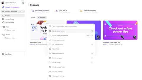
- Pitch Search Modal
- Zeda.io Search Modal
- Routine User Onboarding
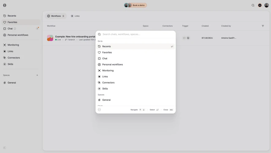
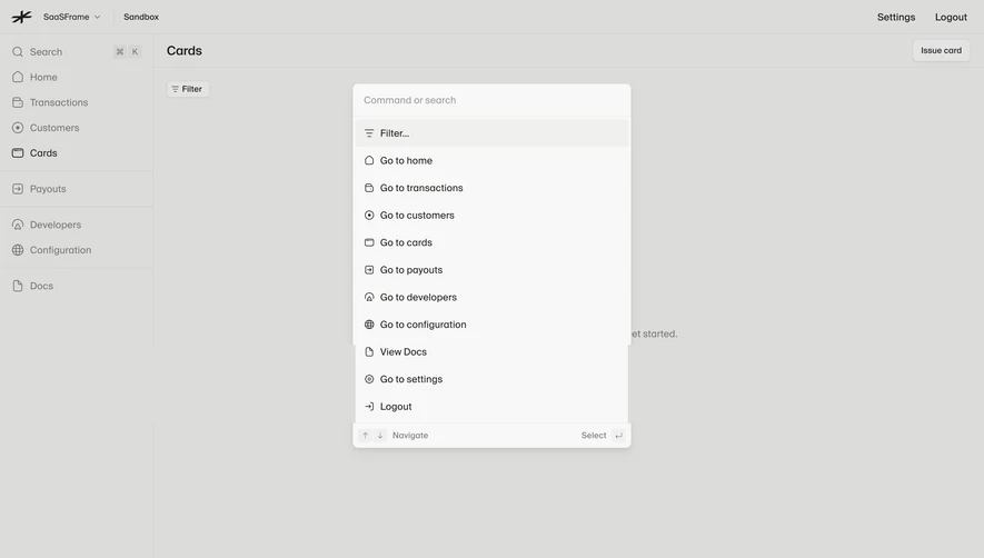
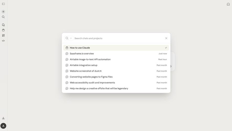
- MonSpark Search Modal
- Assembly Search Modal
- Assembly Search Modal
- Current Search Modal
- Better Stack etter Uptime Hearthbeat Dashboard
- Better Stack etter Uptime Incidents Dashboard
- Attio Search
- Attio Search Results
- Attio Company Notes
- Attio Company Tasks
- Attio Company Team
- Attio Company Email List
- Attio Company Files
- Attio Company Activity
- Attio Companies List
- Crew Import/Export data
- Crew Workspace settings
- Crew Profile settings
- Crew Create automation
- Crew Pipelines templates
- Crew Sequences templates
- Crew Messages templates
- Crew Open jobs
- Crew Send message
- Crew Talent CRM
- Fiberplane Dashboard
- Fiberplane Dashboard
- Arcade Upgrading
Keyboard Shortcuts: design guide
Keyboard shortcuts provide a faster route to actions that remain available through the interface. In SaaS products, they can open search, create an object, move through records, or support repeated editing. The pattern is useful when frequent work benefits from fewer pointer movements and a predictable command.
A shortcut is a commitment about behavior. The key combination needs to be discoverable, valid in the current context, and compatible with ordinary typing and navigation. A visible key hint can teach the route, but the product still needs to implement and test the complete interaction it promises.
Start with frequent actions that have a clear destination
Choose shortcuts according to the user's work, not according to how many commands a competitor exposes. Search is often a strong candidate because it connects many destinations. Repeated creation and navigation tasks can also benefit when the action's scope is clear.
A shortcut should supplement an accessible visible route. People who do not know the command must still be able to complete the task. Learning it should reduce effort rather than unlock a feature that otherwise appears unavailable.
Prioritize commands users can remember and use confidently. A large catalog of obscure combinations can create conflict and maintenance work without improving the common workflow. Introduce additional commands when repeated tasks justify them.
Attio places the search command beside its visible entry point
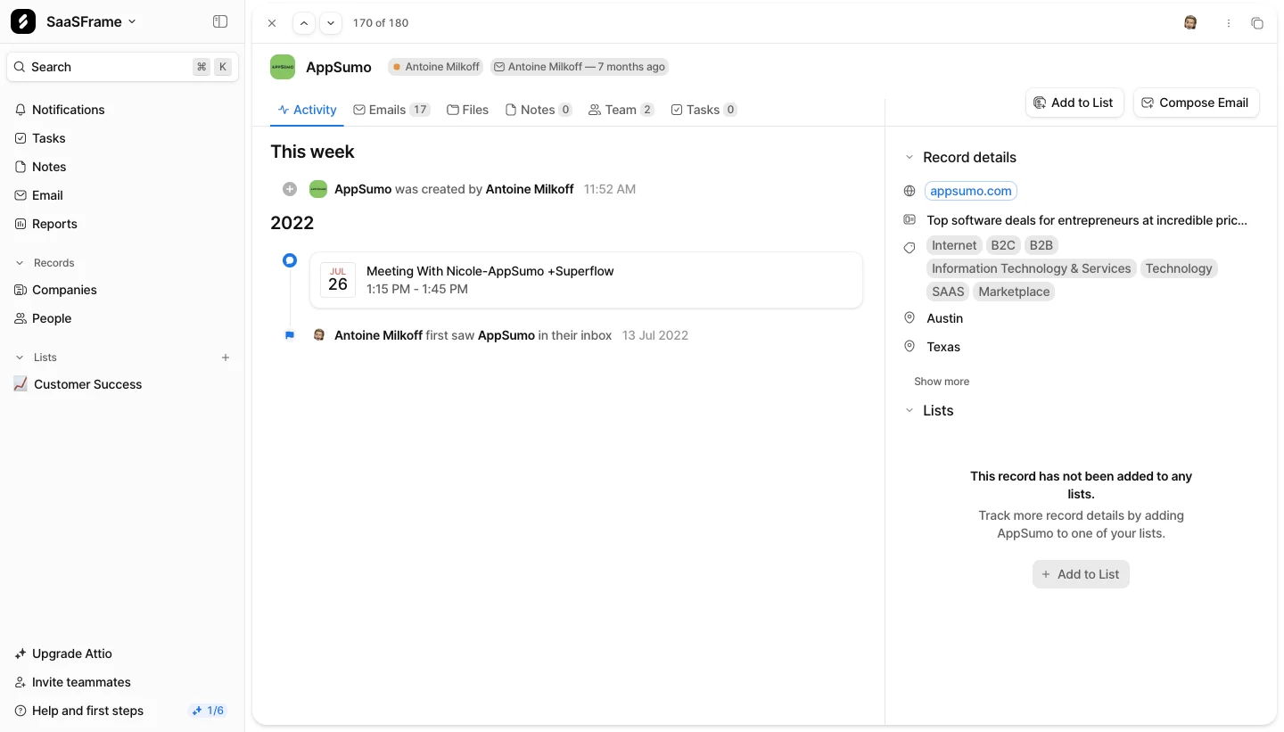
The Attio screenshot shows a Search control near the top of the sidebar with a Command K hint. The rest of the page contains a company activity view and record details. The shortcut is presented as an alternative route to a visible, named control.
This placement teaches the command at the moment a user encounters the task. Someone who clicks Search several times can notice the hint without opening a separate reference page. The label also explains the destination; the key combination is not left floating in the interface.
The capture shows the hint, not the result of pressing the keys. It does not establish whether the command is global, which search scope opens, or how behavior changes while another input is focused. Those rules need direct testing in the implementation.
For your own search shortcut, make the scope predictable. Opening search from a company detail view might search the workspace, the current collection, or the record. The shortcut should follow the same model as its visible counterpart unless a distinction is clearly communicated.
Better Uptime uses a compact hint inside contextual search fields
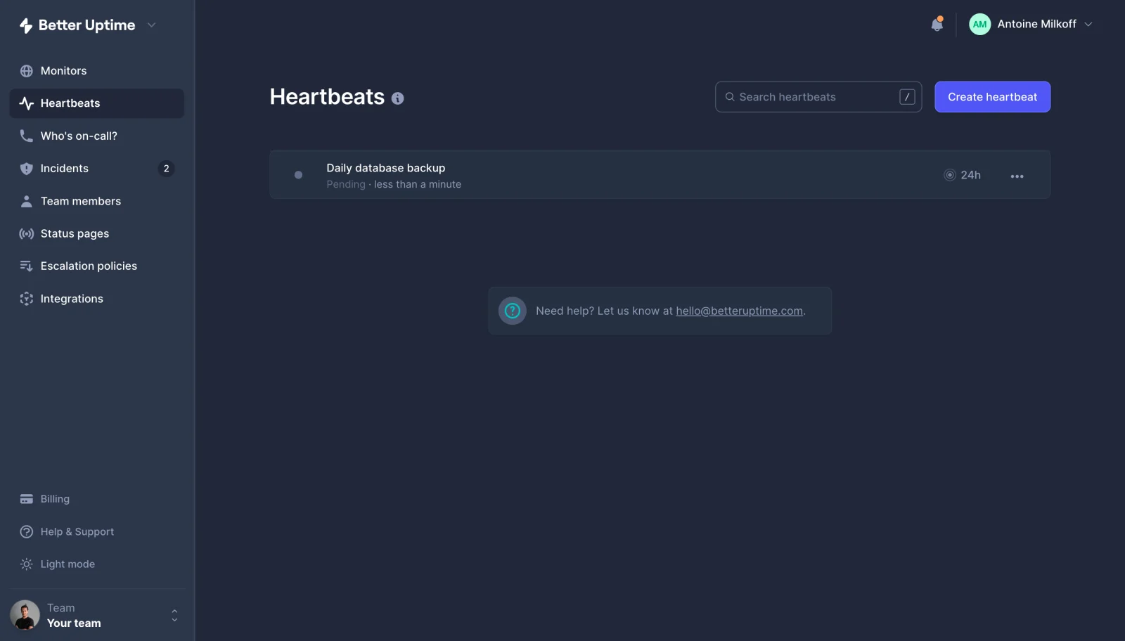
The Better Uptime heartbeat screenshot shows a Search heartbeats field with a slash hint at its right edge. A separate Create heartbeat button sits nearby. The field's label ties the apparent shortcut to a specific collection rather than to an unspecified global destination.
A contextual shortcut can reduce repeated effort while preserving a local mental model. The same visible treatment also appears in the captured incidents search field. When adapting that approach, decide whether the same key focuses the search for whichever collection is currently active.
The screenshot does not prove the actual key behavior. In particular, it cannot show whether pressing slash inserts a character into an active text field or moves focus. That distinction is essential in testing. A shortcut must not unexpectedly interrupt ordinary text entry.
Single-key commands are compact and easy to display, but they require especially careful context handling. Users may type the same character in descriptions, paths, or notes. The product needs a deliberate policy for when the command is active and how users can avoid unintended activation.
Zencal teaches both the keys and the next interaction
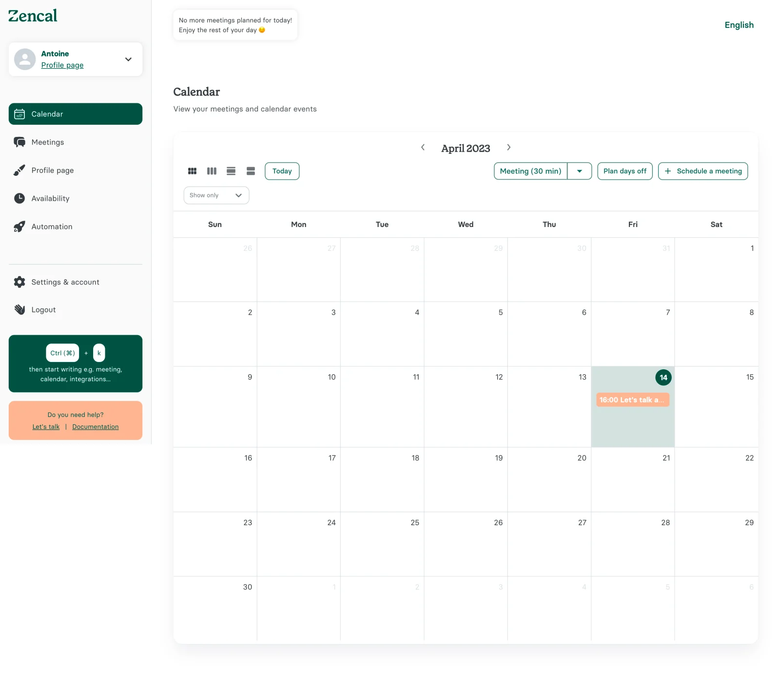
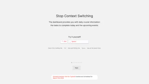
The Zencal screenshot includes a sidebar card showing a Control/Command plus K hint. Supporting text invites the user to start typing terms such as meeting, calendar, or integrations. This is a more explicit teaching treatment than a small key hint inside a field.
The examples connect the command with likely destinations. That can help users understand not only which keys to press but also what to do afterward. A command surface is easier to learn when its purpose and available language are recognizable.
The combined modifier notation is compact, but your own product should verify the correct command for each supported platform and present it understandably. Do not assume that a symbol familiar to one group of users explains a different operating system's modifier.
The captured card does not reveal the command surface itself. It supports an observation about teaching and placement, not a claim about result ranking or command execution. Design and test those later steps separately.
Define when each shortcut is active
A command can be global, page-specific, or component-specific. Document that scope. A global search shortcut may work across the application, while arrow-key movement may belong only to a focused list or menu. Users should not receive conflicting outcomes from the same input without a clear contextual reason.
Text entry deserves explicit protection. A user composing a description should not trigger unrelated navigation merely by typing a letter or punctuation mark. Define how inputs, editable regions, and focused widgets affect command availability.
Consider open dialogs and panels. A global command that opens another surface on top of an unfinished form can create a complicated focus and cancellation problem. Decide whether it remains available, changes scope, or is temporarily suspended in that state.
When a command is unavailable, avoid pretending it succeeded. A visible explanation may be useful if the action is expected and consequential. In other cases, the existing interface can communicate the restriction. Choose feedback according to the task rather than showing a notification for every ignored key.
Check conflicts with the environments your users rely on
Browsers, operating systems, assistive technology, and other applications can use their own key combinations. A product shortcut should be tested in supported environments before being advertised as dependable. Familiarity does not guarantee availability everywhere.
Keyboard layouts and input methods can also affect how users enter a command. A key shown in an English mockup may be less convenient or less obvious on another layout. Include relevant locale and platform coverage in testing instead of treating one developer keyboard as representative.
Where customization is appropriate, provide a coherent way to change or disable commands. This can be useful for products with extensive shortcut systems or diverse workflows. Do not expose customization without maintaining a clear view of conflicts and current assignments.
Keep the visible hint aligned with the actual implementation. A platform-specific label that shows the wrong modifier teaches a command users cannot execute. Hints should be generated or maintained through the same source of truth as the command definition where feasible.
Teach shortcuts where they reduce an observed detour
Inline hints beside buttons or menu items can support gradual learning. A shortcut reference can serve users who want to explore the whole command set. A contextual onboarding tip can introduce a command when the user repeats a task enough to benefit.
Avoid making every screen an advertisement for shortcuts. Too many hints can compete with object names and primary actions. Prioritize the commands that help with the current task, and provide a discoverable reference for the rest.
Use consistent notation and visual treatment. If one menu shows symbols while another spells out modifier names, make sure the relationship remains understandable. The hint should be read as a command, not as a piece of ordinary content or a clickable value without explanation.
Teach the resulting action, not only the keys. Zencal's typing examples illustrate that principle. A user opening search or a command menu still needs to understand what input it accepts and how to choose a result.
Make the resulting focus and state predictable
A shortcut that opens search should place users in a useful state for entering a query. A command that moves between records should reveal the new record and preserve appropriate context. The success criterion is the completed transition, not merely that an event handler ran.
Define how users leave the resulting surface. Closing a menu or cancelling a command should return them to a sensible location. If the command opened from an editable task, preserve that task's state unless a deliberate action changes it.
For commands that change data, provide feedback and recovery according to the consequence. A quick key route should not bypass validation or permission checks. Destructive actions may need confirmation or an undo path just as their visible controls do.
Handle held keys and repeated activation carefully. A navigation shortcut may support repetition, while a create or submit action may need protection against unintended duplicates. Test actual key sequences rather than only isolated presses.
Keep shortcut acceleration distinct from basic keyboard accessibility
Keyboard accessibility means that users can reach and operate the interface without a pointer. Shortcuts offer additional routes. A product can have many shortcuts and still fail basic keyboard tasks if focus is unclear or controls cannot be reached.
Test ordinary navigation through search, buttons, menus, forms, and result lists. A person should not need to memorize a proprietary command to perform the core task. Shortcuts should improve an already usable interaction model.
When single-character commands are offered, consider users who rely on different input methods or assistive technology. Provide appropriate control over those commands and ensure that they do not interfere with ordinary interaction. Evaluate the shipped behavior in context rather than assuming that a visible hint makes it accessible.
Maintain a command system as part of the product interface
Keep a clear inventory of commands, scope, visible hints, and supported platforms. This helps teams identify collisions before adding another shortcut. It also prevents different features from independently claiming the same key combination.
Review commands when navigation or feature names change. A command that opens a removed destination or uses an outdated label can undermine trust in the entire system. Reference documentation and inline hints need to follow the product's current behavior.
For complex products, group commands by task and provide searchable help. Users should be able to find the command they need without reading an undifferentiated catalog. A reference page is most useful when it describes both the action and its context.
Test acceleration through repeated real tasks
Ask users to open search, locate an object, return to their previous task, and repeat the journey. Compare whether the shortcut reduces effort and whether people can remember it after a pause. A command that is technically available but rarely discoverable may need better teaching rather than another key assignment.
Include tests while typing, inside open dialogs, on different supported platforms, and after permission changes. Review accidental activations and duplicate actions alongside successful use. These signals reveal whether speed has come at the cost of predictability.
- Prioritize frequent tasks with visible alternatives.
- Define global, page, and component scopes.
- Protect ordinary text entry.
- Verify platform and layout compatibility.
- Keep hints and command behavior synchronized.
- Specify focus, cancellation, and recovery.
- Test basic keyboard use separately from shortcuts.
Frequently asked questions about keyboard shortcuts
Should every action have a shortcut?
No. Prioritize frequent actions where a key route provides meaningful benefit. Too many commands can create conflicts and a difficult learning burden.
Is a shortcut hint enough to teach a command?
It can support discovery when placed beside a clearly named action. Users still need an understandable destination and next step. A reference or contextual explanation can help with more complex commands.
Can shortcuts replace keyboard navigation?
No. Core tasks should remain operable through a coherent keyboard interaction model. Shortcuts provide acceleration rather than the only way to use the product without a pointer.
Explore keyboard shortcut examples on SaaSFrame to compare inline hints, contextual search commands, and teaching treatments in real SaaS interfaces.