Infinite Marquee
5
Add motion to your social proof with SaaS Infinite Marquee patterns. This popular 2026 trend is perfect for displaying a continuous loop of logos, testimonials, or integration icons.

An infinite marquee presents repeated content in a continuous visual stream. It is often used for customer marks, testimonials, integration cards, or examples that communicate breadth. The design can create a sense of abundance, but movement also makes individual items harder to read and inspect.
Use this pattern when the stream adds useful context and the essential message remains available without following every item. An animated collection should support understanding rather than make motion the only route to information. Static screenshots can reveal the composition, but they cannot verify direction, speed, looping, or pause behavior.
A stream of recognizable marks can suggest a broad ecosystem. A stream of long quotations asks visitors to read detailed evidence while it moves. Those are different tasks, and the same motion treatment may not suit both.
Define what visitors should learn from the collection. If they need to find a specific integration, offer a searchable or browsable directory. If they need to compare testimonials, give them a stable reading route. A marquee can introduce the collection, but it should not become the only way to inspect it.
Consider a static grid first. Continuous movement is justified when it adds something useful to the page's presentation without reducing comprehension. A large collection does not automatically require animation; curation or grouping may communicate its breadth more clearly.
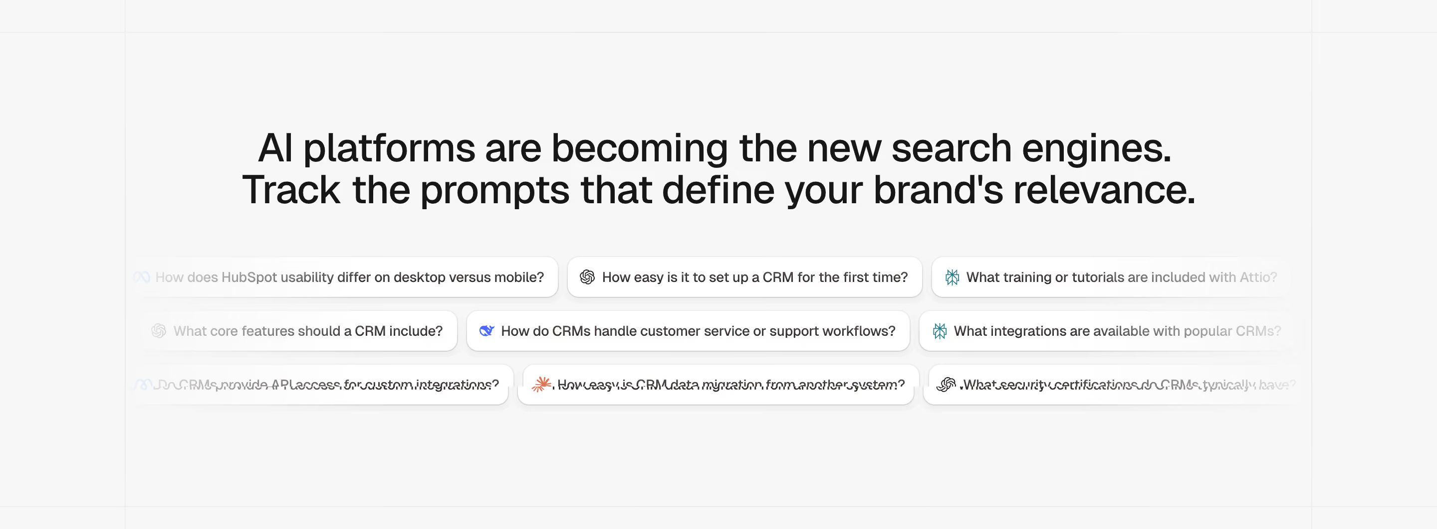
The Peec AI capture shows a persistent headline above several rows of compact prompt-like cards. The cards contain example questions and small source marks, with content fading toward the edges. The heading explains the section while the repeated examples provide texture and specificity beneath it.
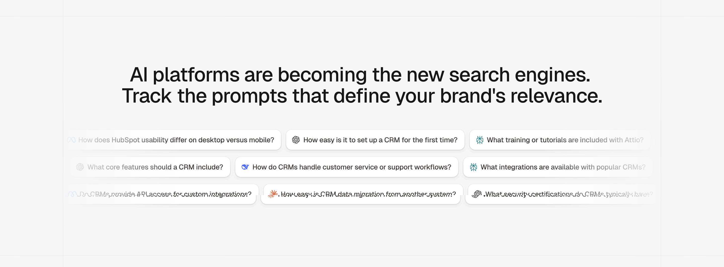
The useful hierarchy is a stable proposition plus a supporting collection. Visitors can understand the section even if they do not read every question. The screenshot's pattern association identifies it as a marquee reference, but the still image itself does not prove continuous movement or any particular animation behavior.
When adapting this approach, keep the central claim in live, readable text. Do not place an essential explanation only on one moving card. The stream should illustrate the argument rather than become a puzzle visitors must watch to reconstruct the page's meaning.
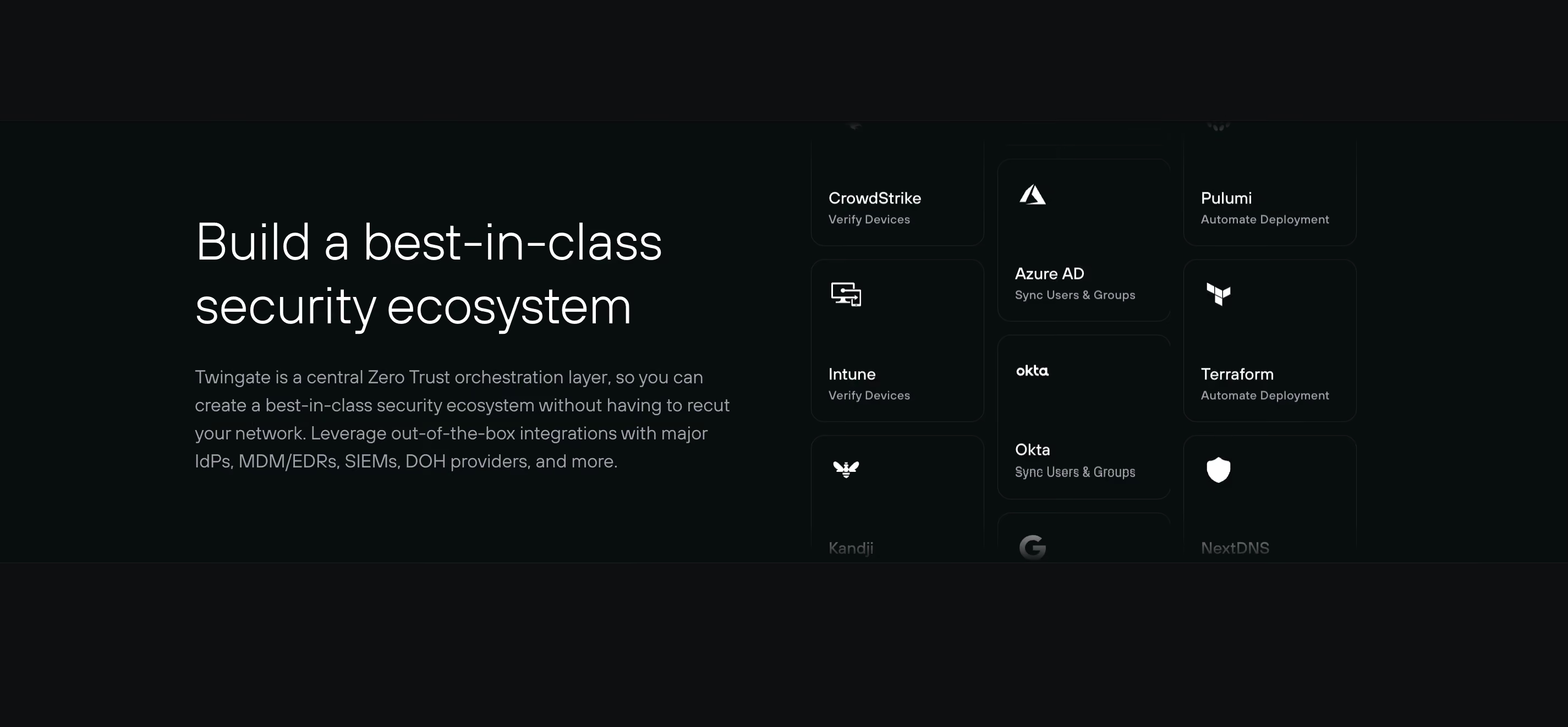
The Twingate capture pairs persistent explanatory copy with columns of integration cards. The cards combine service identities with short functional labels, and the collection fades toward the top or bottom boundaries. The presentation communicates more than a logo wall because the labels distinguish different roles within the ecosystem.
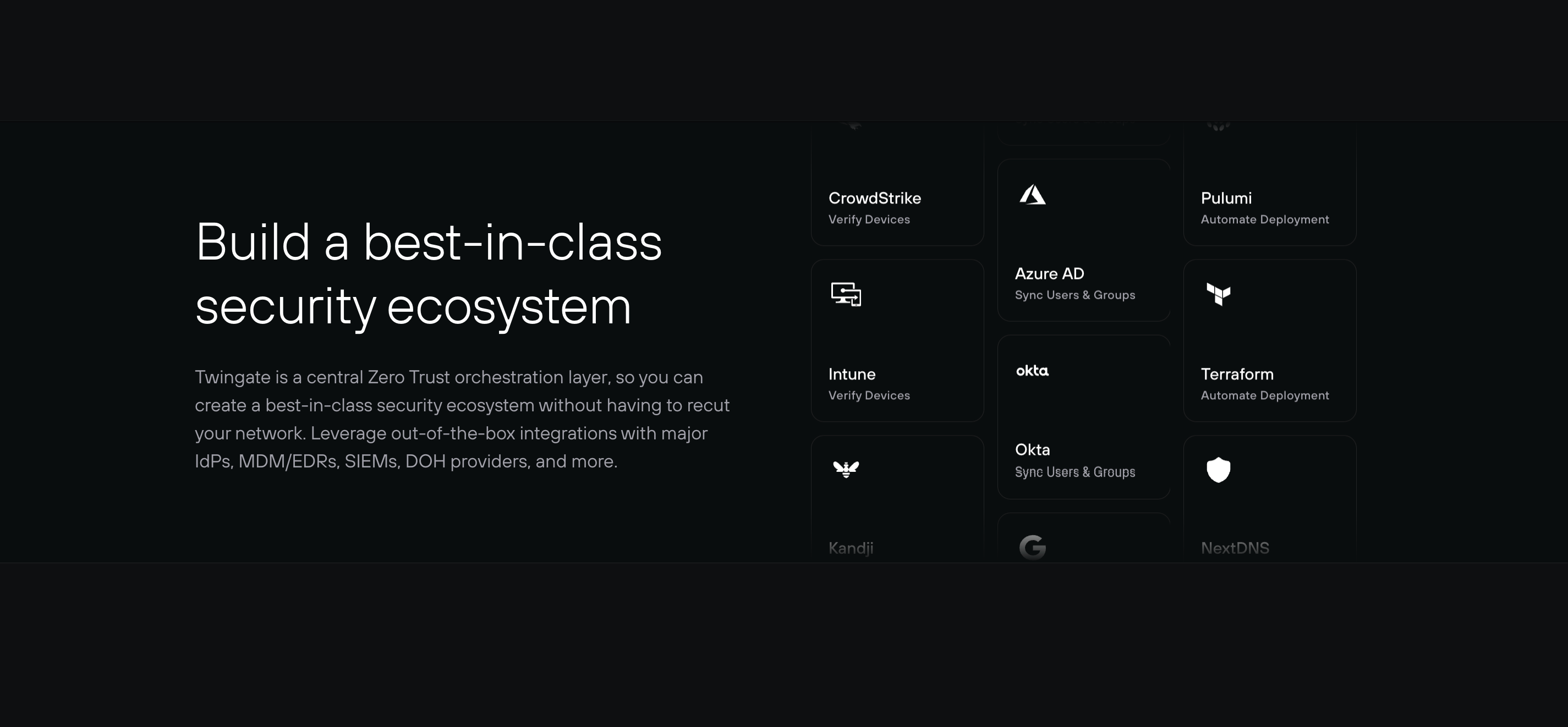
The design lesson is that compact metadata can make a dense collection more interpretable. A visitor may recognize a name but still need to know whether it relates to identity, device verification, or deployment. The capture does not establish current integration support or technical capabilities; those details need their own verified product source.
If the cards are intended to lead to details, provide an interaction model that allows someone to select an item reliably. A moving target can be difficult to activate. If the cards are decorative illustrations, avoid making them look like navigation without offering the expected destinations.
The speed, direction, and amount of visible content shape how demanding the stream feels. Multiple rows moving in different directions can emphasize abundance, but they also create more visual activity. Review the effect in the full page rather than only in an isolated component preview.
Allow enough time to recognize an item when reading is part of the intended task. Long quotations require a different pace and presentation from simple marks. Do not solve unreadable motion by reducing text until the content loses its usefulness.
Avoid abrupt jumps at the loop boundary. A visually continuous stream should not periodically reset in a way that looks like a loading error. Yet a seamless loop is only a presentation quality; it does not answer whether the movement itself serves the visitor.
People need practical ways to read and interact at their own pace. Consider a visible pause control and a static mode appropriate to the content. A hover-only pause does not help someone navigating with a keyboard or using a touch device without a pointer hover state.
If interaction pauses the stream, make the behavior coherent. A visitor should not have a card move away while its link is focused or while they are trying to activate it. Review how movement resumes so it does not immediately disrupt the action they were preparing to take.
Respect reduced-motion needs in the actual implementation. A static grid or still arrangement can preserve the collection's meaning. Do not replace the marquee with an empty region when animation is disabled; the useful content should remain available.
An apparently endless loop may duplicate items to maintain continuity. Those visual duplicates should not force someone to encounter the same links repeatedly in a confusing reading or focus order. Distinguish the meaningful collection from copies that exist only for the visual effect.
Ensure that the accessible presentation gives a sensible account of the unique items. A stream with twelve distinct integrations should not appear to contain thirty-six separate integrations simply because the animation repeats the sequence three times.
If the stream is purely decorative, provide an appropriate stable explanation or collection route elsewhere. If it is informational, its unique content needs to remain understandable without requiring someone to wait through a loop. Choose the semantics according to the purpose, not the animation technique.
Faded boundaries can suggest that the collection extends beyond the visible area. They can also reduce contrast and make partial text difficult to read. Use them to frame supporting content rather than to obscure a card someone is expected to inspect.
Avoid placing an operable control in a region where the fade makes its label or focus indication hard to see. A focused item should remain clearly visible. On narrow screens, review whether the fade consumes so much space that only fragments of every card remain readable.
Keep the relationship between the stream and the persistent text apparent. A fade can create a polished transition into the page background, but the content still needs enough structure for visitors to recognize whether they are looking at testimonials, questions, or integration options.
The main message should not depend on every moving asset loading successfully. Service names, source labels, or short descriptions can preserve meaning when a logo fails. Avoid a stream of blank cards that appears to be a functioning collection.
If the content is retrieved dynamically, decide what appears before it is available and when it cannot load. A stable curated subset or a clearly labeled collection route may be more useful than an indefinite animation placeholder. Keep failures local to the optional supporting section.
Review the effect of missing items on the loop. Gaps or sudden changes in card dimensions can make movement appear broken. Maintain readable sizing without silently inventing replacement testimonials, marks, or relationships to keep the stream full.
Several horizontal rows can become visually dense on mobile. Consider fewer rows, a static selection, or a compact collection route. Preserve readable text and usable actions instead of scaling cards down until they become decoration.
Vertical streams have their own constraints. They can imply more content above and below, but they should not be confused with the page's main scroll. Make the section boundary clear and avoid intercepting ordinary navigation in unexpected ways.
Test text zoom and translated content. Long names or descriptions can alter card height and affect both readability and continuity. A motion design should tolerate realistic content rather than depend on every item having the same short label.
Ask visitors what the section communicates and whether they can inspect a relevant item when they want to. If they notice motion but cannot explain the collection's purpose, strengthen the persistent proposition or simplify the stream.
Check keyboard navigation, pause behavior, reduced-motion presentation, focus visibility, duplicate content, missing assets, and the loop boundary. Measure meaningful exploration of the collection rather than only time spent watching the effect.
Explore the SaaSFrame infinite-marquee collection to compare prompt examples, integration cards, and other repeated content. Use the captures to study hierarchy and density, then test motion and interaction separately in your implementation.
Is a marquee appropriate for long testimonials? Long text is difficult to read while moving. Provide a stable reading route and consider whether manual browsing or a static selection serves the evidence better.
Should the stream be clickable? Only if visitors can reliably identify and activate the destinations. Moving cards need predictable focus and pause behavior; decorative cards should not imply unsupported navigation.
What should appear when motion is reduced? Preserve a useful static collection or summary with access to details. The information should remain available even when the continuous effect is disabled.