 SaaSFrame
👩🎓 For Education Page
Tailor your software for the classroom with SaaS for Education and Student landing pages. These examples showcase student discounts, teacher-specific tools, and classroom management features designed for the EdTech sector.



Index of all 4 For Education Page examples
👩🎓 For Education Page: design guide
A SaaS education page should connect an educational audience to a relevant use case and an understandable access route. Students, educators, and institutional buyers may share a page while needing different explanations and actions.
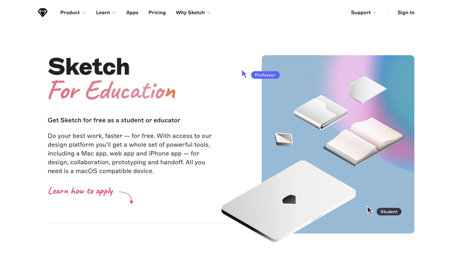
The SaaSFrame captures illustrate educational offers and partnership positioning. Their eligibility and pricing claims belong to the historical pages rather than serving as current program information.
Identify the audience before the offer
State who the page serves. A student building a portfolio needs a different route from a faculty member adopting a tool for a class or an institution considering a partnership.
Separate those routes where requirements differ. A general education headline should not conceal that only one group qualifies for the displayed benefit.
Keep the educational task concrete: collaboration, design, publishing, or building projects. A discount alone does not explain why the product belongs in a learning environment.
Explain the access sequence
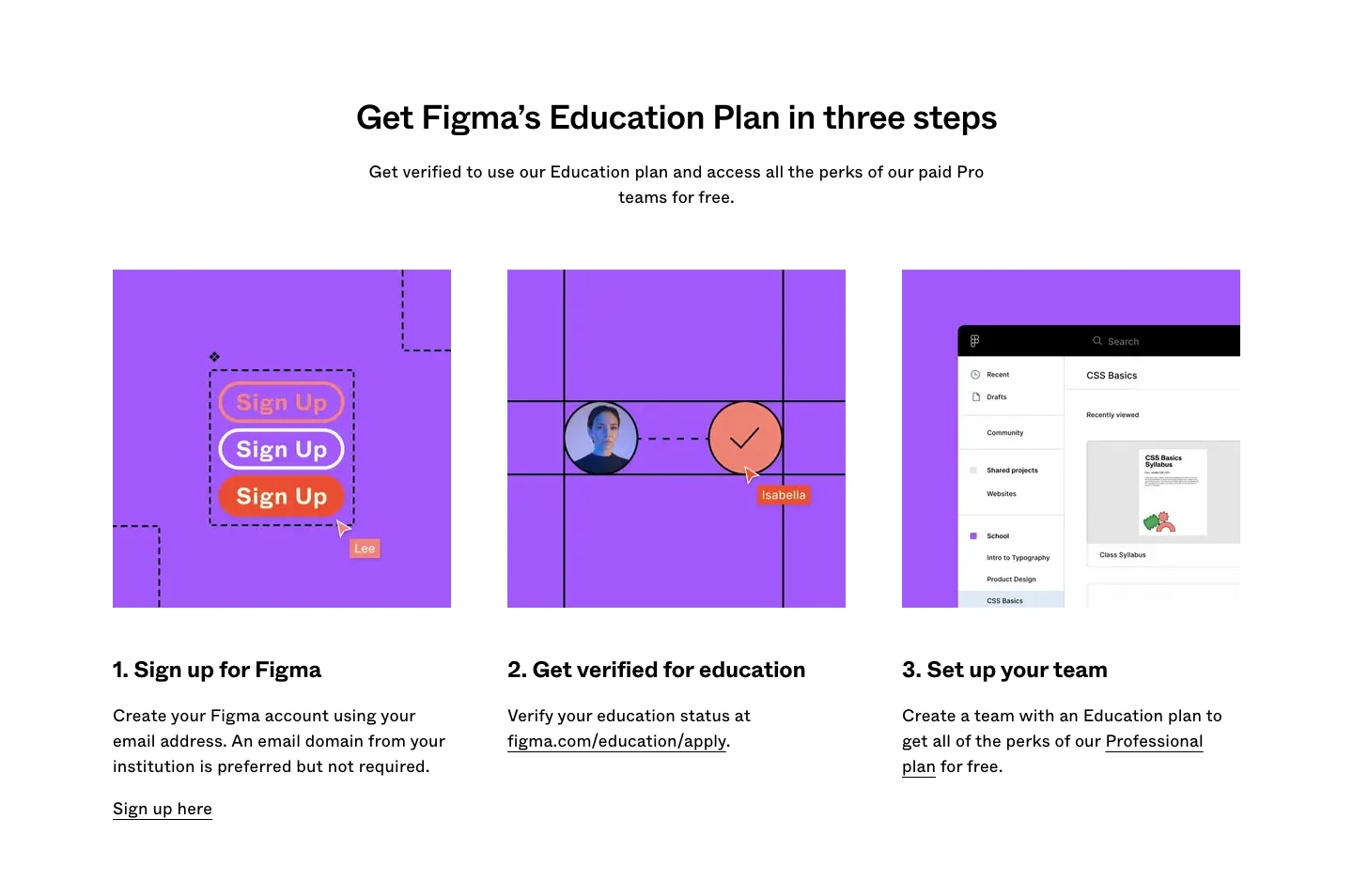
The Figma education reference presents an education-plan message followed by a three-step sequence: signup, education verification, and team setup. Later sections address educators, students, classroom use, and questions.
This helps visitors understand that an offer and access to it are separate stages. Show the actual sequence and prerequisites rather than using a CTA that implies immediate eligibility.
Verification requirements should remain accurate and reachable. Do not copy another product's educational rules into your own offer or present a capture's plan details as current.
Put eligibility near the application route
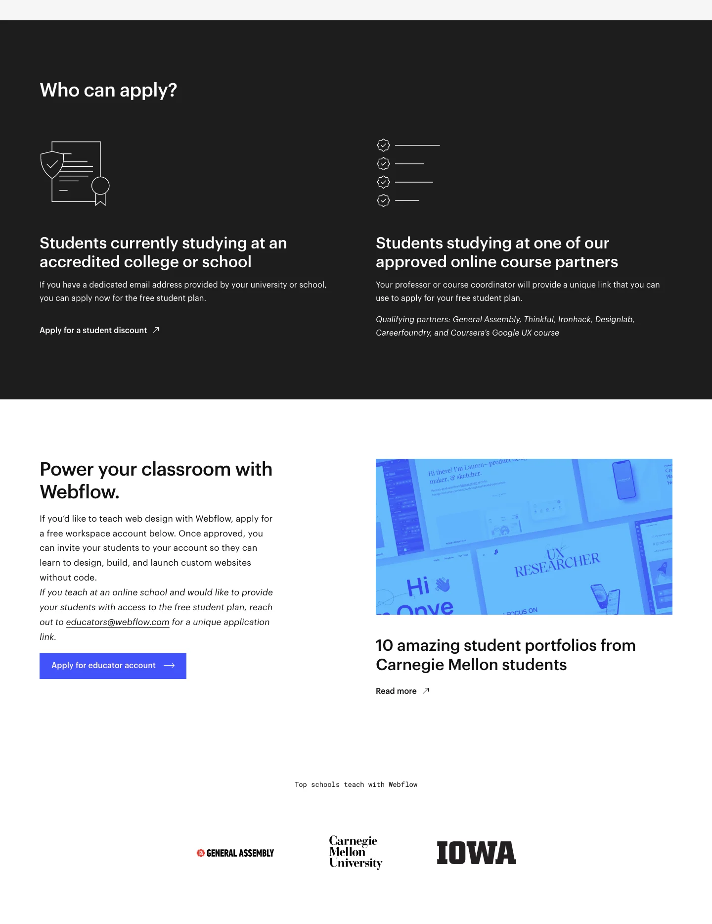
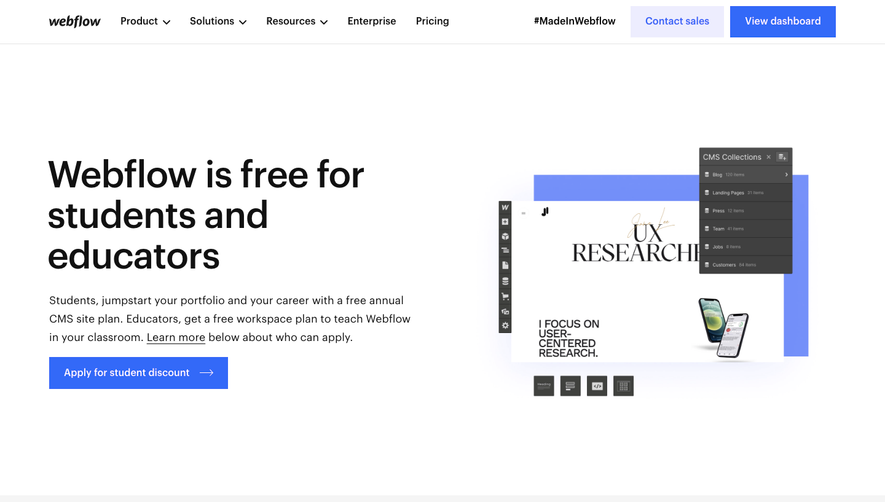
The Webflow capture includes an application action, a who-can-apply section, classroom positioning, templates, and learning material. The page connects the offer to practical student work.
Eligibility information should help visitors decide whether to proceed before they invest effort in an application. Explain relevant institution or course requirements through the actual program.
If educators and students follow different processes, give them clear entry points. A single broad form can create unnecessary back-and-forth when the page already knows the distinction.
Support institutional adoption separately
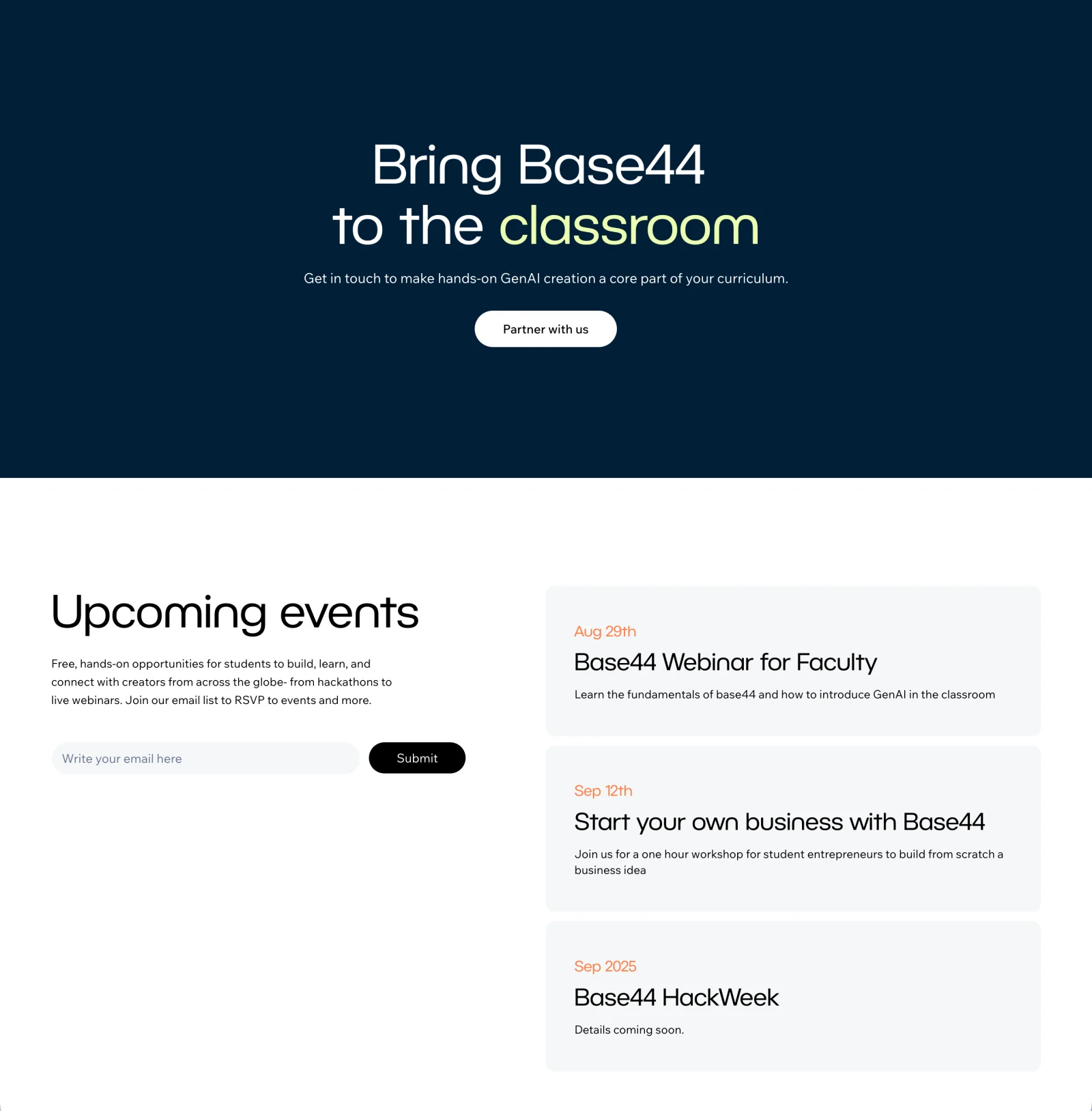
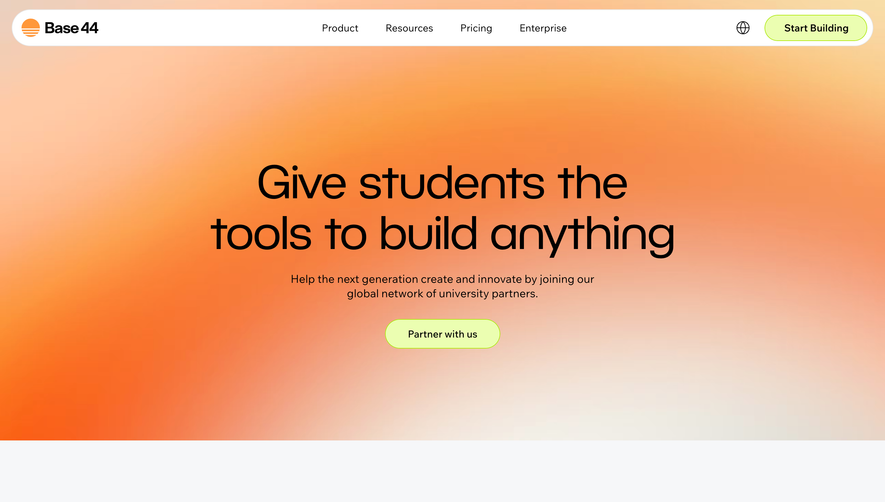
The Base44 reference leads with giving students building tools and offers a partnership action. It follows with institution logos, curriculum positioning, and an events area.
This is a different commitment from an individual student signup. A partnership route should explain what a faculty member or institution can discuss and what information the team needs.
Institution logos can provide context but should not replace the practical explanation. A visitor still needs to understand the adoption path and intended classroom use.
Connect the product to learning outcomes
Show relevant examples, templates, or course material that help an educator imagine a lesson or a student imagine a project. Identify what the resource teaches or enables.
Avoid presenting polished product imagery as proof of improved educational outcomes. Describe the supported activity and preserve context around any attributed result.
Provide a beginner route when the audience may be unfamiliar with the tool. Access to software and the ability to use it effectively are different needs.
Explain program boundaries
Visitors may need to know the access duration, renewal or reverification route, included capabilities, and what happens when eligibility ends. Keep those details aligned with maintained program information.
Do not bury consequential limits beneath an unqualified free headline. State enough to make the offer understandable and link to the complete conditions.
Explain support routes for applicants and existing education users separately where the tasks differ.
Review each audience's journey
Test whether a student, educator, and institutional contact can identify the correct route, understand requirements, and find a practical first resource.
Check expired eligibility, unsuccessful verification, and questions about team setup. The page should lead to a coherent process rather than a dead-end form.
Use SaaSFrame's education-page references to compare audience routing and offer explanation. Build around the learning task and the actual access model.
Education page questions
Should students and institutions use the same CTA?
Only when the process truly matches. Individual access and institutional partnership usually need distinct expectations.
Where should eligibility appear?
Place its summary near the application action and provide a maintained route to complete conditions.
Is an education discount enough for the page?
No. Explain relevant learning activities, access steps, and practical resources for beginning use.