 SaaSFrame
🪄 Account Setup
Streamline your user journey with the best SaaS Account Setup UI examples. From progress bars to personalized profile creation, discover how to reduce time-to-value by designing frictionless account configuration flows that keep new users engaged.
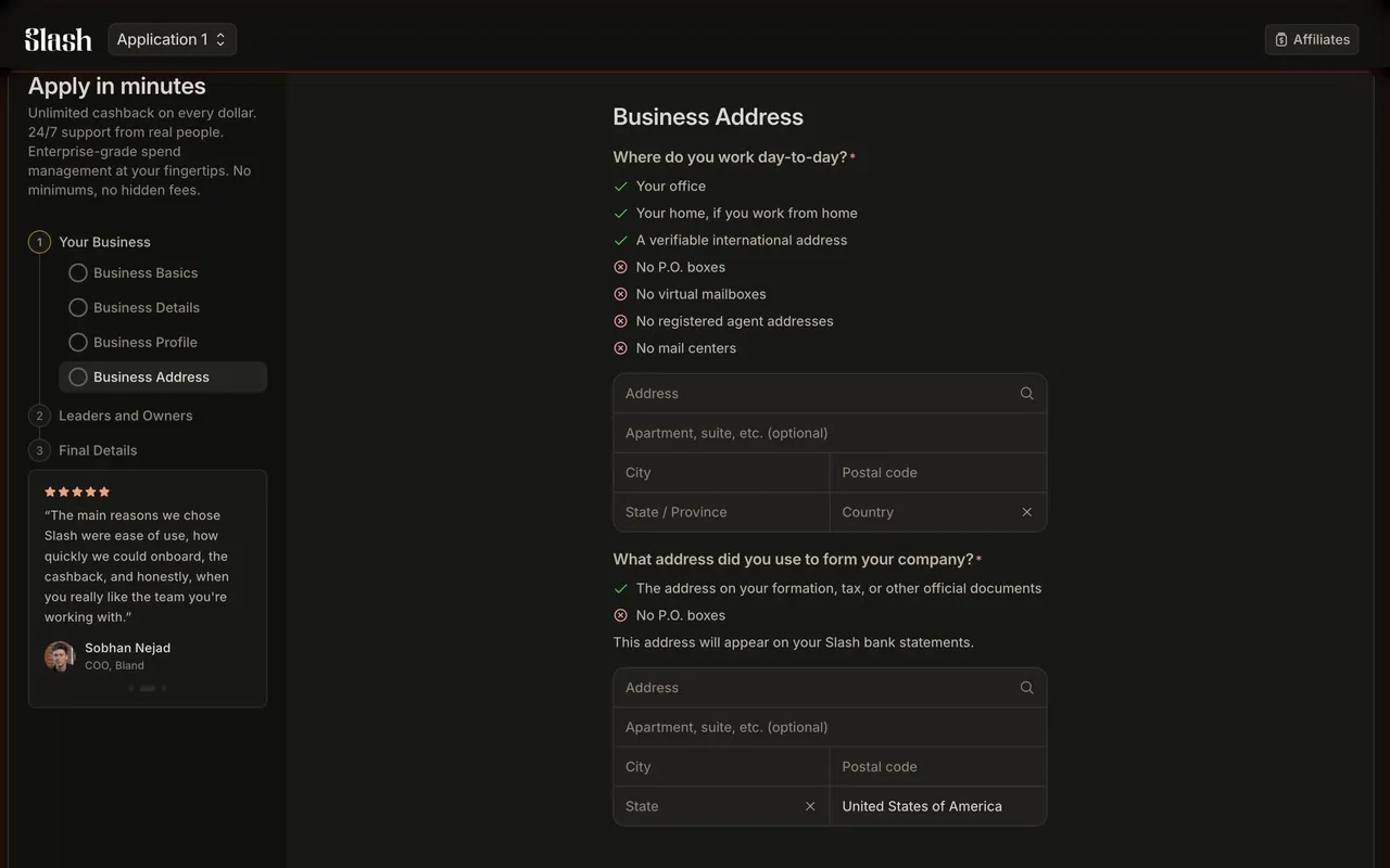

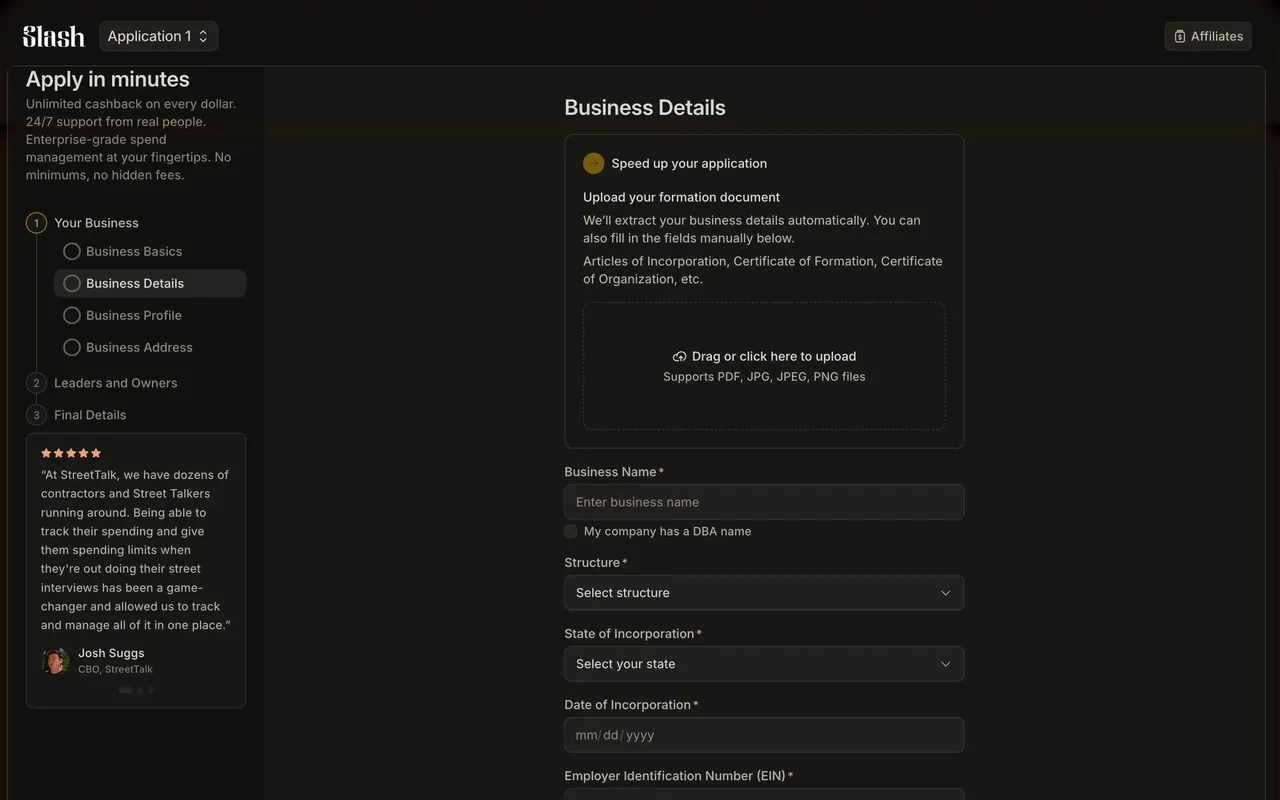
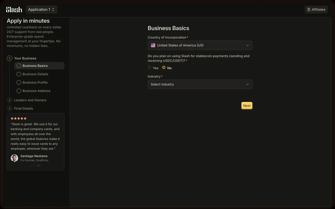
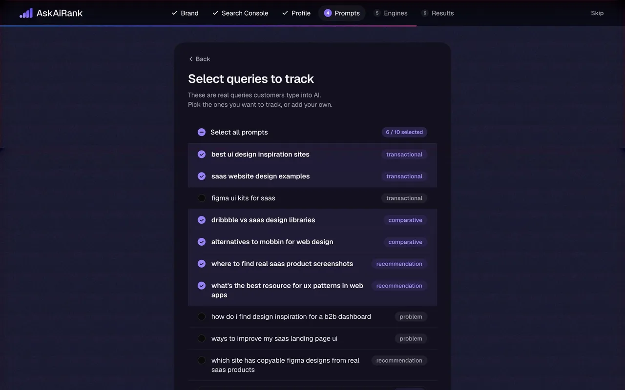
Index of all 592 Account Setup examples
- AskAiRank Onboarding Prompts Step
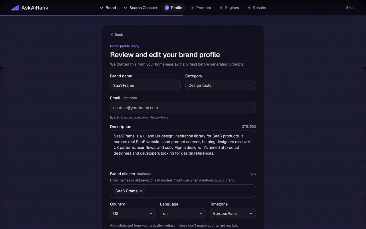
- AskAiRank Onboarding Brand Profile Step
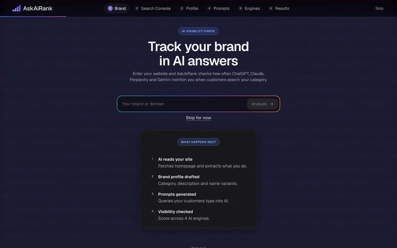
- AskAiRank Onboarding Brand Step
- Rox Onboarding First Outbound Prompt
- Rox Onboarding Accounts Picker
- Privacyboard Workspace Ready Modal
- Privacyboard Onboarding Data Step
- Privacyboard Onboarding Tools Step
- Privacyboard Onboarding Company Step
- Privacyboard Onboarding Website Step
- Privy API Keys Modal
- Privy Onboarding Create First App
- Privy Onboarding Organization Step
- Respan Onboarding Gateway Setup
- Respan Onboarding Workspace Setup
- Voiceflow Atlas Onboarding Channel Step
- Voiceflow Atlas Onboarding Skills Step
- Unabyss Onboarding – Setup
- Dub Connect a custom domain
- Dub Choose a custom domain setup
- Dub Create a workspace
- Tines Account Profile Setup
- Hugging Face Complete your profile
- Profound Select Topics
- Profound Select Region
- Profound Running Prompts
- Profound AI Visibility Ranking
- Profound Add Company Details
- Profound Set Company Size
- Profound Set Email
- Rankfender Review Generated Prompts
- Rankfender Targeted Audience
- Rankfender Validate Topics
- Rankfender Select Topics
- Rankfender Select Keywords
- Rankfender Add Competitors
- Rankfender Add Competitors
- Rankfender Content Preferences
- Rankfender Review Brand Book
- Rankfender Generate Brand Book
- Rankfender Set Up Brand
- Dust Setup Platforms
- Dust Account Setup
- Prelude Add Prelude To App
- Prelude Create First App
- Unkey API Key Ready
- Unkey Create First API Key
- Unkey Create First API Key
- Unkey Create Company Workspace
- Visitors Setup Tracking
- Visitors Project Domain
- Visitors Project Name
- Visitors Profile Picture
- Visitors Account Name
- FullEnrich Account Setup
- Hume AI Account Setup
- Atlas Account Setup
- Atlas Account Setup
- Atlas Account Setup
- Atlas Account Setup
- Wise Multi-Factor Authentication Setup
- Wise 2FA Phone Number Already Used
- Wise Multi-Factor Authentication Setup
- Wise Multi-Factor Authentication Setup
- Wise Choose Country
- Wise Choose Account Type
- Pitch Account Setup
- Pitch Account Setup
- Pitch Privacy Optin
- Customer.io Account Setup
- Customer.io Skills Setup
- Customer.io Channels Setup
- Customer.io Goals And Experiences Set Up
- Customer.io Company Setup
- Superlist Account Setup
- Superlist Account Setup
- Superlist Account Setup
- GoFundMe Setup Banking Transfers
- GoFundMe Setup Banking Transfers
- GoFundMe Setup Banking Transfers
- GoFundMe Account Setup
- GoFundMe Edit Profile Picture
- GoFundMe Setup Profile Picture
- GoFundMe Foundraiser Review
- GoFundMe Foundraiser Details Setup
- GoFundMe Foundraiser Cover Photo Setup
- GoFundMe Edit Cover Photo
- GoFundMe Foundraiser Cover Photo Setup
- GoFundMe Account Details Setup
- GoFundMe Foundraiser Goal Setup
- GoFundMe Foundraiser Setup
- GoFundMe Foundraiser Setup
- Steep Account Setup
- Steep Account Setup
- Wiza Account Setup
- OpenAI Account Setup
- Latitude Account Setup
- Intercom Account Setup
- Intercom Account Setup
- Intercom Account Setup
- Intercom Account Setup
- Intercom Account Setup
- Uvodo Uvodo Account Setup
- Remote Employee Profile Setup
- Remote Employee Profile Setup
- Remote Employee Profile Setup
- Remote Complete Company Details
- Remote Complete Company Details
- Remote Basic Information Account Setup
- Hyperline Company Setup
- Hyperline Account Setup
- Copperx Account Setup
- Copperx Account Setup
- Cal.com Account Setup
- Cal.com Upload Avatar
- Cal.com Upload Avatar
- Cal.com Account Setup
- Cal.com Set Availabilities
- Cal.com Connect Video Apps
- Cal.com Connect Calendar
- Cal.com Account Setup
- Dock Account Setup
- Audienceful Account Setup
- Frame Account Setup
- Frame Account Setup
- Sandhill Markets Account Setup
- Sandhill Markets Account Setup
- Rise Account Setup
- Rise Account Setup
- Rise Account Setup
- Rise Account Setup
- Rise Account Setup
- Rise Account Setup
- Rise Account Setup
- Albato Account Setup
- Albato Account Setup
- Expertpage Account Setup
- Sellx Account Setup
- Plausible Analytics Account Setup
- Plausible Analytics Account Setup
- Duffel Account Setup
- Duffel Account Setup
- Loops Import Contacts
- Loops Connect Domain
- Loops Improve Deliverability Setup
- Loops Domain Setup
- Loops Account Setup
- Zeda.io Account Setup
- Zeda.io Account Setup
- Routine Account Setup
- Stripe Account Setup
- Mixpanel Account Setup
- Mixpanel Account Setup
- DataPulse Account Setup
- DataPulse Account Setup
- Livestorm Account Setup
- Cake Equity Account Setup
- Cake Equity Account Setup
- Cake Equity Account Setup
- Cake Equity Account Setup
- Cake Equity Account Setup
- Cake Equity Account Setup
- Tona Account Setup
- Linktree Choose A Plan
- Linktree Add Links
- Linktree Add Links
- Linktree Tell Us About Yourself
- Linktree Tell Us About Yourself
- Linktree Set Your Name
- Arc Account Setup
- Arc Account Setup
- Arc Account Setup
- Arc Account Setup
- Arc Account Setup
- Arc Account Setup
- Arc Account Setup
- Arc Account Setup
- Arc Account Setup
- Arc Choose MFA Method
- MonSpark Account Setup
- MonSpark Account Setup
- MonSpark Account Setup
- MonSpark Account Setup
- MonSpark Account Setup
- Popwork Account Setup
- Popwork Account Setup
- Hopscotch Account Setup
- Hopscotch Account Setup
- Hopscotch Account Setup
- Hopscotch Account Setup
- Hopscotch Account Setup
- Hopscotch Account Setup
- Hopscotch Account Setup
- Hopscotch Account Setup
- Hopscotch Account Setup
- Assembly Account Setup
- Assembly Account Setup
And 392 more in the library.
🪄 Account Setup: design guide
Short answer
SaaS account setup collects the information a product needs before someone can use it well: name, workspace, website, region or use case. Ask only what changes the experience, group fields by decision, show progress in longer sequences, keep optional inputs clearly optional and hand off to a useful first task.
In the libraryas of November 2026
- Screens
- 592
- SaaS products
- 156
- Last added
- Nov 2026
Common patternsText Input 226Progress Indicator 194Wizard 78File Upload 47Card 30
Recently addedSlashAskAiRankRoxPrivacyboardPrivy
SaaS account setup establishes the information and configuration a person needs before using a product effectively. It can include a name, workspace details, a brand website, regional preferences, or a choice about how the product will be used. Good setup design makes each request understandable and asks for it at a moment when the user can see its purpose.
The SaaSFrame examples in this guide show different ways to collect that context. They are references for interface structure and visible choices, rather than proof of conversion performance. The goal is to learn which decisions belong together, which inputs can wait, and how to make progress honest.
What does an account need to know before first use?
Begin with the minimum state required for the user's first useful task. A personal task tool may need very little beyond identity. A brand-monitoring service may need a website and market context before it can produce relevant results. These products should not share the same setup questionnaire simply because both sell SaaS subscriptions.
For each field, identify the behavior it enables. If the answer changes generated content, displayed language, collaboration settings, or an important default, explain that relationship when it is not obvious. If it only supports internal reporting, consider collecting it later.
Separate a hard dependency from a preference. Required inputs need a clear reason and a recoverable validation process. Optional inputs need a recognizable optional label and a valid route forward without an answer.
Distinguish person, workspace, and project context
A user's name belongs to a person. A company name may describe a workspace. A website may describe the brand or project being tracked. Combining these concepts under a vague “Tell us about yourself” prompt can create information that users later need to correct.
Make the subject of each question explicit. People managing several clients should understand whether they are naming their employer, their first client, or the workspace itself. Where the product supports multiple brands or projects, explain whether the current choice can be expanded later.
Use defaults only where they are trustworthy. An email domain can suggest an organization, but it should not silently determine the account's business identity. Let users inspect and correct inferred values before those values affect their work.
Study how Superlist keeps an identity step focused
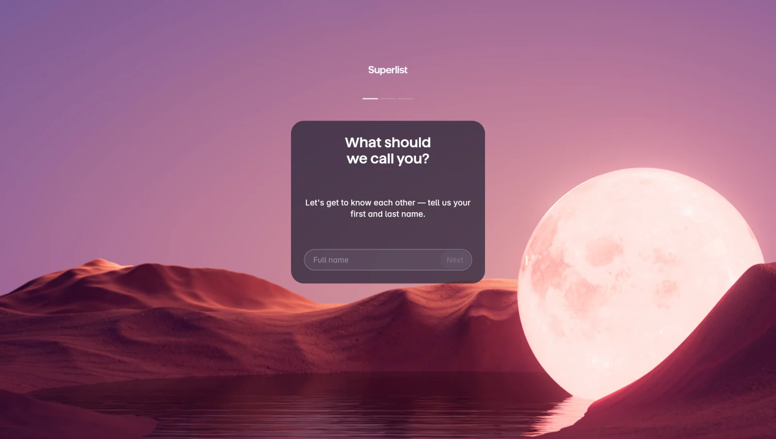
The Superlist full-name capture centers one input and a next action within a visually distinct screen. The request is easy to identify because it does not compete with a long questionnaire or several unrelated settings.
This approach suits a short, understandable identity step. Its simplicity also introduces a tradeoff: separate screens can add navigation effort when several small inputs could comfortably fit together. Choose the grouping according to the task, not according to a rule that every field deserves its own page.
A prominent visual background should preserve text and control readability. The form needs a persistent label, clear focus, and a usable submission state. A sparse layout does not remove the need for validation or accessible interaction.
Group fields by a decision the user understands
Related fields can belong together when they answer one coherent question. A brand name and website establish an object. A country and language establish relevant context. Combining unrelated demographic, billing, and integration questions makes the page harder to reason about.
Use short explanations where the purpose is specific to the product. “Website” may be obvious as a label, while the effect of choosing a target country may need more context. Explain the consequence rather than adding generic encouragement beneath every field.
Keep the initial request proportional to the value available next. A detailed questionnaire may be justified when every answer improves a requested result, but the interface should make that relationship concrete and allow correction later.
Make longer setup sequences visible
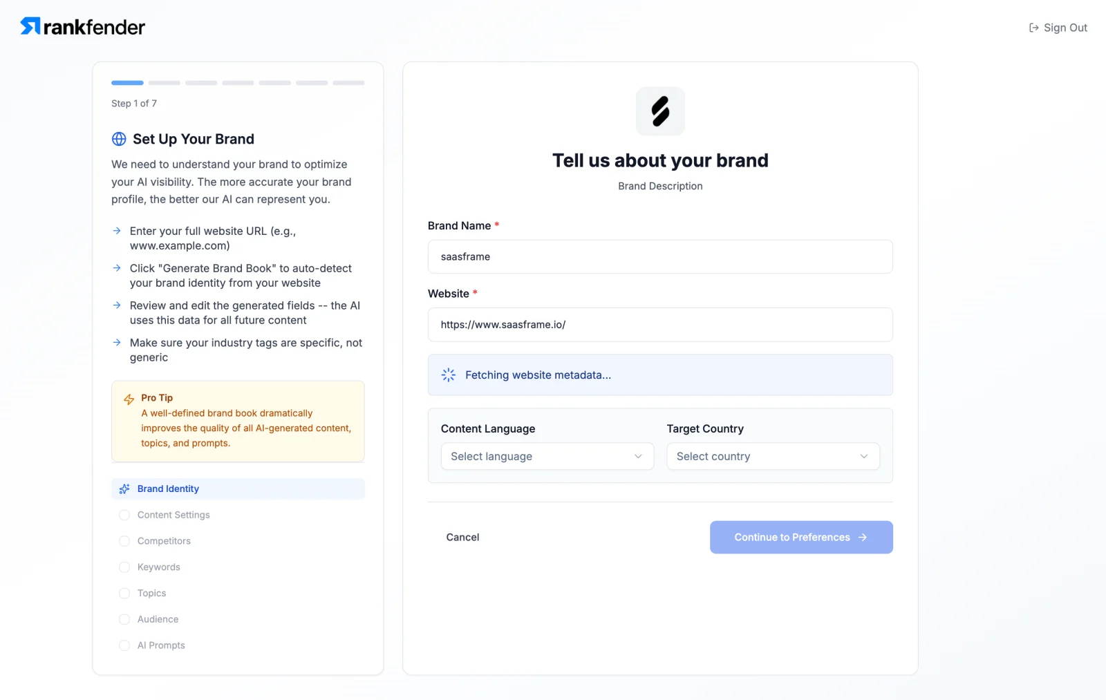
The Rankfender brand-identity capture shows a seven-part sequence in a sidebar. The listed areas include brand identity, content preferences, competitors, keywords, topics, personas, and prompts. The active page groups brand details with language and country choices.
The sidebar gives users a view of the broader work before they commit to the next step. This matters when setup requires domain knowledge and more effort than a name or password. It also creates a clear place for the current step within the sequence.
The design question is whether every part must be completed before useful work can begin. If the product can provide an initial result with fewer answers, consider a shorter required path and later refinement. If the sequence is necessary, explain the expected effort and preserve answers between steps.
Separate regional choices from interface language
A country may describe a target market, a user's location, or an account's operating region. A language may describe generated content or the interface itself. Those meanings are different and should not be left to inference.
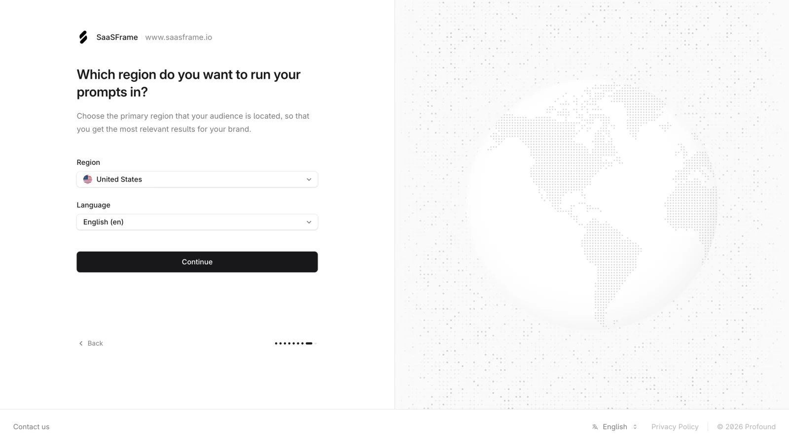
The Profound region capture presents country and language as separate controls and explains their relevance to the prompts used for the brand. The visible brand context helps connect the regional decision to the object being configured.
When adapting this structure, label the actual purpose of each setting. Do not assume that a user's browser language is the language of the content they want to analyze. If changing the region affects existing data or only future work, explain that consequence where users make the choice.
Explain business questions without overloading the flow
Company size, role, or agency status may help tailor a product experience. They can also become friction if users do not understand why the questions are present or if the available answers do not describe their situation.
The Profound company-size capture groups several employee ranges with an agency choice. This illustrates a distinction between the scale of an organization and its operating model. Those are separate pieces of context even when they appear on one page.
Avoid claiming personalization unless the answer actually changes something useful. If a question is optional, let users continue without manufacturing an answer. If it is required for a concrete workflow, explain that requirement and provide categories broad enough for the intended audience.
Make mandatory and optional brand inputs explicit
The Profound start-tracking-brand capture presents a website alongside optional brand details and indicates that additional information can be added later. This makes a useful boundary between establishing the initial object and enriching it.
A website input needs validation that accommodates realistic formats. Explain accepted values when necessary and distinguish malformed input from a failed lookup. A lookup failure should not imply that the person typed the wrong brand when the underlying service may be unavailable.
If the product derives a name or description from the website, show the result and allow correction. Generated or inferred information should not become an invisible source of errors in later recommendations or reports.
Keep consent choices distinct and understandable
The Superlist terms capture presents agreement and a marketing preference as separate controls. That visible separation is useful for understanding the different purposes of the choices. It should not be treated as evidence that a particular implementation meets every applicable requirement.
Use plain labels that describe what the user is choosing. Where a choice requires reading additional information, make the relevant link available without unexpectedly discarding the form. Do not allow decorative copy or a single bundled checkbox to obscure distinct decisions.
The interface should reflect the actual effect of each control. Optional preferences should be editable where appropriate, and the product should not infer an affirmative choice merely because a user continued through setup.
Validate without losing answers
Validation should help users correct a specific problem. Keep entered values when an error occurs, place the message near the relevant input, and explain the next action. A generic banner alone often forces users to inspect every field again.
Choose validation timing carefully. Immediate feedback may help with a website format, while repeated errors during typing can interrupt the task. Validate when the system has enough information to provide a useful result.
If a next button is disabled, make the requirement understandable. A person should not need to guess which field or selection is blocking progress. Account for server errors separately from missing or invalid user input.
Preserve progress and permit correction
Setup can require information a user does not have immediately. Save completed answers where practical and provide a clear return path. Back navigation should not unexpectedly reset earlier work or remove a previously selected option.
Explain where settings can be changed after setup. A user may choose a region, company size, or brand description with imperfect information. The possibility of correction reduces the pressure of an early decision, provided the product actually supports it.
When a change has significant consequences, explain those consequences before applying it. A workspace name change and a data-region migration are not equivalent operations, even if both appear as editable fields in account settings.
Design for invited users and shared ownership
The person creating an account may not be the person responsible for every administrative decision. An invited member may not know company billing details, security requirements, or the correct integration credentials.
Adapt the requests to their role and permissions. Let people complete the work they can own and identify the remaining administrator tasks. A shared workspace should not collect inconsistent organizational settings from every new member.
For agency or multi-brand products, make ownership boundaries explicit. Users need to know which information is personal, which affects colleagues, and which belongs to a particular client or project. This is especially important when defaults carry into later work.
Hand off to a useful first task
Completing account setup should lead somewhere meaningful. Show what is ready and provide a specific next action. A generic success screen can leave users uncertain about why they supplied the information.
The next step might be creating an object, exploring a sample, or connecting a necessary source. If configuration remains incomplete, explain what can already be done and what still depends on additional work.
Use the user onboarding guide for the next stage. Setup establishes context; onboarding helps the user use that context to achieve an outcome. A clear handoff connects the two without treating every questionnaire answer as activation.
Test realistic account states
Test incomplete information, unusual names, long organization names, multiple brands, unsupported website formats, failed lookups, and interrupted sessions. Include invited users who cannot complete administrator work.
Review keyboard navigation, focus after an error, mobile layouts, and increased text size. A multi-step flow must remain usable when the sidebar collapses or the on-screen keyboard reduces the available space.
Measure where users abandon, revise answers, or seek help. Completion alone does not reveal whether the collected information is accurate or useful. Check whether users can proceed into the intended task with a coherent account configuration.
Frequently asked questions about SaaS account setup
Should setup use one page or several steps?
Use one page for a small coherent set of inputs. Use steps when the decisions are meaningfully distinct or require substantial explanation. Preserve answers and make the total effort understandable.
Which questions should be optional?
Questions that do not enable a necessary next action are candidates for deferral. Decide from the product's real dependencies and clearly label any input the user can leave blank.
Is account setup the same as onboarding?
They overlap, but setup establishes account context and configuration. Onboarding helps users accomplish work and understand how to repeat it. Design the transition between those responsibilities explicitly.