.webp)

Steep


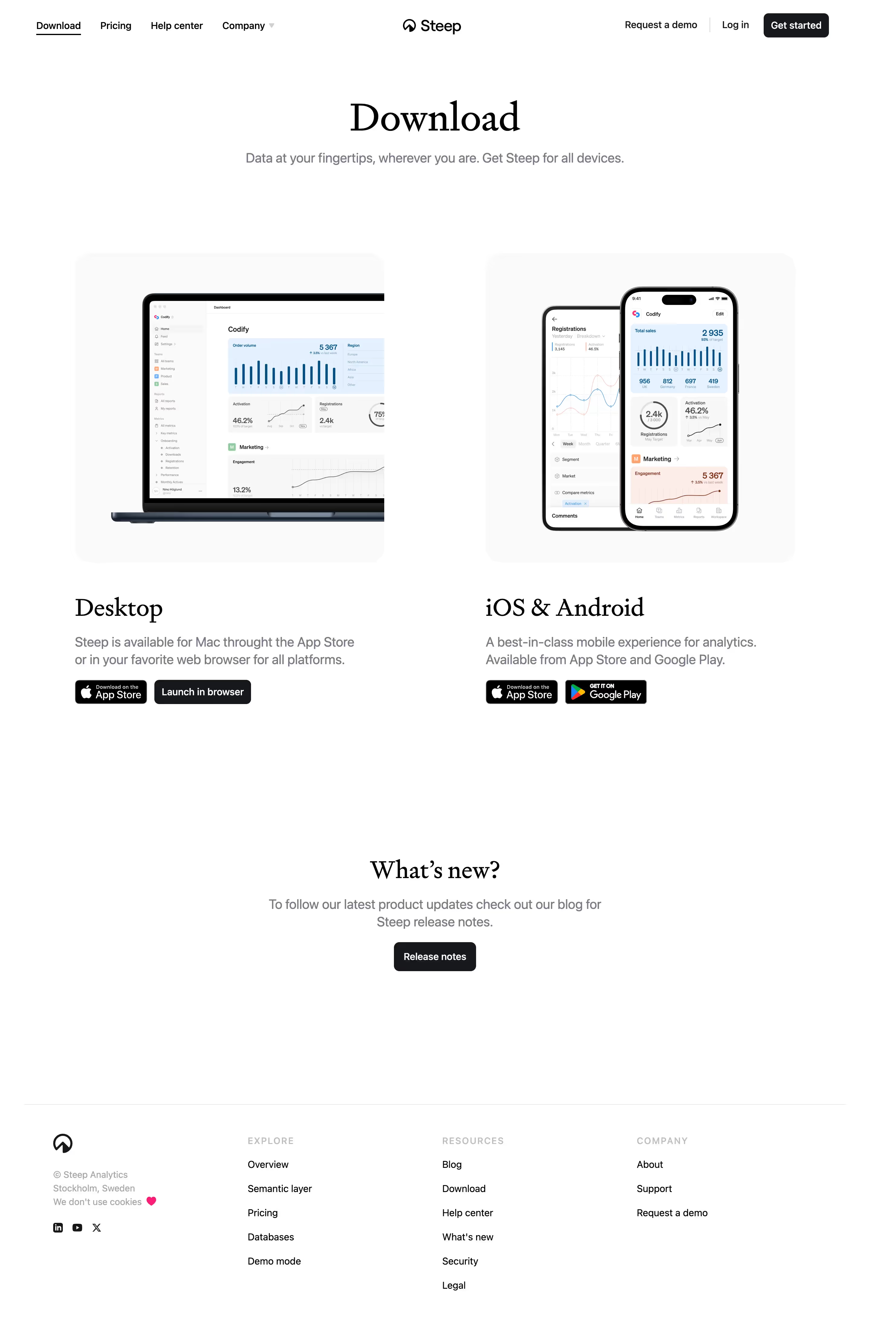


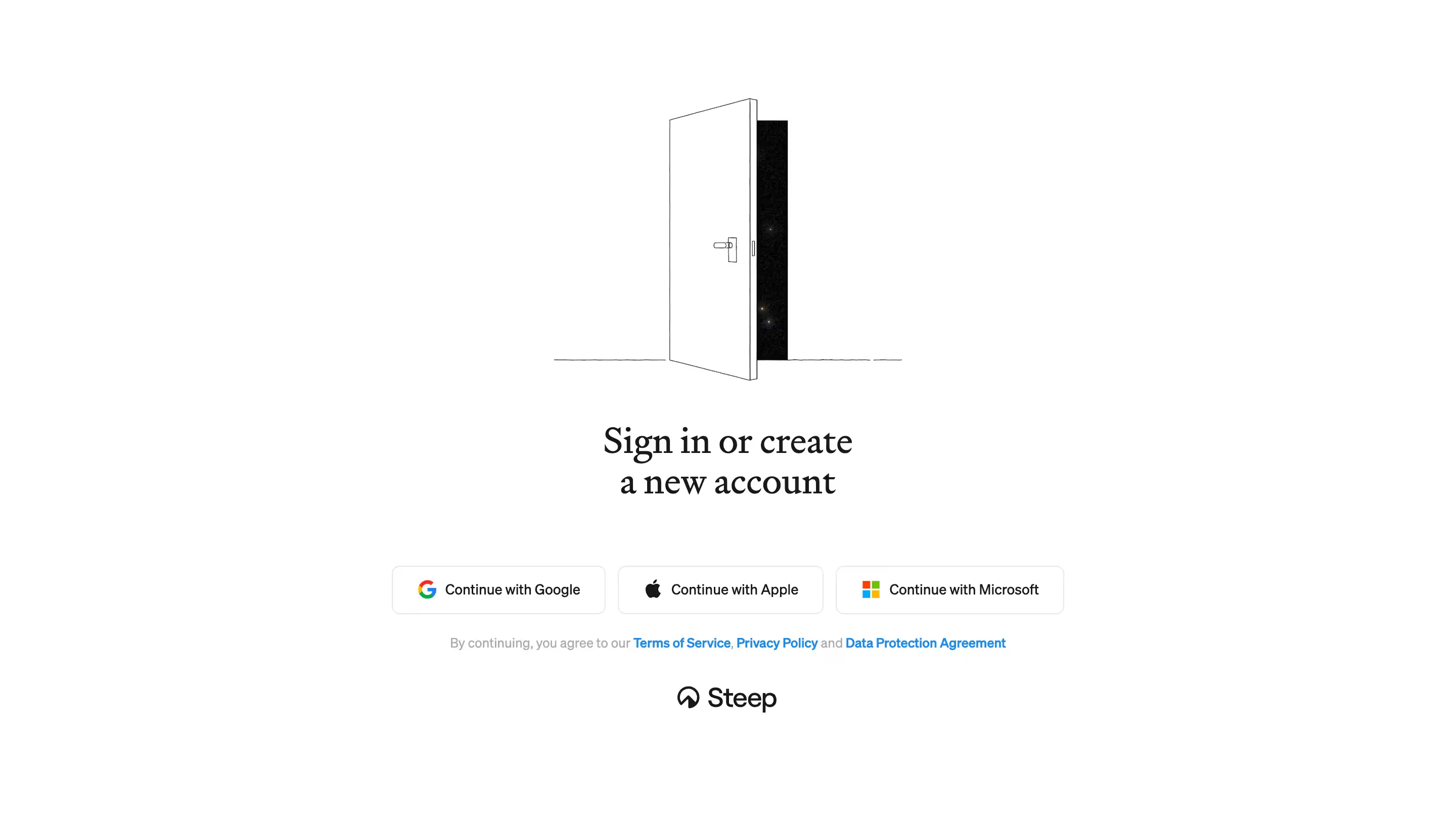


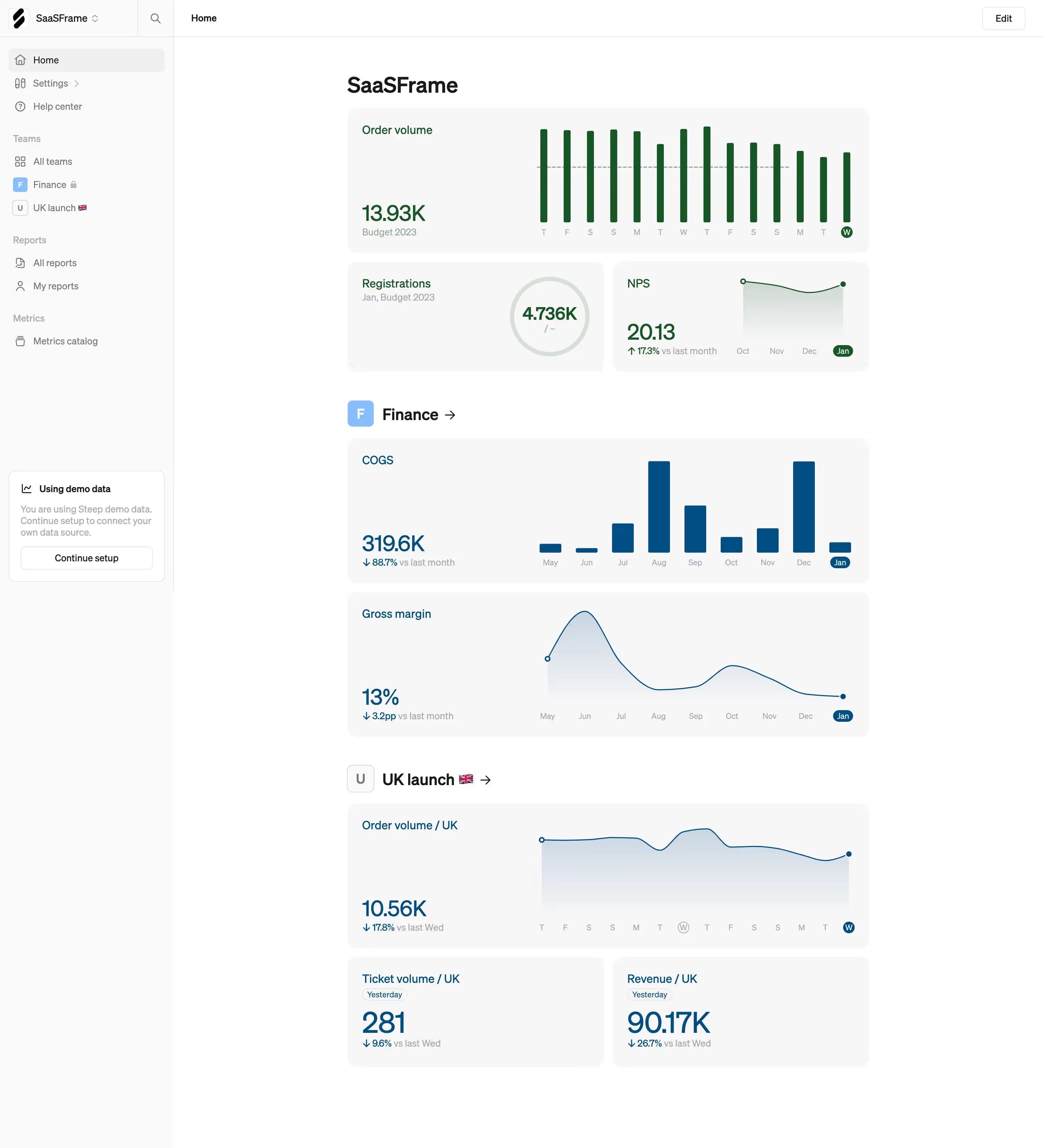

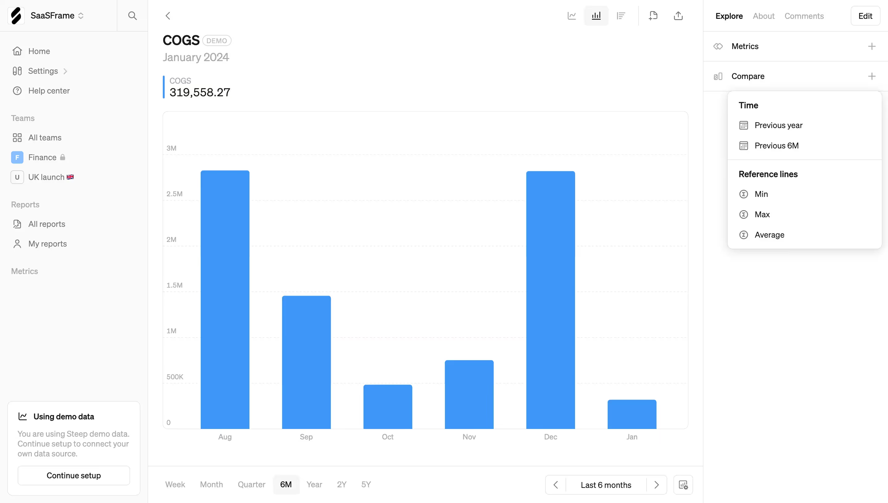
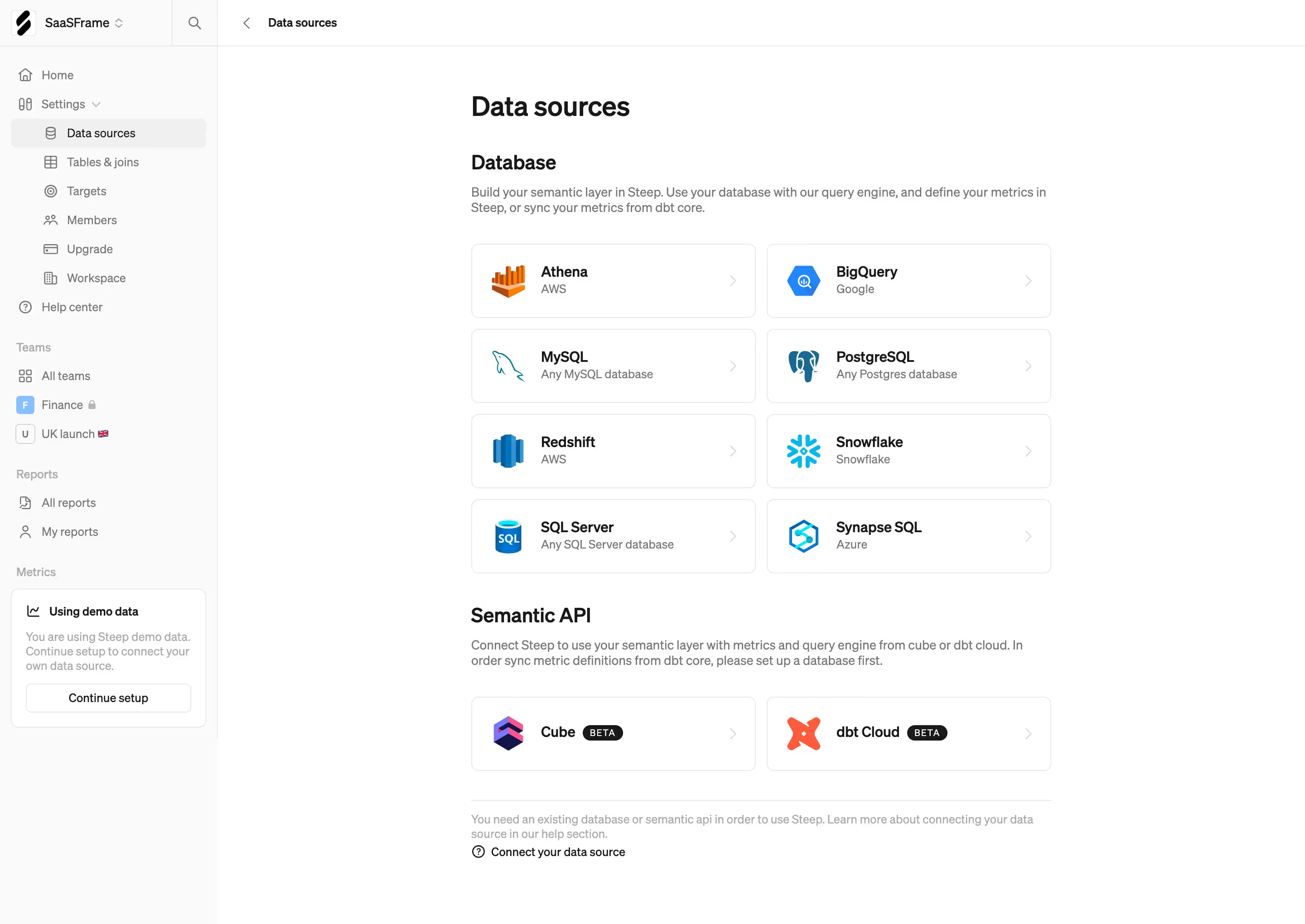

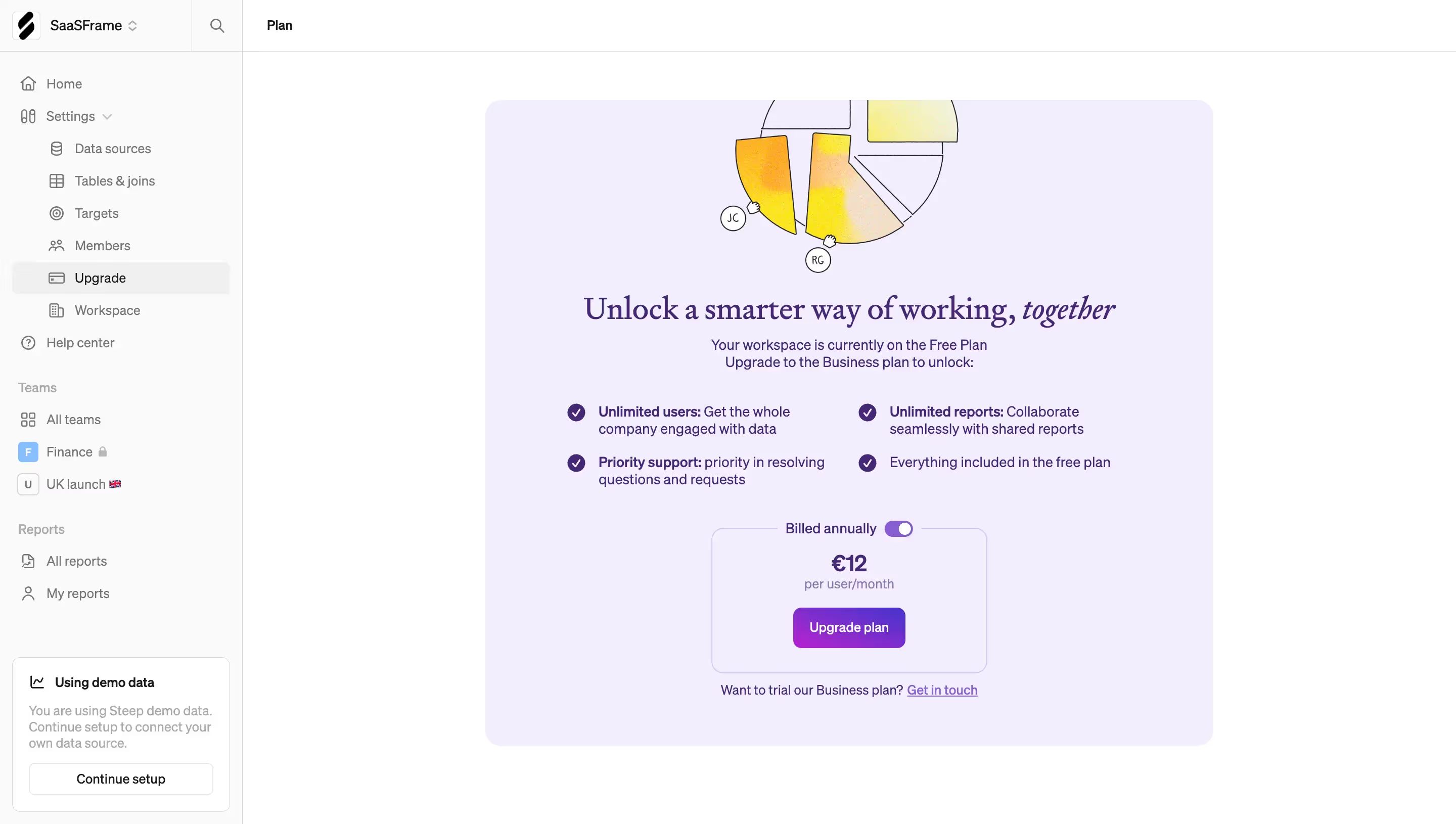

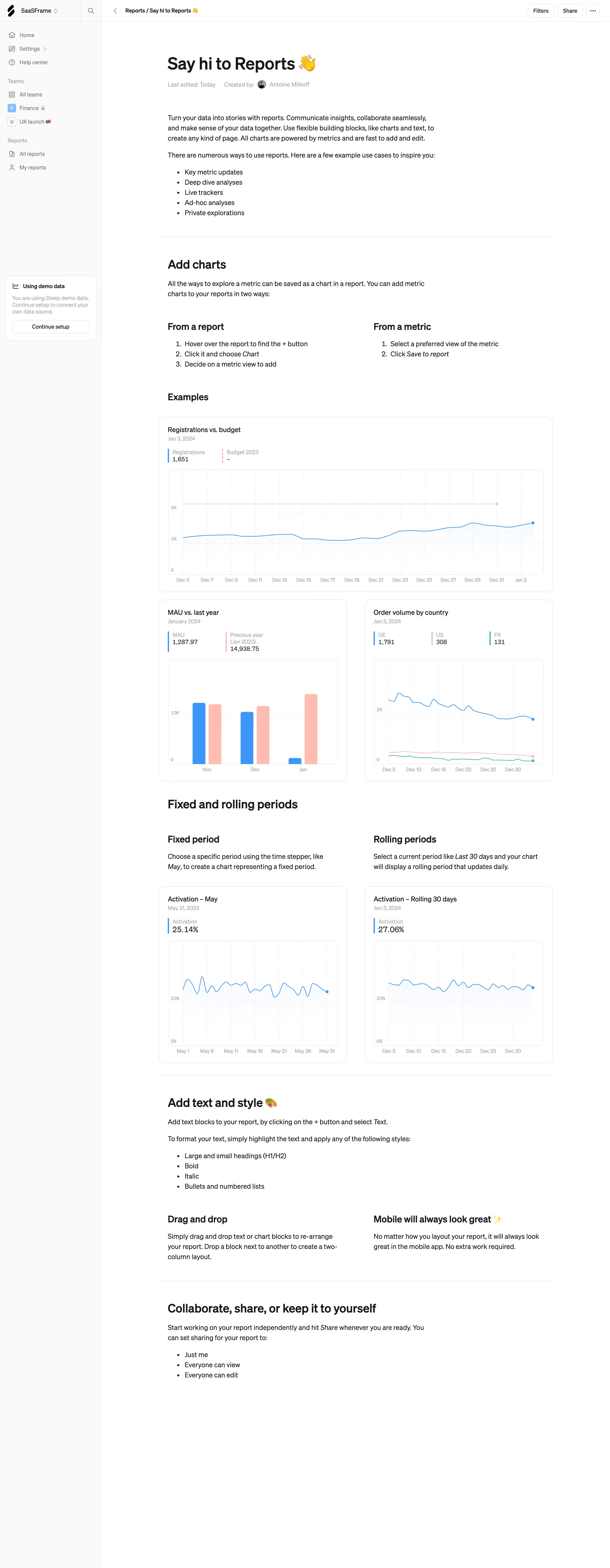

Steep Design System
Stack \- Framework: Next.js (App Router, \_next/ asset paths confirmed) \- Styling: Tailwind CSS + custom CSS modules (utility-first inferred) \- Fonts: Geometric sans-serif display, humanist sans body (custom/licensed) \- Icons: Custom SVG set \- Images: Next.js Image optimization (\_next/image?url=...&w=3840&q=75)
Typography \- Display: Large bold geometric sans, 48-72px, mixed roman + italic for brand keywords \- H2: 32-40px bold \- H3: 24px medium \- Body: 16-18px humanist sans-serif \- Caption/meta: 12-14px \- Italic used deliberately for emotional emphasis (zero chaos, your business) \- Tight tracking on large headings, normal on body text
Color Philosophy \- Dark-first marketing canvas: deep charcoal/near-black full-bleed backgrounds with photography \- Accent trio: coral-pink, sky-blue, warm gray (visible in hero UI block illustrations) \- Light sections: off-white (~#F7F6F2) for contrast alternation \- CTAs: filled dark pill (Get started), ghost/outlined pill (Book a demo) \- App UI screenshots: light-mode product on dark marketing background
Spacing \- Section vertical padding: 80-120px \- Container max-width: ~1200px centered \- Grid gaps: 24-32px \- Component internal padding: 16-24px
Component Defaults \- Buttons: pill shape (border-radius: 9999px), filled + ghost variants \- Cards: ~12px radius, subtle shadow or border \- Nav: transparent-to-sticky minimal top bar \- Logo strip: marquee infinite scroll animation \- Feature sections: tab switcher with animated panel transitions
Layout \- Full-bleed hero with centered text + product screenshot \- Alternating dark/light sections for visual rhythm \- 3-column feature grids on desktop, single column mobile \- Pricing: 3-column card layout with comparison table below
:root { / Typography / --font-sans: 'Inter', 'DM Sans', ui-sans-serif, system-ui, sans-serif; --font-display: var(--font-sans); --font-size-xs: 0.75rem; / 12px / --font-size-sm: 0.875rem; / 14px / --font-size-base: 1rem; / 16px / --font-size-lg: 1.125rem; / 18px / --font-size-xl: 1.25rem; / 20px / --font-size-2xl: 1.5rem; / 24px / --font-size-3xl: 2rem; / 32px / --font-size-4xl: 2.5rem; / 40px / --font-size-5xl: 3rem; / 48px / --font-size-display: 4.5rem; / 72px / --font-weight-normal: 400; --font-weight-medium: 500; --font-weight-semibold: 600; --font-weight-bold: 700; --line-height-tight: 1.15; --line-height-snug: 1.35; --line-height-normal: 1.5; --line-height-relaxed: 1.65; --letter-spacing-tight: -0.03em; --letter-spacing-normal: 0em;
/ Colors — Light mode / neutral base / --color-bg: #ffffff; --color-bg-secondary: #F7F6F2; --color-bg-dark: #0E0E0E; --color-bg-dark-section: #111111; --color-surface: #ffffff; --color-surface-raised: #F2F1ED; --color-border: #E5E4DF; --color-border-strong: #C9C8C3;
--color-text-primary: #0E0E0E; --color-text-secondary: #5C5B57; --color-text-muted: #9E9D99; --color-text-inverse: #ffffff;
/ Brand accents / --color-accent-pink: #F4A5A0; --color-accent-pink-strong: #E87870; --color-accent-blue: #7BB8F0; --color-accent-blue-strong: #4A9AE8; --color-accent-gray: #C8C7C2;
/ CTA / Interactive / --color-cta-bg: #0E0E0E; --color-cta-text: #ffffff; --color-cta-border: #0E0E0E; --color-cta-ghost-text: #0E0E0E; --color-cta-ghost-border: #0E0E0E;
/ Spacing scale / --space-1: 0.25rem; / 4px / --space-2: 0.5rem; / 8px / --space-3: 0.75rem; / 12px / --space-4: 1rem; / 16px / --space-5: 1.25rem; / 20px / --space-6: 1.5rem; / 24px / --space-8: 2rem; / 32px / --space-10: 2.5rem; / 40px / --space-12: 3rem; / 48px / --space-16: 4rem; / 64px / --space-20: 5rem; / 80px / --space-24: 6rem; / 96px / --space-32: 8rem; / 128px /
/ Border radius / --radius-sm: 4px; --radius-md: 8px; --radius-lg: 12px; --radius-xl: 16px; --radius-2xl: 24px; --radius-full: 9999px;
/ Shadows / --shadow-sm: 0 1px 2px rgba(0,0,0,0.06); --shadow-md: 0 4px 12px rgba(0,0,0,0.08); --shadow-lg: 0 8px 32px rgba(0,0,0,0.12); --shadow-xl: 0 16px 64px rgba(0,0,0,0.16);
/ Layout / --container-max: 1200px; --container-padding: 1.5rem; --section-padding-y: 5rem; --section-padding-y-lg: 7.5rem;
/ Transitions / --transition-fast: 150ms ease; --transition-base: 250ms ease; --transition-slow: 400ms ease; }
/ Dark mode (marketing hero sections + dark feature blocks) / [data-theme='dark'], .section-dark { --color-bg: #0E0E0E; --color-bg-secondary: #1A1A1A; --color-surface: #1A1A1A; --color-surface-raised: #242424; --color-border: #2E2E2E; --color-border-strong: #444444; --color-text-primary: #F5F4F0; --color-text-secondary: #A8A7A2; --color-text-muted: #6B6A66; --color-cta-bg: #F5F4F0; --color-cta-text: #0E0E0E; --color-cta-ghost-text: #F5F4F0; --color-cta-ghost-border: rgba(245,244,240,0.3); }
Color Tokens
| Token | Value | Usage |
|---|---|---|
| --color-bg | #ffffff | Page background (light sections) |
| --color-bg-secondary | #F7F6F2 | Alternate section background |
| --color-bg-dark | #0E0E0E | Hero and dark sections |
| --color-text-primary | #0E0E0E | Main body text |
| --color-text-secondary | #5C5B57 | Supporting / meta text |
| --color-text-muted | #9E9D99 | Placeholder, captions |
| --color-text-inverse | #ffffff | Text on dark backgrounds |
| --color-accent-pink | #F4A5A0 | Hero decorative blocks, highlights |
| --color-accent-pink-strong | #E87870 | Stronger pink emphasis |
| --color-accent-blue | #7BB8F0 | Hero decorative blocks |
| --color-accent-blue-strong | #4A9AE8 | Interactive states |
| --color-accent-gray | #C8C7C2 | Neutral decorative block |
| --color-border | #E5E4DF | Subtle dividers |
| --color-cta-bg | #0E0E0E | Primary button fill |
| --color-cta-text | #ffffff | Primary button label |
Spacing Tokens
| Token | Value | px equiv |
|---|---|---|
| --space-1 | 0.25rem | 4px |
| --space-2 | 0.5rem | 8px |
| --space-3 | 0.75rem | 12px |
| --space-4 | 1rem | 16px |
| --space-6 | 1.5rem | 24px |
| --space-8 | 2rem | 32px |
| --space-12 | 3rem | 48px |
| --space-16 | 4rem | 64px |
| --space-20 | 5rem | 80px |
| --space-24 | 6rem | 96px |
| --space-32 | 8rem | 128px |
Typography Tokens
| Token | Value | Usage |
|---|---|---|
| --font-size-base | 1rem / 16px | Body text |
| --font-size-lg | 1.125rem / 18px | Large body |
| --font-size-2xl | 1.5rem / 24px | H3 / subheadings |
| --font-size-3xl | 2rem / 32px | H2 section titles |
| --font-size-4xl | 2.5rem / 40px | Large H2 |
| --font-size-5xl | 3rem / 48px | H1 |
| --font-size-display | 4.5rem / 72px | Hero display text |
| --font-weight-bold | 700 | Headings |
| --font-weight-medium | 500 | Nav, labels |
| --line-height-tight | 1.15 | Display headings |
| --line-height-normal | 1.5 | Body |
| --letter-spacing-tight | -0.03em | Display headings |
Border Radius Tokens
| Token | Value | Usage |
|---|---|---|
| --radius-sm | 4px | Small badges, tags |
| --radius-md | 8px | Input fields |
| --radius-lg | 12px | Cards, panels |
| --radius-xl | 16px | Large cards |
| --radius-2xl | 24px | Hero image frames |
| --radius-full | 9999px | Buttons (pill shape) |
Shadow Tokens
| Token | Value | Usage |
|---|---|---|
| --shadow-sm | 0 1px 2px rgba(0,0,0,0.06) | Subtle lift |
| --shadow-md | 0 4px 12px rgba(0,0,0,0.08) | Cards |
| --shadow-lg | 0 8px 32px rgba(0,0,0,0.12) | Modals, dropdowns |
| --shadow-xl | 0 16px 64px rgba(0,0,0,0.16) | Hero screenshot frames |
Framework: Next.js (App Router) confirmed via next/static/ asset paths and next/image optimization. Styling is likely Tailwind CSS (utility-first pattern) with custom component overrides — no raw CSS custom properties were extractable from the rendered HTML (Next.js inlines or chunks CSS).
Theme support: The site uses a dual-mode design — a dark marketing canvas for hero and feature sections (near-black #0E0E0E with photographic backgrounds), alternating with off-white light sections. The product app UI shown in screenshots appears to be light-mode only. No system prefers-color-scheme dark mode toggle detected on the marketing site.
Data confidence: MEDIUM. CSS variables were inferred from visual analysis of multiple pages (homepage, pricing, AI, about, blog) and standard Next.js/Tailwind conventions. No raw stylesheet was accessible. Colors derived from OG images, UI block screenshots (pink/blue/gray hero blocks), and background image URLs. Font family is inferred — likely Inter or DM Sans based on the geometric humanist style visible in headings and body copy.
Notable patterns: \- Heavy use of full-bleed photographic backgrounds for dark sections \- Italic text used as a brand signature for emotional keywords in headings \- Pill-shaped buttons throughout (border-radius: 9999px) — consistent CTA pattern \- Decorative colored blocks (pink, blue, gray) floating in hero area as visual system anchors \- Infinite marquee scroll for customer logo social proof strip \- 1200px max container width, generous section padding \- Product screenshots rendered as large framed images within the dark canvas \- Pricing page uses a 3-column tier card layout with a detailed feature comparison table below \- Stockholm-based team, Scandinavian design sensibility: restrained, clean, functional
Biggest SaaS library.


.webp)


.webp)

Desktop & mobile versions.


Access the Figma files.


Advanced filtering.
Let it flow.





Save design inspirations.
research




How do you process payment?
SaaSFrame subscriptions are sold on Lemon Squeezy, a secured online selling platform for creators.
What about future updates and versions?
SaaSFrame gets updated all the time! Every new update and version will immediately be made available to all SaaSFrame users.
Can you send me an invoice?
You can generate an invoice on your Lemon Squeezy portal once you purchased SaaSFrame. You will find the link in the order confirmation email.
How can I cancel my membership subscription?
You can cancel your membership subscription at any moment on your profile page.
Can I get a refund?
If you're not satisfied, you can ask for a refund within 7 days. Just send me an email at antoine[at]unmake[dot]io
I have another question.
You can send me an email at antoine[at]unmake[dot]io, I'll be happy to help with any questions.