 SaaSFrame
Cookie Banner
Stay compliant without sacrificing UX with modern SaaS Cookie Banner patterns. See how to design non-intrusive consent bars that align with GDPR/CCPA requirements while maintaining your brand aesthetic.






Cookie Banner: design guide
A cookie banner presents a website's storage and access choices at the point where visitors need to make them. Its design should explain the purpose, make the available actions understandable, and preserve access to more detailed preferences. The visible panel is only one part of the experience: the website must also behave consistently with the choice.
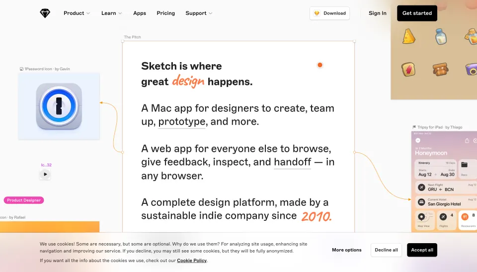
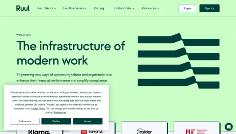
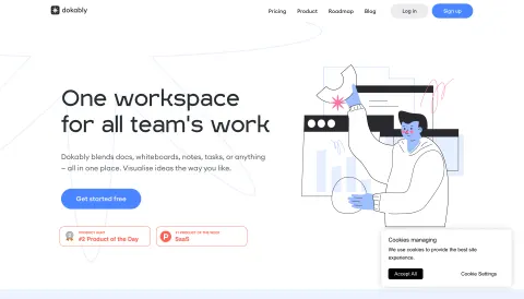
Sketch and Attio show two historical banner designs. Sketch uses a wider explanatory panel with three actions; Attio uses a compact floating strip with two choices and a policy link. The screenshots support visual analysis, but they do not demonstrate the underlying storage behavior or establish legal compliance.
Define the banner's choices before styling it
Start with the actual technologies, purposes, and applicable requirements the responsible team has identified. The interface needs to reflect those decisions accurately. A design template cannot determine which technologies are exempt, which choices are required, or what legal wording applies to a particular service.
For a UK-specific reference, the ICO's guidance on managing consent describes clear purpose information, an active choice for non-exempt technologies, refusal that is as easy as acceptance, and an accessible withdrawal route. Apply the relevant jurisdiction's requirements with the responsible team rather than assuming a historical capture supplies a compliant implementation.
Once the choice model is defined, make it legible. The banner should tell visitors what they are deciding and which control corresponds to each outcome. Avoid labels that reduce a meaningful preference to an unexplained OK button.
Use concise purpose information with access to detail
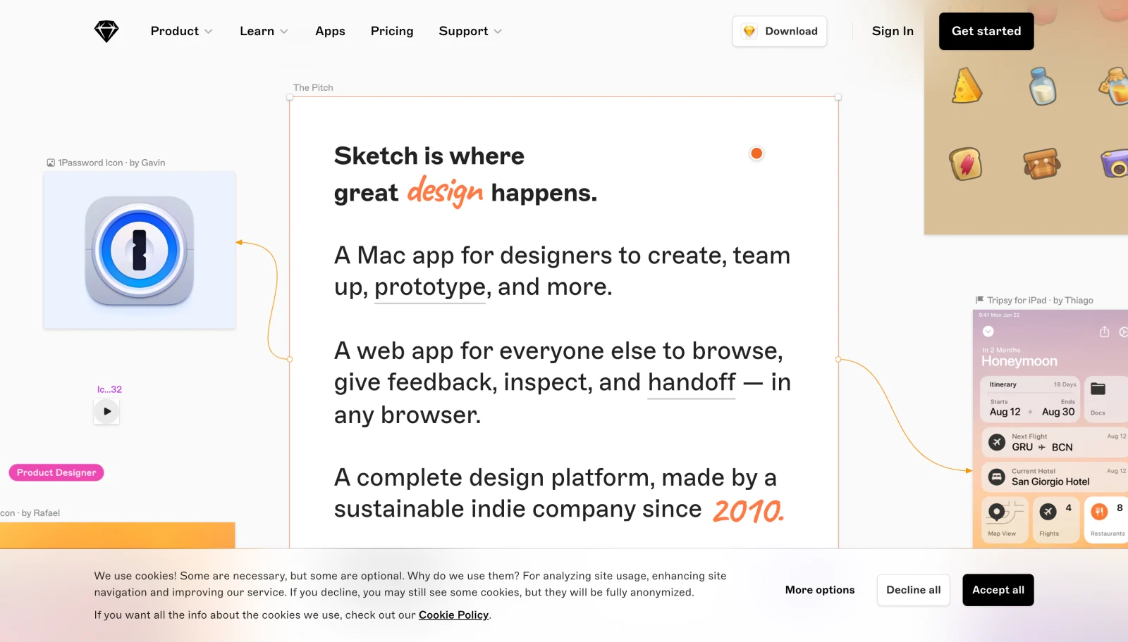
Sketch's banner includes an explanation, a Cookie Policy link, and three visible actions: More options, Decline all, and Accept all. The panel gives readers several routes without requiring them to leave the page simply to identify the available choices.
The copy distinguishes necessary and optional technologies and names purposes in the captured design. Its wording about what happens after declining is also a reminder that the banner's text must match actual implementation and applicable requirements. The image alone cannot verify that match.
Keep the initial explanation concise but specific. A vague phrase about improving the experience does not tell a visitor much about the purposes. Use a clear summary and a well-labeled route to details rather than a large block of technical language or a policy link with no context.
Balance compactness with meaningful choice

Attio's capture shows a smaller strip with a short explanation, a privacy-policy link, and Accept and Reject controls. Its compact footprint leaves much of the main page visible. The choice labels are direct, though the capture does not reveal a granular preferences route or what each action changes.
A compact banner can reduce disruption, but it must not remove information or controls needed for the actual choice model. Decide what belongs in the first layer and what can move into a clearly accessible preference layer.
Consider surrounding interface elements. The Attio capture also contains an announcement bar and a chat launcher. Those are separate page components, yet their combined footprint can affect navigation and reading. Review the full viewport instead of assessing the banner as an isolated rectangle.
Make action labels specific and distinct
Use labels that describe the outcome. Accept all, Reject optional, and Manage preferences convey different decisions. Choose wording that matches the actual scope rather than borrowing labels from another product.
A close icon needs an explicit, consistent meaning. Dismissing a panel should not silently stand for a different preference. If the banner can be dismissed without choosing, the site needs a defined behavior that the responsible team has reviewed. Keep that behavior understandable in the interface.
Do not use visual hierarchy to make one legitimate choice difficult to find. Make each action readable, comfortably targetable, and accessible by keyboard. Test the choice sequence from the visitor's perspective: the person should not have to open several unrelated screens to find the outcome they intended.
Provide a useful preferences layer when needed
A preferences panel can explain categories, purposes, and relevant parties in more detail. Keep its structure consistent with the first-layer summary. A visitor who opens More options should find the controls implied by that label, rather than an unrelated policy page with no editable settings.
Describe each category in understandable language. If a setting is not editable, explain its status. If options are editable, expose the selected state and make saving or confirming the selection clear. The visitor should know which decision is stored when the panel closes.
Avoid a long undifferentiated list that forces technical knowledge on every visitor. Group information where that helps understanding while preserving access to required detail. Keep the path back to the initial banner or the page predictable and do not lose choices made within the panel.
Respect the selected state beyond the visible banner
The banner's disappearance is not evidence that a preference was applied. Verify the resulting site behavior for each available route. The design and implementation should use one coherent interpretation of acceptance, refusal, and customization.
Provide a discoverable way to revisit preferences. A stable footer or settings route can make that possible without repeatedly interrupting the visitor. Its label should identify the task, and opening it should reflect the relevant stored state rather than an unrelated default.
Handle preference-saving failures clearly. If a choice cannot be stored, do not show a success state that implies completion. Preserve useful context and offer a retry where appropriate. Keep error messages proportionate to the problem and avoid making the visitor guess whether the action took effect.
Keep the panel from obscuring critical page controls
A bottom banner can overlap navigation, form actions, or content near the viewport edge. A floating strip can also collide with chat widgets or sticky controls. Review these combinations across page types and screen sizes.
Decide whether the panel occupies layout space or overlays content, then test the consequences. If it overlays, ensure essential controls remain reachable and focused elements are not hidden behind it. If it changes layout, avoid disruptive shifts that make the visitor lose their place.
Use an appropriate focus model. A modal preference dialog needs different behavior from a nonmodal banner. Keep keyboard navigation predictable and avoid trapping focus in a component that is not intended to block the page. The visual position alone does not determine the interaction model.
Design for mobile and assistive technology
A desktop row of text and buttons can become tall on mobile. Stack the explanation and controls in a clear order, preserve readable labels, and allow content to grow for translation and zoom. Do not compress the text into an unreadable strip to maintain the desktop height.
Provide visible focus, appropriate control names, and accessible state information for preference toggles. Policy links should remain distinguishable from action buttons. If the panel is a dialog, give it an understandable title and a clear way to complete or leave the task.
Test screen-reader reading order and keyboard access to every choice. Decorative icons should not add confusing announcements. The person should be able to understand the purpose, reach details, choose an outcome, and revisit the setting without relying on color or pointer hover.
Review the visible and underlying experience together
- Does the banner reflect the actual choice model?
- Is purpose information specific enough to understand?
- Do labels accurately describe each outcome?
- Are legitimate choices easy to find and activate?
- Does a preferences route provide the promised controls?
- Does each route produce the intended site behavior?
- Can visitors revisit their preferences?
- Are saving failures distinguished from success?
- Does the panel avoid hiding important page controls?
- Have the responsible teams reviewed applicable requirements and implementation?
Use screenshots for layout comparison and live testing for behavior. The Sketch and Attio captures show different information densities, but neither proves what technologies run before or after a choice. Keep that distinction explicit during review. A well-designed first layer can still be attached to an inconsistent implementation.
Recheck the experience when the site adds services or changes purposes. New scripts, embedded tools, and preference categories can make old copy inaccurate. Update the inventory, information, controls, and behavior as one coordinated change rather than editing only the banner's appearance.
Measure usability without treating acceptance as the only successful outcome. A visitor who deliberately refuses or customizes has completed a legitimate task. Look for comprehension, reachable controls, successful saving, and predictable return visits. Optimizing only one response can hide friction in the other paths.
Frequently asked questions about cookie banners
Is a policy link enough to explain the choice?
A link can provide detail, but the first layer should still make the decision understandable. The required information and controls depend on the service and applicable rules. Use clear purpose copy and a relevant details route.
Should a cookie banner be a modal?
Choose the interaction model according to the defined experience and requirements. A nonmodal banner may allow continued reading, while a preferences dialog may need modal behavior. Test focus, visibility, and completion rather than assuming one visual style is universally appropriate.
Can a screenshot show that a banner is compliant?
No. It can show labels, hierarchy, and visible choices. Compliance and correct behavior require review of the applicable requirements, information, stored preferences, and actual technologies. Evaluate those separately from the static design.
Explore SaaS cookie banner examples on SaaSFrame to compare first-layer information, action labels, preference routes, and responsive placement.