 SaaSFrame
Download Call to Action
Optimize your app distribution with SaaS Call to Download patterns. Explore how to present App Store badges, QR codes, and direct download links for desktop and mobile software.






Download Call to Action: design guide
A download call to action gets visitors to the right app or resource. Name the platform in the button, detect the visitor's operating system, list other platforms and app stores without clutter, show the app in use and say what happens after clicking.
In the libraryas of November 2026
- Examples
- 8
- SaaS products
- 8
- Last added
- Sep 2026
Most common inLanding Page 3Download Page 2Pricing Page 2Blog Post 1
A download call to action helps visitors obtain the right application or resource through a predictable route. For SaaS products, this may involve a desktop installer, an app store, a browser extension, or a companion app. The section should explain what is being downloaded, which platform it supports, and what happens after the click.
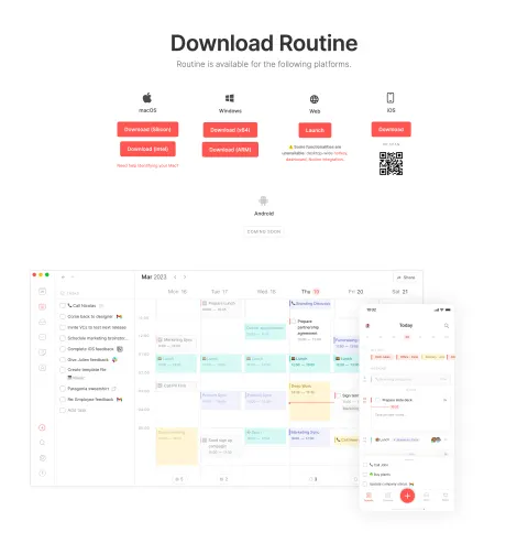
Raycast and Asana show two distinct handoffs: a desktop download with an alternative installation route, and a mobile-app section with store buttons and a QR code. Their captured requirements are historical design evidence. Check current product documentation before using any version or installation detail as practical guidance.
What is being downloaded, and for which platform?
Start with what the visitor is obtaining. A desktop app is different from a mobile companion, a browser extension, or a document. Name the item and explain why it is useful in the product journey.
If the app supplements an existing account, make that relationship clear. A visitor should not assume the download creates access to a separate product or includes every capability of the web experience. If setup requires an account or another service, provide that expectation at the appropriate point.
Use the section to support a concrete next step, not merely repeat a generic benefit. The visitor needs enough context to choose the correct route and continue after the file or store page opens. Treat the download as the beginning of a handoff rather than the final outcome.
Name the platform in the primary action

Raycast's primary action explicitly names Mac. Beneath it, the section offers an alternative installation command and shows an operating-system requirement. This makes the supported route more concrete than a button labeled only Download.
Platform-specific labels reduce ambiguity when visitors arrive from different devices. If a site detects a likely platform, keep other valid routes discoverable and do not silently make an irreversible assumption. A person browsing on one computer may be obtaining an app for another device.
Place compatibility information near the action when it affects whether the download can be used. Keep it readable rather than treating it as decorative fine print. The historical requirement in a screenshot should not be copied into a current implementation without checking the maintained product source.
Provide multiple mobile routes without confusing them
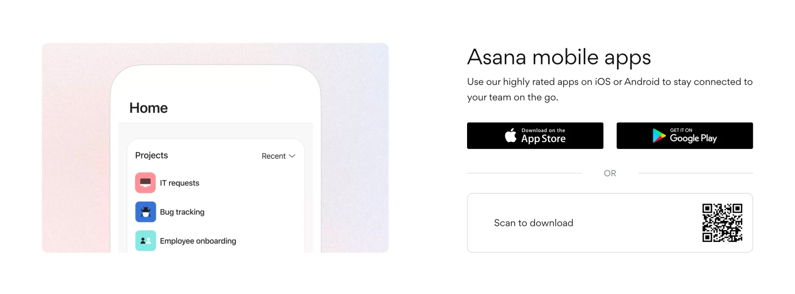
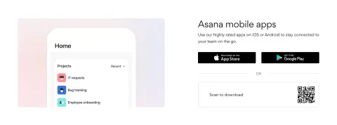
Asana presents separate store routes for iOS and Android, plus a QR code labeled Scan to download. The phone preview establishes that the section concerns the mobile product, while the route choices support visitors browsing from a computer or from a phone.
The store buttons make the destinations recognizable. The QR route offers a cross-device handoff, but it should not replace ordinary links. A visitor using the same phone to view the page may be unable to scan the displayed code conveniently.
Keep all routes connected to the same intended product. Verify that the store page, QR destination, and textual links lead to the appropriate app rather than similar names or outdated listings. The static capture demonstrates the arrangement, not the correctness of the live destinations.
Explain alternative installation methods proportionately
Raycast's alternative command route acknowledges a more technical audience without replacing the primary graphical download. This is useful when some users prefer a package manager or managed installation method, while others need a familiar button.
Label the alternative according to its purpose and maintain any executable instruction as technical content. A command shown on a marketing page may be copied and run, so it needs a current official source and review. Do not present an outdated command merely because it fits the visual style.
Keep prerequisites discoverable. A command-based route may depend on tooling the visitor does not have. Provide a link to the relevant setup guidance rather than assuming the displayed line is sufficient. The primary download should remain easy to find for visitors who do not use that method.
Use interface imagery to explain the app's value
Asana's phone preview shows a home screen with recognizable project items. This gives context for what the visitor will use after installation. A focused preview can be more informative than a generic device mockup with no visible workflow.
Choose a view that supports the section's stated value. If the app helps people stay connected on the go, show a relevant mobile task or information view. Do not imply that every desktop capability is available on mobile simply because the product name is shared.
Keep essential information in text. A small app screenshot can establish familiarity, but its contents may become unreadable on narrow screens. Use a concise explanation of the app's role and a clear action so the section remains useful even when the illustration is not visible.
Set expectations for the click and the next screen
A direct installer download, a store-page link, and a request for an email download link are different experiences. The action should describe the actual route. If the browser will open another service or begin receiving a file, make that predictable.
After a direct download begins, provide a useful next step where appropriate: where to find the file, how to continue setup, or where to get help. Avoid pretending the product is installed merely because the browser requested the file.
If an account is needed after installation, explain that relationship. If the download is a resource behind a form, disclose the form before the visitor clicks a label that suggests immediate access. A clear handoff reduces uncertainty and helps people recover if the expected transition does not happen.
Handle unsupported platforms and failed downloads
A visitor on an unsupported platform still needs an accurate explanation and a valid alternative if one exists. Offer the web experience, another supported device route, or maintained compatibility information. Do not show a broken action or imply support that is not available.
For a failed download, provide a retry and a relevant help destination. Distinguish a network failure from a compatibility issue where the interface can establish that difference. Preserve the user's selected platform instead of resetting the choice unnecessarily.
Keep versioned links maintained. An installer URL, store listing, or QR redirect can change independently of the section's appearance. Assign an owner and verify the destinations after product releases. A visually intact panel can still be unusable if one route no longer reaches the correct download.
Make download controls accessible across devices
Use descriptive link names and visible focus. Store badges should have text alternatives that identify the destination. A QR code needs an ordinary link alternative and a label explaining its purpose. Do not rely only on a platform logo to communicate the route.
On mobile, stack routes in a clear order and maintain comfortable targets. Long platform labels and compatibility text should wrap without colliding. If the site offers a copyable command, its control and feedback need to work with keyboard navigation as well as pointer input.
Do not auto-trigger a download solely because the visitor opened the page. Let them choose the route and understand the commitment. If platform detection changes the primary label, keep the state stable enough to read and make other routes accessible. The section should remain usable without animation or device-specific assumptions.
Review the complete installation handoff
For a cross-device handoff, retain a useful fallback if the QR destination does not open. The visible store links can serve that role, and a short text URL may be appropriate in some contexts. Keep the destination stable or managed through a maintained redirect so a printed or cached code does not become a dead end after a release.
Review account and workspace context after installation when the app serves existing SaaS customers. A user may need to select an organization or sign in with a familiar method. The download section can point to setup help without trying to document every screen, but the next experience should remain consistent with the product identity and purpose established on the page.
- Is the app or resource clearly identified?
- Does the action name the platform or destination?
- Are compatibility requirements maintained and readable?
- Do store and QR routes lead to the same intended product?
- Are technical installation alternatives verified against official guidance?
- Does imagery show a relevant workflow?
- Does the visitor know whether a file, store page, or form comes next?
- Is account setup explained where needed?
- Are unsupported and failure states useful?
- Can all routes be used without scanning a QR code?
Verify the destinations from the published section rather than only checking labels in the design file. Follow each route on a relevant device or environment and confirm the expected app identity. For a direct file, check that the handoff and next-step guidance are coherent; for a store route, check that the listing is appropriate.
Measure successful continuation rather than clicks alone. A download click does not prove installation, account access, or useful product engagement. Use the signals available to the product responsibly and combine them with observed setup journeys. A frequent retry may reveal a broken link, unclear next step, or unsupported-device confusion.
For teams with managed devices, consider a separate deployment-information route when it is relevant. An administrator may need a different process from an individual user. Keep that option secondary but discoverable, and avoid mixing organization deployment instructions into the primary consumer download action.
Frequently asked questions about download calls to action
Should the site detect the visitor's platform?
Detection can suggest a useful default, but keep other supported routes available. Visitors may be downloading for another device, and detection can be imperfect. The primary label should still make the chosen platform explicit.
Is a QR code enough for mobile downloads?
No. Provide store links or another ordinary navigation route as well. A person viewing the page on the target phone may not be able to scan its screen, and assistive-technology users need an accessible alternative.
Should a download section include installation commands?
Include them when they serve the audience and can be maintained accurately. Label the method, explain prerequisites through official guidance, and keep the simpler primary route available. Treat copyable commands as technical instructions, not decorative text.
Explore SaaS download call to action examples on SaaSFrame to compare platform labels, store routes, QR handoffs, and installation expectations.