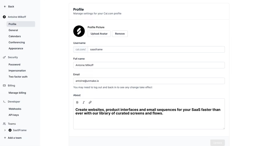
Generate a new design based on this screen using your own content.
Thank you! Your submission has been received!
Oops! Something went wrong while submitting the form.
# Design from Reference: Checkout.com Team Permissions
Create an original, high-fidelity visual design inspired by the reference. Prioritize composition, typography, colors, spacing, and component styling over technical implementation.
## Reference
- **Product:** Checkout.com
- **Category:** Settings
- **Screenshot:** https://cdn.prod.website-files.com/5e9dc792e1210c5325f7ebbc/6acad4c71025e911ae5184d2_6acad3dcb2165b6c7f008bc3_cms-a5522b1e17e75a23f9c56b1a.webp
Analyze the screenshot first. If inaccessible, request it rather than guessing.
## Content
{{content.instructions}}
{{content.data}}
Preserve essential messaging and factual accuracy. Adapt structure and copy length for visual balance; never invent product claims.
## Visual Design
Use this context to reproduce the reference's visual language: layout, typography, colors, spacing, borders, radii, and distinctive elements. The screenshot takes priority if descriptions conflict.
## Direction
{{preferences.fidelityInstructions}}
## Output
{{output.instructions}}
Deliver a polished, cohesive design with precise alignment, hierarchy, and spacing. Produce the requested visual artifact, not just a description. If unsupported, explain the limitation.
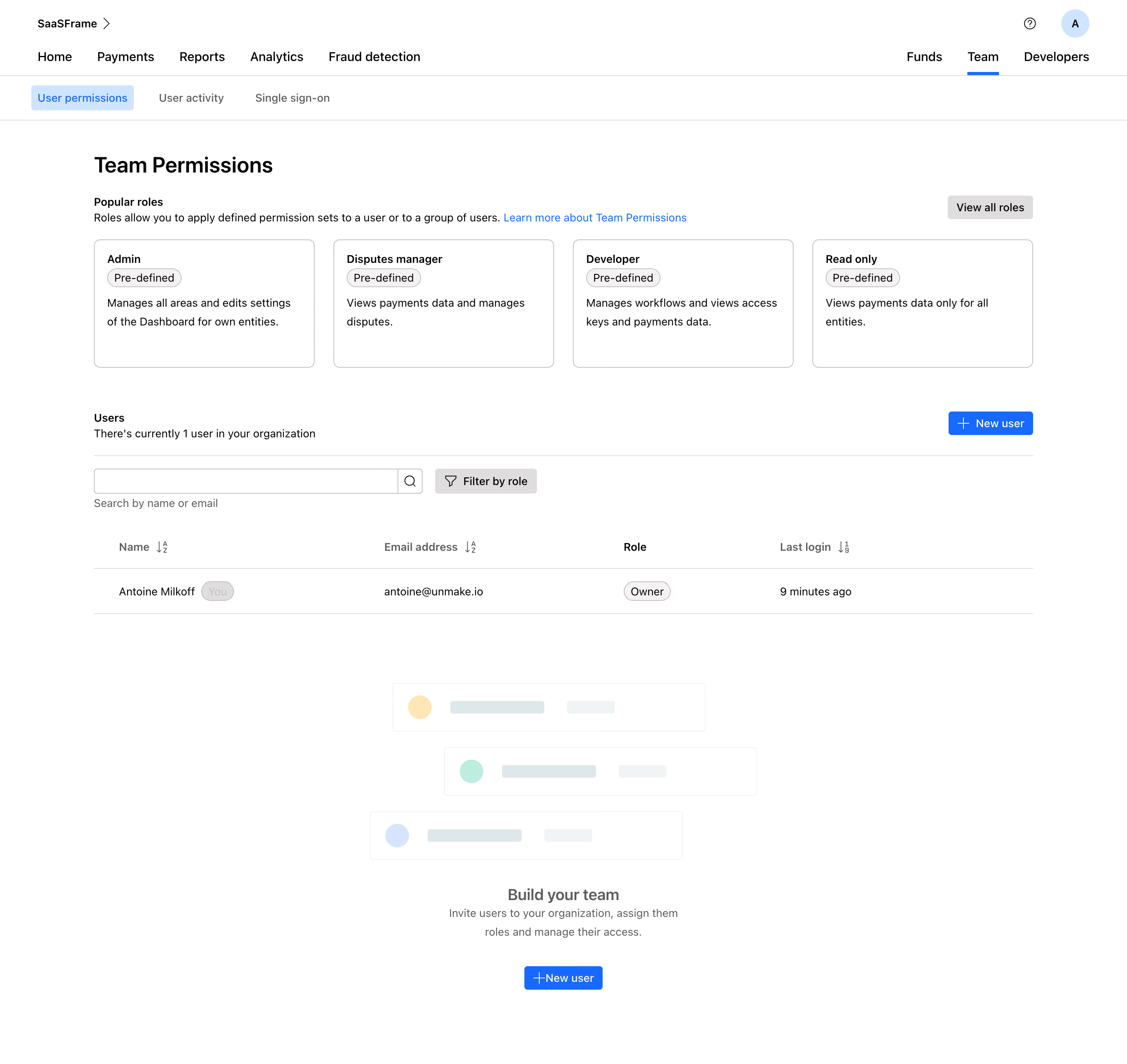
This is Checkout.com's Team Permissions page and it's a great example of how to make admin panels feel approachable. The four pre-defined role cards at the top immediately orient you. Admin, Disputes manager, Developer, Read only. Each one gets a short, human description. No jargon. You know exactly what you're picking.
Structure That Actually Helps
The layout flows top to bottom in a logical way: roles first, then the user table, then a soft CTA to build your team. That bottom illustration section with the stacked user avatars and the "Build your team" prompt is a smart touch. It fills the empty state without feeling desperate. The blue "New user" button appears twice, top right and bottom center, catching you wherever you are on the page.
Typography and Restraint
Everything is set in a clean sans-serif. The type hierarchy is tight but readable. Minimal color usage here. Just black, white, and that signature blue for interactive elements. The "You" badge next to Antoine Milkoff's name is a small detail that adds clarity fast. Overall this feels calm, functional, and well-considered.