Prompt 925 words Copy
# Design from Reference: Checkout.com API Key Details

Create an original, high-fidelity visual design inspired by the reference. Prioritize composition, typography, colors, spacing, and component styling over technical implementation.

## Reference

- **Product:** Checkout.com
- **Category:** Details
- **Screenshot:** attached to this message (also available at https://media.saasframe.io/v/b356495aeed715a783e4-1600.webp)
- **Source:** https://dashboard.sandbox.checkout.com/developers/keys/5F60128F32DF39D7D5F9CDC16A706B87

Analyze the attached screenshot first. If no image is attached, open the screenshot link; if neither is accessible, ask for it rather than guessing.

## Visual Design Context

### Overall aesthetic
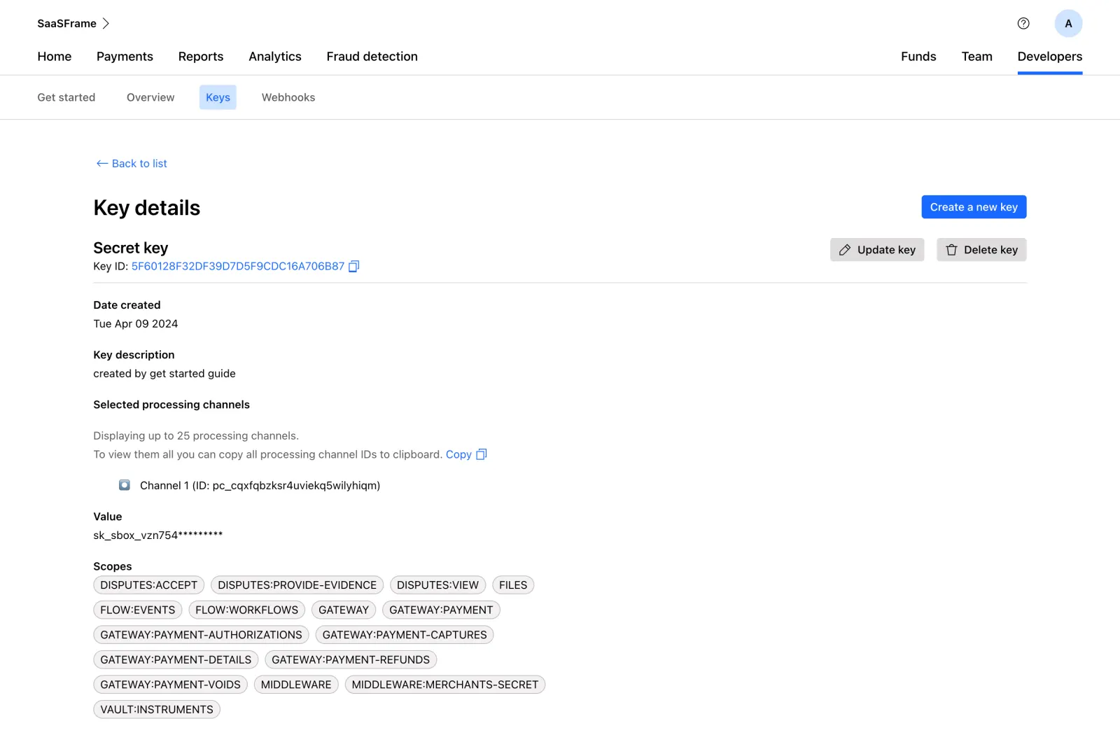
- **Character:** Sparse white developer-key detail page with black typography, blue links/actions and neutral scope chips.
- **Visual tone:** Plain labels and thin rules prioritize technical information over decoration.
- **Scale:** The source measures 2880 × 1926 image px. Dimensions below estimate a 1440 × 963 CSS layout at 2× scale; device ratio and zoom are unverified.

### Page composition
- **Global navigation:** Workspace/account row sits above a broad product-navigation row.
- **Developer tabs:** Get started, Overview, Keys and Webhooks form a second navigation strip; Keys is selected.
- **Main region:** A wide centered content column begins with Back to list and Key details.
- **Key header:** Secret-key label and copyable identifier align left, with create/update/delete controls right.
- **Details:** Creation date, description, processing-channel information, masked value and wrapping scope chips stack beneath a divider.

### Information hierarchy
- **Location:** Developers and Keys have distinct active treatments.
- **Resource:** Key details and key-type label lead before technical metadata.
- **Actions:** Blue creation action is strongest; gray update/delete controls are secondary and are not activated.
- **Permissions:** Many compact scope chips form a dense lower group.
- **Privacy:** Identifiers, channel values and masked-secret prefixes are intentionally not reproduced in this description.

### Typography
- **Family:** Neutral sans-serif; exact identity is unverified.
- **Page title:** Approximately 28 px, bold.
- **Key type:** Around 22 px, bold.
- **Labels/values:** Approximately 14–16 px, with bold labels and regular values.
- **Scopes:** Compact uppercase text around 14 px in rounded chips.
- **Navigation:** Approximately 16 px, medium weight.

### Colors & surfaces
- **Measured base:** ICC-aware sRGB sampling yields #FFFFFF.
- **Measured neutral:** #F4F2F2, #DFDDDD and #C7C1C1 occur in chips/buttons/rules.
- **Measured action:** Blue #006BFF marks links and creation; #CAE5FF is the selected-tab fill.
- **Measured foreground:** #000000 and #424141 are dark tones; #5C5B60 is muted.
- **Depth:** Flat controls and fine outlines dominate, with no large cards/shadows.

### Components
- **Active navigation:** A blue underline marks Developers; a pale-blue rounded chip marks Keys.
- **Copy controls:** Small outline copy symbols follow identifier/channel-copy links.
- **Actions:** Compact blue create button and gray update/delete buttons pair text with simple icons.
- **Scope chips:** Light warm-gray fully rounded capsules wrap across several lines.
- **Masked value:** A single text line displays a partially obscured key without a visible reveal control.
- **Channel row:** Small marker and one channel entry sit below explanatory copy.

### Visual rhythm
- **Alignment:** Main title, section labels and values share one left axis.
- **Spacing:** Generous gaps separate metadata groups; label/value pairs remain tight.
- **Density:** Scope chips create the only dense cluster at the bottom.
- **Whitespace:** Large blank right-side areas keep the page visually light.

### Responsive
- **Evidence limit:** Only desktop is shown; recommendations follow.
- **Navigation:** Collapse/wrap broad navigation strips.
- **Actions:** Move key utilities beneath the header on narrow screens.
- **Values:** Wrap or safely scroll long identifiers and preserve copy targets.
- **Scopes:** Continue natural chip wrapping with readable labels.

### Adaptation guidance
- **Reusable pattern:** Show key metadata, processing scope and permissions with clearly separated management actions.
- **Privacy:** Keep credentials masked and avoid exposing identifiers in reusable examples.
- **State clarity:** Distinguish viewing details from updating/deleting/creating keys.
- **Accessibility:** Label copy controls and active tabs, and provide focus/confirmation feedback for real management actions.

## Content

**Instructions:**

Generate realistic example content that fits the selected design reference.

Create appropriate headlines, descriptions, labels, buttons, and supporting copy based on the type of interface being designed.

If a product or business description is provided, use it to guide the content.

Otherwise, invent a plausible fictional SaaS product appropriate for the reference.

Keep the content concise, coherent, and visually balanced.

Do not present fictional statistics, customer names, or testimonials as verified facts.

## Design Direction

**Instructions:**

Use the reference screenshot as the main source of visual inspiration rather than a strict layout template.

Preserve its most distinctive design characteristics, such as typography, visual rhythm, color relationships, component treatments, and overall aesthetic.

Feel free to modify section arrangements, proportions, spacing, and individual components to better suit my content.

Introduce original design decisions where they improve usability, composition, or brand consistency.

The result should clearly reflect the reference's visual language without looking like a direct reproduction.

Follow the visual identity of the reference design.

Use its typography, color palette, component styling, and overall aesthetic as the primary design direction.

Do not introduce an unrelated visual identity.

## Output

**Instructions:**

Generate a high-fidelity visual mockup of the requested interface.

Present the design as a polished, realistic website or product UI screenshot.

Prioritize visual composition, typography, spacing, colors, alignment, and component details.

Use the available image-generation or visual-design capabilities.

Do not replace the mockup with source code, a written design specification, or a textual description.

If direct visual generation is unavailable, clearly explain the limitation.

## Constraints

- Use the actual screenshot as the primary visual reference.
- Preserve essential messaging and factual accuracy.
- Prioritize visual quality and consistency.
- Do not invent unsupported product claims.
- Adapt structure and copy length for visual balance.
Reference image Attach it to your message: assistants can’t open image links. Open in ChatGPT ↗ Open in Claude ↗
Build it in Lovable ↗ v0 ↗ Figma Make ↗
Opening a tool copies the screenshot so you can paste it with your prompt.
 SaaSFrame