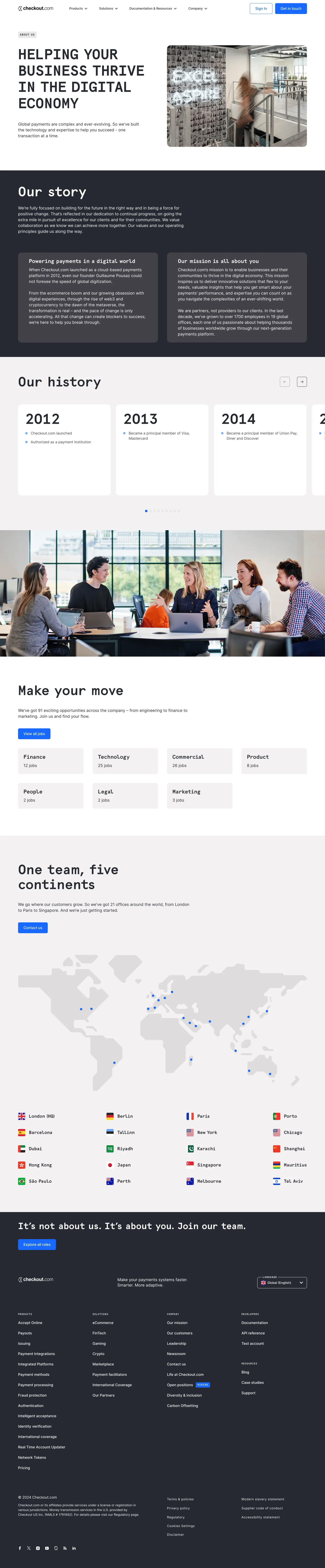
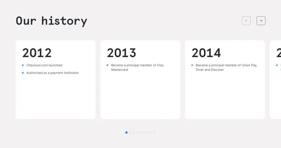
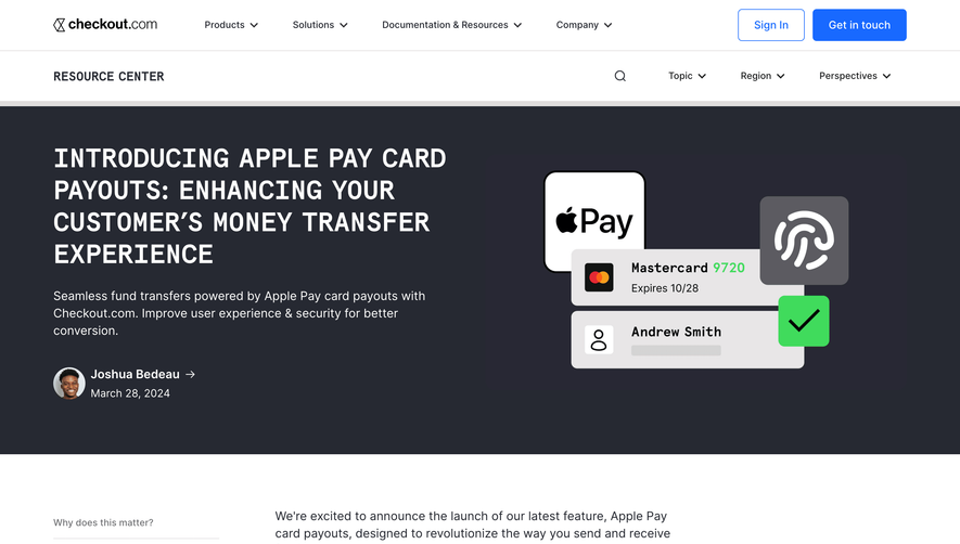
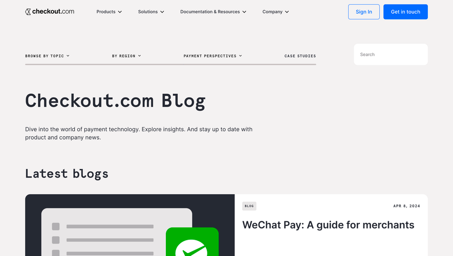
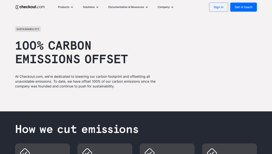
The Checkout.com Mission page exemplifies a modern, minimalist approach with a distinctly professional tone. Clean lines, generous white space, and a restrained use of color give the site a sleek, sophisticated feel. The design communicates credibility and trustworthiness, well-suited for a fintech SaaS platform.
Layout and Structure
The structure is intuitive and focused. A bold hero section introduces the company’s mission with concise, impactful text set beside an abstract, animated visual. Scrolling downward reveals neatly segmented content blocks that guide the visitor through narrative text, supporting visuals, and concise value propositions. The page concludes with a clear call-to-action and a simple, understated footer.
Visual Elements
Striking vector illustrations and subtle animations add a dynamic yet unobtrusive energy to the page. Rather than relying on stock photography, the visuals feel custom and brand-aligned, enhancing the uniqueness of the design. Animation is used sparingly for accent—enough to draw the eye without distracting from the message.
Color Palette and Typography
A refined palette of whites, deep blues, and sparing highlights in green and teal underscores the brand’s identity. Typography is crisp, with prominent headings in a bold sans-serif font, clean body text, and visually clear hierarchy. Important phrases are highlighted for emphasis, supporting rapid content scanning.
User Experience Patterns and Unique Choices
Navigation is sticky and minimal, ensuring easy access to other pages without clutter. Calls-to-action are prominent but not aggressive. Micro-interactions and scrolling effects subtly reinforce flow, while the consistent use of bespoke visuals avoids any generic SaaS look. The tone remains innovative and aspirational, perfectly aligning with the brand’s mission-driven ethos.
 SaaSFrame