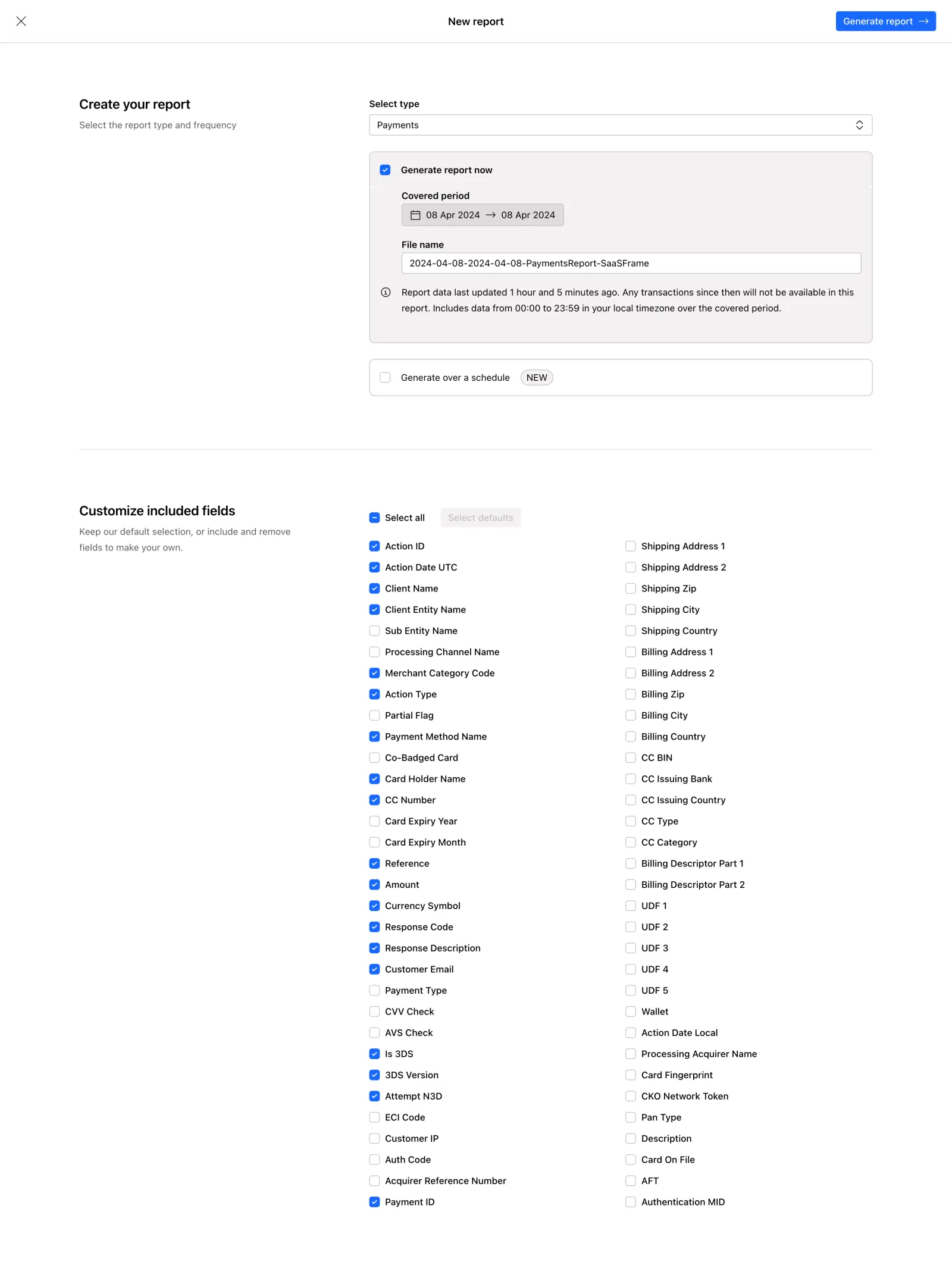
This is a payments report generator from what looks like a checkout or payment processing dashboard. The first thing you notice is how much whitespace there is. It breathes. The two-column layout for the field selector at the bottom is doing heavy lifting without feeling overwhelming, even with 60+ checkboxes visible.
Smart Visual Hierarchy
The page splits into two clear sections: report configuration up top, field customization below. A subtle horizontal divider separates them. The blue checkboxes pop against the white background and create a scannable pattern so you can instantly see what's selected. That "NEW" badge next to "Generate over a schedule" is a tiny detail that draws curiosity without being obnoxious.
What Makes It Stand Out
The covered period selector with its arrow between dates is dead simple. The auto-generated filename is a thoughtful touch. Typography is restrained, probably a system font or similar sans-serif, keeping everything functional. The blue CTA button top-right stays fixed and visible. No decoration, no gradients, no illustrations. Just a tool that respects your time. This is enterprise UI done with restraint.
 SaaSFrame