Design with AI
Generate a new design based on this screen using your own content.
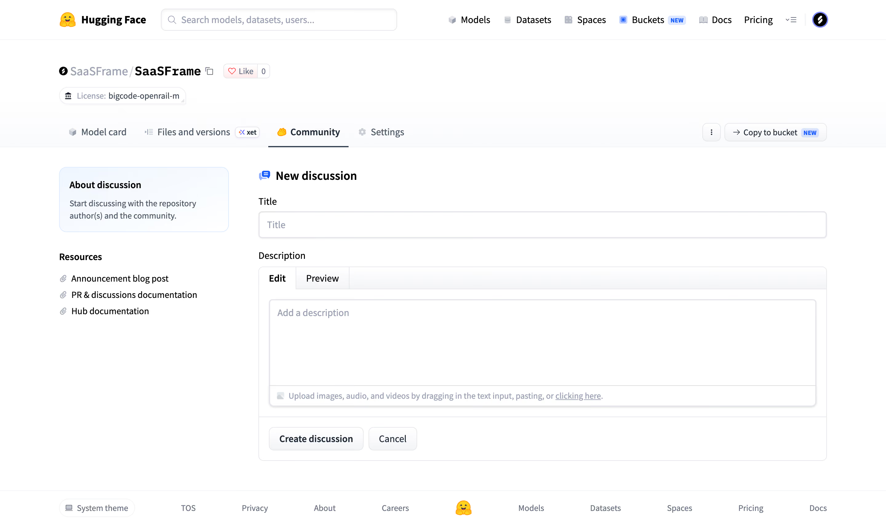
# Design from Reference: Hugging Face Create a discussion or pull request
Create an original, high-fidelity visual design inspired by the reference. Prioritize composition, typography, colors, spacing, and component styling over technical implementation.
## Reference
- **Product:** Hugging Face
- **Category:** Add & Edit
- **Screenshot:** https://cdn.prod.website-files.com/5e9dc792e1210c5325f7ebbc/6acad332d5603a17eba5b546_6acad0240aa47f6da2c98a06_cms-96ec80dd00401dd9a2bfd9ee.webp
Analyze the screenshot first. If inaccessible, request it rather than guessing.
## Content
{{content.instructions}}
{{content.data}}
Preserve essential messaging and factual accuracy. Adapt structure and copy length for visual balance; never invent product claims.
## Visual Design
### Overall aesthetic
- **Style:** White repository discussion composer with compact navigation and light bordered editor.
### Page composition
- **Canvas:** 2880 × 1724 image px; CSS estimates assume unverified 2×.
- **Top:** Global search/nav, repository identity/license, tabs.
- **Main:** Small resource sidebar left, title and description form right.
- **Bottom:** Create discussion/Cancel and global footer.
### Information hierarchy
- **Primary:** New discussion heading and title.
- **Composition:** Description editor with Edit/Preview tabs.
- **Support:** About discussion box and resource links.
- **Action:** Create discussion beneath editor.
### Typography
- **Family:** Compact sans serif; exact identity unverified.
- **Heading:** Approximately 20px CSS, semibold.
- **Labels/body:** Approximately 14px.
- **Helper:** Approximately 12px.
- **Precision:** Estimated under 2×.
### Colors & surfaces
- **Canvas:** #FFFFFF.
- **Pale surfaces:** #FAFBFC.
- **Borders:** #E6E7EB.
- **Text:** Dark slate.
- **About box:** Very pale blue outline/fill.
- **Precision:** Flat sampled colors; exact accent tokens unverified.
### Components
- **Editor:** Rounded outlined container, large textarea, attachment guidance strip.
- **Title:** Full-width outlined input.
- **Tabs:** Edit selected, Preview adjacent.
- **Actions:** Small neutral outlined buttons.
- **Repository tabs:** Community underlined with icon.
### Visual rhythm
- **Spacing:** Clear title/editor grouping, broad blank textarea.
- **Alignment:** Form controls share common width.
- **Footer:** Thin top rule separates global links.
### Responsive
- **Observed:** Desktop only.
- **Recommendation:** Stack resource sidebar above/below composer and keep editor width fluid.
### Adaptation guidance
- **Preserve:** Title-first discussion creation and clear edit/preview organization.
- **Privacy:** Replace repository details.
- **Behavior:** Preview, uploads, and creation not demonstrated.
Use this context to reproduce the reference's visual language: layout, typography, colors, spacing, borders, radii, and distinctive elements. The screenshot takes priority if descriptions conflict.
## Direction
{{preferences.fidelityInstructions}}
## Output
{{output.instructions}}
Deliver a polished, cohesive design with precise alignment, hierarchy, and spacing. Produce the requested visual artifact, not just a description. If unsupported, explain the limitation.