Design with AI
Generate a new design based on this screen using your own content.
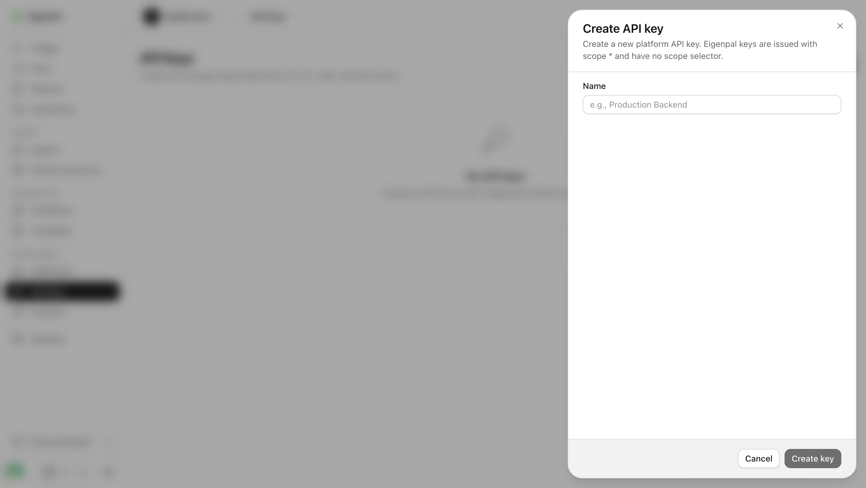
# Design from Reference: EigenPal Create an API key
Create an original, high-fidelity visual design inspired by the reference. Prioritize composition, typography, colors, spacing, and component styling over technical implementation.
## Reference
- **Product:** EigenPal
- **Category:** Add & Edit
- **Screenshot:** https://cdn.prod.website-files.com/5e9dc792e1210c5325f7ebbc/6acad04734c900e8fc1b4885_6acacfd634c900e8fc1b24be_cms-3539373dd667fcd86451046b.webp
Analyze the screenshot first. If inaccessible, request it rather than guessing.
## Content
{{content.instructions}}
{{content.data}}
Preserve essential messaging and factual accuracy. Adapt structure and copy length for visual balance; never invent product claims.
## Visual Design
### Overall aesthetic
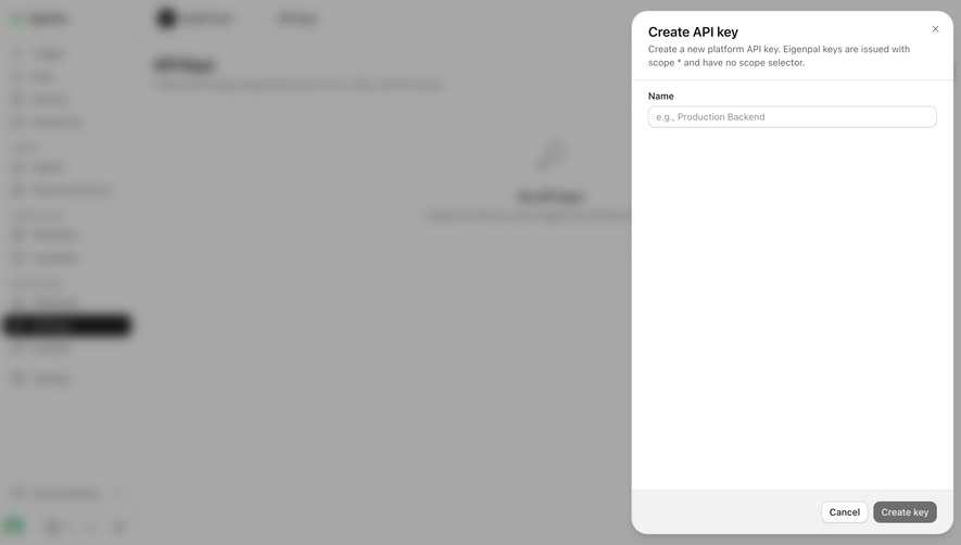
- **Style:** Minimal right-side API-key creation drawer over a blurred, dimmed application.
- **Character:** Monochrome palette, one short form, large empty interior, and a pale bottom action bar.
- **Focus treatment:** Background blur and gray veil isolate the crisp white drawer.
### Page composition
- **Capture and scale:** 2880 × 1624 image px. CSS estimates assume a 2× capture, approximately 1440 × 812 CSS px; scale is unverified.
- **Drawer:** Approximately 480px wide, inset around 16px from the top/right/bottom, with large rounded corners.
- **Header:** Create API key title, two-line explanatory copy, and small close icon at upper-right.
- **Form:** One Name label and empty single-line input beneath a horizontal divider.
- **Interior:** Large blank area fills the remaining drawer body.
- **Footer:** Pale-gray strip with Cancel and gray Create key actions aligned right.
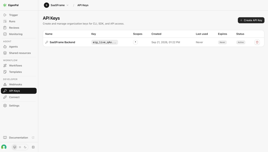
- **Backdrop:** Blurred navigation and API-key area remain structural context only; detailed background text is not reconstructed.
### Information hierarchy
- **Title:** Strong dark creation heading identifies the current task.
- **Explanation:** Smaller gray copy describes the platform key and scope treatment.
- **Entry:** Name is the only visible field.
- **Actions:** Cancel is white outlined; Create key is gray filled in the captured empty-input state.
- **State limit:** The screenshot does not show a generated key or success result.
### Typography
- **Family:** Neutral proportional sans serif; exact identity is unverified.
- **Title:** Approximately 20px semibold with 26px line-height.
- **Explanation:** Approximately 14px with 20px line-height.
- **Label / input:** Approximately 14px regular.
- **Footer actions:** Approximately 14px medium.
- **Precision:** CSS sizes and weights are pixel-based estimates.
### Colors & surfaces
- **Drawer:** Sampled #FFFFFF.
- **Footer:** Sampled #F2F2F2.
- **Backdrop composite:** Sampled #A8A8A8 with nearby #A7A7A7 and #A6A6A6.
- **Secondary composite shades:** Sampled #A4A4A4 and #A1A1A1 across blurred background details.
- **Text/control roles:** Near-black title, gray explanation/placeholder, pale borders, and gray filled creation action.
- **Interpretation:** Backdrop samples describe the composited blur, not a verified overlay token.
### Components
- **Drawer shell:** Approximately 24px radius with thin pale boundary and soft shadow.
- **Header:** Around 24px horizontal inset and a fine bottom rule.
- **Name field:** Approximately 432 × 32px, white fill, thin gray outline, 10px radius, and muted example-name placeholder.
- **Footer bar:** Approximately 66px tall, pale fill, top divider, and 16–24px padding.
- **Cancel:** Compact white button with thin gray border, small shadow, and 10px radius.
- **Create key:** Compact gray filled button with white label and matching radius; disabled behavior is not independently verified from appearance.
- **Close:** Small gray X near the top-right.
- **State limits:** No scope selector, key value, copy control, validation, or confirmation is visible.
### Visual rhythm
- **Top concentration:** Title, explanation, and single field occupy only the upper portion.
- **Whitespace:** Large blank body separates entry from footer actions.
- **Alignment:** Header copy, label, and field share a stable left inset.
- **Action rhythm:** Two compact actions sit side by side at the lower-right.
### Responsive
- **Observed state:** Desktop drawer only; mobile behavior is unverified.
- **Width recommendation:** Use a viewport-constrained drawer or full-width small-screen panel with side gutters.
- **Footer recommendation:** Keep actions reachable and allow the body to scroll on short screens.
- **Field recommendation:** Retain a readable label and adequate touch height.
- **Accessibility recommendation:** Provide focus management and accessible close/action names.
### Adaptation guidance
- **Preserve:** One-field simplicity, clear key-creation context, right-side drawer, and separated footer actions.
- **Starting geometry:** Approximately 480px drawer, 24px inset, 32px field, and 24px outer radius under the unverified 2× assumption.
- **Product fidelity:** Define actual key naming, scope, validation, and creation behavior from supplied requirements.
- **Sensitive state:** Do not invent or display a generated key when the reference only shows an empty form.
- **Implementation recommendation:** Provide explicit validation and success feedback with appropriate key handling; no key creation was performed from this screenshot.
Use this context to reproduce the reference's visual language: layout, typography, colors, spacing, borders, radii, and distinctive elements. The screenshot takes priority if descriptions conflict.
## Direction
{{preferences.fidelityInstructions}}
## Output
{{output.instructions}}
Deliver a polished, cohesive design with precise alignment, hierarchy, and spacing. Produce the requested visual artifact, not just a description. If unsupported, explain the limitation.