Design with AI
Generate a new design based on this screen using your own content.
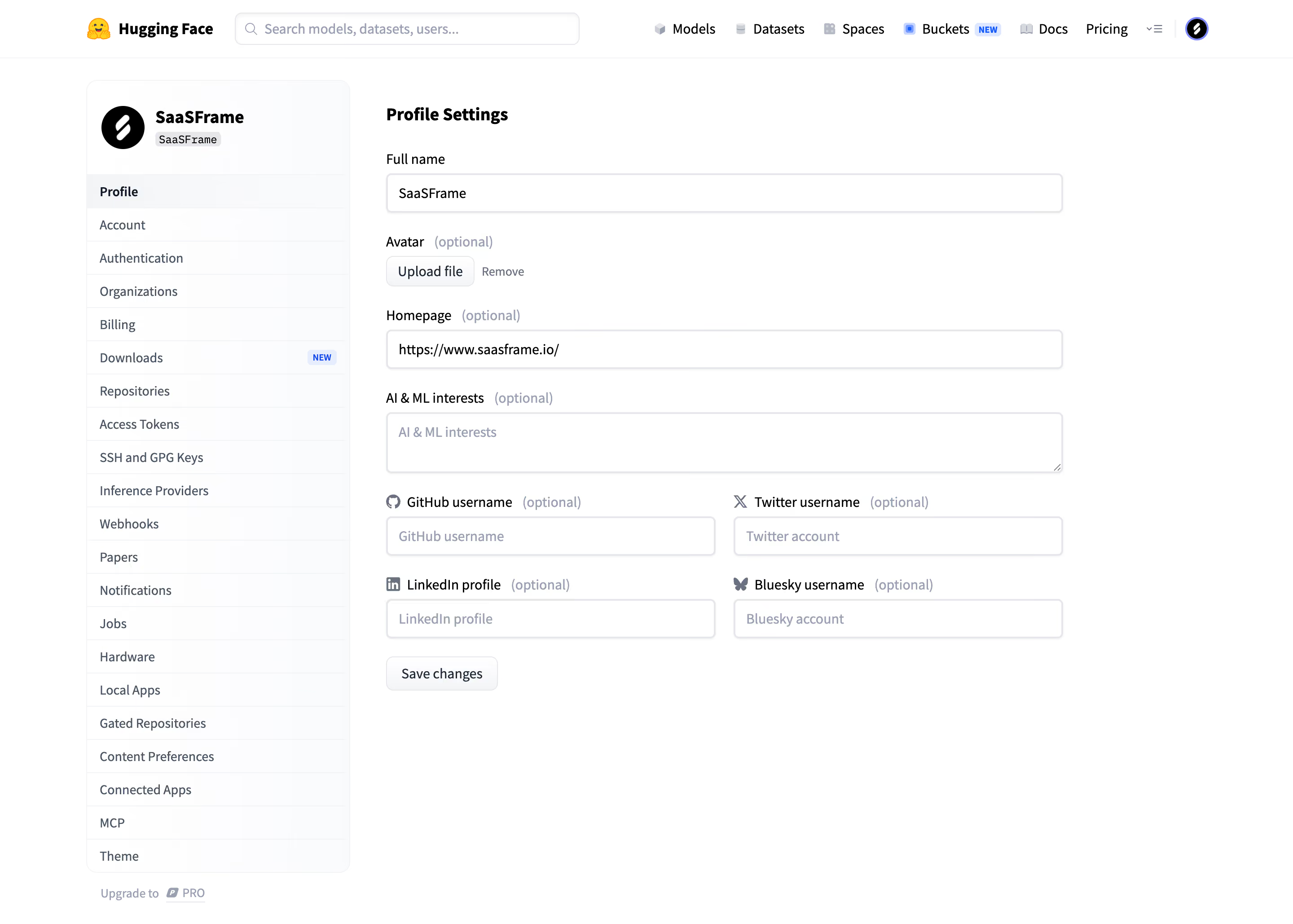
# Design from Reference: Hugging Face Profile settings
Create an original, high-fidelity visual design inspired by the reference. Prioritize composition, typography, colors, spacing, and component styling over technical implementation.
## Reference
- **Product:** Hugging Face
- **Category:** Settings
- **Screenshot:** https://cdn.prod.website-files.com/5e9dc792e1210c5325f7ebbc/6acad09051f927271bf81db6_6acad02231610a406324c8ff_cms-c29bc7505f63157946296728.webp
Analyze the screenshot first. If inaccessible, request it rather than guessing.
## Content
{{content.instructions}}
{{content.data}}
Preserve essential messaging and factual accuracy. Adapt structure and copy length for visual balance; never invent product claims.
## Visual Design
### Overall aesthetic
- **Character:** Conventional developer profile settings with white surfaces, a long navigation list and straightforward labeled fields.
### Page composition
- **Capture:** 2880 × 2058 screenshot pixels; estimated 2× CSS scale.
- **Structure:** Global search/navigation, left identity/settings panel and main Profile Settings form with name, avatar, homepage, interests and paired social fields.
### Information hierarchy
- **Priority:** Required full name comes first; optional markers qualify all secondary profile details. Save changes sits below the form.
### Typography
- **Family:** Sans serif; exact family unverified.
- **Estimated CSS sizes:** Section heading 20px bold, labels/body 16px, sidebar 14px and optional markers 14px.
### Colors & surfaces
- **Measured surfaces:** White #FFFFFF, pale #FAFBFC and near-white #FEFEFE/#FDFDFE/#FCFCFD/#FCFDFD.
- **Treatment:** Dark primary text, gray-blue secondary labels and fine cool-gray borders; blue small badges/links.
### Components
- **Elements:** Avatar upload/remove, full-width inputs, interests textarea, provider icons, two-column social fields and neutral Save changes button.
- **Estimated geometry:** Sidebar 294px, form approximately 754px, 42px inputs, 6px radii and 20px column gaps.
### Visual rhythm
- **Spacing:** Compact sidebar rows contrast with regular 24px form-group gaps and ample blank space below.
### Responsive
- **Suggested adaptation:** Collapse settings navigation and stack social fields. Mobile behavior is not shown.
### Adaptation guidance
- **Transfer:** Preserve optional-field clarity and provider identity; avoid adding decorative elements to the form.
Use this context to reproduce the reference's visual language: layout, typography, colors, spacing, borders, radii, and distinctive elements. The screenshot takes priority if descriptions conflict.
## Direction
{{preferences.fidelityInstructions}}
## Output
{{output.instructions}}
Deliver a polished, cohesive design with precise alignment, hierarchy, and spacing. Produce the requested visual artifact, not just a description. If unsupported, explain the limitation.