Design with AI
Generate a new design based on this screen using your own content.
# Design from Reference: Profound Content Brief
Create an original, high-fidelity visual design inspired by the reference. Prioritize composition, typography, colors, spacing, and component styling over technical implementation.
## Reference
- **Product:** Profound
- **Category:** Text Editor
- **Screenshot:** https://cdn.prod.website-files.com/5e9dc792e1210c5325f7ebbc/6acad33dd5603a17eba5b680_6acad0c8cf7be2f31192cdd0_cms-f9461cf41b9af03513502886.webp
Analyze the screenshot first. If inaccessible, request it rather than guessing.
## Content
{{content.instructions}}
{{content.data}}
Preserve essential messaging and factual accuracy. Adapt structure and copy length for visual balance; never invent product claims.
## Visual Design
### Overall aesthetic
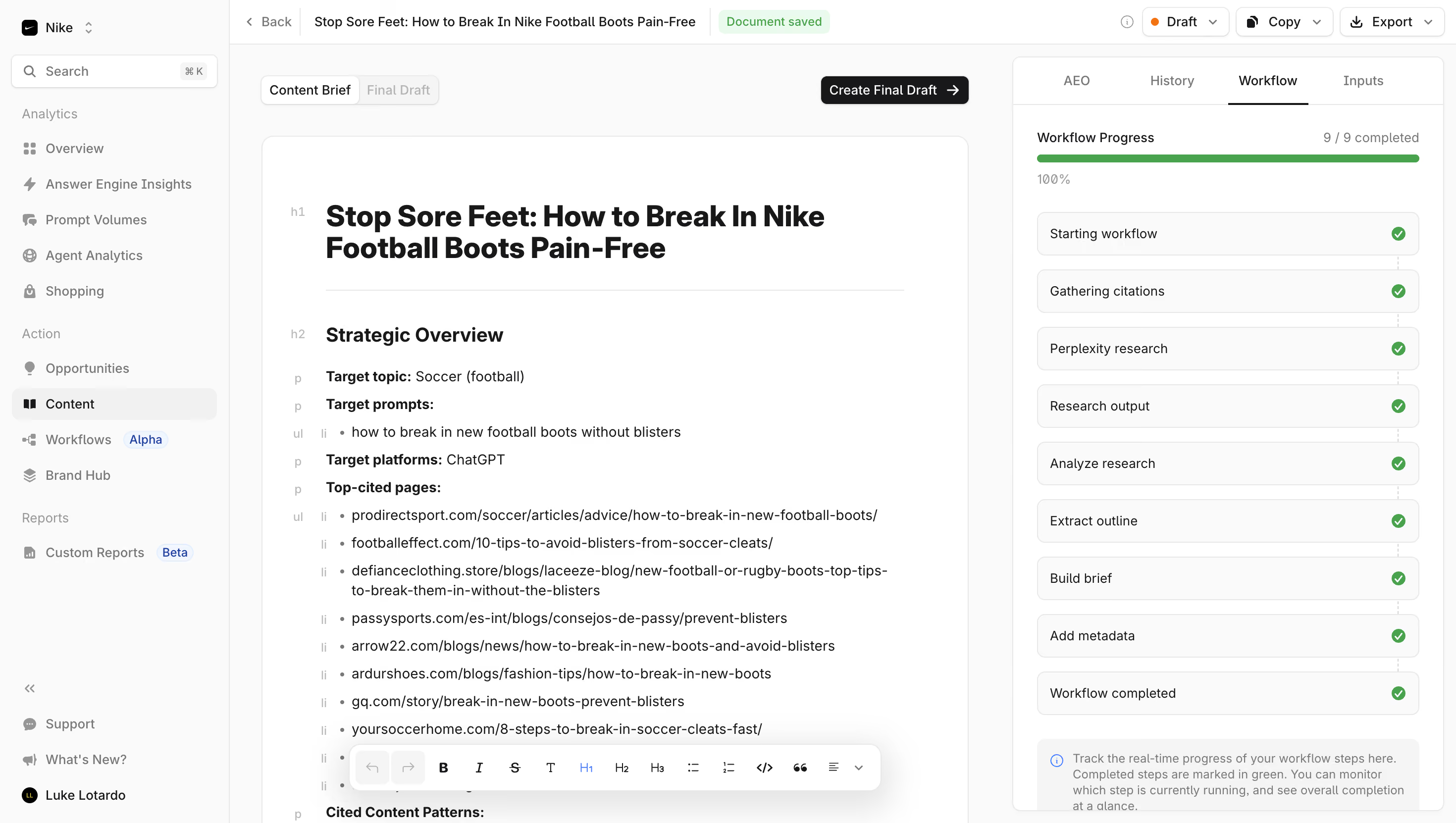
- **Character:** Dense, monochrome content-brief editor with a document canvas, persistent navigation and visible workflow-completion status.
### Page composition
- **Canvas:** 2940 × 1662 screenshot px; CSS estimates assume approximately 2× capture.
- **Structure:** Left app sidebar, slim document toolbar, central rich-text brief and right workflow panel with tabs. Bottom of the central document continues beyond the screenshot.
### Information hierarchy
- **Priority:** Large document headline and Strategic Overview heading lead the brief. Right panel emphasizes a full green progress bar and nine completed stages.
### Typography
- **Family:** Modern sans serif, exact font unverified.
- **Scale:** Estimated CSS document title 28–30 px, subsection 20 px, body 14 px and toolbar/sidebar 12–14 px.
### Colors & surfaces
- **Sampled palette:** White #FFFFFF, page/sidebar #FAFAFA, stage fills #F5F5F5/#F1F1F1, text/action #18181A and borders #E8E8E8.
- **Status:** Green saved/completed states; small orange draft indicator; blue sidebar badges.
### Components
- **Document:** White bordered rounded sheet with generous padding, faint block-type markers in the left margin, heading rule and bulleted source list.
- **Workflow:** Outlined stage rows, green trailing checks, progress summary and pale explanatory callout.
- **Controls:** Black Create Final Draft button, top Draft/Copy/Export controls and floating rich-text formatting toolbar near the document bottom.
### Visual rhythm
- **Spacing:** Compact chrome and repeated workflow rows contrast with padded document content. Estimated CSS gutters 20–24 px and card radii 8–12 px.
### Responsive
- **Observed:** Desktop only.
- **Adaptation:** Use one primary document pane on mobile with workflow in a drawer; keep formatting controls reachable and avoid shrinking the three columns together.
### Adaptation guidance
- **Preserve:** Strong document/workflow separation, compact chrome and explicit completion state.
- **Replace:** Use supplied brief and genuine research/workflow state; do not copy reference URLs or imply research completion without evidence.
Use this context to reproduce the reference's visual language: layout, typography, colors, spacing, borders, radii, and distinctive elements. The screenshot takes priority if descriptions conflict.
## Direction
{{preferences.fidelityInstructions}}
## Output
{{output.instructions}}
Deliver a polished, cohesive design with precise alignment, hierarchy, and spacing. Produce the requested visual artifact, not just a description. If unsupported, explain the limitation.