Design with AI
Generate a new design based on this screen using your own content.
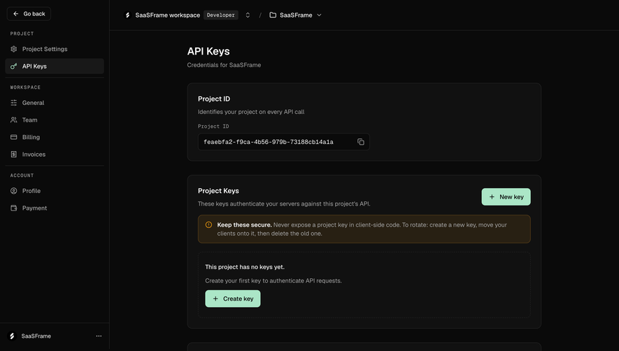
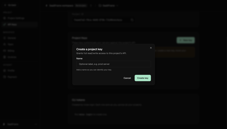
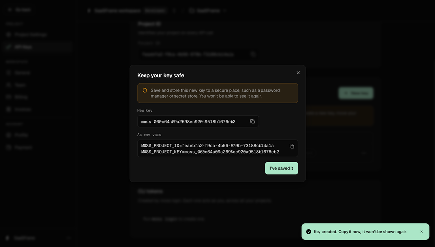
# Design from Reference: Moss Create a project API key
Create an original, high-fidelity visual design inspired by the reference. Prioritize composition, typography, colors, spacing, and component styling over technical implementation.
## Reference
- **Product:** Moss
- **Category:** Add & Edit
- **Screenshot:** https://cdn.prod.website-files.com/5e9dc792e1210c5325f7ebbc/6acf52511f4e2219bc53aded_Cs3rfPMGb9-bsvUhOAZvdRMicsNL6CL7-Jq7gGxoox8.png
Analyze the screenshot first. If inaccessible, request it rather than guessing.
## Content
{{content.instructions}}
{{content.data}}
Preserve essential messaging and factual accuracy. Adapt structure and copy length for visual balance; never invent product claims.
## Visual Design
### Overall aesthetic
- **Character:** A compact dark creation dialog over a heavily dimmed and blurred developer dashboard.
- **Focus:** One optional name field and a mint primary action keep the task simple, with permission scope stated immediately under the title.
### Page composition
- **Capture scale:** The source is 2880 × 1624 pixels. A roughly 1440 × 812 CSS-pixel viewport at 2× scale is plausible but unverified.
- **Overlay:** A centered dark panel around 520 × 260 estimated CSS pixels sits over an indistinct project/API settings page.
- **Internal order:** Title, scope description, Name label, single input, helper sentence and lower-right action pair.
- **Background:** Sidebar navigation and project/API panels remain visible only as blurred shapes; no obscured values should be inferred.
### Information hierarchy
- **Title:** “Create a project key” is the strongest text.
- **Scope:** A muted sentence states full read/write access to the project's API.
- **Field:** Name is followed by an optional-label example and a short naming helper.
- **Actions:** Plain Cancel precedes mint Create key; a small close icon sits at upper right.
### Typography
- **Family:** A neutral sans serif is visible; exact identity is unverified.
- **Title:** Approximately 18 estimated CSS pixels, semibold.
- **Body/field:** Around 14 pixels with 20-pixel line height; helper text is slightly smaller, around 12 pixels.
- **Actions:** Approximately 14 pixels, medium weight, with dark text on the mint primary button.
### Colors & surfaces
- **Measured palette:** ICC-aware sRGB sampling yields backdrop #040404/#070707 and dialog/input family #111111, with nearby dark variations #050505 and #060606.
- **Foreground:** White/light gray title and labels contrast with muted description/helper text.
- **Accent:** Pale mint identifies the primary action; a dim amber region is visible in the blurred background but its content is unverified.
- **Edges:** The modal has a fine dark-gray outline, roughly 12-pixel estimated CSS corners and a soft surrounding shadow.
### Components
- **Name input:** A full-width dark field around 470 × 40 estimated CSS pixels has a thin gray border and small corners.
- **Helper:** A short sentence explains that the name should help identify the key.
- **Create action:** A roughly 102 × 40-pixel mint button uses rounded corners around 8 pixels.
- **Dismissal:** Cancel is a text action; the top-right close symbol is small and unobtrusive.
### Visual rhythm
- **Padding:** Approximately 24-pixel dialog insets align title, description, label and field.
- **Spacing:** Label/input/helper are tightly grouped, while a larger gap separates them from the action row.
- **Contrast:** The mint action is the only bright surface in the otherwise nearly black view.
### Responsive
- **Recommendation:** Keep the dialog within viewport width minus 32 CSS pixels and retain a full-width input.
- **Recommendation:** Allow the scope sentence to wrap and maintain distinct Cancel/Create targets on phones. No mobile state is shown.
### Adaptation guidance
- **Preserve:** Retain the explicit permission scope, optional naming field and clear action hierarchy.
- **Implement:** Use accessible dialog/form labels and visible keyboard focus; actual creation behavior is not established by the image.
- **Privacy:** Do not infer or reproduce blurred background identifiers. No key value is visible in the dialog.
Use this context to reproduce the reference's visual language: layout, typography, colors, spacing, borders, radii, and distinctive elements. The screenshot takes priority if descriptions conflict.
## Direction
{{preferences.fidelityInstructions}}
## Output
{{output.instructions}}
Deliver a polished, cohesive design with precise alignment, hierarchy, and spacing. Produce the requested visual artifact, not just a description. If unsupported, explain the limitation.