Settings & Preferences
203
Organize your app's power with SaaS Settings patterns. Explore sidebar navigation, tabbed views, and 'Save' feedback loops that make complex configurations easy to manage.

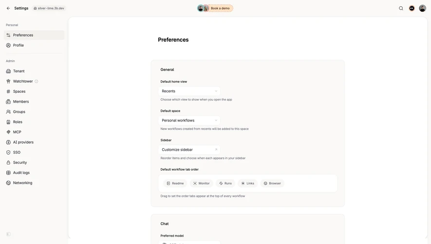
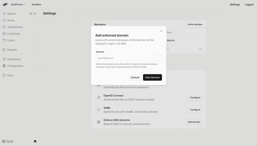
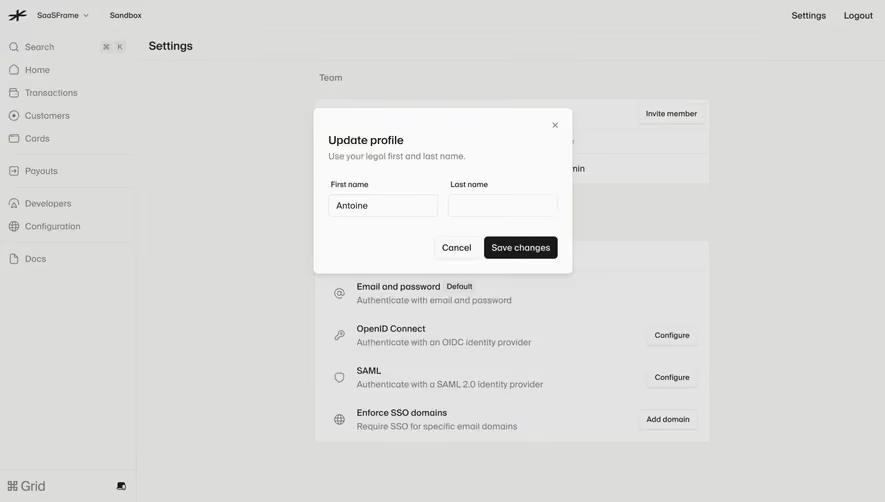
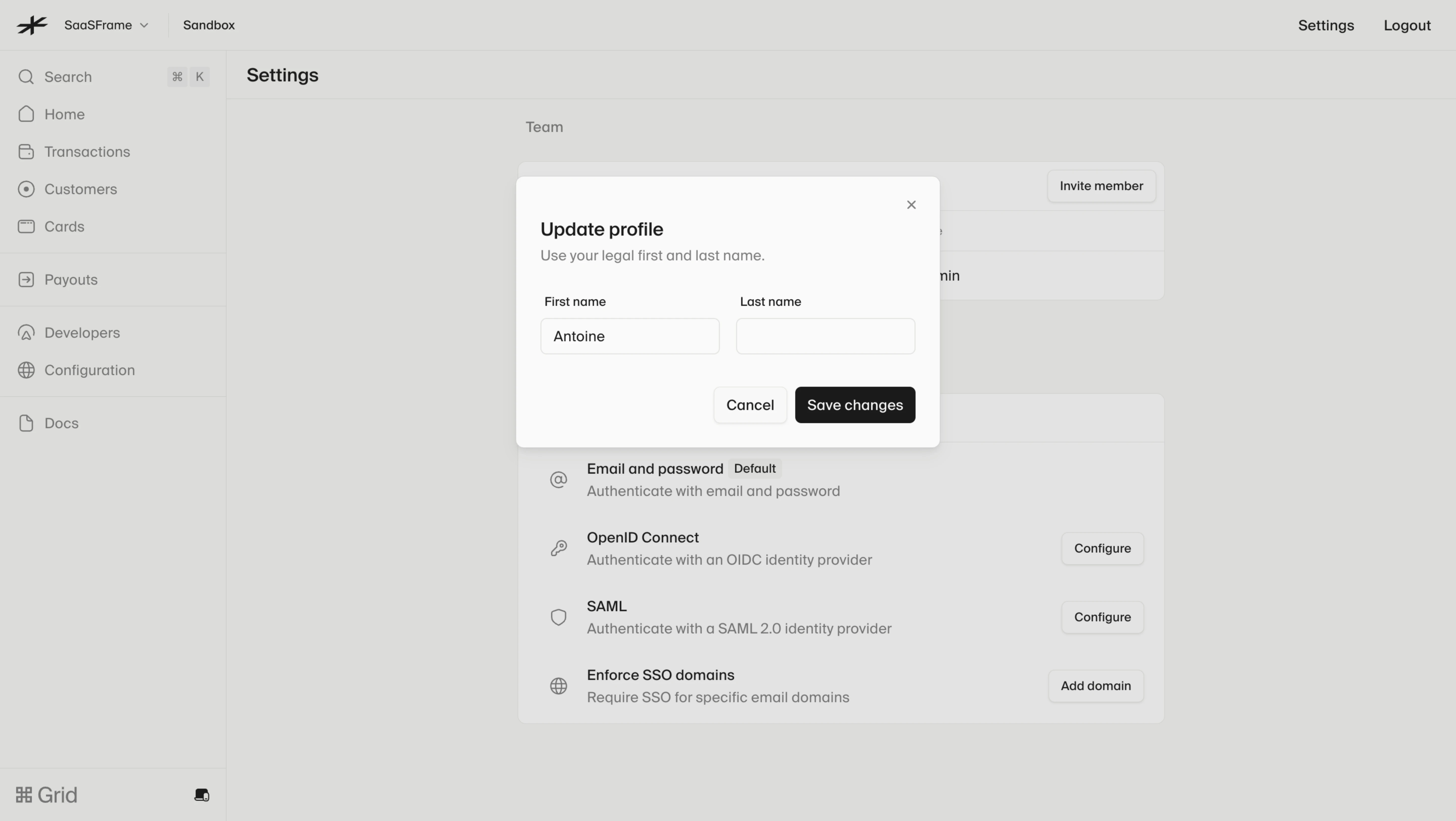
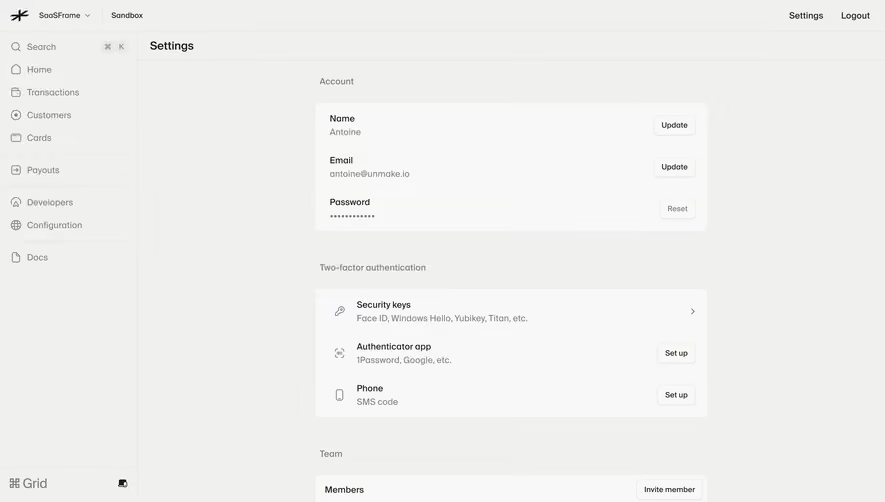
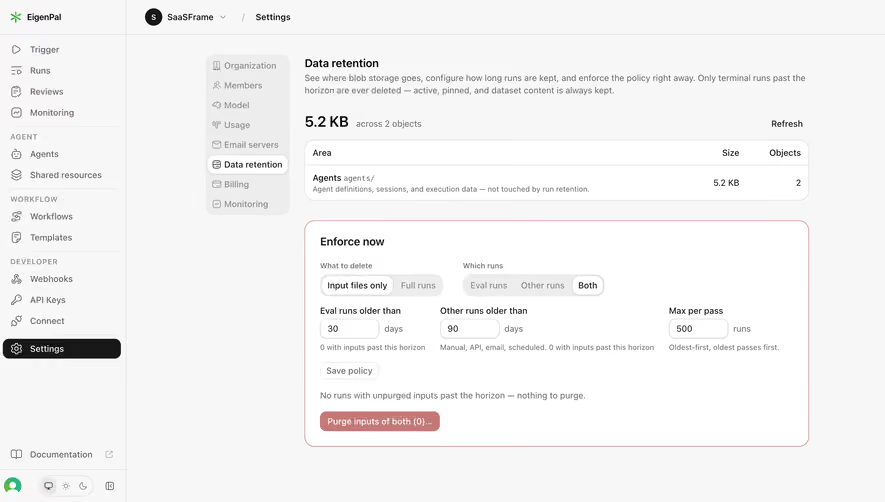
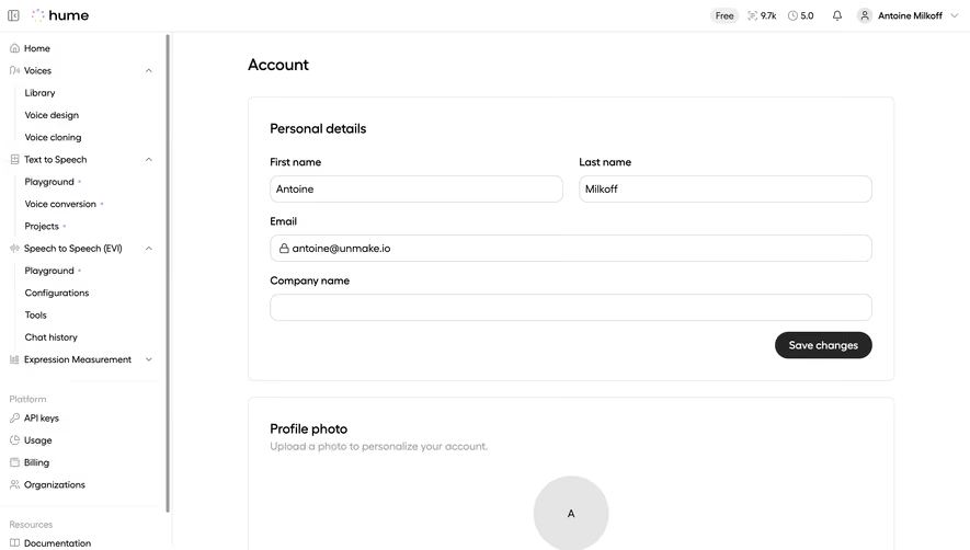
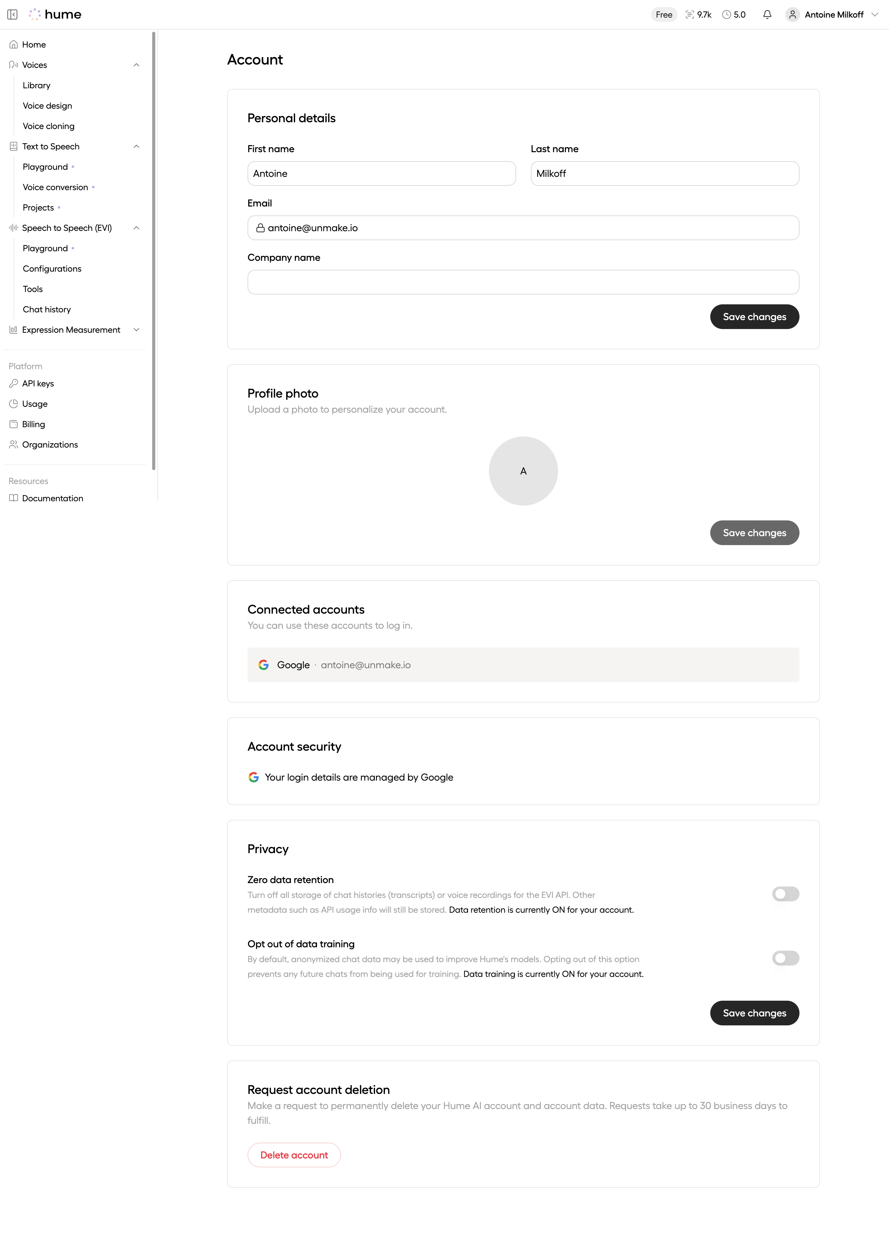
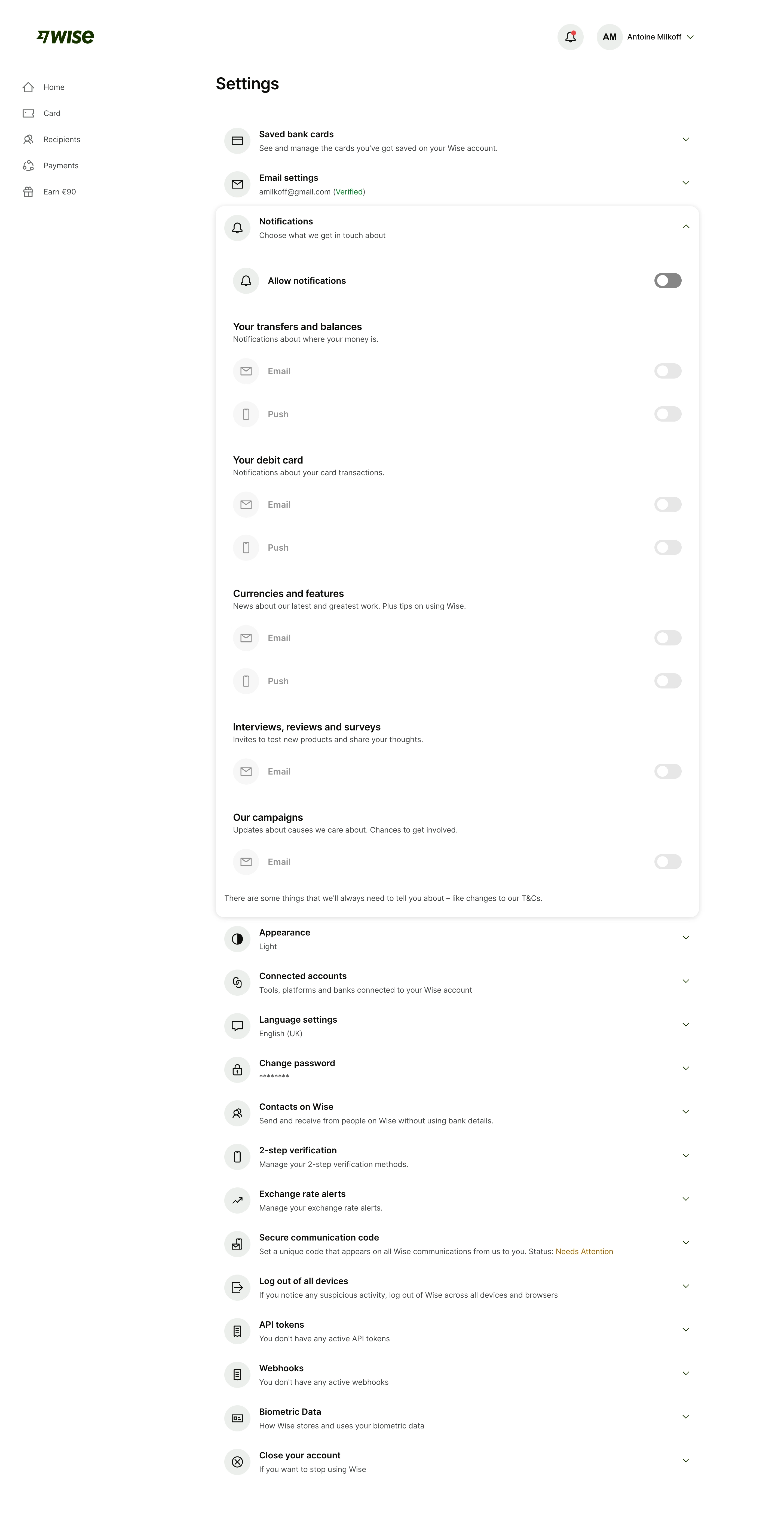
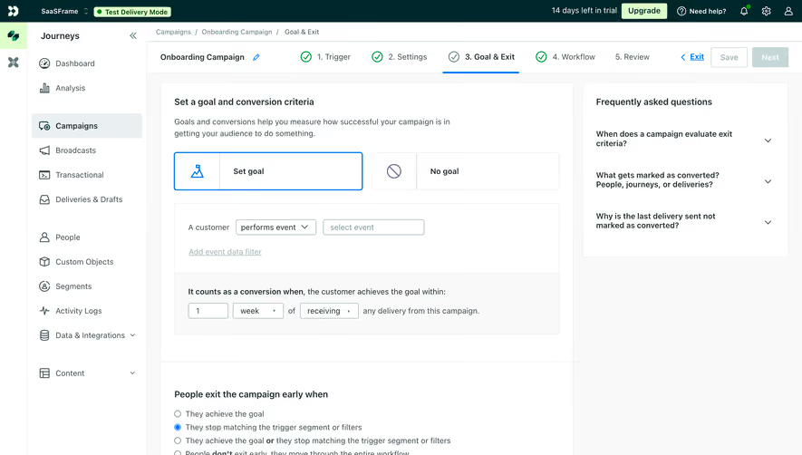
Settings and preferences let people change how a SaaS product behaves after its initial setup. They can apply to one person, an entire organization, or a specific object such as a form. A well-designed settings page makes that scope visible, explains the effect of each choice, and gives people confidence about whether a change has taken effect.
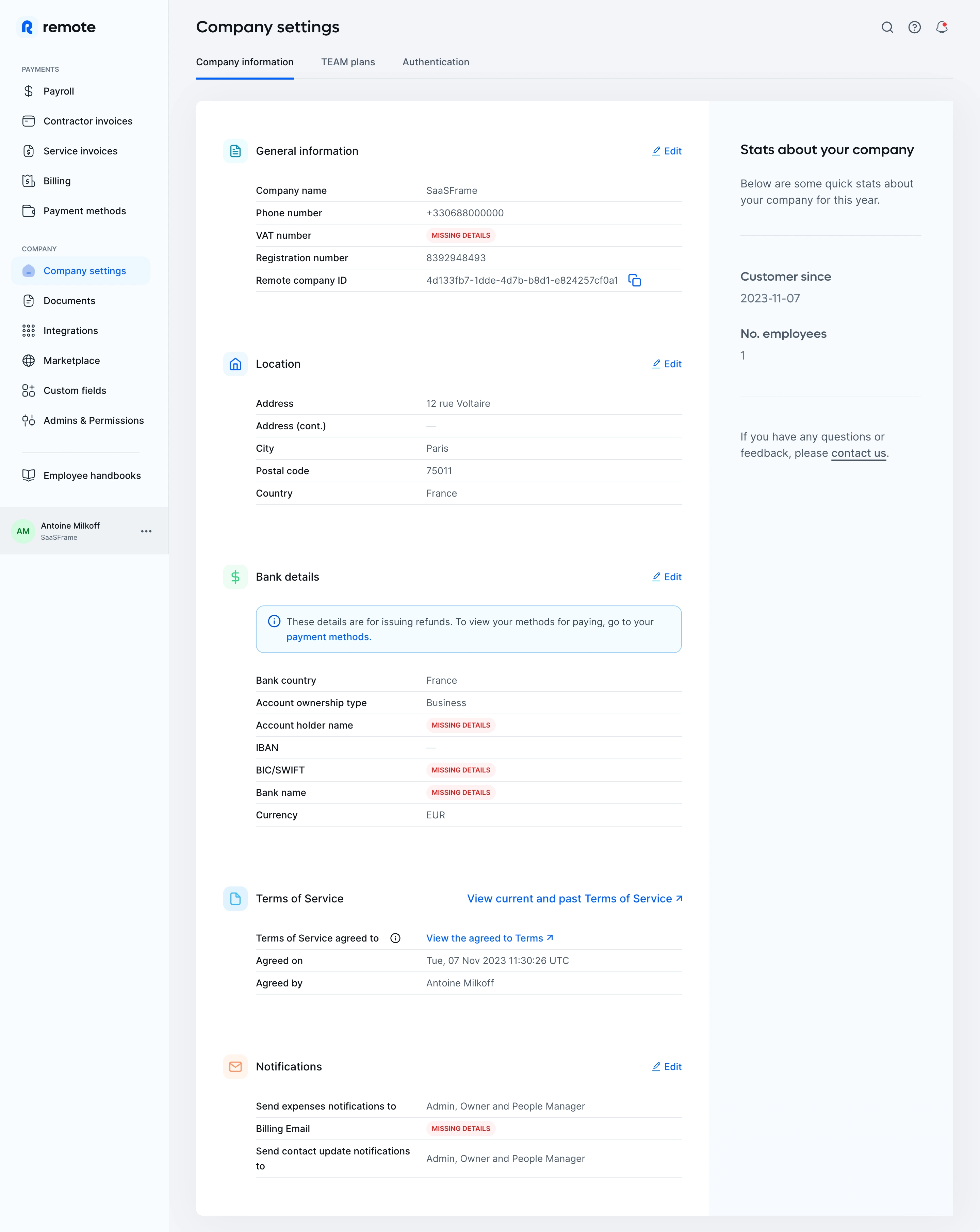
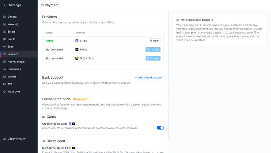
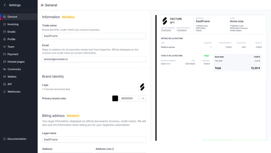
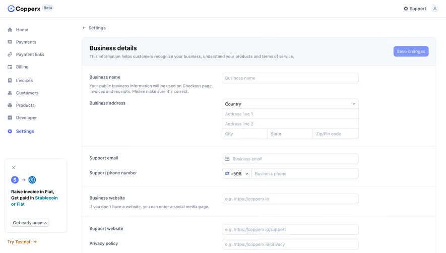
Formcarry, Café, and Threads illustrate three different configuration problems: managing one form, coordinating organization-wide workplace defaults, and defining collaboration policies. The screenshots show the controls and explanations available in those captured states. They do not establish how changes are saved or how the products behave today.
The first question on a settings page is whose experience will change. A personal notification preference and an organization-wide invitation policy can look like similar toggles while having very different consequences. Put the relevant person, organization, or object in the page heading and navigation context.
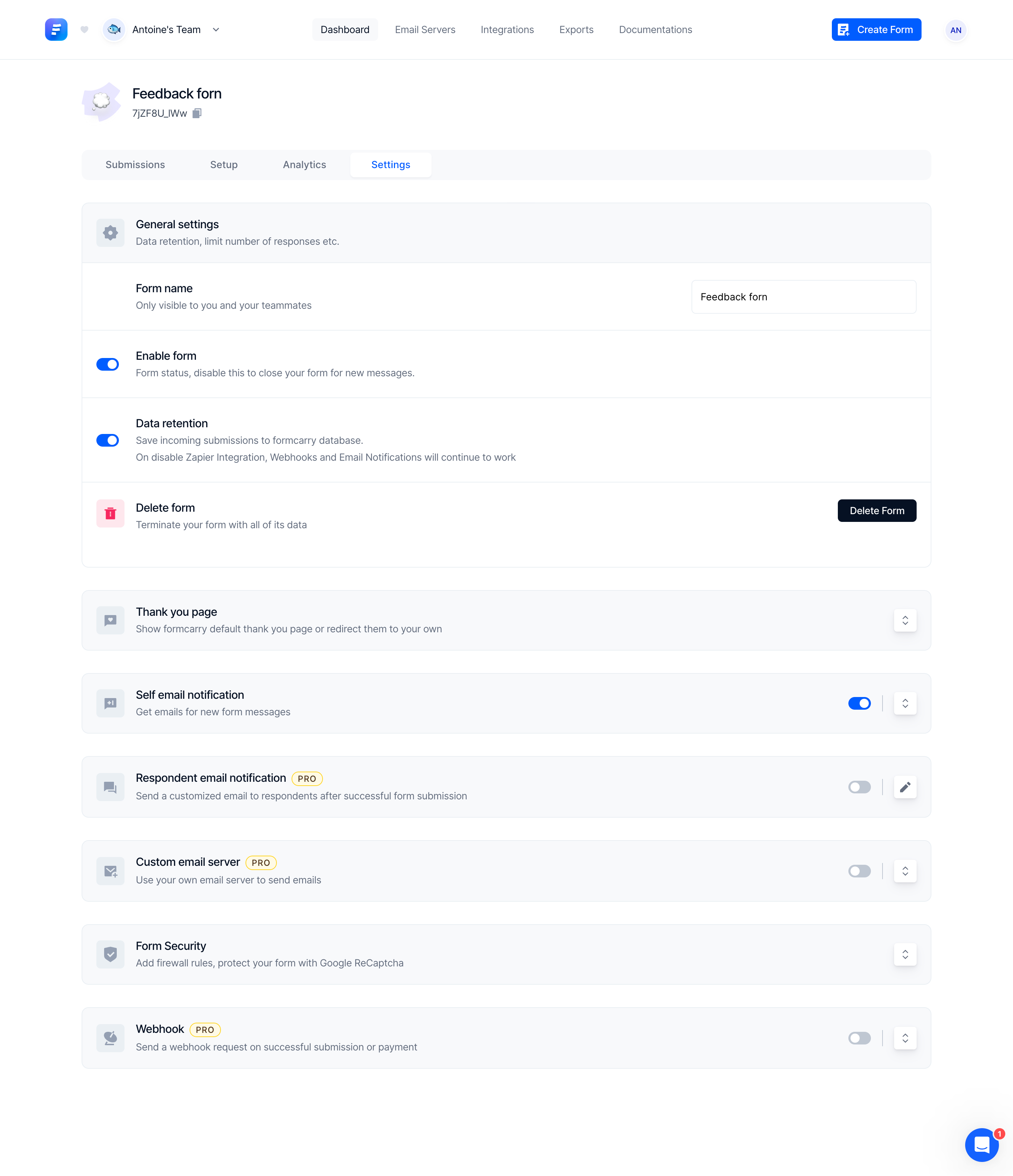
Formcarry’s capture places settings beneath a named form, alongside submissions, setup, and analytics. The form name and surrounding tabs establish that this configuration belongs to an individual form. A person changing data retention should understand that object scope before using the control.
Keep scope visible when the page becomes long or opens a nested editor. If administrators manage several organizations or projects, a generic heading such as “General” is insufficient on its own. A persistent context label helps prevent a valid change in the wrong place.
Settings often grow as the product gains features. Group controls by the decisions people make: identity, access, notifications, integrations, calendar behavior, or data handling. Avoid making internal implementation categories the primary navigation vocabulary.
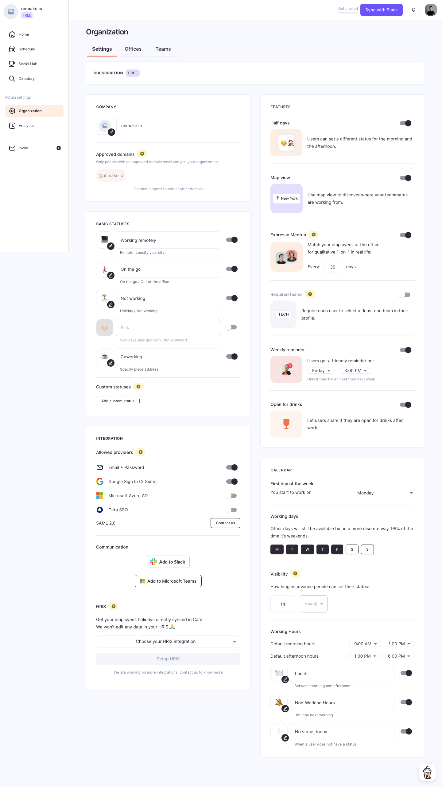
Café groups organization configuration into sections including basic statuses, integrations, features, and calendar settings. Threads uses General, Integrations, and Customize tabs. These arrangements suggest different scales of organization: sections within a longer page and navigation between related settings pages.
Choose according to actual volume and task relationships. A small page may not need a sidebar with many nearly empty destinations. A long page may benefit from navigation that lets someone find a specific policy without scanning every setting. Retain meaningful group names on narrow screens rather than relying solely on desktop column position.
A setting label should identify the behavior it controls. Supporting text should explain a meaningful consequence or constraint, rather than repeating the label in a longer sentence. People need enough context to choose without opening unrelated documentation.
Formcarry explains that disabling a form closes it to new messages. Its data-retention description distinguishes saving submissions in the product database from the integrations and notifications that can continue working. That distinction matters because “stop storing” and “stop processing” are different decisions.
Write descriptions that match the actual behavior. If disabling a setting only affects future events, say so. If it also removes an existing capability, makes a resource unavailable, or changes a shared workflow, state the effect before the change. Avoid a reassuring phrase such as “you can change this anytime” unless reversal truly restores the previous situation.
Café’s organization settings include approved email domains, sign-in providers, reminder timing, working days, and status options. These choices define a shared operating environment. They are not simply the administrator’s personal preferences.
If people can override a default, explain that relationship where it affects the decision. An organization default may initialize a new user’s preferences, constrain everyone’s choices, or supply a fallback only when no individual value exists. Those models require different descriptions.
Show inherited values distinctly from direct choices when both exist. For example, a notification schedule inherited from an organization should not look like a personal choice the user can edit freely. If a policy is locked, explain the restriction and identify the available route for requesting a change.
Use a checkbox or switch for a genuinely independent on-or-off choice. Use radio buttons for a small set of mutually exclusive alternatives. A select control can suit a larger bounded list, while text fields serve values that people must enter themselves.
Threads uses checkboxes for allowing members to invite people and for matching-domain joining. It uses radio groups for default public-channel selection, share-link behavior, and organization presence indicators. The control types help communicate whether choices can coexist or compete.
Do not use a switch merely because it creates a compact row. A choice with three meaningful states, such as inherited, enabled, and disabled, cannot be faithfully represented by a two-state control without another mechanism. Likewise, avoid several checkboxes when only one option is valid.
Threads’ captured share-link section distinguishes automatically creating different kinds of links, leaving links for people to create themselves, and prohibiting particular link types. One option also explains that existing links will stop working. That is a consequential difference between a default for new work and a policy affecting existing resources.
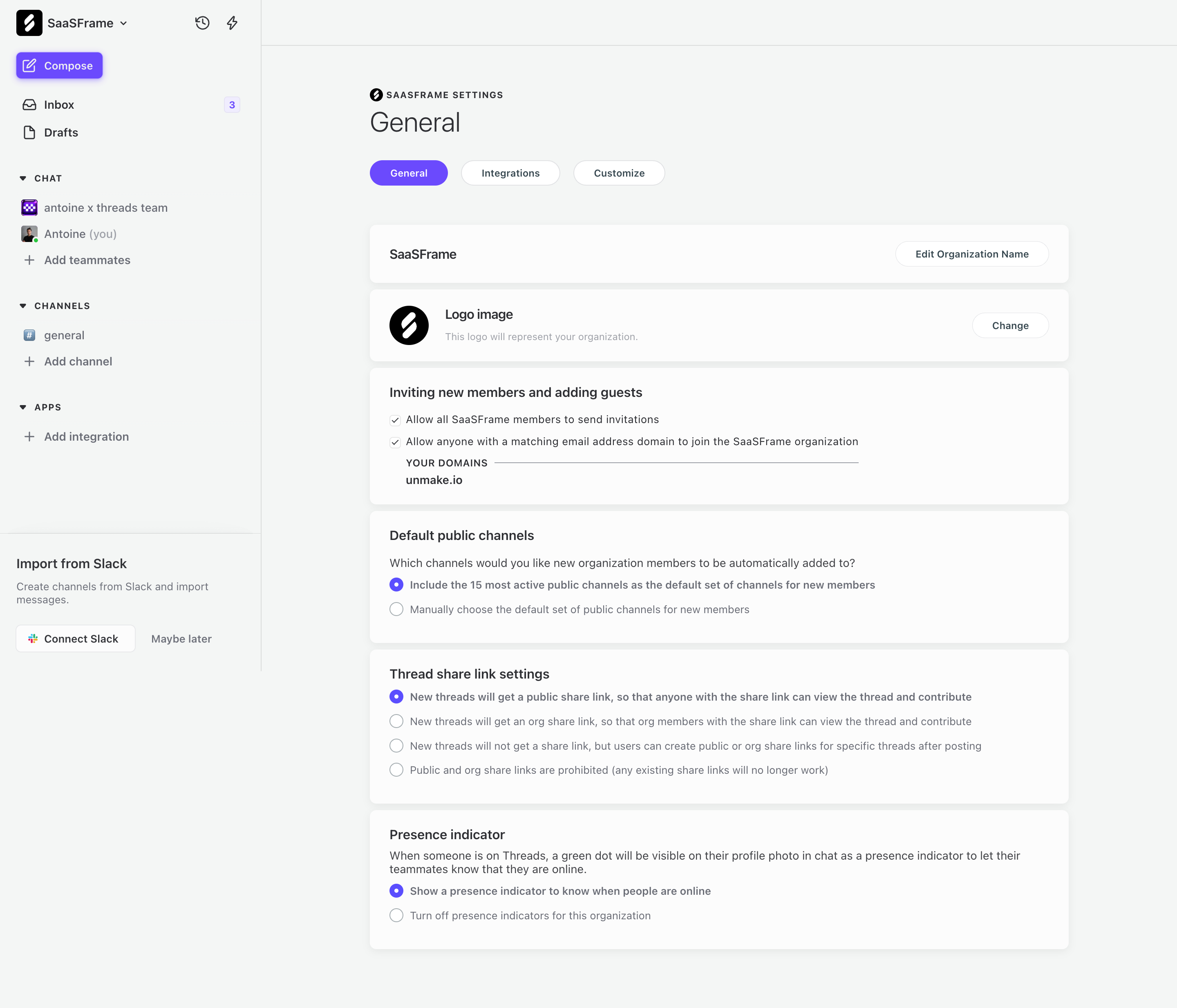
Describe both dimensions when relevant: what happens next and what happens to what already exists. A change to a default project visibility may affect only future projects. A restriction on public sharing may also require a migration or invalidate current links. The settings interface should not make the administrator infer which model applies.
For broad changes, provide a review step when it helps communicate actual scope. Show the affected organization and relevant consequences. Avoid adding confirmation dialogs to every harmless preference; reserve extra friction for decisions where it improves understanding.
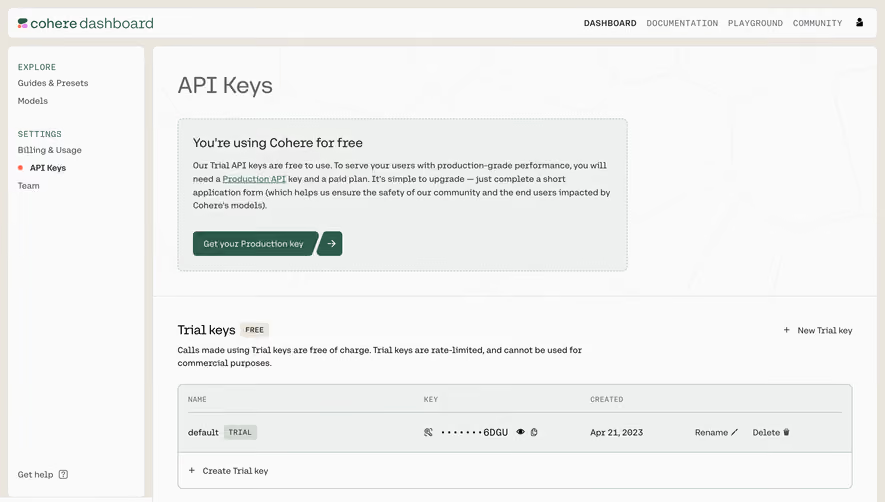
Formcarry uses expandable groups for thank-you pages, email notifications, custom email servers, security, and webhooks. Some rows expose a switch before the detailed editor. This can reduce the amount of configuration shown at once while retaining a recognizable overview.
The collapsed state still needs to communicate enough for a decision. Give each group a descriptive title and, when useful, a summary of its configured state. A hidden detail panel should not contain the only explanation of what an exposed switch will do.
Preserve the relationship between enabling a feature and completing its configuration. If a webhook needs a valid destination before it can run, the flow should make that dependency clear. Avoid an apparently enabled feature that remains unusable because required details are concealed farther down the page.
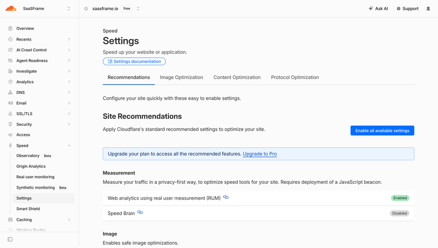
Formcarry marks several advanced settings with a PRO badge. Café shows integration setup controls and provider choices with different available states. These visual restrictions can arise from different causes, so a disabled control alone is not enough explanation.
A subscription limit calls for information about the relevant plan capability. A permissions restriction calls for the access policy or an administrator route. A missing dependency calls for the prerequisite step. Treating all three as an upgrade prompt confuses the person trying to complete configuration.
Explain the restriction close to the affected control, using the product’s actual policy. Keep the current configuration readable where access permits it. Administrators may need to understand a setting even when they cannot change it.
Café includes an interval for meetup behavior, a weekly reminder day and time, calendar visibility, working days, and morning and afternoon ranges. These settings depend on units, boundaries, and the calendar context.
Include units where people enter or review values. Explain which time zone a schedule uses and whether a date or time applies to the organization or the individual. A reminder set to Friday at 3 PM is ambiguous if collaborators work across time zones and the scheduling context is hidden.
Validate relationships between values as well as each value separately. A valid time field can still produce an invalid range when its end precedes its start. Keep the entered information available and explain the correction beside the affected setting.
Choose a saving model deliberately. Immediate updates suit independent changes that are easy to reverse. An explicit Save action can suit a related group that needs validation together. Neither model should leave people unsure whether an edit is merely local or already active.
For immediate saving, show a meaningful pending or failure state when needed. For explicit saving, make unsaved changes recognizable and handle navigation away intentionally. Do not show success before the server has accepted the change.
Test interrupted requests, simultaneous administrators, and a permission change during editing. Recover in a way that preserves useful input and shows the current authoritative value. A failed update should not leave a switch visually enabled while the underlying feature remains off.
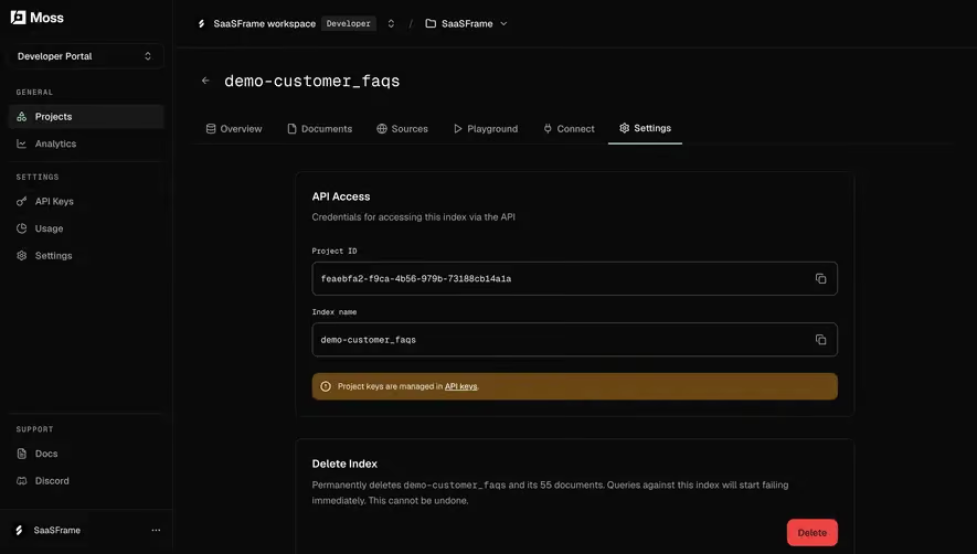
Formcarry’s delete-form row names the object and explains that its data will be removed. Deletion is a different task from ordinary configuration. Give it a clear label and a review appropriate to the product’s actual recovery model.
Use accessible names for switches, inputs, tabs, and expandable sections. Associate help and errors with their controls. A checked state, disabled state, or validation failure needs a programmatically available meaning as well as a visual treatment.
Test keyboard navigation through long pages, opening advanced groups, changing radio choices, and reaching the final action on mobile. Ensure that saving feedback can be perceived without relying on color or a brief animation.
No. Choose according to the relationship between fields, validation needs, and consequences. In either model, make the saved state and any failure clear.
A preference typically configures an individual experience. A policy governs shared behavior or allowed choices. Explain the scope rather than relying on the page title alone.
Identify the actual reason and next step: a required plan, insufficient permissions, or missing configuration. These situations should not share a generic explanation.
Explore User Profile for personal identity, Roles & Permissions for administrative access, Tabs for settings navigation, and Webhooks for integration configuration.
Use the gallery to compare scope, consequence explanations, and saving decisions. For accessible inputs and status feedback, consult W3C’s form labels guidance and form notifications guidance.