Overall Style and Aesthetic
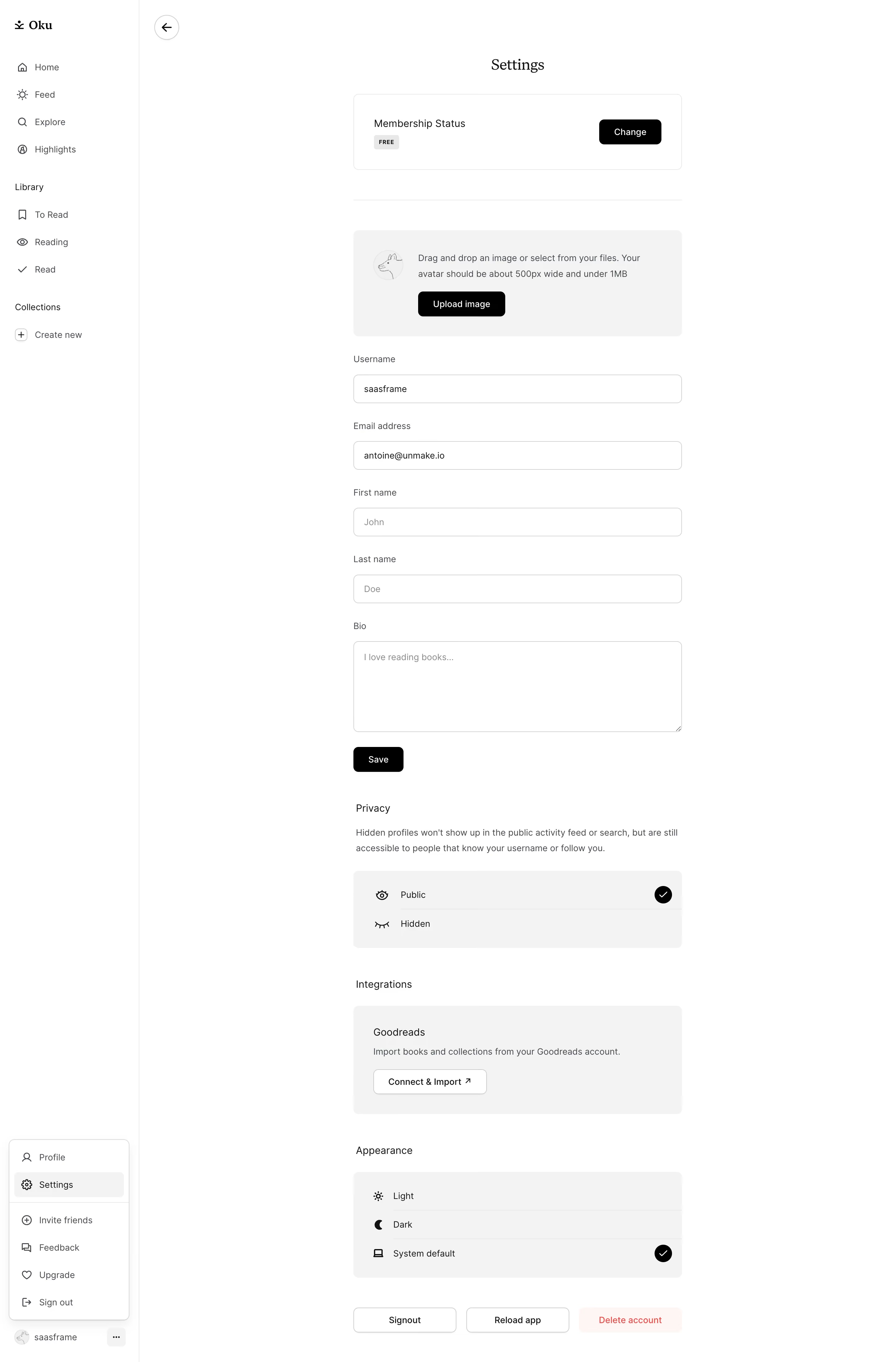
Oku Club’s settings page perfectly embodies a clean, minimalist, and contemporary design approach—aesthetic choices are restrained but purposeful. White space dominates, punctuated by gentle accent colors that lend a calm, professional air. The style feels approachable yet sophisticated, reinforcing a sense of trustworthiness ideal for SaaS platforms. Layout and Structure
The layout is straightforward: a narrow, left-sided vertical navigation bar offers quick access to sections like Account, Email, and Notifications, while the main content area focuses attention on form fields and controls. There’s no superfluous hero/banner—utility takes center stage. The UI efficiently clusters related controls under discreet sub-headers, making scanning effortless. Visual Elements
Visual flourishes are subtle: crisp, monochrome icons integrate with text, offering cues without distraction. Micro-interactions—like button hover shifts and input field highlights—add finesse. Rather than relying on bold illustrations or large photos, the emphasis is on interface clarity. Color Palette and Typography
The palette is soft and neutral, primarily off-whites with sparing use of Oku’s signature accent—a gentle purple. Primary actions use bold, filled buttons that draw the eye. Modern sans-serif typefaces deliver clarity with a well-defined hierarchy, using weight and size (not color) for emphasis. User Experience Patterns
Navigation is intuitive, with sticky sidebar links and clear section dividers. Forms are single-column (for easy completion), every input providing feedback and error validation. Calls-to-action—such as "Save"—are persistent and easily accessible, ensuring frictionless progression. Unique or Notable Design Choices
What stands out is Oku’s restraint: the design confidently avoids needless embellishment, focusing instead on granular usability. The Sidebar’s sticky positioning aids in context retention, while contextual tooltips and validation lend a sense of polish. The overall tone is thoughtful and trustworthy, projecting reliability without feeling sterile.