Design with AI
Generate a new design based on this screen using your own content.
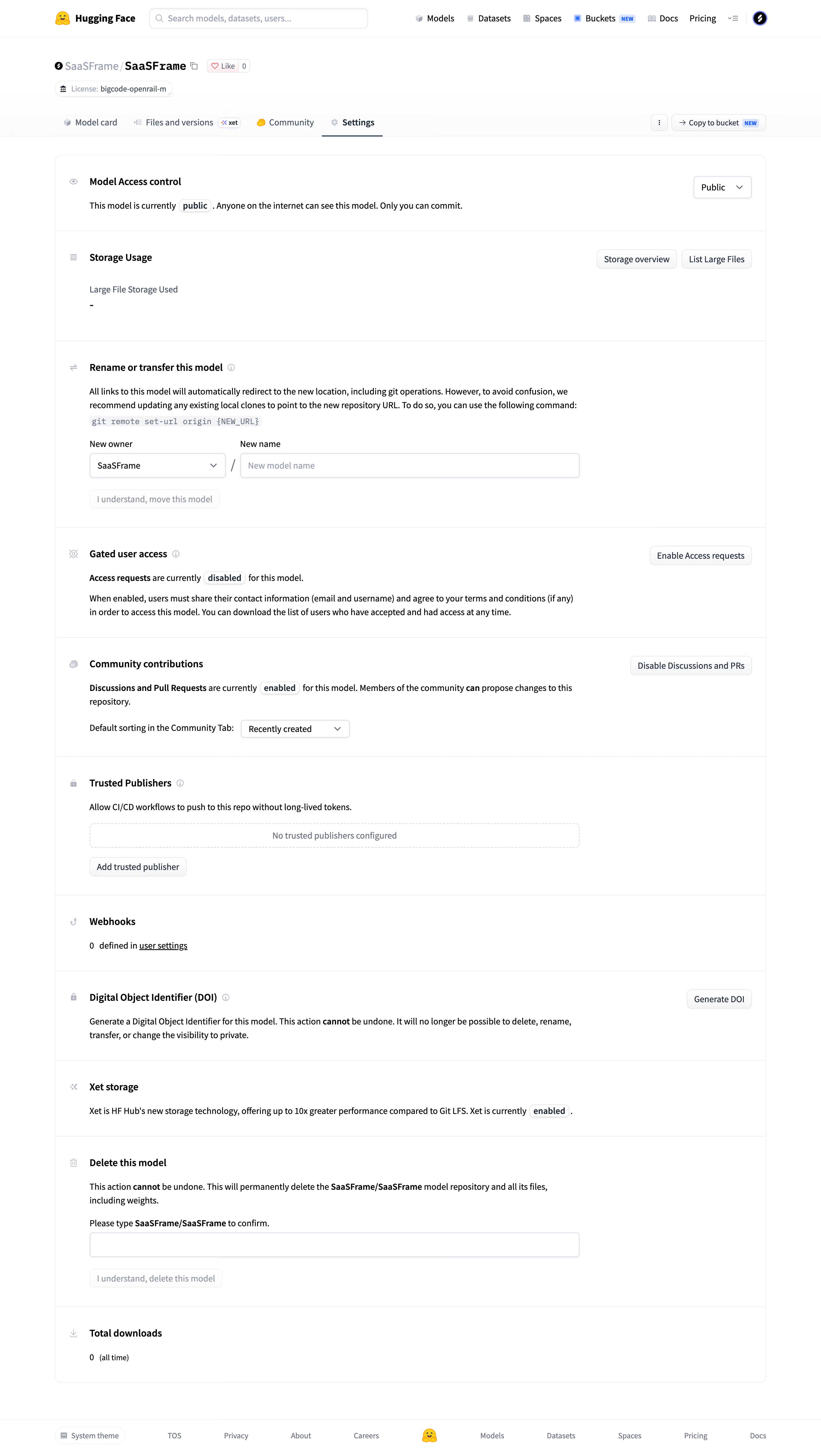
# Design from Reference: Hugging Face Repository advanced settings
Create an original, high-fidelity visual design inspired by the reference. Prioritize composition, typography, colors, spacing, and component styling over technical implementation.
## Reference
- **Product:** Hugging Face
- **Category:** Settings
- **Screenshot:** https://cdn.prod.website-files.com/5e9dc792e1210c5325f7ebbc/6acad09051f927271bf81dd5_6acad023610f0f51f4ed2d3e_cms-a59c9e115558d77365e83f64.webp
Analyze the screenshot first. If inaccessible, request it rather than guessing.
## Content
{{content.instructions}}
{{content.data}}
Preserve essential messaging and factual accuracy. Adapt structure and copy length for visual balance; never invent product claims.
## Visual Design
### Overall aesthetic
- **Style:** A utilitarian repository-settings page with a white foundation, compact navigation, and a long divided settings panel.
- **Character:** Developer-oriented and text-led, relying on section headings, explanatory copy, small controls, and explicit state labels.
### Page composition
- **Capture and scale:** 2880 × 5108 screenshot pixels, consistent with estimated 2× capture. Following sizes are estimated CSS pixels under that assumption.
- **Header:** Global brand/search/navigation precede repository identity, license badge, and repository tabs. Settings is underlined.
- **Settings sequence:** One wide rounded panel contains access control, storage, rename/transfer, gated access, community contributions, trusted publishers, webhooks, DOI, storage technology, deletion, and download count.
- **Footer:** A slim global footer follows with theme control and platform/legal links.
### Information hierarchy
- **Sections:** Bold icon-led headings divide independent administrative tasks.
- **Controls:** Simple settings place actions at the right; complex rename/delete regions place labeled inputs and muted actions below explanations.
- **States:** Small inline outlined labels emphasize public, enabled, or disabled status without large banners.
### Typography
- **Family:** Compact neutral sans serif; exact identity unverified.
- **Roles:** Section headings approximately 16 px semibold; body and controls 14–15 px with 23–24 px line-height.
- **Technical text:** A command example uses small monospace on a pale inline background. Repository identity is larger/bolder than ordinary navigation.
### Colors & surfaces
- **Foundation:** Sampled sRGB #FFFFFF dominates, with #FAFBFC and #EDEEF1 supporting utility surfaces.
- **Boundaries:** Sampled #E6E7EB and near-white #FCFCFD/#FDFDFE define subtle separators and fields.
- **Ink:** Black #000000 anchors text. Small platform icons provide localized color rather than broad colored sections.
### Components
- **Panel:** A roughly 1250 px-wide white container uses thin borders, 12 px radii, and full-width horizontal section dividers.
- **Inputs:** Owner selector/name field share a row with a slash. Deletion has a confirmation field and subdued action beneath.
- **Buttons:** Small pale bordered rectangles use 6–7 px radii and subtle shadows/gradients.
- **Empty configuration:** Trusted publishers uses a dashed outlined empty strip and a small add action.
- **Warnings:** Irreversible-action explanations are conveyed through bold inline phrases in normal body text, not a large red panel.
### Visual rhythm
- **Spacing:** Use around 30–40 px section padding and 20–24 px gaps between explanatory copy, inputs, and actions.
- **Alignment:** Headings and body share a consistent inset, with icons in a narrow left gutter and simple action buttons right aligned.
### Responsive
- **Observed state:** Desktop only; all described sections are visible.
- **Recommended reflow:** Stack right-side actions below copy and wrap complex input rows. Preserve readable technical/warning text.
### Adaptation guidance
- **Preserve:** Retain the divided settings structure, compact controls, explicit state chips, and restrained administrative typography.
- **Adapt:** Use actual settings and permissions for the new product.
- **Avoid:** Do not perform or imply administrative changes; this context describes visible design only. Do not copy repository identity.
Use this context to reproduce the reference's visual language: layout, typography, colors, spacing, borders, radii, and distinctive elements. The screenshot takes priority if descriptions conflict.
## Direction
{{preferences.fidelityInstructions}}
## Output
{{output.instructions}}
Deliver a polished, cohesive design with precise alignment, hierarchy, and spacing. Produce the requested visual artifact, not just a description. If unsupported, explain the limitation.