Toggle
154
Enable instant actions with SaaS Toggle and Switch patterns. Use these for 'On/Off' settings, feature activations, and status changes that require immediate feedback.

A toggle or switch-style control lets users change a setting between on and off. In SaaS interfaces, it can enable a notification channel, activate an optional mode, or configure a security feature. Its design must make the setting's identity, current state, scope, and application behavior clear. The familiar switch shape does not explain whether a change is immediate, pending, or subject to another setup step.
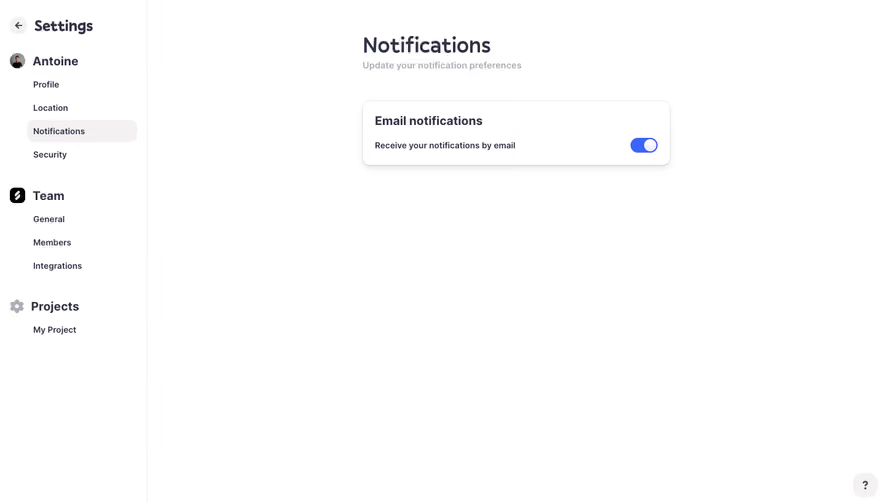
Crew's notification preferences and message composer, alongside Evervault's team settings, show three contexts for switches. They differ in consequence and scope: a notification channel, a sequence-related mode inside a composer, and a team security setting. The screenshots demonstrate visible controls, not the behavior after activation.
A switch suits a named binary setting such as email notifications or automatic refresh. The user should understand what is active when the switch is on and what stops when it is off. If the choice is between several alternatives, use a control that exposes those alternatives.
A switch is also different from a toggle button that marks a mode or pressed state. A toolbar control for bold text and a setting for notifications can both be toggled, but their presentation and semantics serve different contexts. Choose the control according to the actual behavior.
Avoid forcing complex states into a binary switch. A feature can be configuring, active, paused, unavailable, or failed. The switch may express the desired on/off setting, while a separate indicator explains its operational condition.
A stable label identifies the setting; the switch communicates whether that setting is on. “Email notifications” remains meaningful in both states. Changing the label from “Enable email” to “Disable email” can turn the text into an action description and complicate the relationship between label and state.
W3C's switch guidance specifically calls for a label that remains the same when state changes. Align the visual label and accessible name, then let the checked state convey the setting's value.
Use more than color to distinguish states. Thumb position, track treatment, optional state text, and appropriate semantics can reinforce the difference. Test disabled and pending states separately so a pale switch does not ambiguously mean off, unavailable, or loading.
Keep the label close enough that users can identify which setting the control changes, especially in wide administrative layouts. A distant column of switches can make a misaligned click consequential.
Crew's notification settings show switches for Email, Slack, and Daily digest above a matrix of event-level choices. Email and Daily digest appear on, while Slack appears off with an “Integration required” label. Cancel and Update actions sit at the bottom of the settings surface.
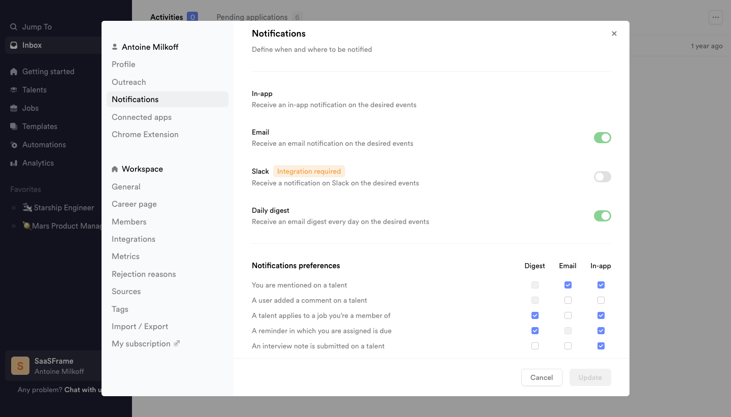
This layout raises an important design question: how does the channel setting relate to the choices below it? If a channel is off, explain whether its event preferences are retained but inactive, cleared, or unavailable. Users should not need to infer that rule from disabled-looking cells.
The visible Update action means the screenshot should not be used as proof that each switch persists immediately. In your own product, make the commit model explicit. If users are editing several preferences before saving, show pending changes and preserve them through validation.
The integration label provides context for Slack's availability. A disabled or off switch alone would not explain the dependency. Give users an appropriate route to connect the integration, subject to their permissions, and clarify whether returning after setup preserves their intended preference.
Crew's email composer includes a switch labeled “Sequence” beneath the message fields. It appears off in the captured state, near the Send email action rather than on a general settings page.
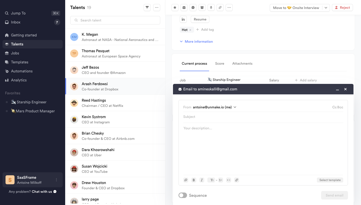
The placement associates the switch with the current task, but the screenshot does not reveal what enabling Sequence changes. A product-specific explanation should identify whether it adds follow-up steps, changes delivery behavior, or selects another mode; do not assume those details from the label alone.
For your own composer, explain the consequences close to the control. If changing the mode alters recipients, timing, or the action button, update those elements coherently. Preserve the draft where possible so inspecting the mode does not erase work.
Clarify whether the choice affects only the current message or becomes a default for future messages. A small switch can cause confusion when a local-looking action silently modifies a global preference.
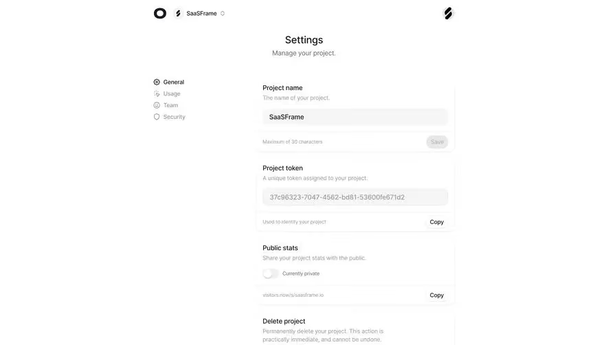
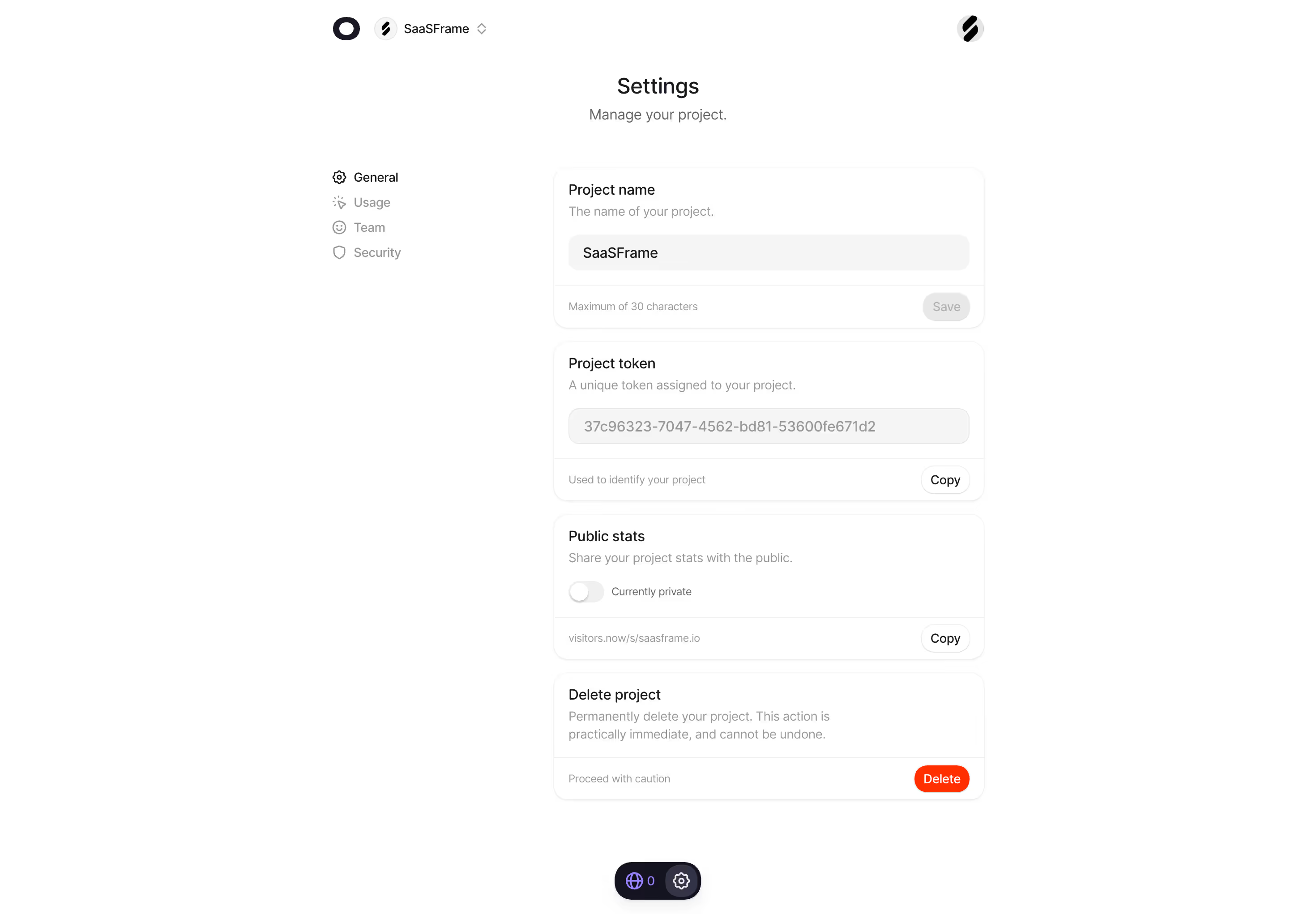
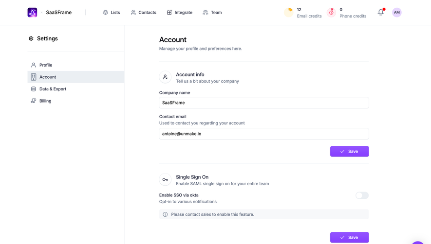
Evervault's Team Settings screen places “Enable Multi-Factor Authentication” under Team Security. The switch is off in the capture, within a page that identifies the team and includes separate integration and billing areas.
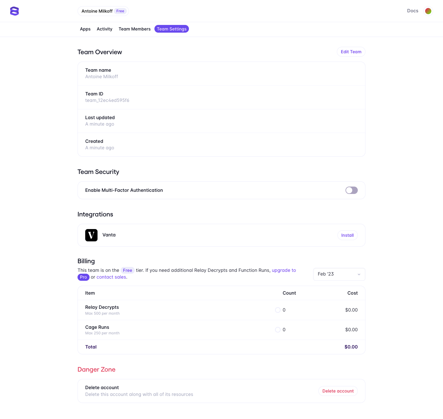
A security switch deserves a precise explanation of scope. Does it enroll the current person, require all members to use a factor, or activate another policy? The screenshot alone cannot establish that distinction. Use visible copy and resulting states that reflect the actual implementation.
If activation requires setup, do not make the on state imply completion before the requirement has been satisfied. A configure action, intermediate state, or clear setup flow can communicate the dependency more honestly.
Similarly, disabling a security setting may have consequences that justify review or reauthentication under the product's established policy. Keep the switch's convenience proportional to the meaning of the change rather than applying identical behavior to every setting.
Immediate application can suit a simple, reversible setting. A user changes the switch, sees the updated state, and continues. The interface still needs feedback if the update takes time or fails.
Explicit saving can fit a group of related settings that users review together. In that model, the switch expresses the pending choice. Make the Save or Update action visible and indicate unsaved changes where needed.
Do not mix commit models unpredictably on one settings page. If some controls apply immediately and others need saving, explain the difference near the relevant group. A user should not leave with only half of their intended changes applied because similar controls behaved differently.
For changes that launch a workflow, distinguish the requested state from the process that applies it. A successful click is not necessarily a successful activation. Show the operational result when it matters.
Load the actual saved value before presenting an interactive setting. A temporary off state during retrieval can look like an established configuration and encourage an accidental overwrite.
When a request is pending, prevent ambiguous repeated changes or define how the latest desired value wins. Keep the setting's identity visible while communicating that the update is in progress.
If the update fails, explain which value remains effective. A switch that stays visually on while the server rejected the change can create false confidence. If an optimistic update is used, reconcile it clearly with the confirmed outcome.
Preserve the user's intent for recovery where appropriate. A retry should not require them to remember a long list of preferences. At the same time, avoid retrying consequential operations silently when the result is uncertain.
A feature may require an integration, an eligible plan, an administrator role, or another configuration. Keep the reason visible enough to understand and provide a useful next step when available.
Distinguish off from unavailable. Off means the setting can be inactive; unavailable means the user cannot currently change or use it. A disabled switch should not force people to guess whether the product is broken.
If an organization policy fixes a setting, show its value and explain the restriction. Do not present a normal interactive switch that snaps back after every click without context.
When one setting controls several subordinate options, preserve a clear parent-child relationship. Turning off a notification channel can deactivate event preferences while retaining them for later, but that policy needs intentional copy and rendering.
Routine switches should not produce repetitive confirmation dialogs. Interruption is useful when the change has consequences worth reviewing, such as affecting other users or stopping a shared service.
When review is needed, identify the setting, scope, and effects. The dialog should explain the decision rather than merely ask “Are you sure?” Keep the final effective state clear after the operation.
Do not treat a confirmation as a substitute for permission checks. A person may be able to see the setting without being allowed to change it. The visible control and the execution policy need to agree.
For reversible settings, appropriate feedback or an undo route can support confidence without adding a modal. Verify that the promised recovery actually applies to the relevant downstream effects.
A settings page can become stale while someone else changes the same value. Define how conflicts are handled and communicate meaningful updates instead of silently overwriting another person's configuration.
Scope the stored value appropriately. A personal preference, team policy, project setting, and per-device option are different models. Place the switch within the correct context and repeat the scope when the surrounding interface can be ambiguous.
When users return later, display the effective saved state. A preference that was only pending before navigation should not look applied simply because a local UI value was cached.
For high-impact shared settings, a record of changes can help users understand why the current value differs from what they remember. Link to an appropriate history or audit view when the product supports it.
Expose the switch's name and on/off state through appropriate semantics. Support expected keyboard activation and visible focus. A draggable thumb should not be the only way to change the value.
Make the target comfortable on touch devices and keep label interaction predictable. If a help link appears nearby, ensure that opening help does not change the setting accidentally.
Use feedback that preserves focus while communicating completion or failure. Test the control's actual behavior with assistive technology rather than assuming that an attractive animation announces the new state.
Check narrow layouts, zoom, long labels, dark themes, disabled states, and slow networks. The label and switch should remain clearly associated when the row wraps or the page becomes dense.
No. A switch can appear in a form with an explicit Save or Update action. Make the commit behavior clear rather than relying on its shape.
A checkbox can suit an independent selection among pending form values. A switch can emphasize an on/off setting. Choose a consistent model that fits the surrounding task.
For a switch, keep its label stable and communicate the state through the control. A changing action label may belong to a different button model.
It can initiate a setup process, but the UI should distinguish requested activation from completed readiness. Do not show an unqualified on state before required configuration succeeds.
Compare Checkbox for independent form selections, Settings & Preferences for configuration structure, Status Indicator for operational conditions, and Confirmation Dialog for consequential review. See W3C's switch guidance for semantic and keyboard requirements.