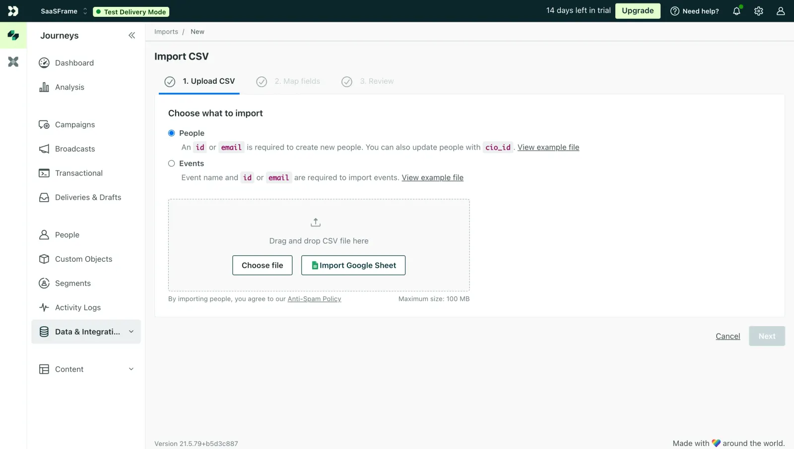
Customer.io's CSV import page is a great example of how to handle a potentially tedious task without overwhelming the user. The three-step progress bar at the top instantly tells you where you are and what's coming. Step 1 is highlighted with a bold blue underline. Simple and effective.
Smart Use of Restraint
The radio button selection between People and Events is dead clear. Each option has a short helper line with inline code snippets styled in that soft pink/red monospace treatment for `id`, `email`, and `cio_id`. That's a smart touch. It pulls technical details into the UI without making things feel like documentation.
The Upload Zone Feels Inviting
Dashed border, upload icon, two distinct CTAs. "Choose file" is understated, while "Import Google Sheet" gets the green Google icon treatment. The 100 MB max size note sits quietly in the corner. The pale green sidebar with its left-aligned nav keeps everything organized without competing for attention. Typography is consistent and readable throughout. Nothing flashy, just thoughtful hierarchy doing its job.
 SaaSFrame