Generate a new design based on this screen using your own content.
Thank you! Your submission has been received!
Oops! Something went wrong while submitting the form.
# Design from Reference: Huly Profile Details
Create an original, high-fidelity visual design inspired by the reference. Prioritize composition, typography, colors, spacing, and component styling over technical implementation.
## Reference
- **Product:** Huly
- **Category:** Details
- **Screenshot:** https://cdn.prod.website-files.com/5e9dc792e1210c5325f7ebbc/6acad3fec910b3adf9e48a7c_6acad17a34fc5239ec23fd35_cms-30df785788ed7ccae58b3e28.webp
Analyze the screenshot first. If inaccessible, request it rather than guessing.
## Content
{{content.instructions}}
{{content.data}}
Preserve essential messaging and factual accuracy. Adapt structure and copy length for visual balance; never invent product claims.
## Visual Design
Use this context to reproduce the reference's visual language: layout, typography, colors, spacing, borders, radii, and distinctive elements. The screenshot takes priority if descriptions conflict.
## Direction
{{preferences.fidelityInstructions}}
## Output
{{output.instructions}}
Deliver a polished, cohesive design with precise alignment, hierarchy, and spacing. Produce the requested visual artifact, not just a description. If unsupported, explain the limitation.
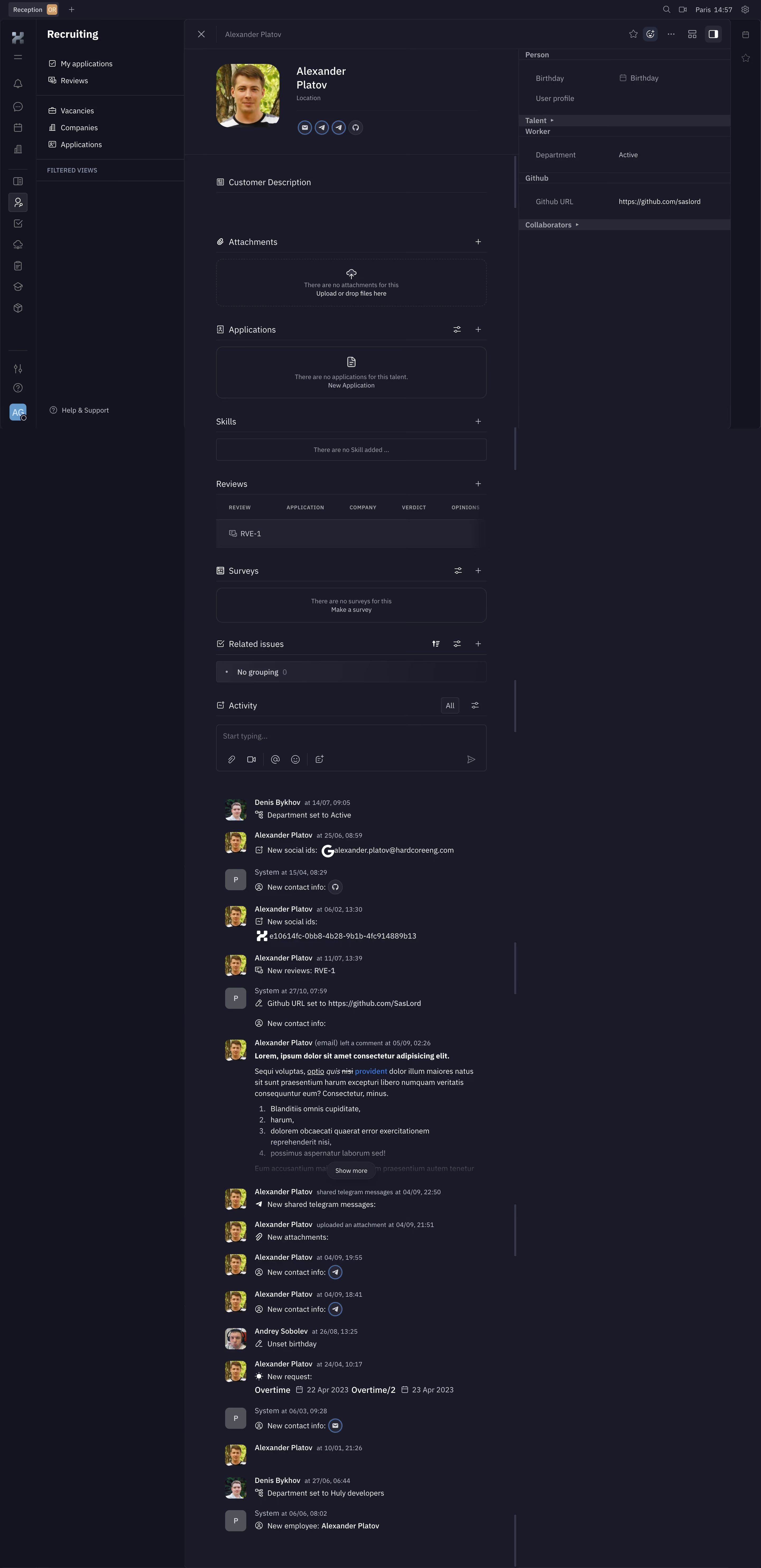
First thing that hits you is the deep navy/charcoal background with that left sidebar in near-black. It's moody but not muddy. The accent color is a warm orange-gold used sparingly for active states and section headers like "Talent" and "Worker" tags. Smart restraint there.
Everything About One Person, One Scroll
This is a talent profile for "Alexander Platov" in what looks like Huly's recruiting module. The layout splits into a main content column and a right-side metadata panel showing birthday, department, GitHub URL. The main column stacks sections vertically: Customer Description, Attachments, Applications, Skills, Reviews, Surveys, Related Issues, then a full Activity feed. It's dense but scannable. Each section has its own + button for quick additions.
The Activity Feed Does the Heavy Lifting
That timeline at the bottom is packed. Social IDs added, Telegram messages shared, department changes, overtime requests. Each entry gets an avatar, timestamp, and icon. The typography is small but legible, with bold names and muted timestamps creating clear hierarchy. Feels like a tool built by people who actually use it daily.