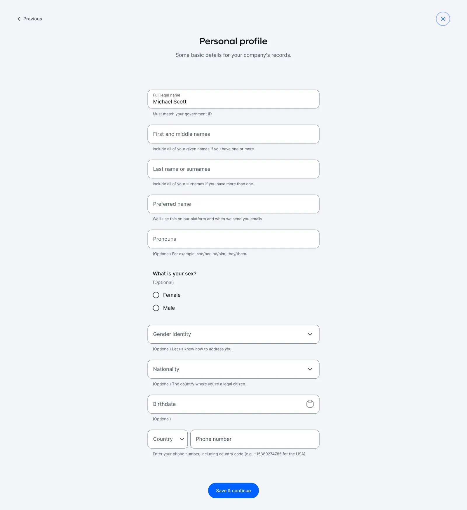
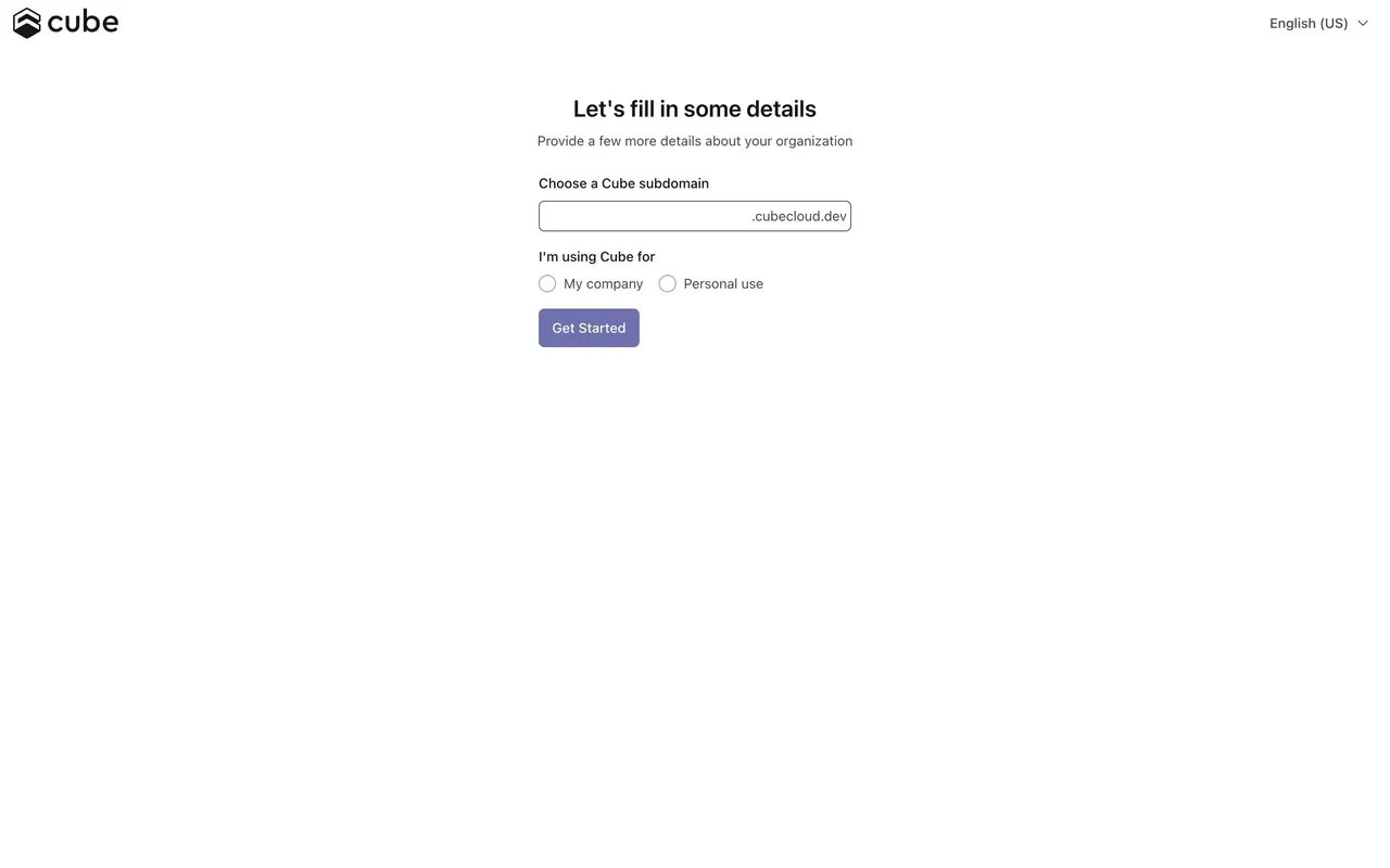
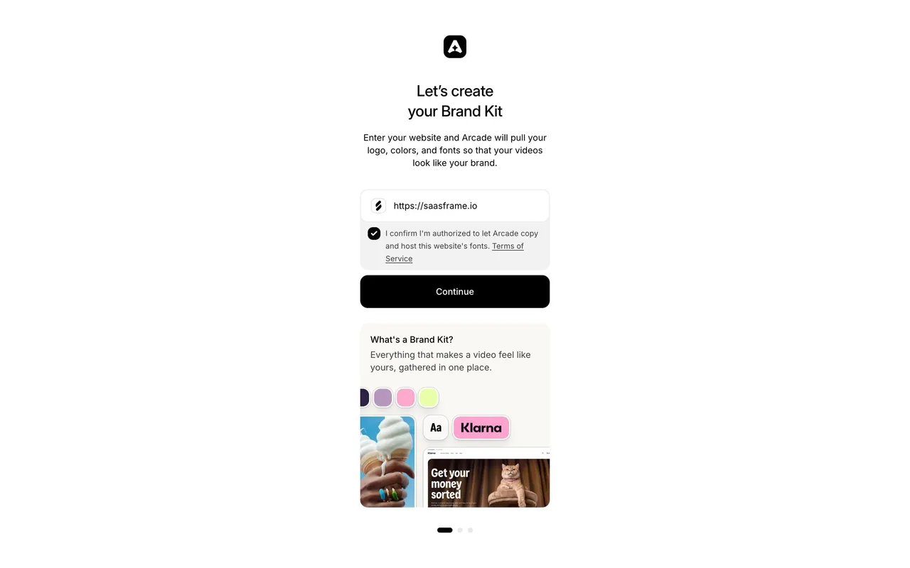
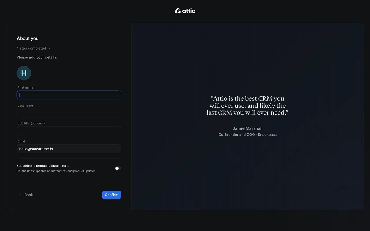
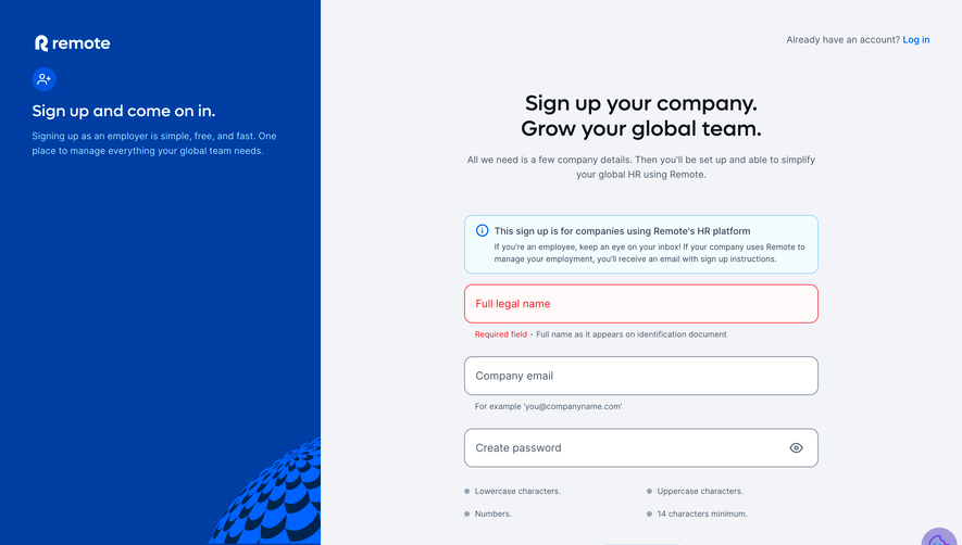
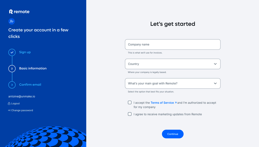
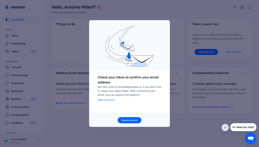
Remote's onboarding page exudes a clean, minimalist, and professional vibe. There’s a sense of calm, confidence, and trust, created with generous white space and consistent, carefully balanced elements. The interface radiates a global, inclusive spirit—subtle references to diversity and accessibility appear in iconography and user avatars, making every user feel welcomed.
Layout and Structure
The structure follows a straightforward path, placing a central, focused form at its heart, framed by a slim lateral progress indicator for onboarding steps. There’s minimal distraction—no hero banners or feature noise—just a clear progression, with the form fields as the prime focal point. Key navigation elements float intuitively at the top, while sticky CTAs ensure users are never left hunting for the next step.
Visual Elements
Soft, unobtrusive icons and teaser illustrations (like a user avatar placeholder) add warmth and break the monotony of form fields. Microinteractions appear throughout—inputs gently highlight on focus, error alerts are understated yet unmistakably clear, and step completion is rewarded by animated checkmarks.
Color Palette and Typography
The page uses a fresh palette: bright, inviting whites; soft blues for accents and highlights; and a dash of yellow or purple for action elements. Typography sticks to legible sans-serifs (think Inter or Avenir) with strong hierarchy—section headers pop in bold, labels stay subtle but readable, and helper text is quiet but always present.
User Experience Patterns
Navigation flows linearly; the left-side progress tracker gently encourages users while subtly reducing anxiety about how many steps remain. Primary CTAs are always visible and actionable, with clear disabled states to guide completion. Well-timed tooltips and validation lessen cognitive load, ensuring zero frustration.
Notable Design Choices and Feel
The deliberate restraint—eschewing splashy visuals in favor of clarity—demonstrates a user-centric ethos and a focus on usability over flair. The tone is quietly supportive, guiding users through sensitive onboarding with clarity, inclusivity, and a reassuring touch. This page is a model of seamless, confidence-boosting SaaS UX design.
 SaaSFrame