That Background Does All the Heavy Lifting
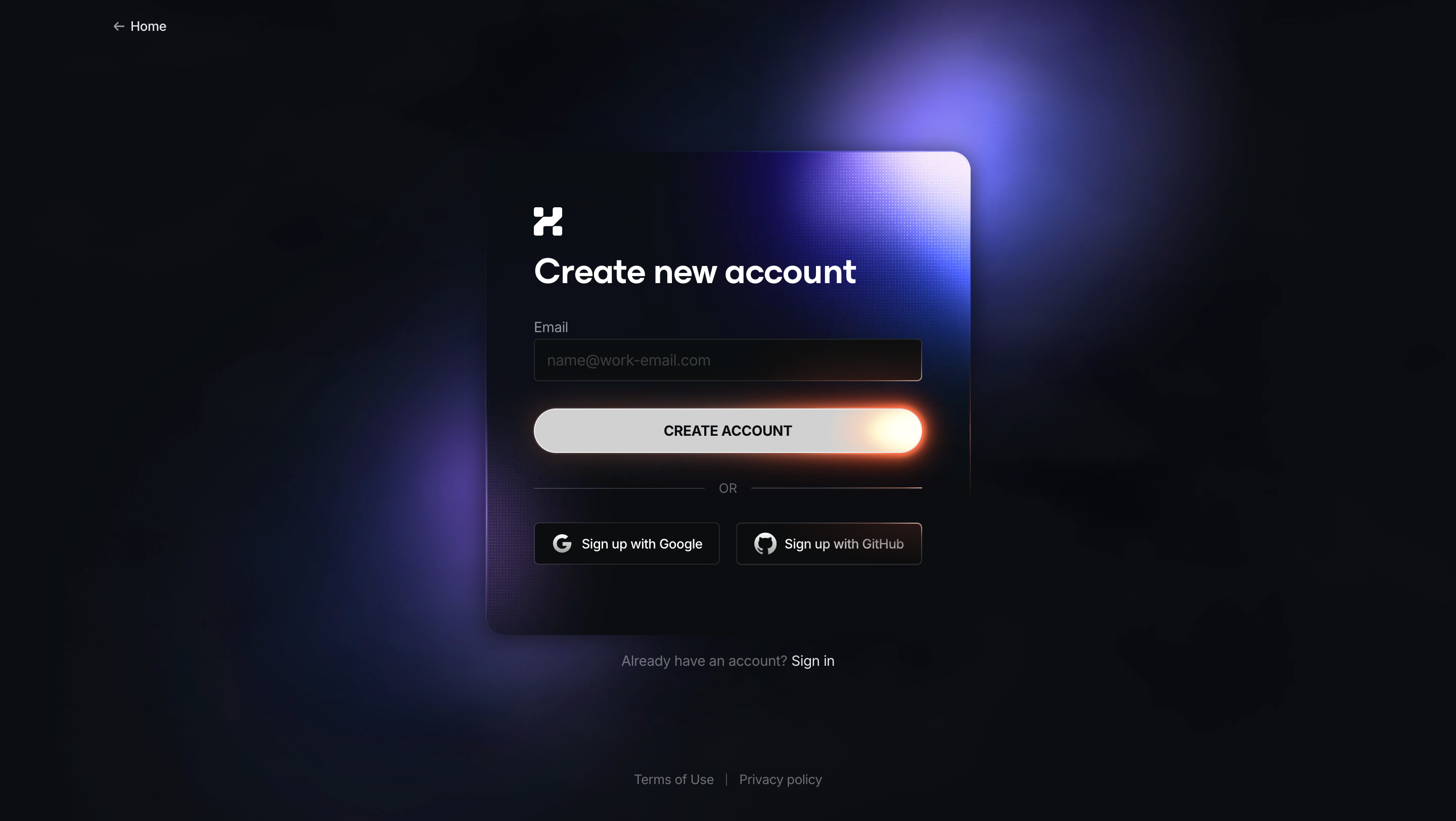
First thing you notice is the deep, moody dark background with those purple and blue light bleeds. It feels cinematic. The glassmorphism card in the center floats on top of it with a subtle transparency that lets those colors bleed through just enough. Really effective depth without trying too hard.
Dead Simple Form, Zero Friction
One email field. One button. That's it. The "CREATE ACCOUNT" button has this warm orange-to-white gradient that practically glows against the dark surroundings. It's the brightest element on the page and your eye goes straight to it. Below that, Google and GitHub sign-up options sit in outlined buttons that know their place in the hierarchy. The "OR" divider keeps things clean.
What Makes It Stand Out
The placeholder text says "
[email protected]" which tells you this is B2B without being pushy about it. Typography is bold and confident. The logo mark top-left of the card is minimal. "Already have an account?" sits quietly below the card. Everything has a purpose and nothing fights for attention. Great example of letting atmosphere do the branding work.