Prompt 899 words Copy
# Design from Reference: Customer.io Password Setup

Create an original, high-fidelity visual design inspired by the reference. Prioritize composition, typography, colors, spacing, and component styling over technical implementation.

## Reference

- **Product:** Customer.io
- **Category:** Sign Up
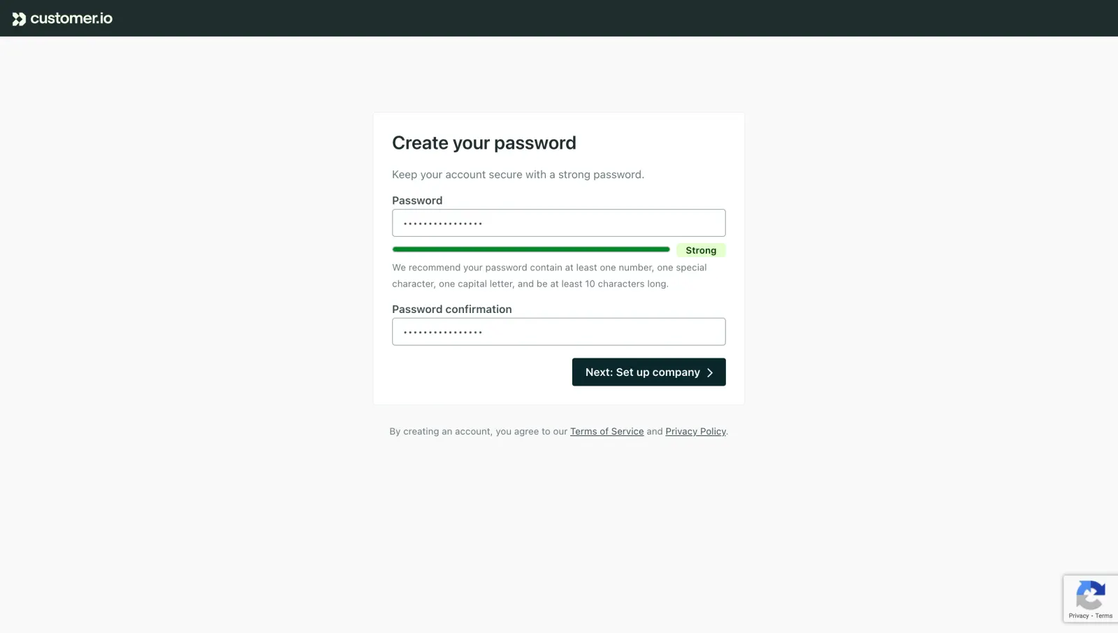
- **Screenshot:** attached to this message (also available at https://media.saasframe.io/v/ecbe46def074805fa432-1600.webp)
- **Source:** https://fly.customer.io/signup/password

Analyze the attached screenshot first. If no image is attached, open the screenshot link; if neither is accessible, ask for it rather than guessing.

## Visual Design Context

### Overall aesthetic

- **Style:** A restrained account-setup screen uses a pale gray canvas, white form panel and dark teal branding.
- **Character:** Clear labels and a visible green strength state prioritize form comprehension.

### Page composition

- **Capture:** The original measures 2880 × 1630 pixels. Estimated CSS dimensions below assume an unverified 2× capture.
- **Header:** A dark teal bar around 48 pixels high contains the small brand at left.
- **Form:** A centered outlined white panel around 480 × 375 pixels begins roughly 145 pixels below the top, with title, helper, two fields and right-aligned action.
- **Legal:** A small centered agreement line sits below the panel.
- **Peripheral badge:** A small verification-service badge appears at bottom right.

### Information hierarchy

- **Heading:** Create your password leads the form.
- **Guidance:** A short helper line precedes the first labeled field.
- **Strength:** A green bar and Strong badge appear beneath the masked password, followed by two lines of recommendations.
- **Confirmation:** The second masked field follows with its own label.
- **Action:** A dark filled next-step button anchors the panel's lower right.

### Typography

- **Family:** Neutral sans serif; exact identity is unverified.
- **Heading:** Approximately 24 pixels, semibold.
- **Labels/body:** Around 14 pixels, with labels heavier than helper copy.
- **Recommendations/legal:** Approximately 12 pixels with 20-pixel leading.
- **Action:** Around 14 pixels, semibold, white.

### Colors & surfaces

- **Measured canvas:** Near-white #F8F9F9 surrounds white #FFFFFF.
- **Brand surfaces:** Dark #1B2C2D and #00282C define header/action tones.
- **Borders:** Pale #EAF0F1 appears in subtle UI surfaces; field outlines are muted blue-gray.
- **Strength state:** A saturated green bar and pale green status badge indicate the observed strong state; exact green hex is unverified.
- **Depth:** Flat surfaces and thin borders replace conspicuous shadows.

### Components

- **Panel:** Small corner radius, thin pale outline and roughly 24-pixel padding.
- **Inputs:** Approximately 430 × 36 pixels, outlined, with masked dots and small radii.
- **Strength indicator:** A thin rounded green horizontal track ends before a compact Strong badge.
- **Next action:** Approximately 198 × 36 pixels, dark teal, small radius and a right chevron.
- **Legal links:** Underlined terms and privacy labels sit inline in the agreement text.

### Visual rhythm

- **Alignment:** Title, copy and fields share one left edge; action aligns with the right field edge.
- **Spacing:** Tight label-to-field gaps contrast with larger breaks before confirmation and action.
- **Whitespace:** Broad empty canvas surrounds the compact setup task.

### Responsive

- **Evidence:** One desktop form state is shown; validation transitions and mobile behavior are unverified.
- **Recommended width:** Use a fluid panel with 20–24-pixel viewport insets.
- **Recommended action:** Allow the action to span the available width on narrow screens.
- **Accessibility:** Associate labels and strength guidance with fields and expose status through text as well as color.

### Adaptation guidance

- **Preserve:** Keep the teal shell, compact white panel and explicit strength feedback.
- **Scope:** Masked entries reveal no password values; do not infer them.
- **Implementation:** Define password rules and validation from actual requirements rather than treating screenshot copy as a security specification.
- **Behavior:** The next-step result is not shown.

## Content

**Instructions:**

Generate realistic example content that fits the selected design reference.

Create appropriate headlines, descriptions, labels, buttons, and supporting copy based on the type of interface being designed.

If a product or business description is provided, use it to guide the content.

Otherwise, invent a plausible fictional SaaS product appropriate for the reference.

Keep the content concise, coherent, and visually balanced.

Do not present fictional statistics, customer names, or testimonials as verified facts.

## Design Direction

**Instructions:**

Use the reference screenshot as the main source of visual inspiration rather than a strict layout template.

Preserve its most distinctive design characteristics, such as typography, visual rhythm, color relationships, component treatments, and overall aesthetic.

Feel free to modify section arrangements, proportions, spacing, and individual components to better suit my content.

Introduce original design decisions where they improve usability, composition, or brand consistency.

The result should clearly reflect the reference's visual language without looking like a direct reproduction.

Follow the visual identity of the reference design.

Use its typography, color palette, component styling, and overall aesthetic as the primary design direction.

Do not introduce an unrelated visual identity.

## Output

**Instructions:**

Generate a high-fidelity visual mockup of the requested interface.

Present the design as a polished, realistic website or product UI screenshot.

Prioritize visual composition, typography, spacing, colors, alignment, and component details.

Use the available image-generation or visual-design capabilities.

Do not replace the mockup with source code, a written design specification, or a textual description.

If direct visual generation is unavailable, clearly explain the limitation.

## Constraints

- Use the actual screenshot as the primary visual reference.
- Preserve essential messaging and factual accuracy.
- Prioritize visual quality and consistency.
- Do not invent unsupported product claims.
- Adapt structure and copy length for visual balance.
Reference image Attach it to your message: assistants can’t open image links. Open in ChatGPT ↗ Open in Claude ↗
Build it in Lovable ↗ v0 ↗ Figma Make ↗
Opening a tool copies the screenshot so you can paste it with your prompt.
 SaaSFrame