Overall Style and Aesthetic
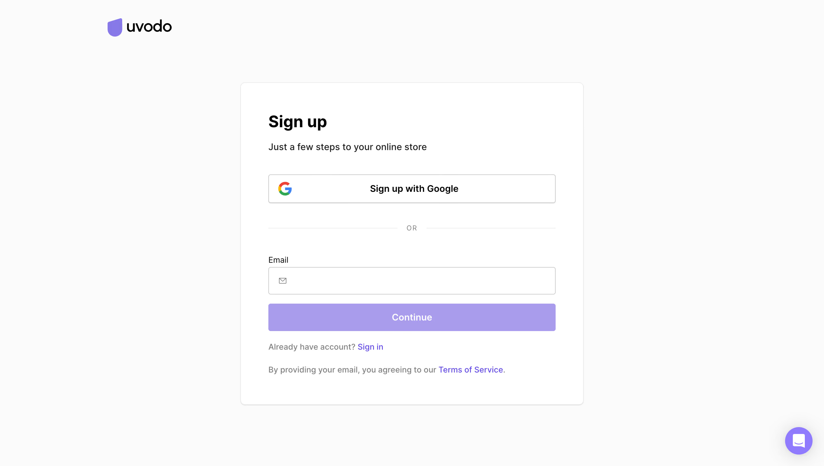
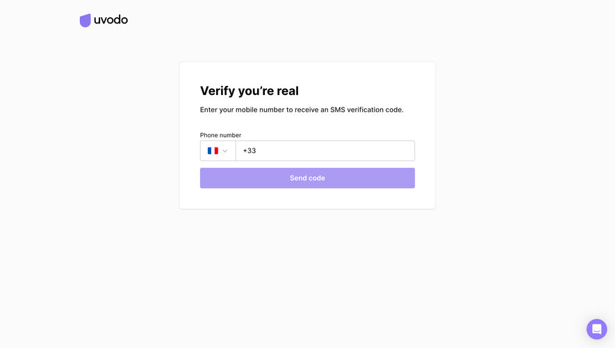
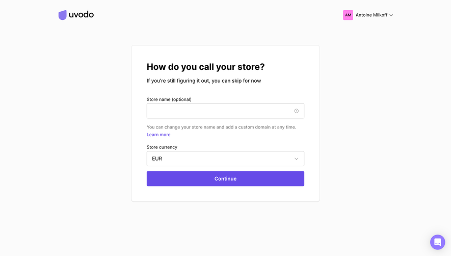
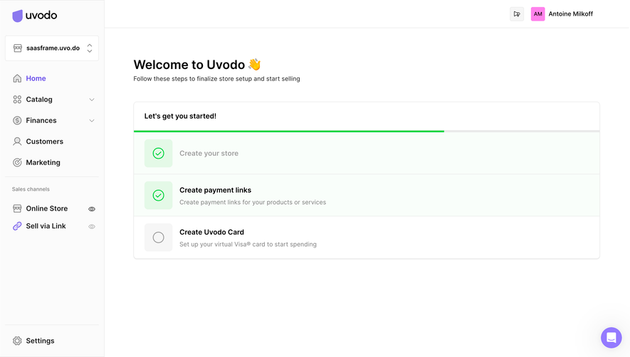
Uvodo’s sign-up page exemplifies a sleek, minimalist ethos, radiating professionalism while remaining approachable. The design leverages ample white space, crisp lines, and restrained elements, fostering focus and clarity within the interface. It feels modern yet welcoming, suitable for both seasoned founders and newcomers. Layout and Structure
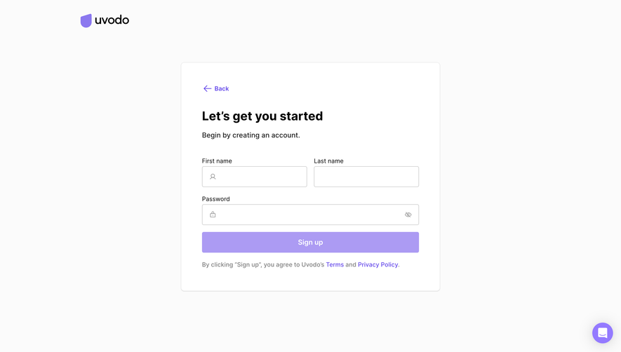
The page maintains a laser focus on the primary goal: account creation. There's no hero section or feature showcase to distract—only a centered sign-up panel that instantly earns the user’s attention. Essential links, like “Log in,” are thoughtfully placed above the form, while privacy policy and terms subtly anchor the footer without drawing attention away from the task. Visual Elements
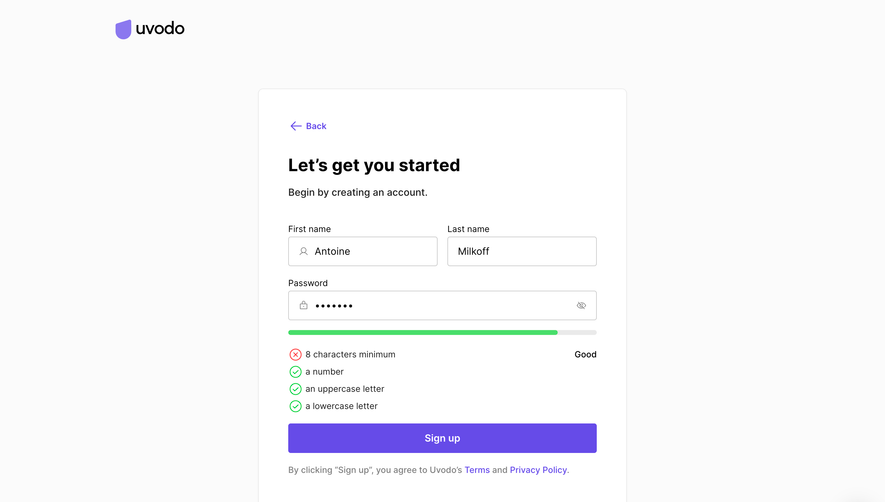
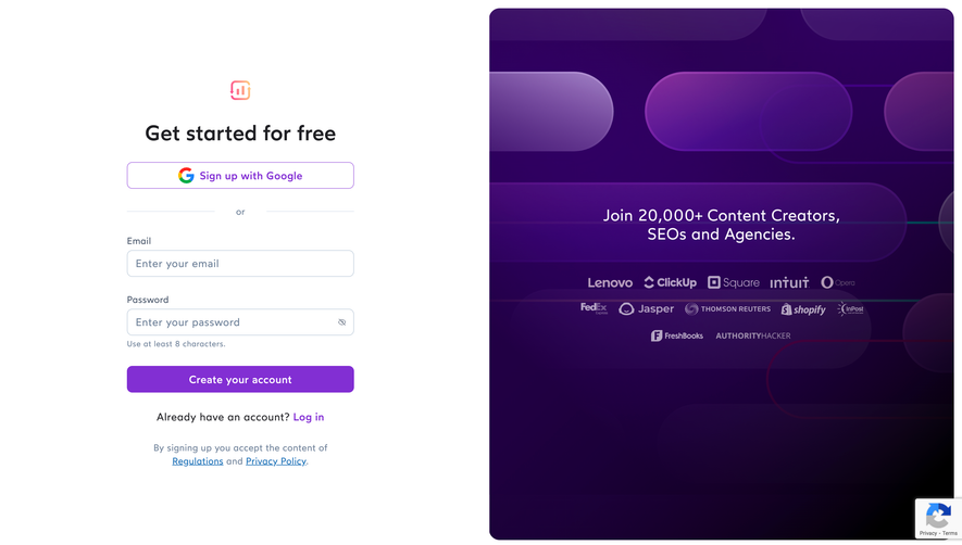
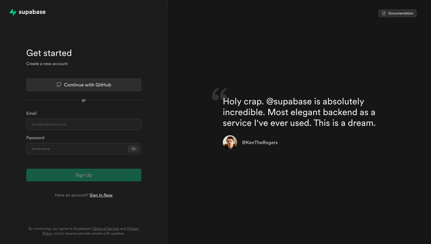
Visual minimalism reigns. The absence of heavy imagery or animated distractions directs all eyes to the form itself. An understated brand logo sits above, providing identity without overpowering the experience. Clear input fields, delicate icons for visibility toggling, and rounded buttons add a touch of friendliness to the utility-driven design. Color Palette and Typography
A cool, nearly monochrome palette juxtaposes soft blue and neutral whites, infusing the page with calm and trust. Subtle accent colors—the soft blue CTA button, muted error states—guide interaction seamlessly. The typography is clean, sans-serif, and balanced in hierarchy; form titles gently command attention, while supporting text sits unobtrusively beneath input fields for guidance. User Experience Patterns
The streamlined navigation and single-page flow minimize barriers to entry. CTAs are bold, clearly labeled, and strategically placed for conversion. Real-time form validation and accessible design choices—like password visibility toggles—enhance assurance and usability, ensuring frictionless interaction from first click to account creation. Unique or Notable Design Choices
Uvodo’s commitment to a distraction-free environment is rare among SaaS platforms, keeping users securely focused on their intent. The restrained color splash in CTAs and the friendly micro-interactions build a sense of quiet confidence and approachability—making sign-up not just simple, but reassuring.