Design with AI
Generate a new design based on this screen using your own content.
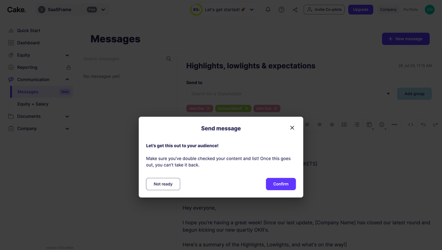
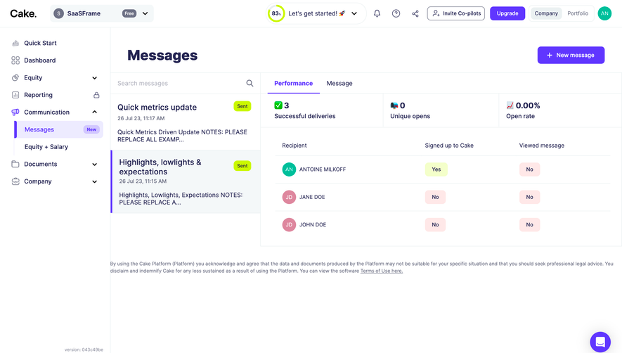
# Design from Reference: Cake Equity Send A Message
Create an original, high-fidelity visual design inspired by the reference. Prioritize composition, typography, colors, spacing, and component styling over technical implementation.
## Reference
- **Product:** Cake Equity
- **Category:** Add & Edit
- **Screenshot:** https://cdn.prod.website-files.com/5e9dc792e1210c5325f7ebbc/6acb61eea2ab34f17293326b_6acadc895c79bb17f221bd0b_cms-d4fa05a8e46ab779066af5db.webp
Analyze the screenshot first. If inaccessible, request it rather than guessing.
## Content
{{content.instructions}}
{{content.data}}
Preserve essential messaging and factual accuracy. Adapt structure and copy length for visual balance; never invent product claims.
## Visual Design
### Overall aesthetic
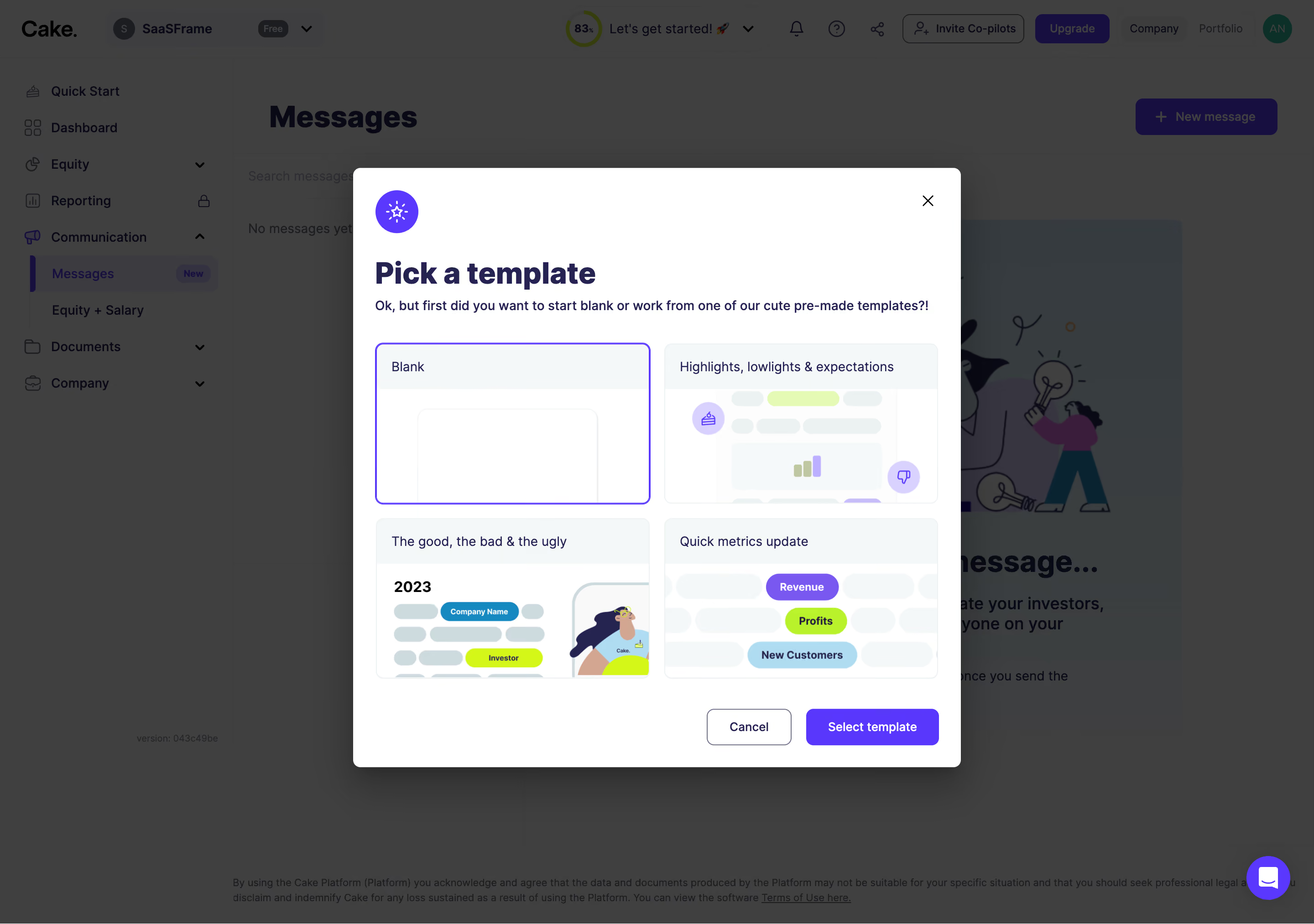
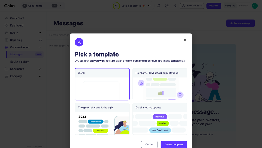
- **Style:** Template-selection modal over a dimmed messaging dashboard.
- **Character:** White dialog, navy typography, purple selected outline and action, pale preview headers, and playful colorful template thumbnails.
- **Depth:** Dark overlay and a strong soft shadow separate the modal from the underlying application.
### Page composition
- **Capture and scale:** 2880 × 2026 image px. CSS estimates assume a 2× capture, approximately 1440 × 1013 CSS px; scale is unverified.
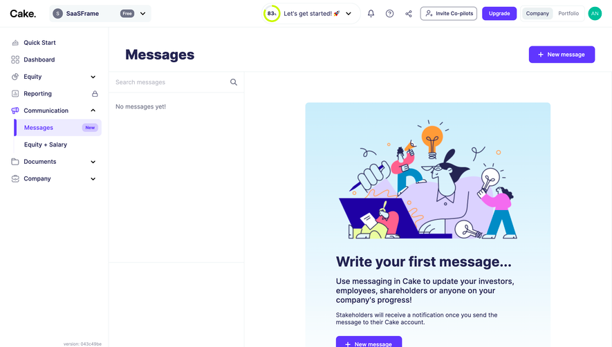
- **Backdrop:** Messaging dashboard with top utilities, left navigation, Messages heading, and empty-state illustration.
- **Dialog:** Approximately 666 × 658px, centered, with about 24px padding.
- **Header:** Purple circular sparkle icon, large Pick a template title, one-line instruction, and close icon upper-right.
- **Template grid:** Four preview cards in a two-by-two layout; Blank at top-left is outlined purple.
- **Footer actions:** Cancel and purple Select template align at the lower-right.
- **Support:** Purple chat launcher remains visible at viewport lower-right.
### Information hierarchy
- **Task:** Large bold title defines the selection step.
- **Instruction:** Smaller dark sentence explains blank versus premade choices.
- **Selection:** Purple border marks Blank as the current captured selection.
- **Template labels:** Short headings above preview images distinguish the three premade alternatives.
- **Action hierarchy:** Purple Select template is stronger than outlined Cancel; close is a small icon.
### Typography
- **Family:** Neutral proportional sans serif; exact identity is unverified.
- **Dialog title:** Approximately 34px bold with 42px line-height.
- **Instruction / card labels:** Approximately 14px regular or medium.
- **Actions:** Approximately 14px semibold.
- **Preview text:** Miniature artwork includes small labels and figures; these are illustrative rather than main interface copy.
- **Precision:** CSS sizes and weights are inferred from pixels.
### Colors & surfaces
- **Dialog:** Sampled #FFFFFF.
- **Preview headers / neutral fills:** Sampled #F4F8F9.
- **Backdrop:** Sampled #404040 with nearby #3F3F3F and #3E3E3E over dimmed underlying surfaces.
- **Primary roles:** Dark navy headings and purple selection/action treatment.
- **Preview accents:** Lime, lavender, cyan, and pale blue appear in the template artwork.
- **Depth:** Broad gray-black shadow below the dialog; fine pale outlines around unselected cards.
- **Interpretation:** Backdrop hex values are composited pixels, not a verified overlay CSS color/opacity.
### Components
- **Modal shell:** Approximately 8px radius, white fill, and strong broad shadow.
- **Sparkle badge:** About 48px purple circle with white symbol.
- **Template cards:** Approximately 300 × 176px with 8px radius and clipped preview image beneath a pale title strip.
- **Selected card:** Thin vivid-purple outline around the Blank option; its preview is mostly empty white.
- **Premade previews:** Stylized report blocks, chips, small charts, and character artwork, cropped within their cards.
- **Cancel:** Approximately 92 × 40px outlined rectangle with navy text and 7px radius.
- **Select action:** Approximately 145 × 40px purple rectangle with white label and matching radius.
- **Close:** Small dark X at top-right.
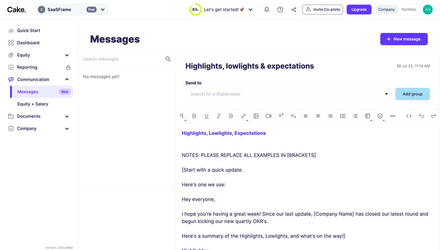
- **State limits:** No template has been applied and no composer is visible; only selection state is shown.
### Visual rhythm
- **Grid alignment:** Equal cards, roughly 16px gaps, and consistent header heights support comparison.
- **Header spacing:** Badge and title form a clear introductory group before the grid.
- **Action spacing:** Broad white gap separates grid and footer buttons.
- **Backdrop restraint:** Dimmed navigation establishes context while the modal remains the only crisp content.
### Responsive
- **Observed state:** Desktop only; mobile behavior is unverified.
- **Dialog recommendation:** Use viewport gutters and internal scrolling on short displays.
- **Grid recommendation:** Stack cards into one column when two previews become too small.
- **Action recommendation:** Keep selection and cancellation reachable below the grid with clear focus.
- **Accessibility recommendation:** Use dialog semantics and an accessible selectable-card/radio pattern.
### Adaptation guidance
- **Preserve:** Clear four-option choice, labeled visual previews, purple selected border, and distinct confirmation action.
- **Starting geometry:** Approximately 666px dialog width, 24px padding, 300px cards, 16px gaps, and 40px actions under the unverified 2× assumption.
- **Content fidelity:** Use actual supplied templates and representative previews; do not infer full template contents from cropped thumbnails.
- **State modeling:** Keep chosen template explicit and apply it only through the intended confirmation flow.
- **Privacy:** Replace underlying example account details with approved sample data.
- **Implementation recommendation:** Provide keyboard selection, visible focus, and clear selected state beyond color.
Use this context to reproduce the reference's visual language: layout, typography, colors, spacing, borders, radii, and distinctive elements. The screenshot takes priority if descriptions conflict.
## Direction
{{preferences.fidelityInstructions}}
## Output
{{output.instructions}}
Deliver a polished, cohesive design with precise alignment, hierarchy, and spacing. Produce the requested visual artifact, not just a description. If unsupported, explain the limitation.