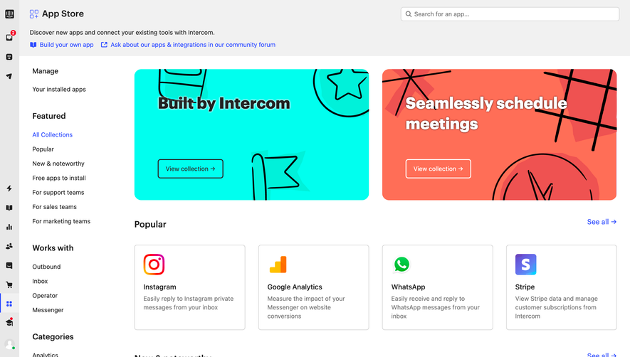
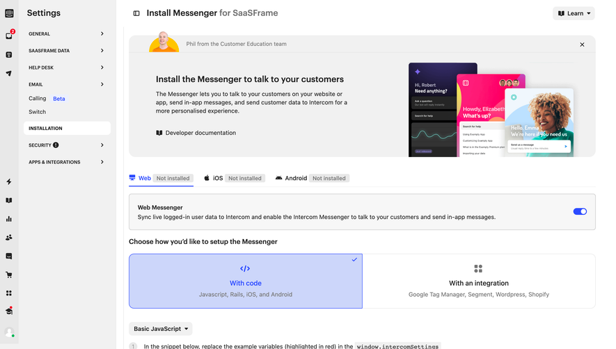
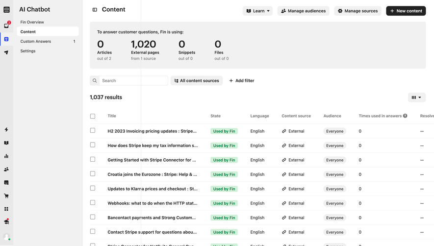
Generate a new design based on this screen, using your own content.
Preview the prompt
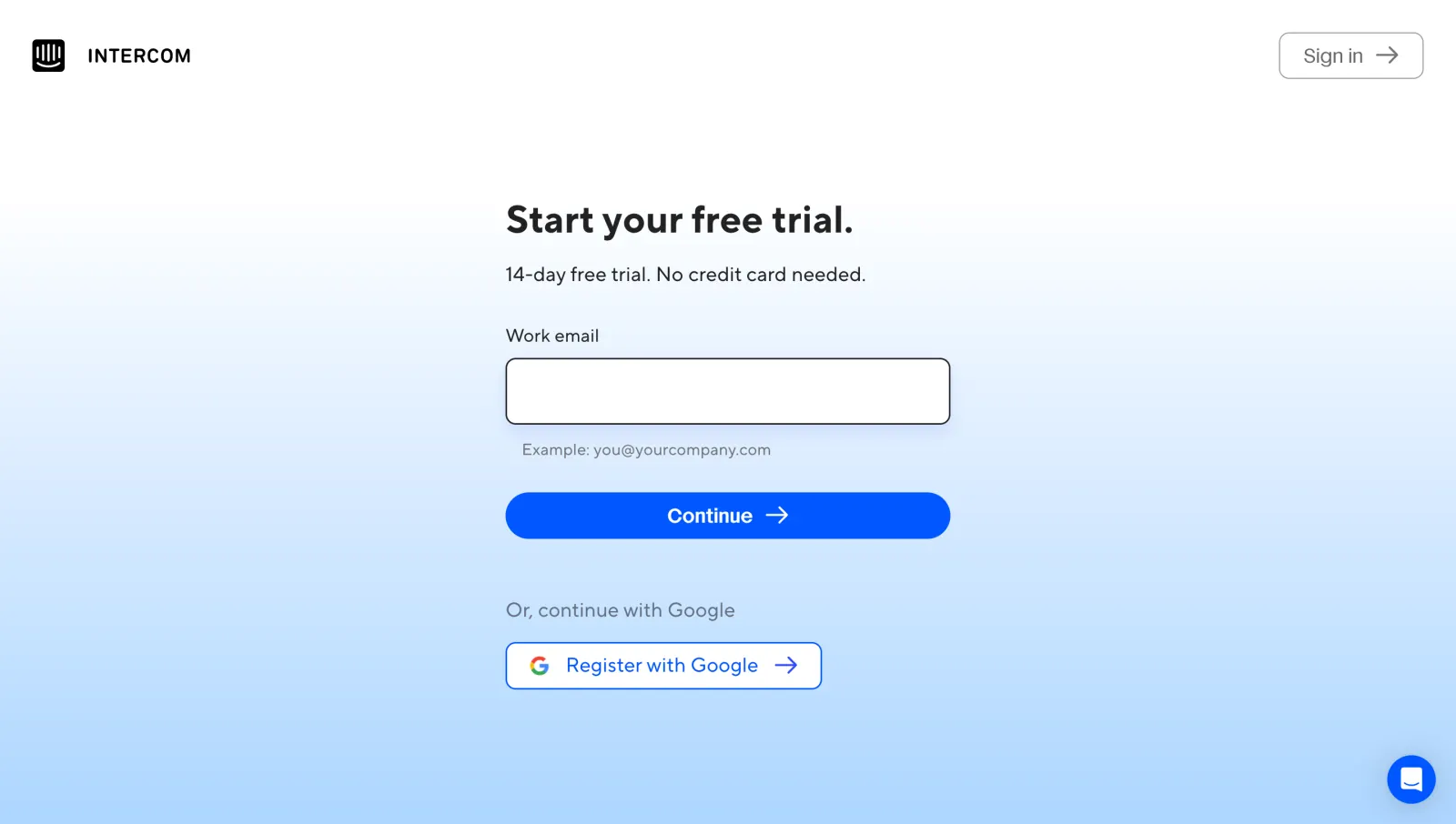
# Design from Reference: Intercom Sign Up

Create an original, high-fidelity visual design inspired by the reference. Prioritize composition, typography, colors, spacing and component styling over technical implementation.

## Reference

- **Product:** Intercom
- **Category:** Sign Up
- **Screenshot:** https://media.saasframe.io/v/bd6af2902d886d2e31a2-1600.webp

Analyze the screenshot first. If you can’t access it, ask me for it rather than guessing.

## Content

**Instructions:**

Generate realistic example content that fits the selected design reference.

Create appropriate headlines, descriptions, labels, buttons, and supporting copy based on the type of interface being designed.

If a product or business description is provided, use it to guide the content.

Otherwise, invent a plausible fictional SaaS product appropriate for the reference.

Keep the content concise, coherent, and visually balanced.

Do not present fictional statistics, customer names, or testimonials as verified facts.

Preserve essential messaging and factual accuracy. Adapt structure and copy length for visual balance; never invent product claims.

## Visual design

Use this context to reproduce the reference’s visual language: layout, typography, colors, spacing, borders, radii and distinctive elements. The screenshot takes priority if descriptions conflict.

### Overall aesthetic

- **Character:** Focused signup screen with minimal branding and a soft white-to-sky-blue background gradient.

### Page composition

- **Capture:** 2880 × 1630 screenshot pixels; estimated 2× CSS scale.
- **Structure:** Brand upper left, outlined Sign in upper right and narrow centered form with trial heading, email field, primary Continue and separate Google registration.

### Information hierarchy

- **Priority:** Bold trial heading leads to one labeled email input and full-width blue action. Google signup is visually separated below.

### Typography

- **Family:** Rounded sans serif; exact family unverified.
- **Estimated CSS sizes:** Heading 36–38px, supporting copy/label 18px, action 20px and helper example 16px.

### Colors & surfaces

- **Measured palette:** White #FFFFFF, saturated blue #0059FF and gradient samples #A3D7FF, #AFDCFF, #D9EEFF and #C7E7FF.
- **Treatment:** Dark text, muted helper text and a thin dark input outline maintain legibility over the gradient.

### Components

- **Elements:** Work-email input, example text, blue pill Continue with arrow, outlined Google option, Sign in button and floating chat launcher.
- **Estimated geometry:** Form approximately 440px wide, input 64px high with 10px radius, primary action 46px high and pill radius.

### Visual rhythm

- **Spacing:** Large open top/side margins isolate the form. A broad vertical gap separates primary registration from the identity-provider alternative.

### Responsive

- **Suggested adaptation:** Keep a fluid form with 24px gutters, reduce heading size and retain the single-column action sequence. Mobile behavior is unverified.

### Adaptation guidance

- **Transfer:** Preserve the simple one-field entry point and gradient atmosphere. Substitute accurate trial terms and supported authentication methods.

## Direction

**Instructions:**

Use the reference screenshot as the main source of visual inspiration rather than a strict layout template.

Preserve its most distinctive design characteristics, such as typography, visual rhythm, color relationships, component treatments, and overall aesthetic.

Feel free to modify section arrangements, proportions, spacing, and individual components to better suit my content.

Introduce original design decisions where they improve usability, composition, or brand consistency.

The result should clearly reflect the reference's visual language without looking like a direct reproduction.

## Output

**Instructions:**

Generate a high-fidelity visual mockup of the requested interface.

Present the design as a polished, realistic website or product UI screenshot.

Prioritize visual composition, typography, spacing, colors, alignment, and component details.

Use the available image-generation or visual-design capabilities.

Do not replace the mockup with source code, a written design specification, or a textual description.

If direct visual generation is unavailable, clearly explain the limitation.

Deliver a polished, cohesive design with precise alignment, hierarchy and spacing. Produce the requested visual artifact, not just a description. If unsupported, explain the limitation.
 SaaSFrame