Checkbox
53
Master selection states with SaaS Checkbox UI patterns. Explore how to design single, bulk, and indeterminate states for lists and forms to ensure clear user intent.

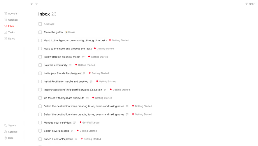
A checkbox lets users select or clear an independent option. Several checkboxes can be selected together, or none can be selected when the task permits it. In SaaS interfaces, they appear in signup forms, preference groups, access settings, and record selection. Their usefulness depends on clear wording, an understandable relationship between options, and a predictable point of commitment.
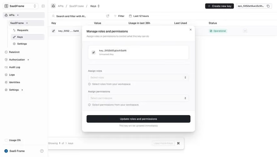
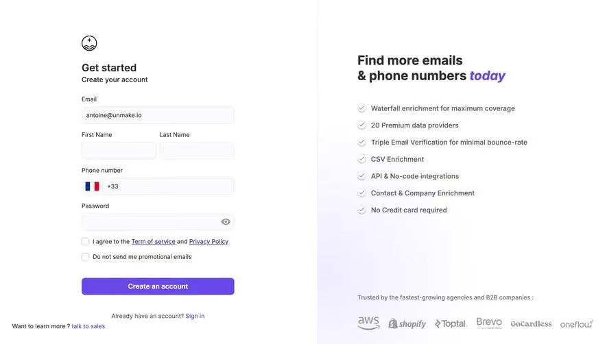
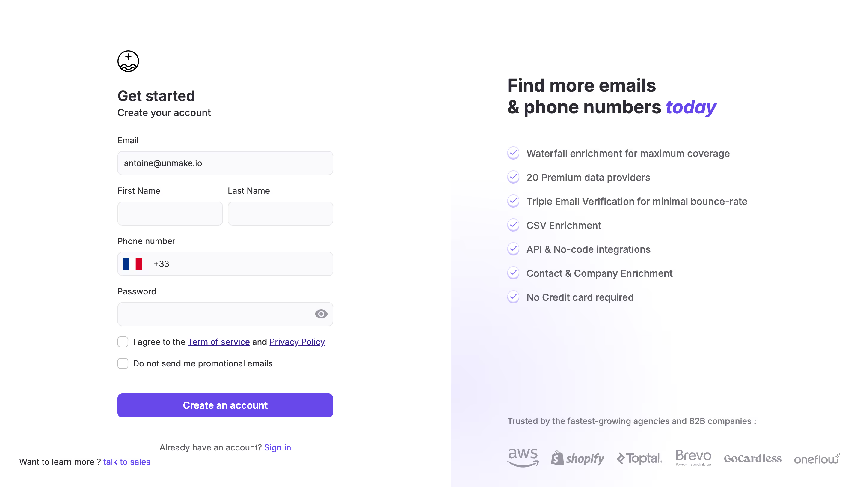
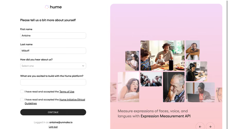
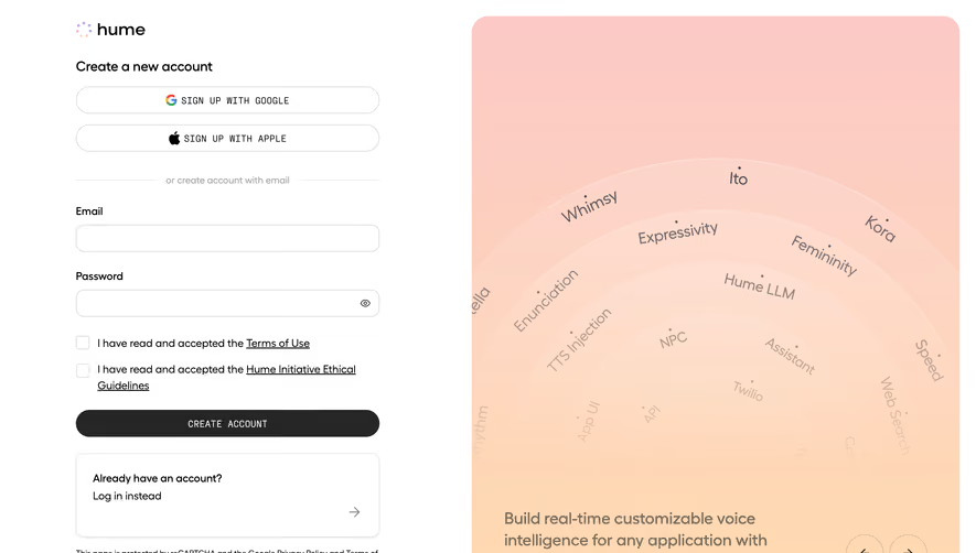
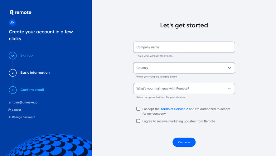
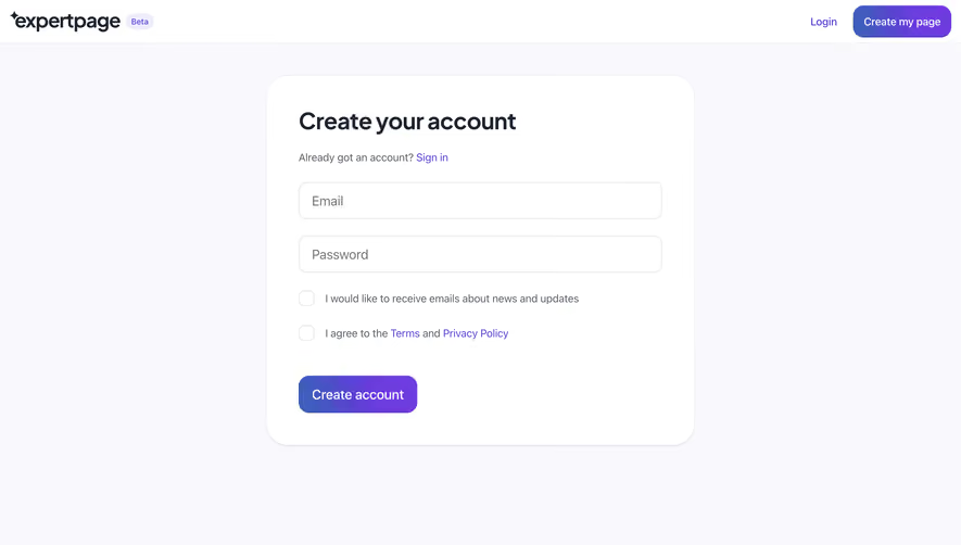
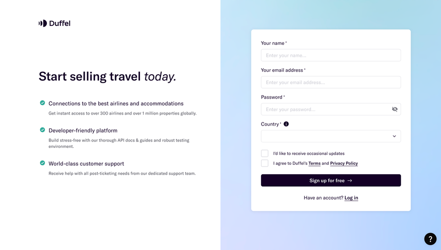
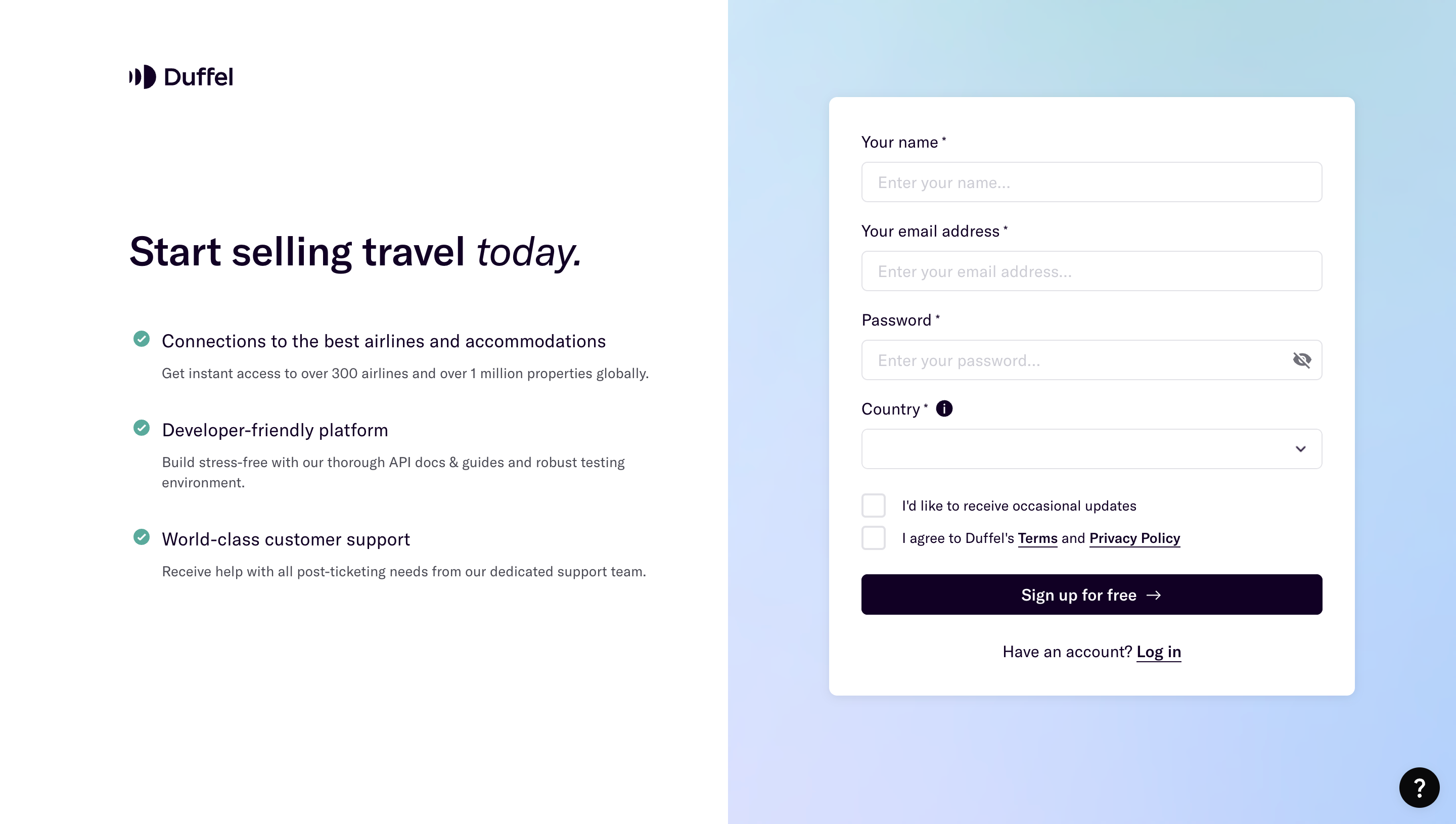
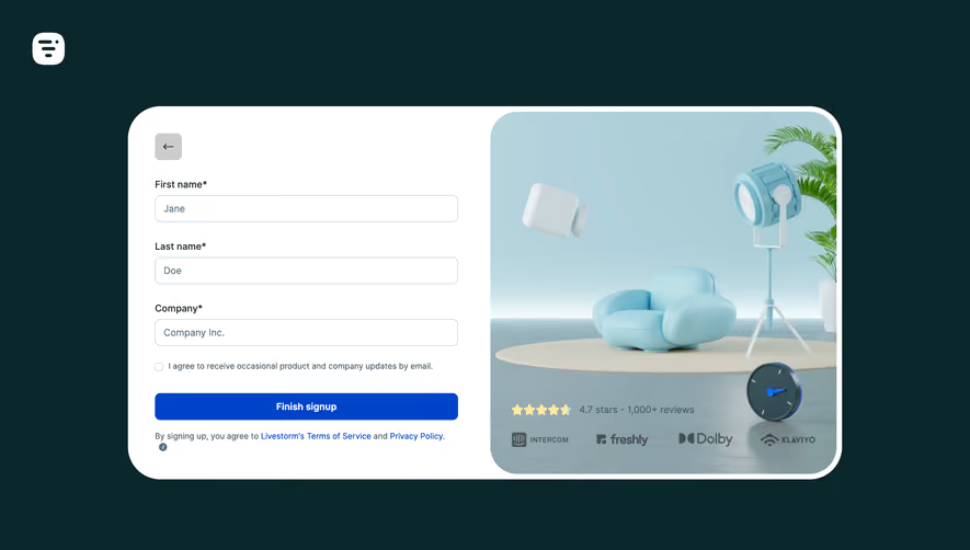
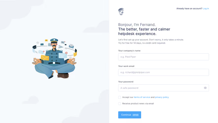
Fernand's signup and invitation screens separate acceptance from product-news preference. Crew's member-invitation dialog uses checkboxes to modify access within a selected role. These examples show how the same control can serve different decisions. The screenshots reveal labels and visible states, not validation, persistence, or enforcement behavior.
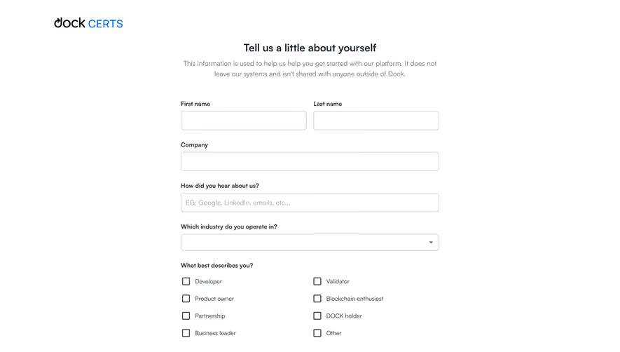
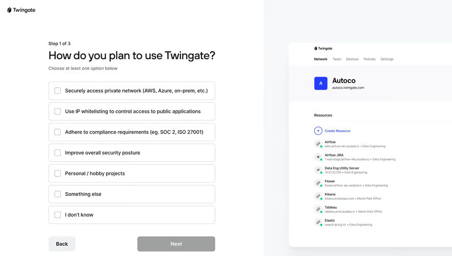
A checkbox answers whether a particular option is selected. A group can contain several simultaneous choices, such as the channels through which someone wants notifications. If choosing one option should replace another, a radio group or another single-choice control is usually clearer.
Define whether no selection is allowed. “Choose the topics you want to follow” may permit an empty set; “Choose at least one export format” requires a group-level rule. State that rule in the question rather than leaving people to discover it through a failed submission.
A single checkbox can represent acknowledgment or an optional modifier, but its unchecked state must have a clear meaning. Do not use the same box to mean both “not yet answered” and “explicitly declined” when the product needs to distinguish those values.
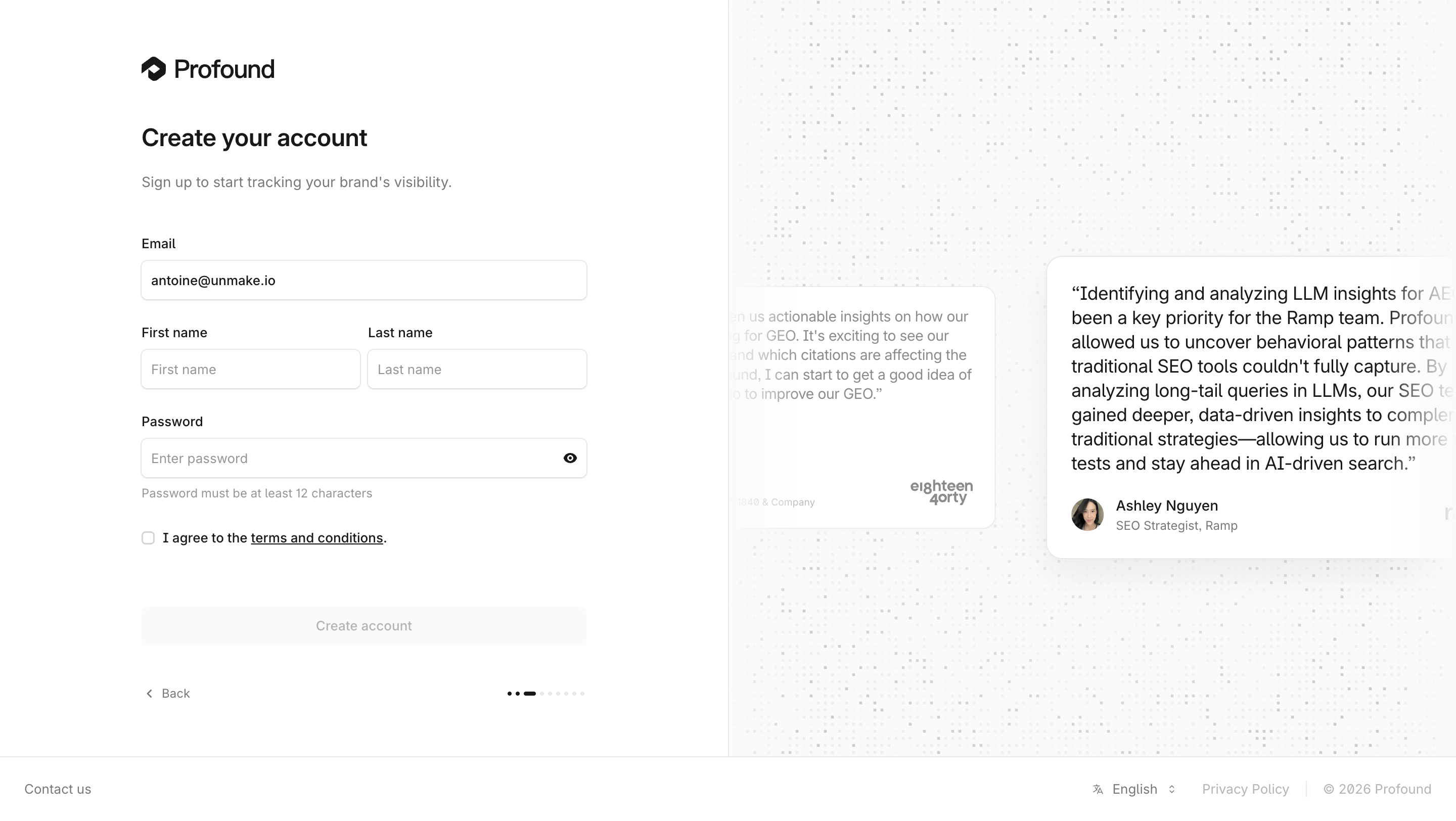
Fernand's signup form includes one checkbox for accepting the terms and privacy policy and another for receiving product news by email. Both are visible and unchecked in the capture, with links provided for the referenced documents.
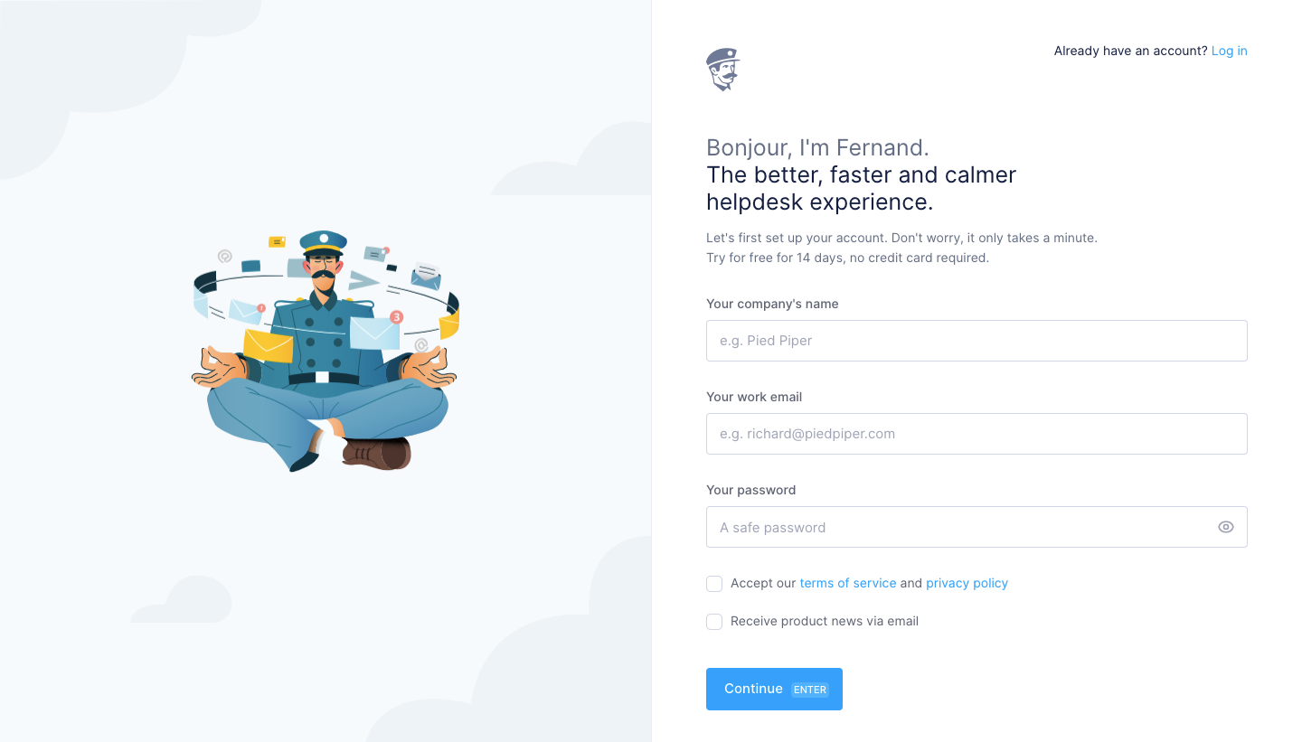
The UX lesson is separation of purpose. Combining unrelated choices into one checkbox makes it harder for people to understand what they are agreeing to and removes the ability to choose independently. Keep the wording specific enough to identify the consequence of each selection.
Clarify required versus optional behavior in the actual flow. A screenshot showing two boxes does not prove which blocks submission or how preferences are stored. Test the unchecked and checked combinations and make the next step understandable.
Links inside a checkbox label need deliberate interaction. Opening the terms should not accidentally change the checkbox, and activating the label should remain an easy way to select the control. Preserve entered form information when the person reviews supporting content.
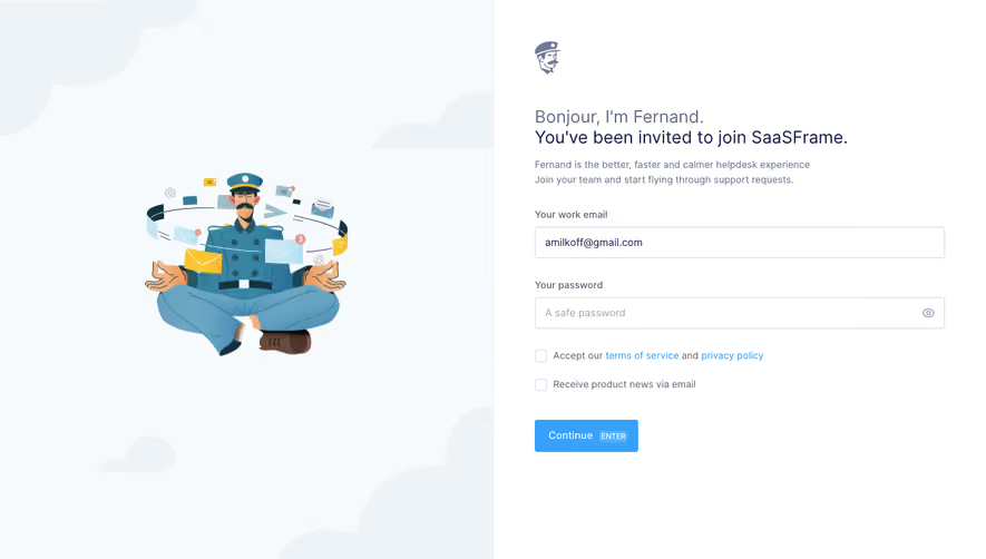
Fernand's invitation screen names the workspace the person has been invited to join and shows a prefilled email field. It retains separate boxes for acceptance and product-news email, even though the user is joining a team rather than creating a new company workspace.
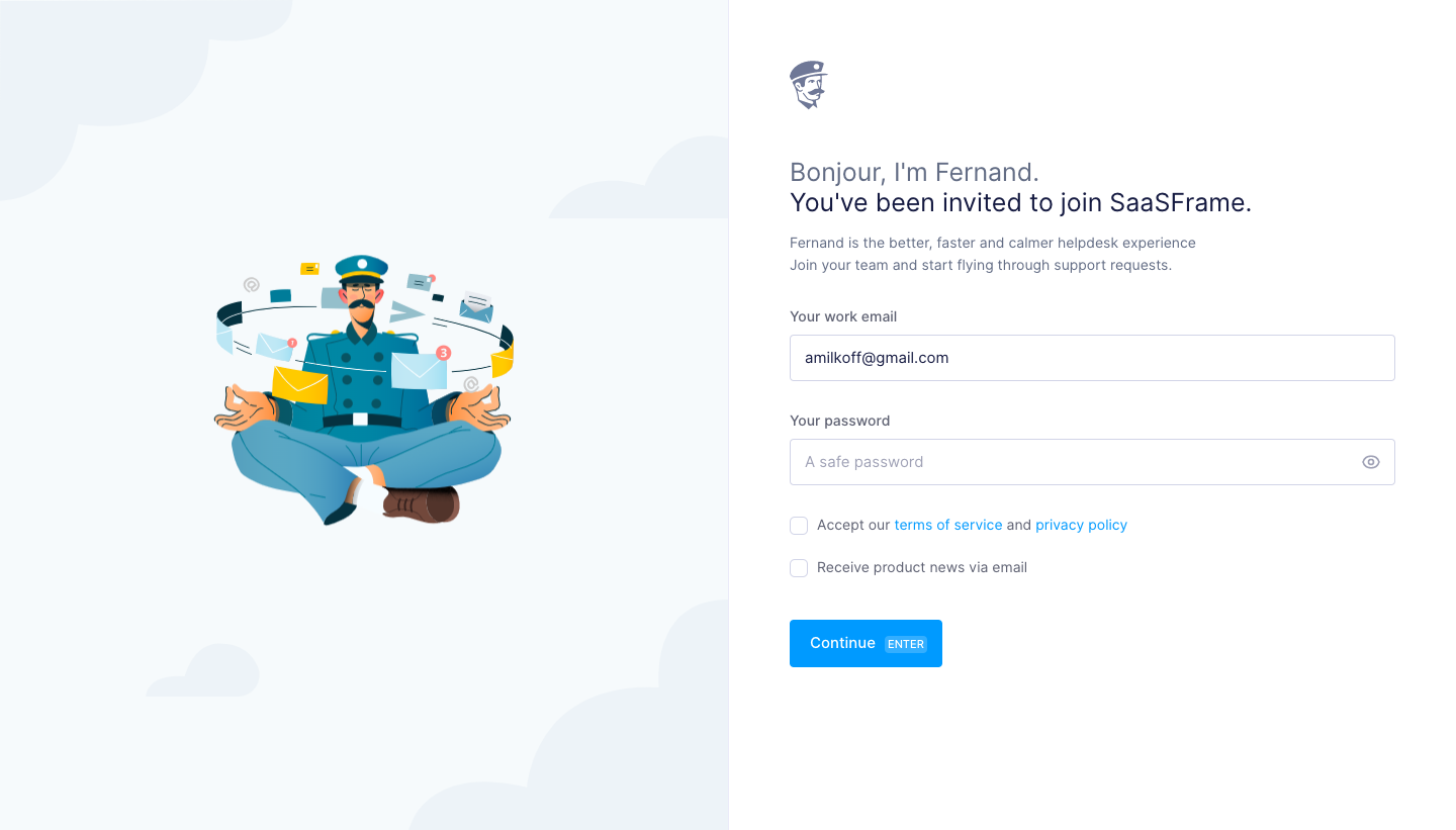
This distinction matters in collaborative products. A workspace administrator may invite someone, but the invite does not necessarily represent that person's preference for optional communications. Keep the scope of a personal choice clear even when the surrounding setup is organization-driven.
For returning users, consider whether an established preference already exists. Show the appropriate saved state and explain any change that the invitation requires. Avoid silently replacing personal settings with workspace defaults.
The visible invitation context also helps people assess whether the form is intended for them. When a checkbox contributes to a consequential account step, the email and destination workspace should be recognizable before submission.
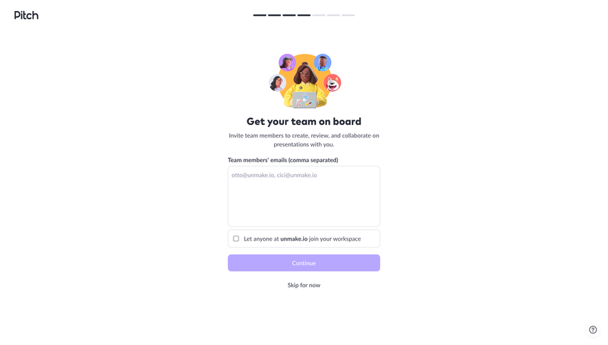
Crew's invitation dialog combines a selected Recruiter role with checkboxes labeled “Hide the talent's salary information for this user” and “Restrict access to specific profiles.” These boxes represent restrictions rather than positive grants.
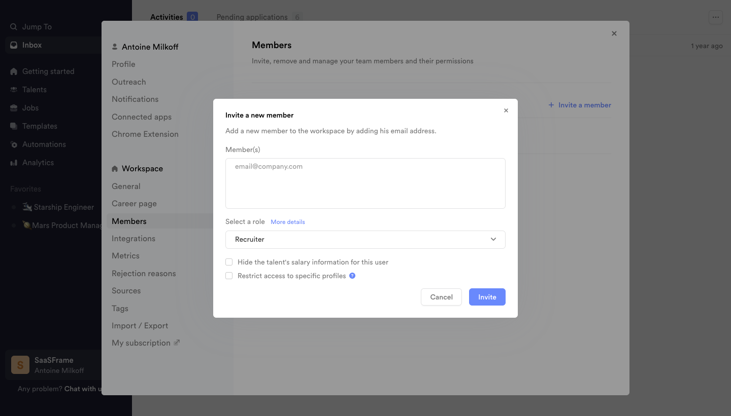
A checked box does not universally mean more access or more functionality. It means that the stated option is selected. If a label says “Hide salary information,” checking it enables hiding. Make that consequence explicit instead of relying on a generic enabled/disabled mental model.
Use positive, direct language where it improves understanding, but do not rewrite a restriction into an ambiguous double negative. “Do not disable salary visibility” would require users to mentally reverse the meaning twice. Test labels with the people who actually manage access.
A selected role and additional modifiers can interact. Explain which capabilities come from the role and which the checkbox changes. The screenshot demonstrates the available controls, not the underlying permission policy; enforcement needs separate verification.
Checked and unchecked are the basic states. A mixed state can summarize a group in which some items are selected and others are not. It should represent a defined relationship, not a vague pending or unknown value.
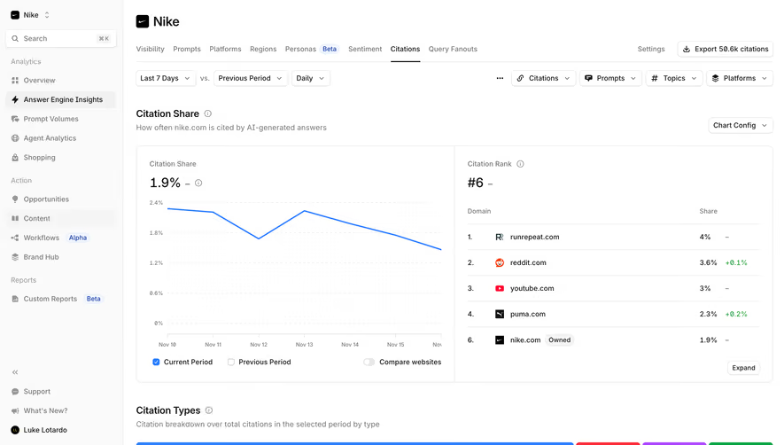
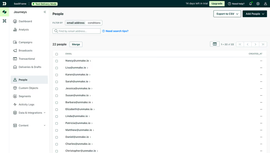
A select-all control above a table can use the mixed state when only part of its scope is selected. Make that scope clear: visible rows, the current page, all loaded rows, or every matching record are different sets. A compact checkbox alone cannot communicate the distinction.
Disabled controls need a reason when that reason helps users proceed. A plan limitation, missing integration, or restricted role should not look like an unexplained broken box. Keep the state perceivable while ensuring the label remains readable.
Focus, hover, and selection also need separate visual treatment. A user should be able to see which checkbox has keyboard focus without mistaking that focus for a selected value.
When editing preferences, display the saved values. Do not briefly show a default unchecked state while loading if users could mistake it for the current setting and submit an accidental change.
For new choices, justify the initial state according to the task. A product recommendation can be communicated separately from the selection. Do not make an optional preference appear to be a prerequisite through a preselected value and ambiguous copy.
Distinguish a recommended default from an organization's enforced setting. If users cannot change a value, explain why it is fixed rather than showing an apparently interactive checkbox that never responds.
Restored form state should remain coherent across steps. If the user goes back to review an earlier field, preserve their independent selections unless a changed dependency makes one invalid. Explain the invalidation rather than silently clearing unrelated choices.
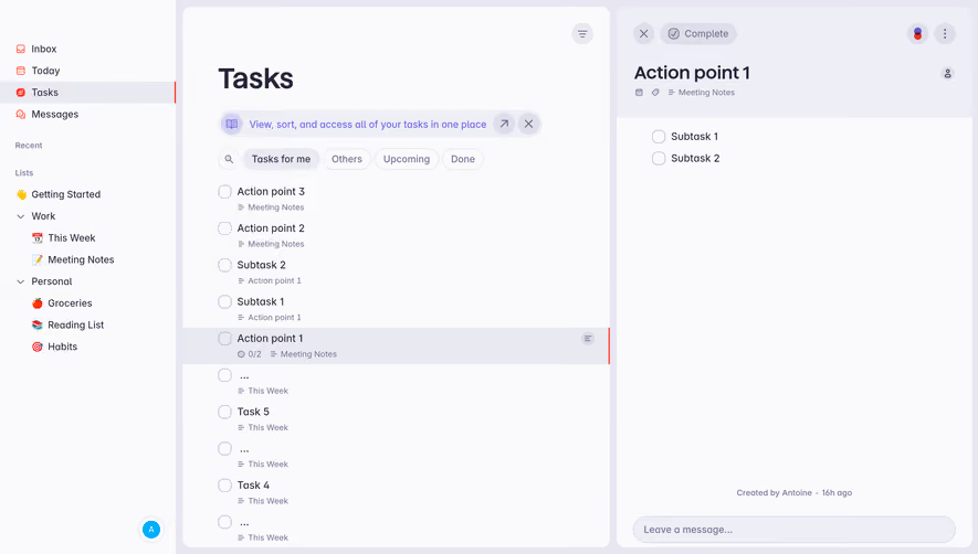
A checkbox in a form often expresses a pending value that applies on Save, Continue, or Invite. A checkbox used to select table rows changes the selection immediately. These are different interaction contexts even though the control looks similar.
Keep pending choices distinct from persisted settings when that difference matters. If the form needs saving, use clear action wording and unsaved-change feedback. If the change applies immediately, confirm the result or explain any delay.
For consequential modifiers, summarize the effect before commitment where appropriate. Inviting a member with restricted access should not leave the administrator guessing which boxes were applied. The resulting record or confirmation can reflect the chosen scope.
A failure to save should preserve the user's intended choices and show recovery. Do not reset the boxes to old values without explaining that the update failed.
Some options reveal additional choices. Selecting “Restrict access to specific profiles” may require defining those profiles in a product's implementation. Make the follow-up visible and explain whether it is required before the primary action can succeed.
When a parent option is cleared, decide what happens to its dependent values. Retaining them can help users compare alternatives, while ignoring them during submission may be necessary. Hidden stale values should not continue affecting the outcome unexpectedly.
If one selection makes another impossible, explain the relationship and update the interface coherently. Do not present independent checkboxes for options that secretly behave like mutually exclusive choices.
For groups with minimum or maximum selection rules, show the rule before interaction. A limit of three selected topics is not the standard checkbox model, so users need feedback that helps them adjust without trial and error.
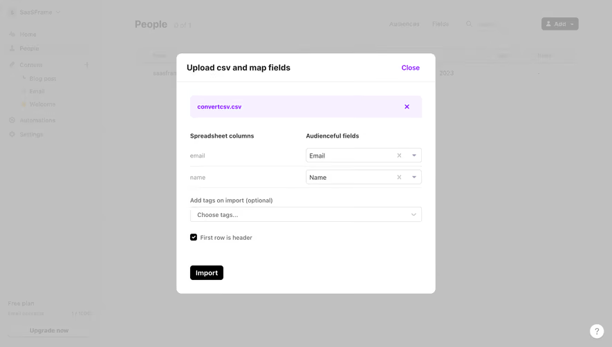
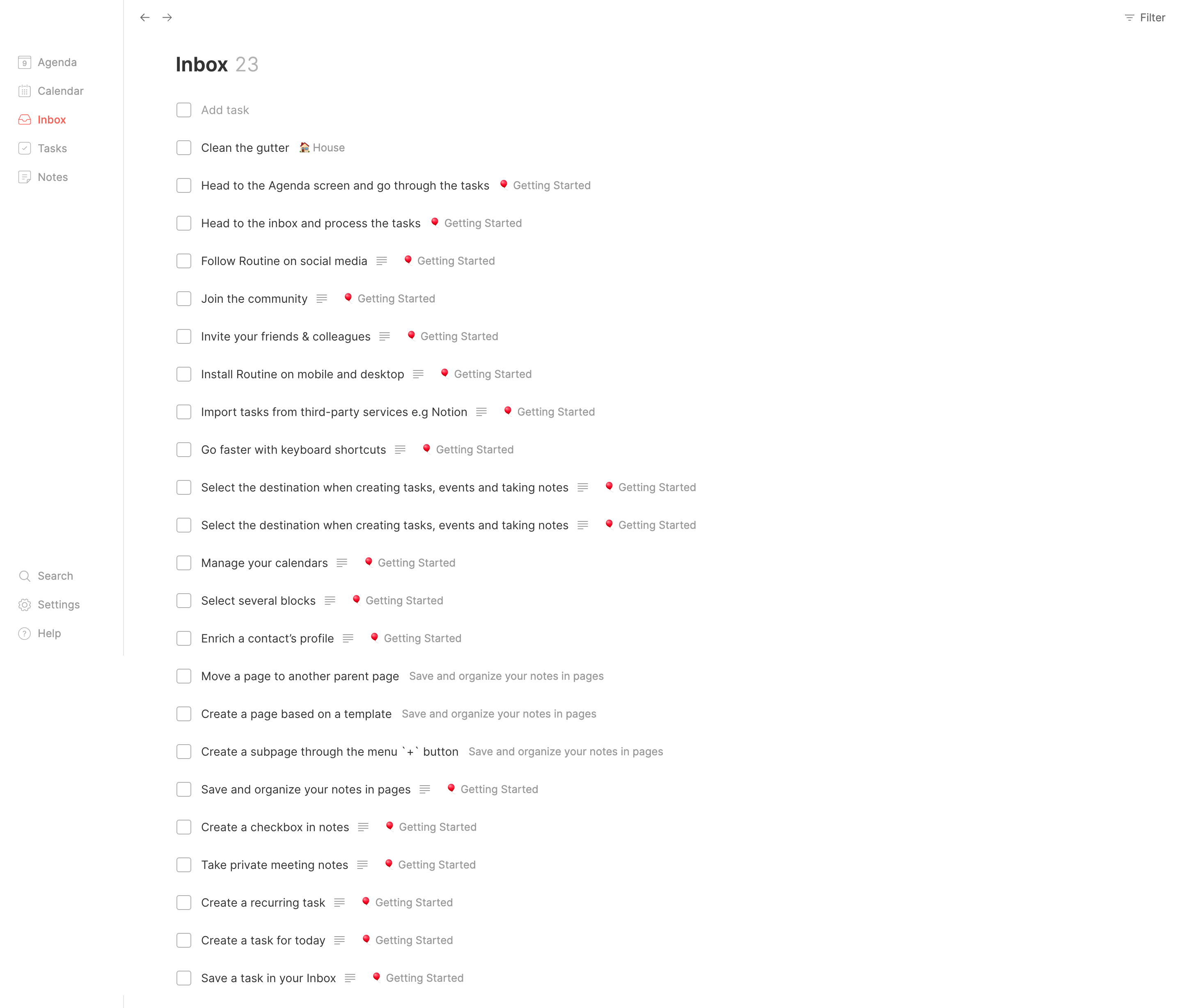
Table checkboxes need clear association with their rows. When selection spans pages, preserve a visible summary and a way to inspect or clear the full set. Do not make invisible selections a surprise when the user invokes a bulk action.
A select-all action should describe its scope. If the first action selects the current page and a second expands to all matching items, make that progression explicit. Keep counts updated when filters or records change.
Bulk selection is only preparation for the operation. Before high-impact actions, describe the selected count and relevant consequences through an appropriate review. A checked header does not establish informed intent for every downstream action.
After an operation, distinguish successful items from failures and preserve useful selection for recovery. Avoid forcing users to reselect a large failed subset by hand when the system knows which records need attention.
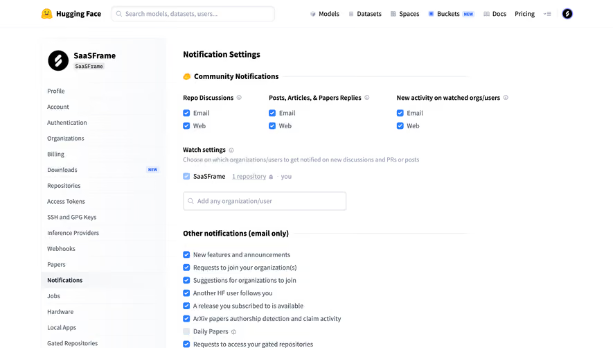
Associate each checkbox with a meaningful label, and name groups when the options answer a shared question. Native inputs provide a useful starting point; custom designs should preserve the checked state and expected interaction.
W3C's checkbox guidance distinguishes two-state controls from mixed-state controls that summarize partial selection. Use the mixed state only where that relationship is meaningful, and test its announcement and behavior directly.
Make the label area an appropriate target so touch users do not need to hit a tiny square. Keep nearby links or help buttons distinguishable. Provide visible focus and readable state indicators across themes.
Errors should explain the actual problem, such as a required acknowledgment or an unmet group-selection rule. Place feedback near the relevant question, associate it with the control or group, and retain the selected values during correction.
Use a checkbox for an independent selection or form value, especially alongside other pending choices. A switch-style toggle can suit an on/off setting when its state and application behavior are clear.
It commonly indicates that a defined group is partially selected. It should not stand in for a loading, unknown, or failed state without an explicit model.
Yes, when the task defines a required acknowledgment or selection rule. Explain the requirement and associate validation feedback with the relevant control or group.
Choose and label the intended scope. Selecting a page and selecting all matching records are both possible, but users need to know which set they are acting on.
Compare Radio Buttons for exclusive choices, Toggle for on/off settings, Bulk Actions for selected records, and Roles & Permissions for access modifiers. Consult W3C's checkbox guidance for state and interaction requirements.