Generate a new design based on this screen using your own content.
Thank you! Your submission has been received!
Oops! Something went wrong while submitting the form.
# Design from Reference: Superlist Checklist
Create an original, high-fidelity visual design inspired by the reference. Prioritize composition, typography, colors, spacing, and component styling over technical implementation.
## Reference
- **Product:** Superlist
- **Category:** Checklist
- **Screenshot:** https://cdn.prod.website-files.com/5e9dc792e1210c5325f7ebbc/6acad5175a5fdf4c30310d1e_6acad43cd63d2caea65b8468_cms-b1db5259ccced3dc98d54515.webp
Analyze the screenshot first. If inaccessible, request it rather than guessing.
## Content
{{content.instructions}}
{{content.data}}
Preserve essential messaging and factual accuracy. Adapt structure and copy length for visual balance; never invent product claims.
## Visual Design
Use this context to reproduce the reference's visual language: layout, typography, colors, spacing, borders, radii, and distinctive elements. The screenshot takes priority if descriptions conflict.
## Direction
{{preferences.fidelityInstructions}}
## Output
{{output.instructions}}
Deliver a polished, cohesive design with precise alignment, hierarchy, and spacing. Produce the requested visual artifact, not just a description. If unsupported, explain the limitation.
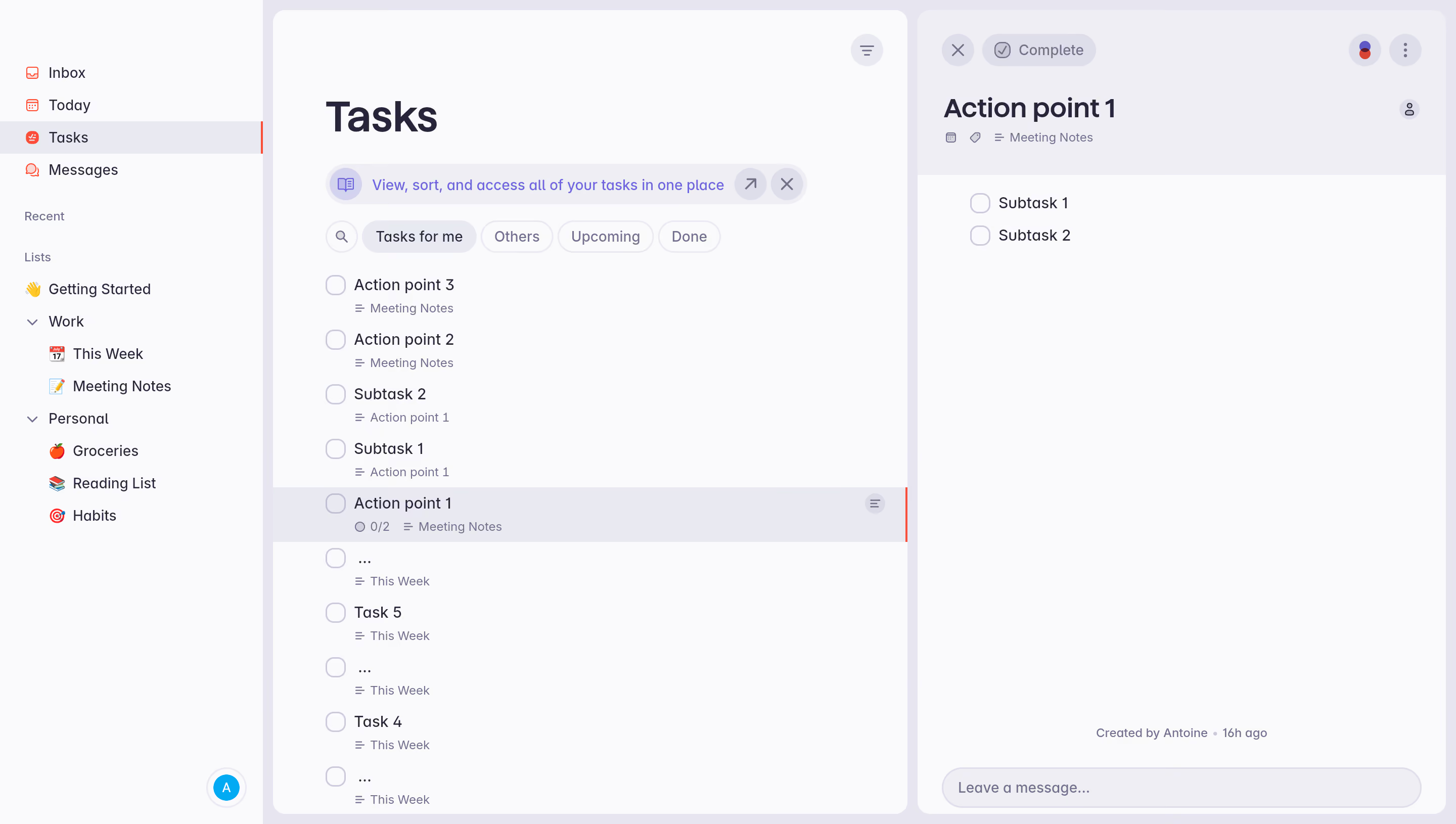
First thing you notice is how calm this whole interface feels. The soft gray background with that left sidebar in near-white creates a layout that doesn't scream at you. The purple accent on the active "Tasks" nav item is subtle but effective. It's doing a lot with very little color.
Smart hierarchy without the clutter
The three-column approach works well here. Sidebar for navigation, center for the task list, right panel for task detail. What's cool is how subtasks like "Subtask 1" and "Subtask 2" appear both inline in the main list AND nested inside the detail view for "Action point 1" with that 0/2 progress indicator. The filter tabs up top (Tasks for me, Others, Upcoming, Done) use pill-shaped buttons with clean rounded corners. No heavy borders anywhere.
Typography that stays out of the way
The type is simple sans-serif throughout, with weight doing most of the hierarchy work. Task names are medium weight, metadata like "Meeting Notes" sits underneath in smaller gray text. That "Created by Antoine · 16h ago" footer in the detail panel is a warm touch. Feels human.
Similar screens
Upgrade to SaaSFrame Pro now to see similar examples.