Design with AI
Generate a new design based on this screen using your own content.
# Design from Reference: Reveal Set your interest
Create an original, high-fidelity visual design inspired by the reference. Prioritize composition, typography, colors, spacing, and component styling over technical implementation.
## Reference
- **Product:** Reveal
- **Category:** Account Setup
- **Screenshot:** https://cdn.prod.website-files.com/5e9dc792e1210c5325f7ebbc/6acbd1f5f1e28b554223844a_6acbcff8e761f7d027b8532f_cms-a87ea9197efc980bb8a87bea.webp
Analyze the screenshot first. If inaccessible, request it rather than guessing.
## Content
{{content.instructions}}
{{content.data}}
Preserve essential messaging and factual accuracy. Adapt structure and copy length for visual balance; never invent product claims.
## Visual Design
### Overall aesthetic
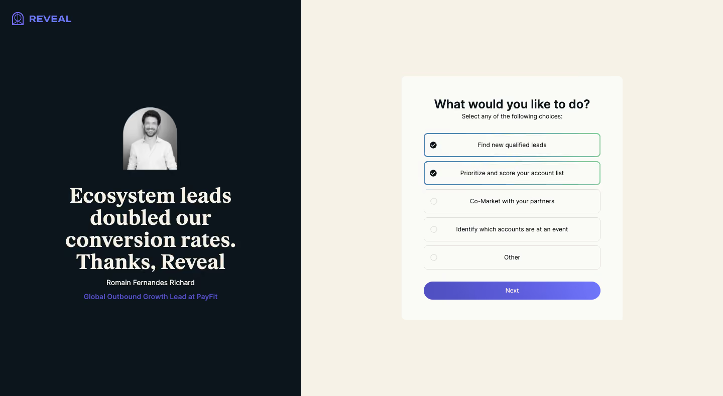
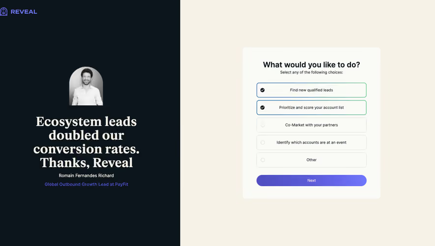
- **Character:** Split onboarding screen pairing a dramatic testimonial with a warm, compact multi-select preference form.
### Page composition
- **Canvas:** 1440 × 789 screenshot pixels; CSS estimates are near screenshot scale, with capture scale unverified.
- **Structure:** Dark left panel occupies about 42% of width; cream right panel centers a pale form card roughly 440px wide.
### Information hierarchy
- **Priority:** Right-side question precedes five choices and a broad Next button. The first two choices are selected in the captured state.
- **Proof:** Left side shows a small grayscale portrait, large centered serif quotation and compact attribution.
### Typography
- **Families:** Heavy serif testimonial paired with sans-serif form; exact families are unverified.
- **Scale:** Estimated CSS quote 40–44px, form title 24px bold, choice labels 13–14px and attribution 14px.
### Colors & surfaces
- **Sampled palette:** Cream #F6F2E8; dark navy-black #0C151B; pale card #FAFAF6; subtle border #E1DEDA; purple variants #5150C1 and #5151C2.
- **Selection:** Selected rows use blue-to-green outlines and dark checked circles; Next uses a purple gradient.
### Components
- **Choices:** Five full-width outlined rows, approximately 46px high, with left selection markers and centered labels.
- **Geometry:** Estimated 8px card radius, 6px option radii, 36–44px card padding and pill-shaped Next action.
### Visual rhythm
- **Spacing:** 8–10px gaps between options; large surrounding blank space keeps the small preference form prominent.
### Responsive
- **Guidance:** Mobile is not shown. Put the form first and shorten or move testimonial below; keep full-row selection targets.
### Adaptation guidance
- **Transfer:** Preserve choice clarity and complementary social proof. Use original testimonial evidence and relevant interest categories.
Use this context to reproduce the reference's visual language: layout, typography, colors, spacing, borders, radii, and distinctive elements. The screenshot takes priority if descriptions conflict.
## Direction
{{preferences.fidelityInstructions}}
## Output
{{output.instructions}}
Deliver a polished, cohesive design with precise alignment, hierarchy, and spacing. Produce the requested visual artifact, not just a description. If unsupported, explain the limitation.