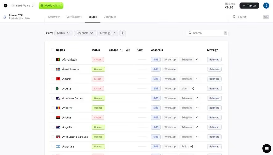
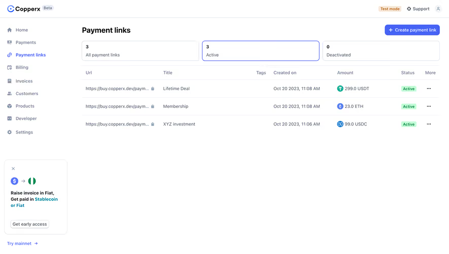
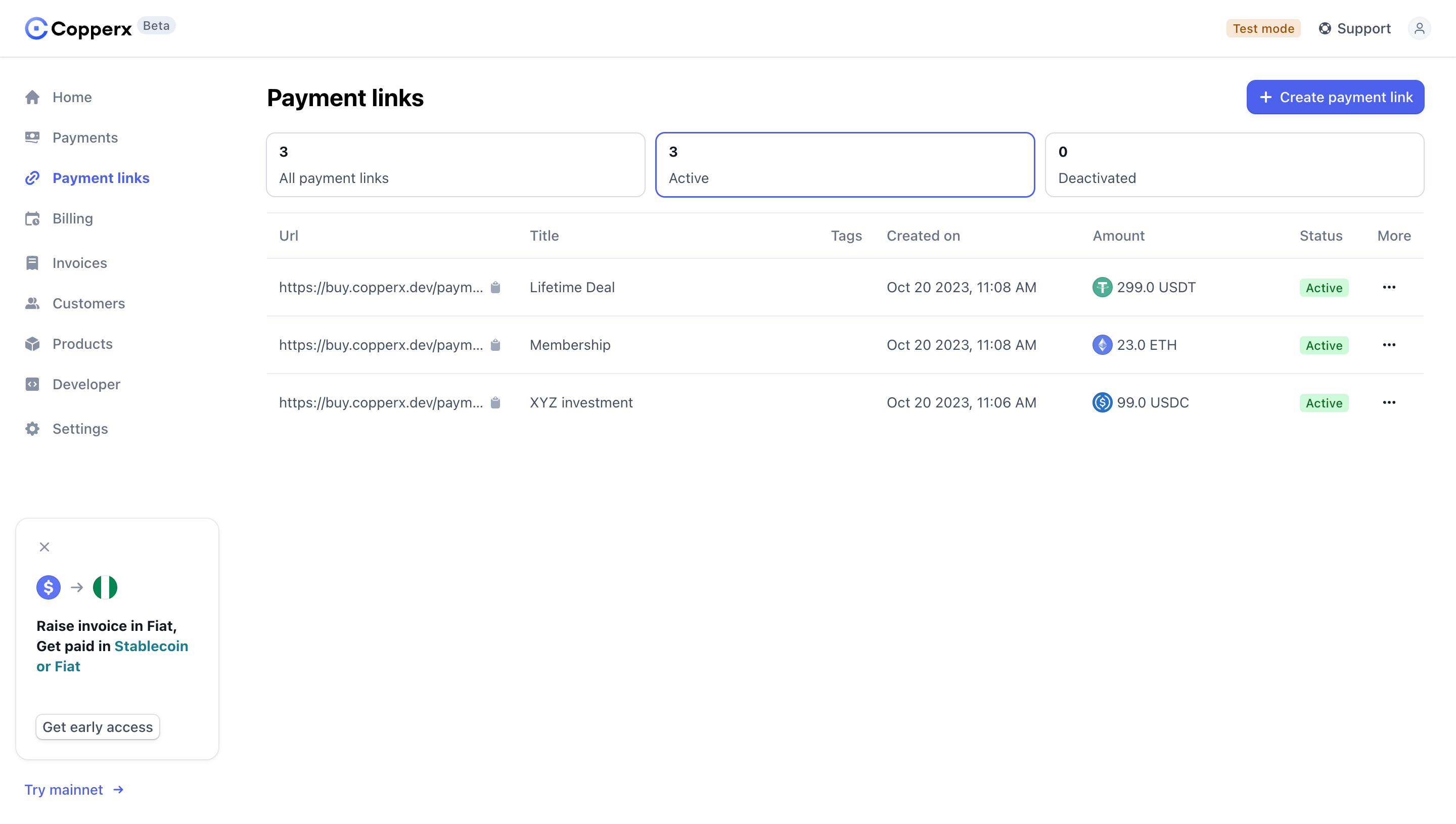
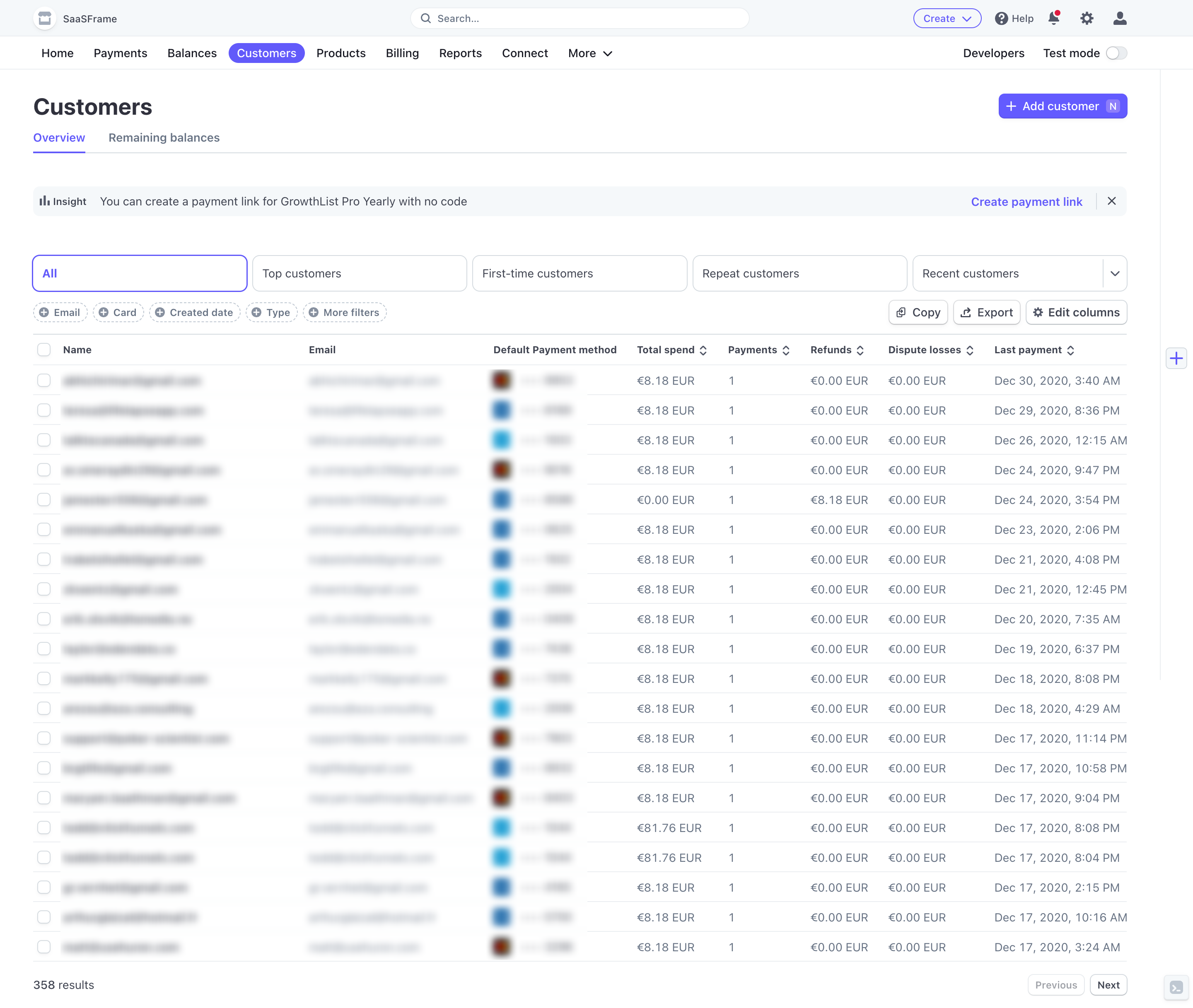
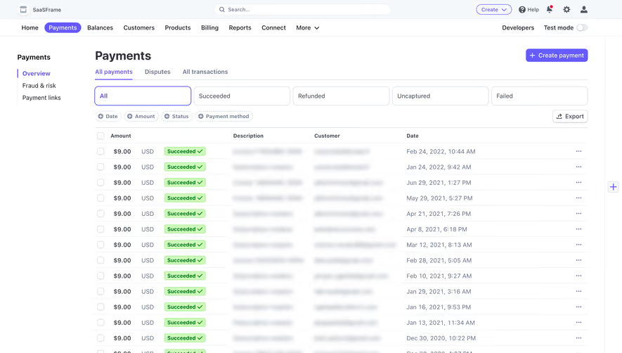
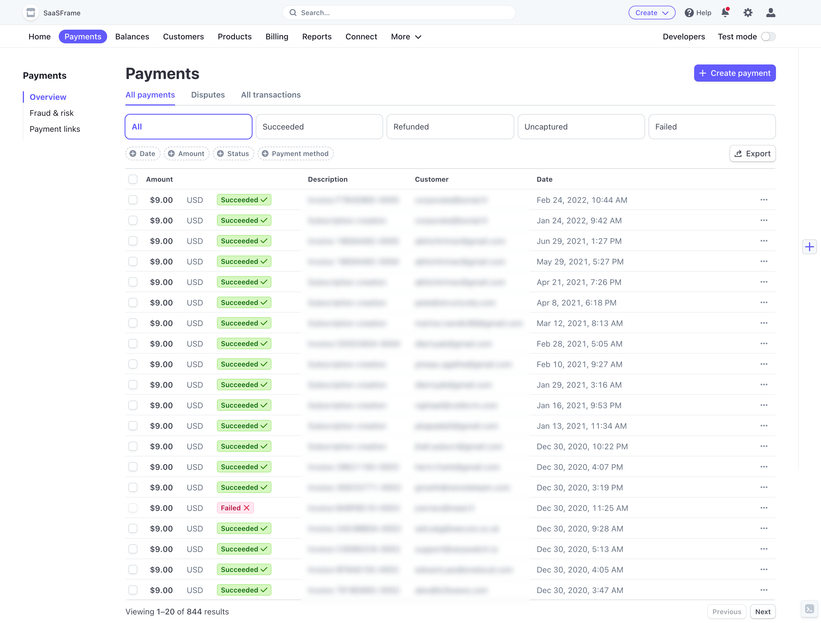
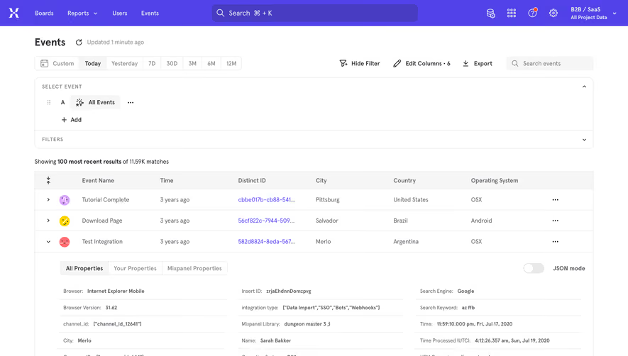
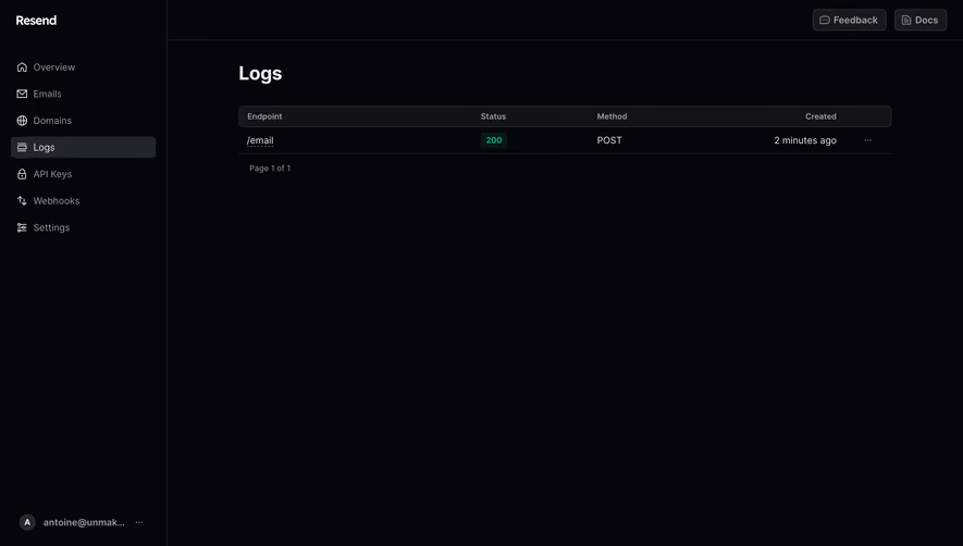
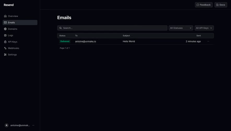
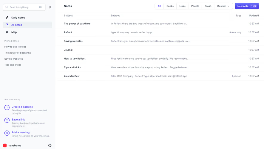
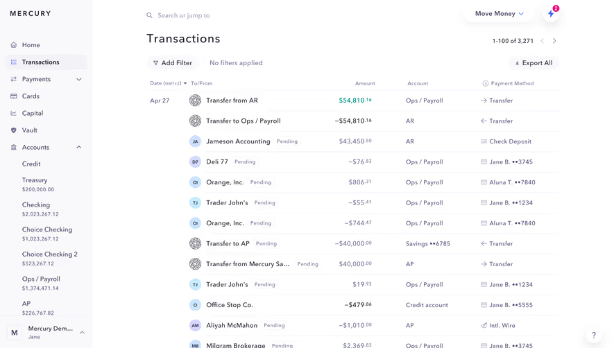
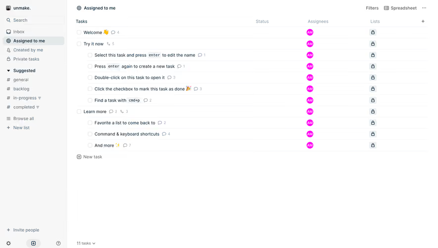
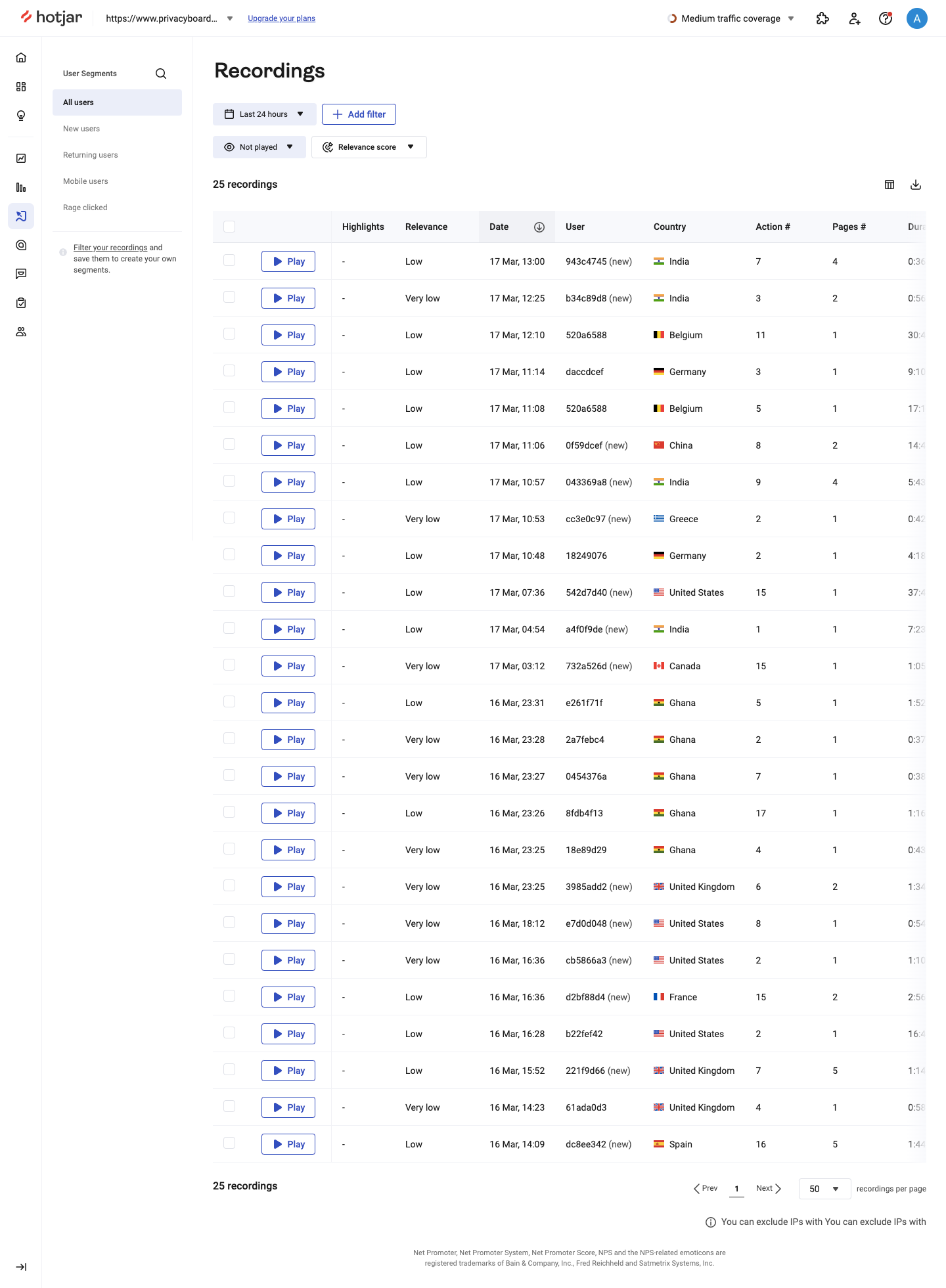
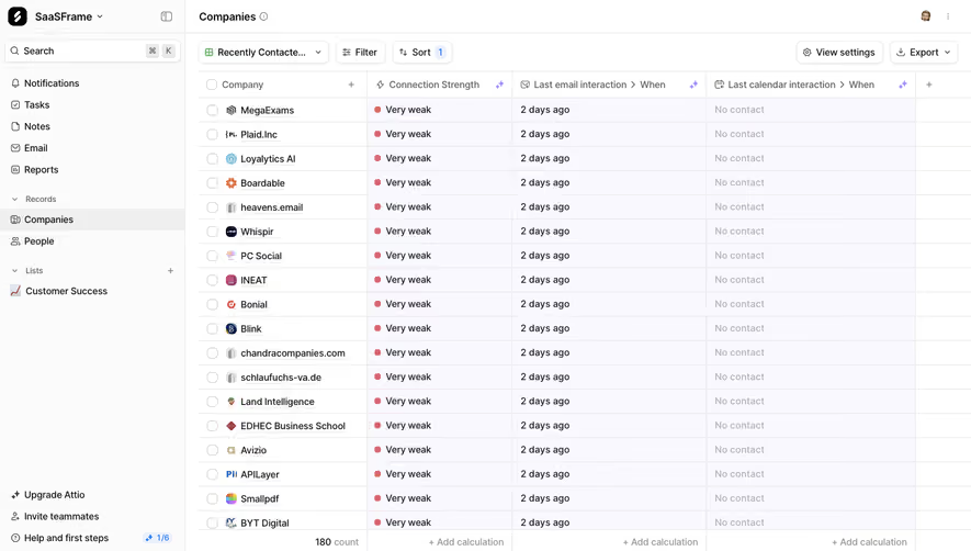
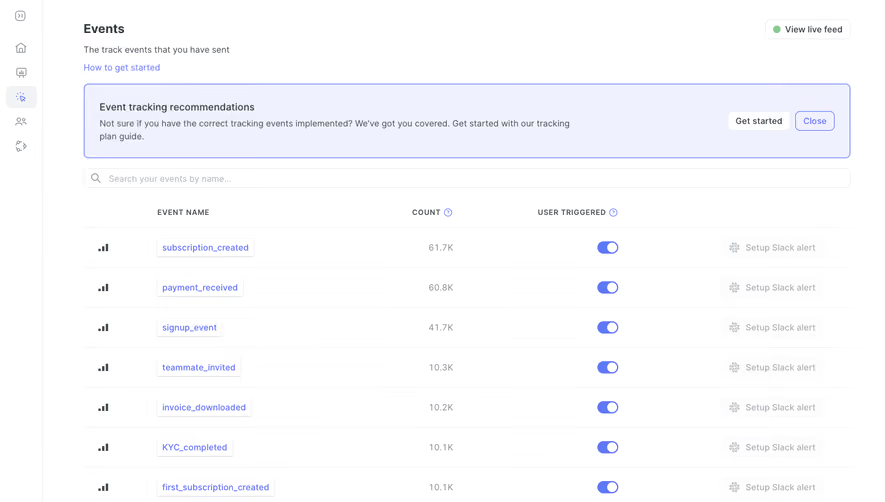
Display large datasets with functional SaaS Table and Data Grid designs. These examples focus on sortable columns, inline editing, batch actions, and horizontal scrolling solutions for data-heavy enterprise applications.
Browse 94 real SaaS Table with modern UI patterns and conversion strategies.
We sell SaaSFrame licenses on Gumroad, a secured online selling platform for creators.
What about future updates and versions?
SaaSFrame gets updated all the time! Every new update and version will immediately be made available to all SaaSFrame users.
I didn't receive my licence key, what should I do?
The licence key required to create your SaaSFrame account is send by Gumroad once you made your purchase. If this email is blocked by your email client, send me an email at antoine[at]unmake[dot]io so I can resend the licence key.
Can you send me an invoice?
You can generate an invoice on Gumroad once you purchased SaaSFrame. You will find the link in the order confirmation email.
Can I get a refund?
If you're not satisfied, you can ask for a refund within 7 days. Just send me an email at antoine[at]unmake[dot]io
Table Design Guide
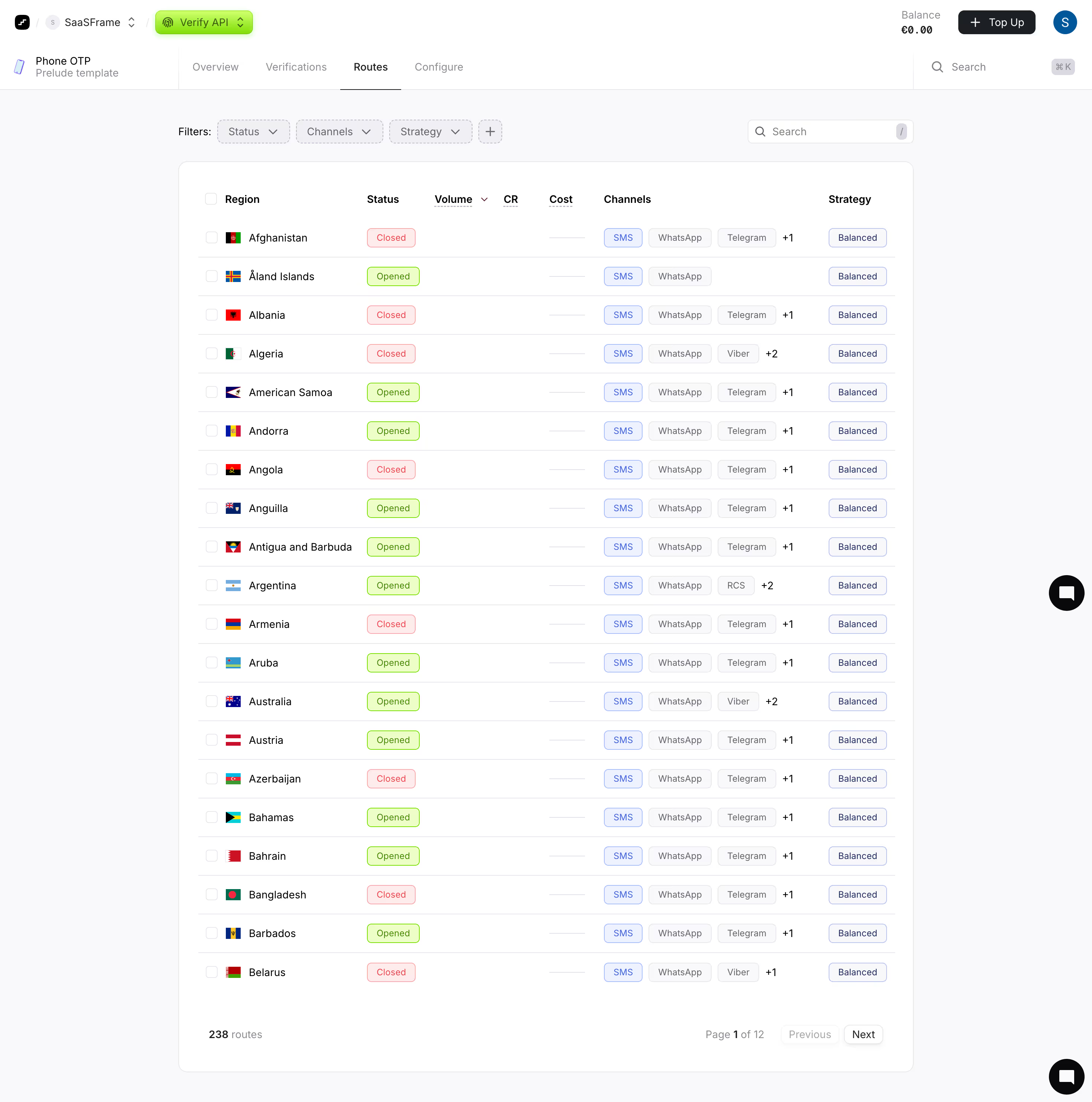
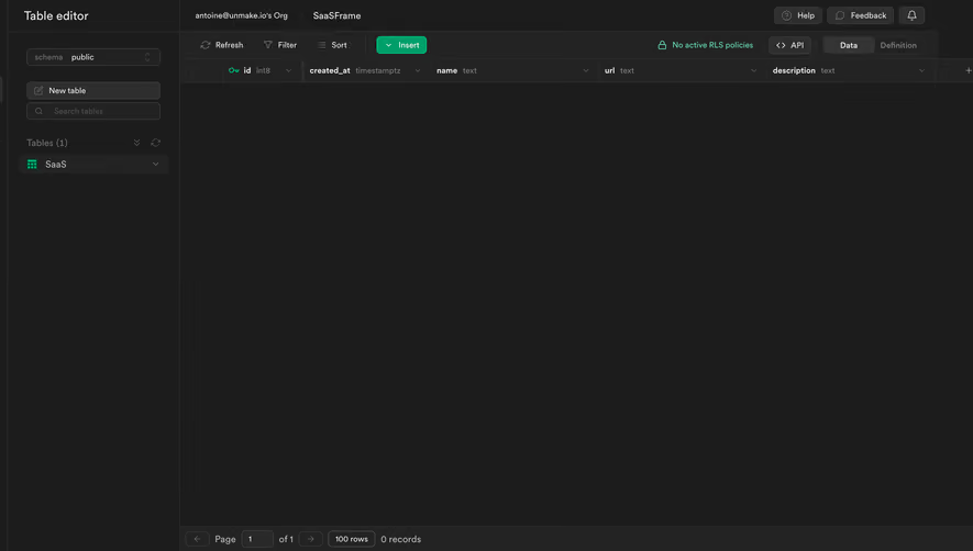
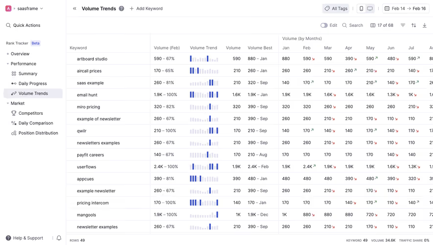
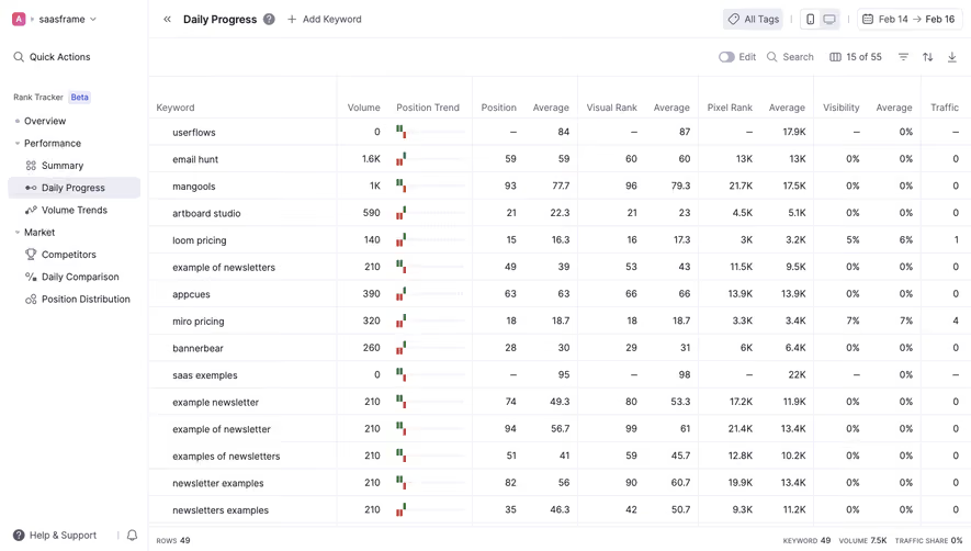
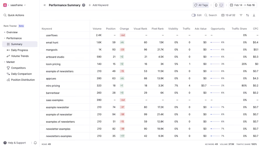
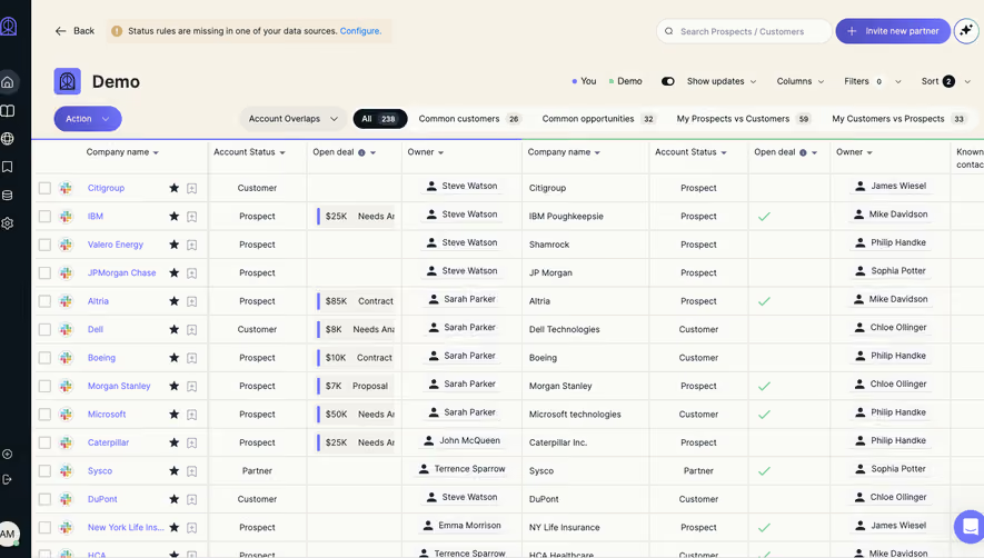
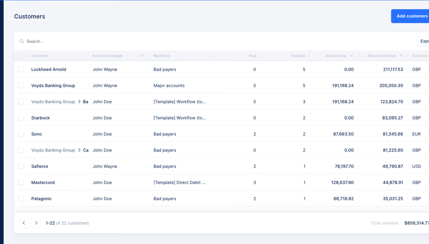
A SaaS table presents records in a structure that supports comparison, scanning, and action. It can contain contacts, transactions, API keys, webhook endpoints, or other product objects. Its usefulness depends on which relationships the columns make visible and how easily users can move from a summary row to the work behind it.
This category treats the table as a product screen rather than an isolated component. The SaaSFrame references show how navigation, search, status, row identity, and record actions fit together. Captured records are design examples, not production data to reuse.
Define the table's main task
A table can support browsing, investigation, monitoring, or editing. Decide which task leads before choosing columns. A transaction history needs date, amount, and state context; an API-key inventory needs ownership, lifecycle, and access context.
Write the questions users need to answer from the list. Then identify the smallest useful set of columns. Adding every available field often reduces scanability without helping the main decision.
Keep deeper detail accessible rather than forcing it all into the row. A table can establish what the record is and whether it needs attention, then route the user to a focused detail view.
Make each record identifiable
A row needs a recognizable identity. A human-readable name may work better than an internal ID, while a financial or developer record may require both. Place the identifier where it can be found consistently.
Use secondary text when it helps distinguish similar records. An endpoint name and URL, or a contact name and company, can establish context without creating several narrow columns. Avoid adding secondary content merely to fill visual space.
Long identifiers need a usable inspection route. Truncation should not remove the only distinguishing part of a value. Where copying matters, copy the full intended value and confirm the action clearly.
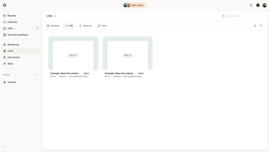
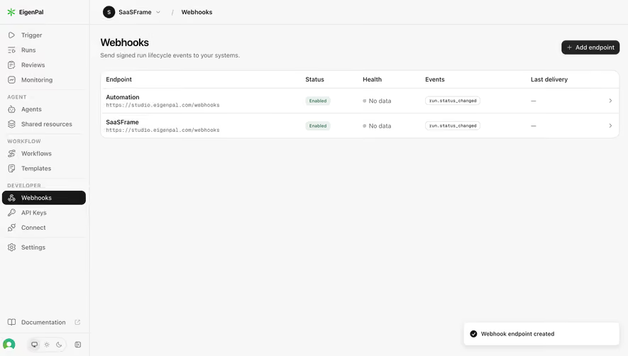
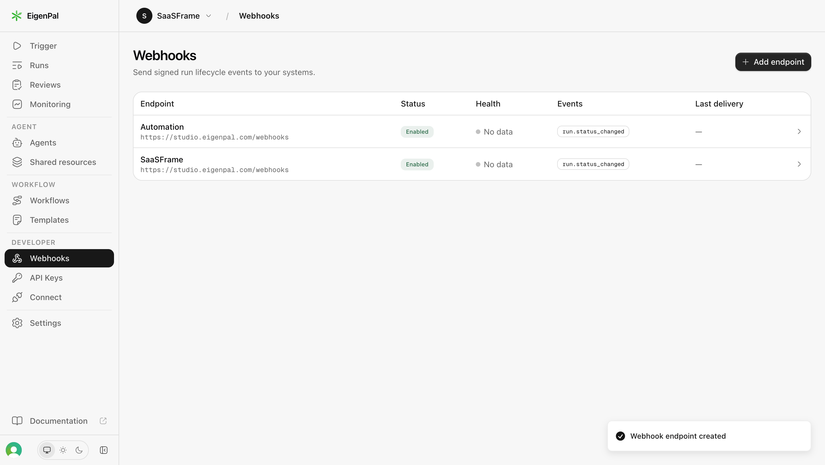
Study how an endpoint table separates status and health
The EigenPal webhook capture shows endpoint identity, status, health, subscribed events, and last delivery. Its rows include an enabled status alongside a no-data health state.
That distinction is useful: being enabled does not establish that delivery is healthy or that delivery has happened. Separate columns can prevent one positive badge from implying overall readiness.
When adapting the model, define each status according to the underlying system. A last-delivery dash needs a clear meaning, such as no delivery yet, rather than silently mixing absence and unavailable reporting. The table should expose enough context for users to decide whether investigation is necessary.
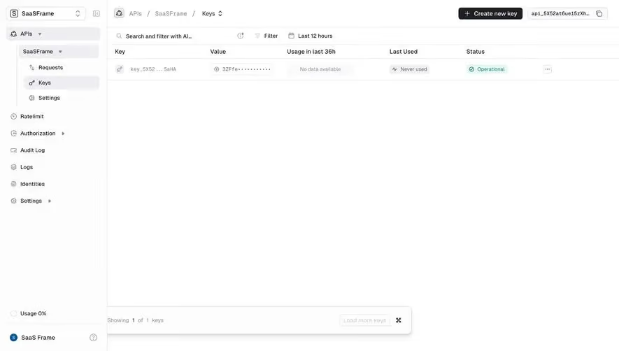
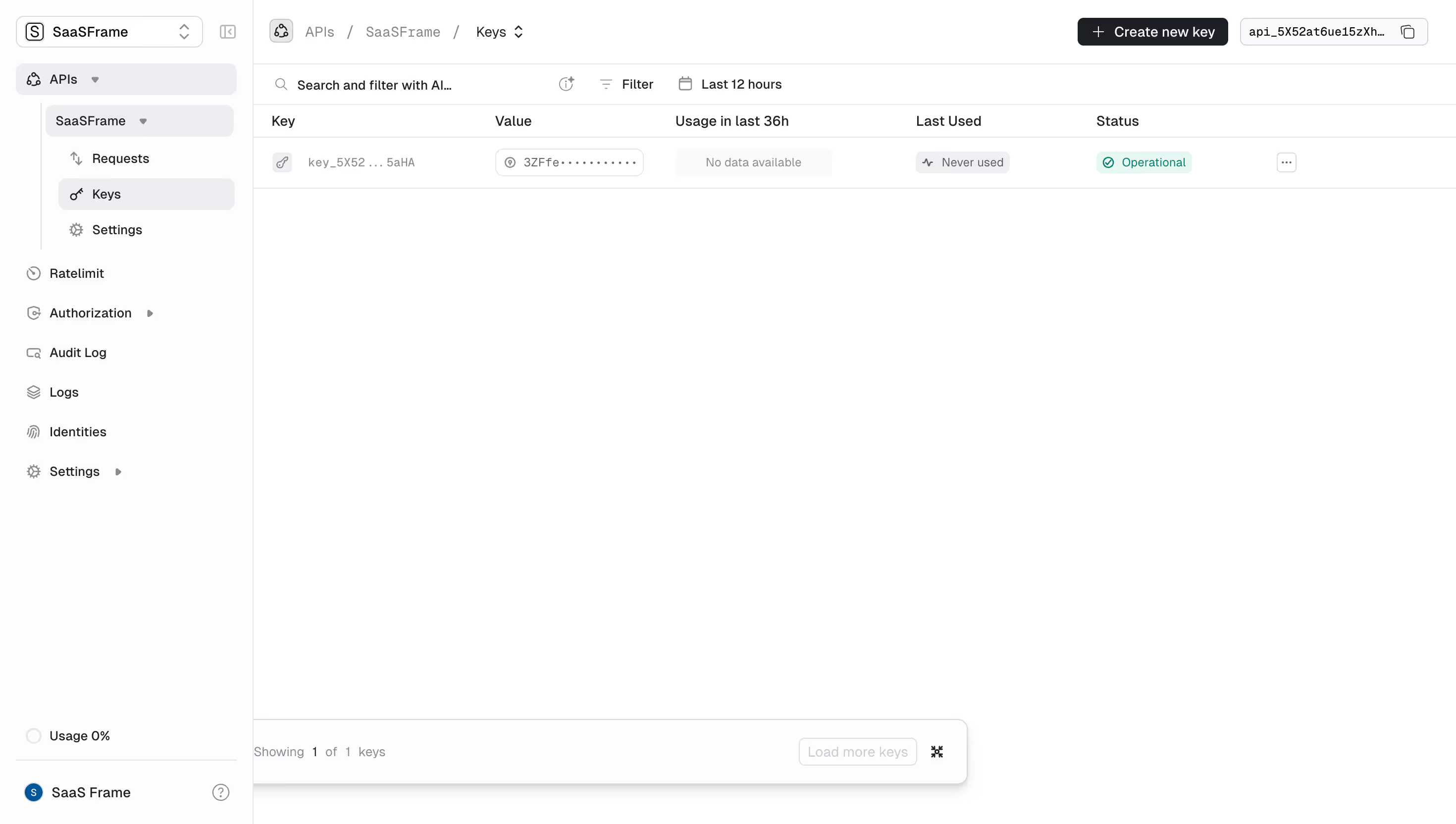
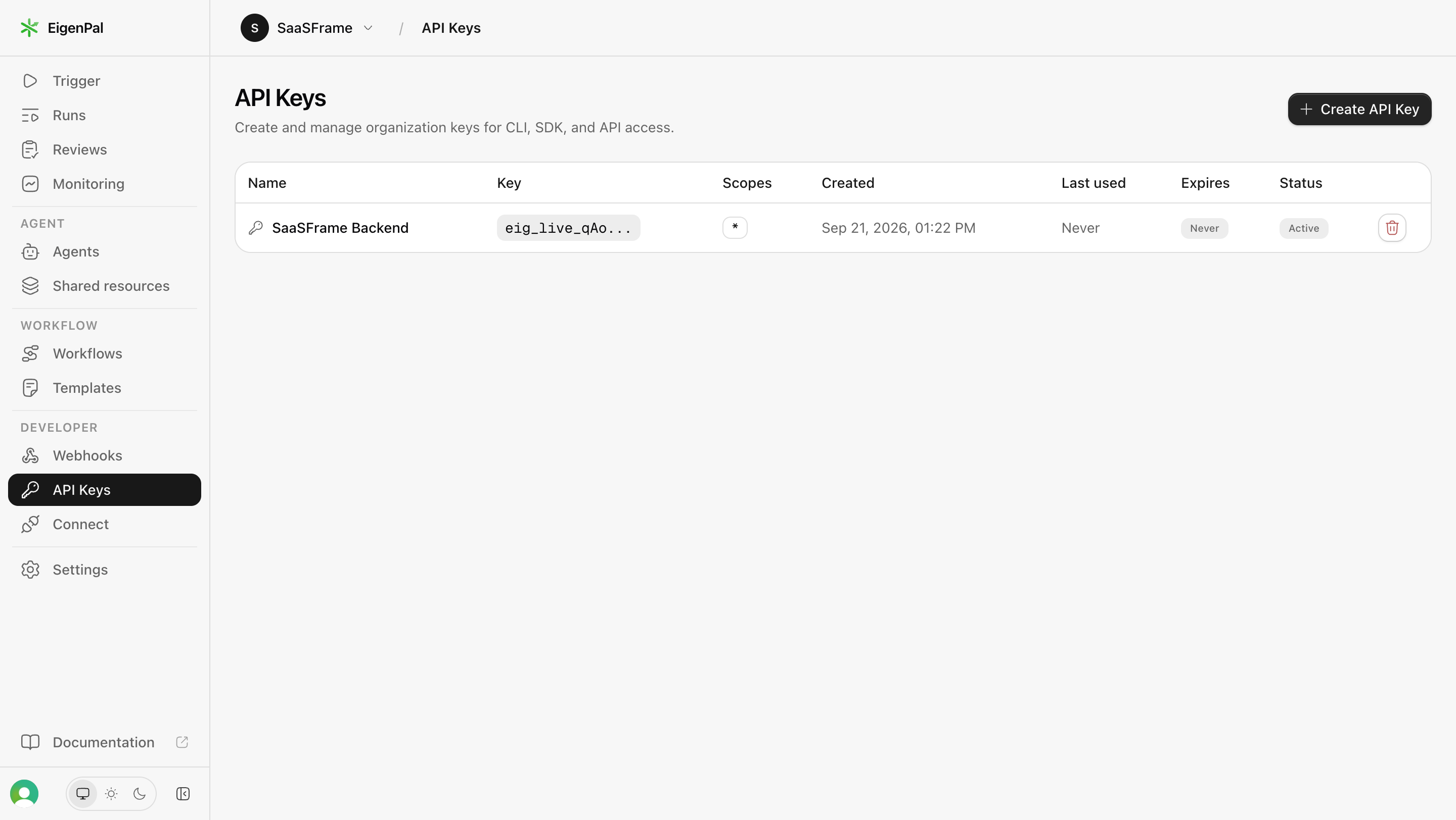
The EigenPal API-key capture presents a name, masked key, scopes, creation time, last-used value, expiry, and status. A create action appears above the inventory.
This is an inventory organized around access and lifecycle. Created, last used, and expires answer different questions. A never-used key is not automatically invalid, and a never-expiring key is not necessarily the right choice for every use case.
Keep secret values appropriately protected when adapting this structure. A table can identify a credential without exposing the full value. Destructive or sensitive actions also need clear targets and appropriate confirmation or recovery behavior.
Use a list when comparison is secondary
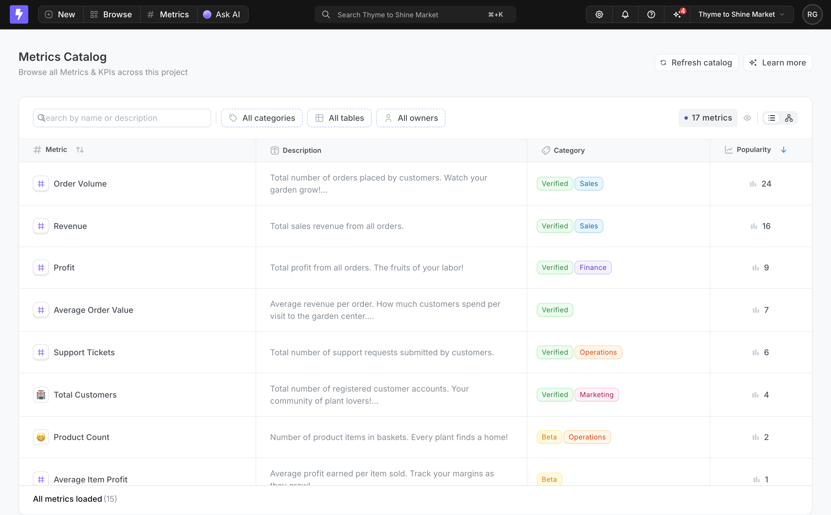
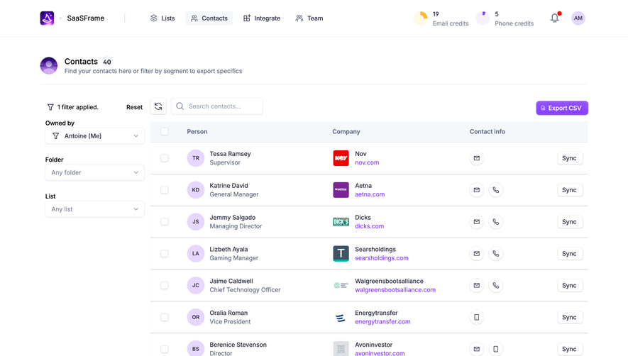
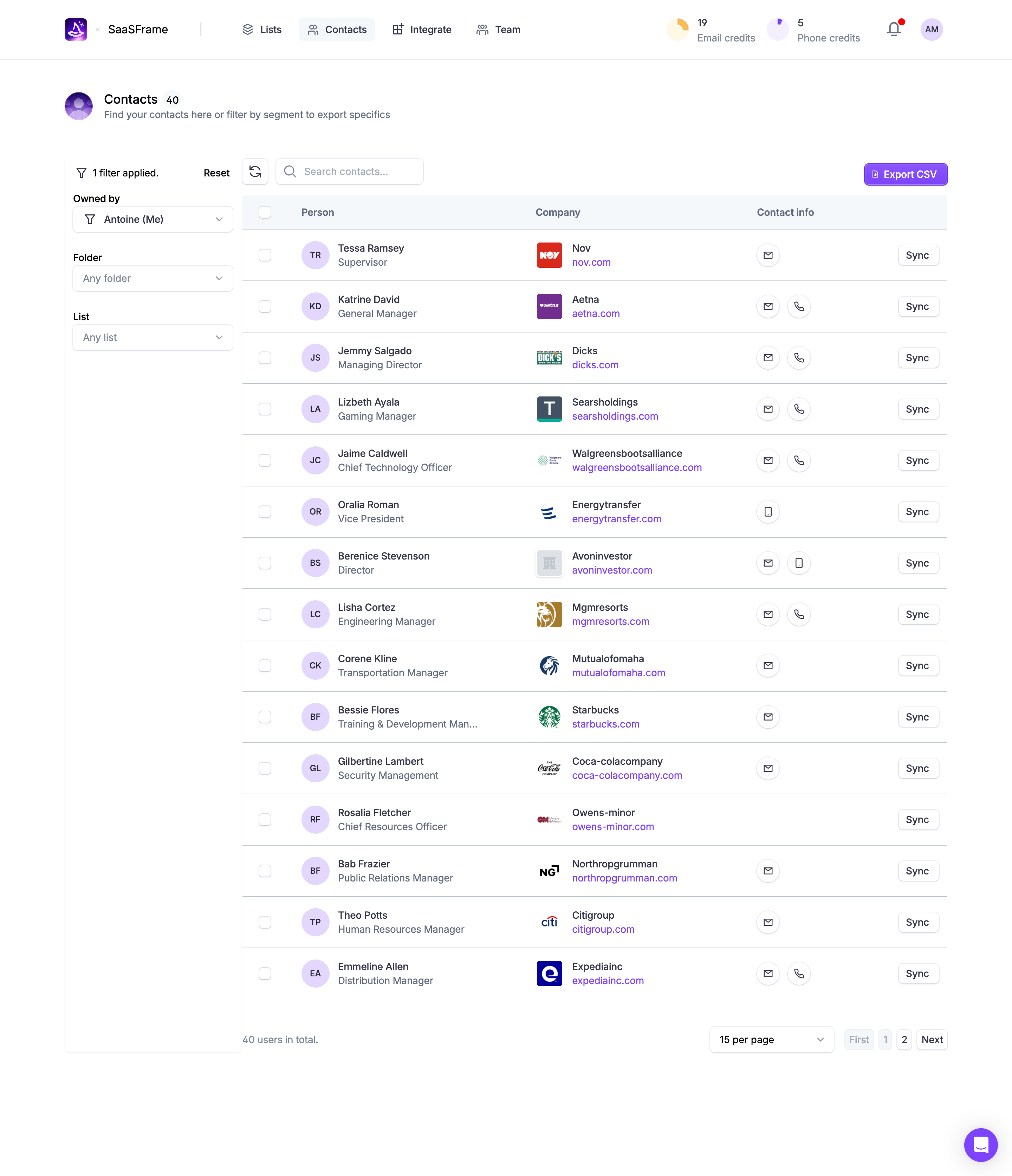
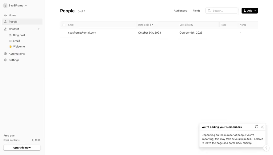
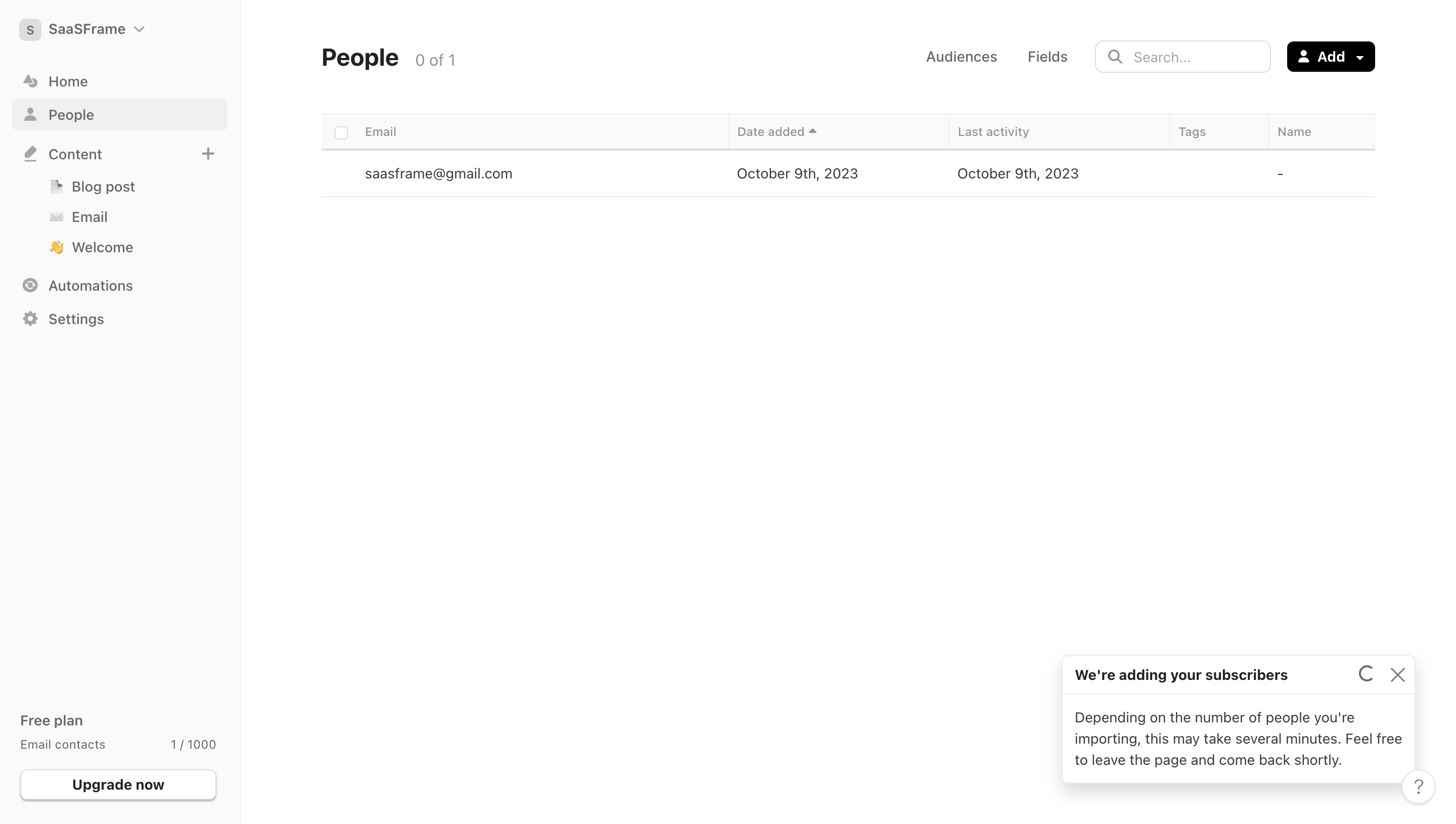
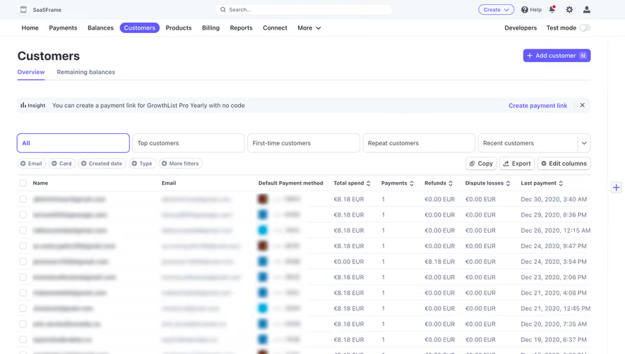
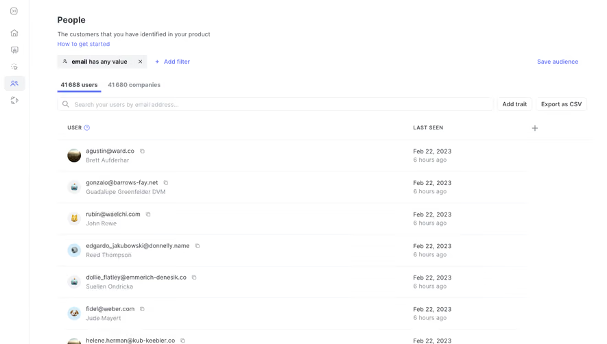
The Glide CRM contacts capture uses a compact list with names, role-and-company context, and related-deal counts. This is classified within the table category, but its visible structure is closer to a record directory than a dense column matrix.
That difference is worth preserving. If users mostly find a person and open their record, a list may fit better than a wide table. If they repeatedly compare numeric values across records, aligned columns become more useful.
Choose the structure from the task rather than the taxonomy label. A responsive presentation may also change from a table to a list when the column relationships can no longer be preserved on a narrow screen.
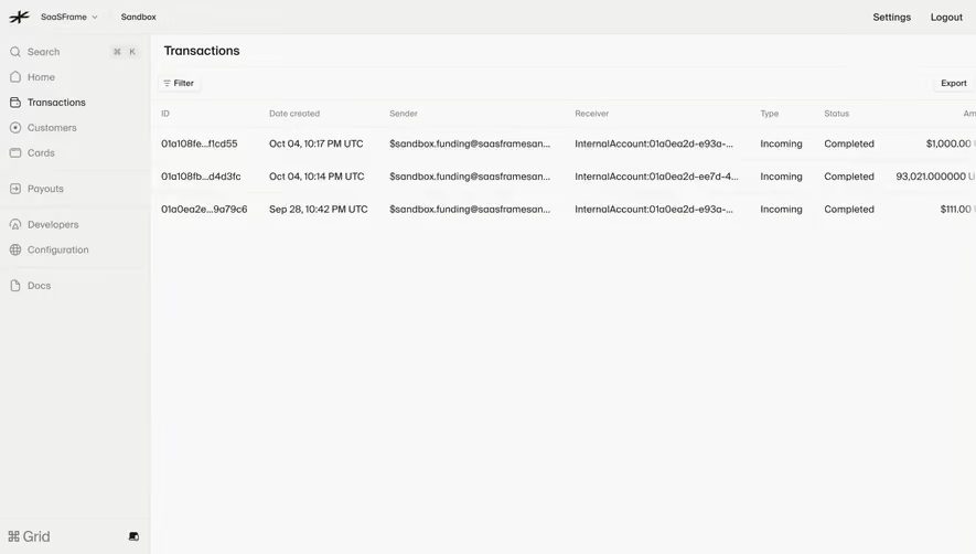
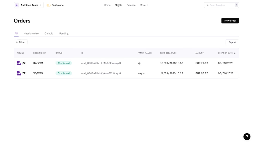
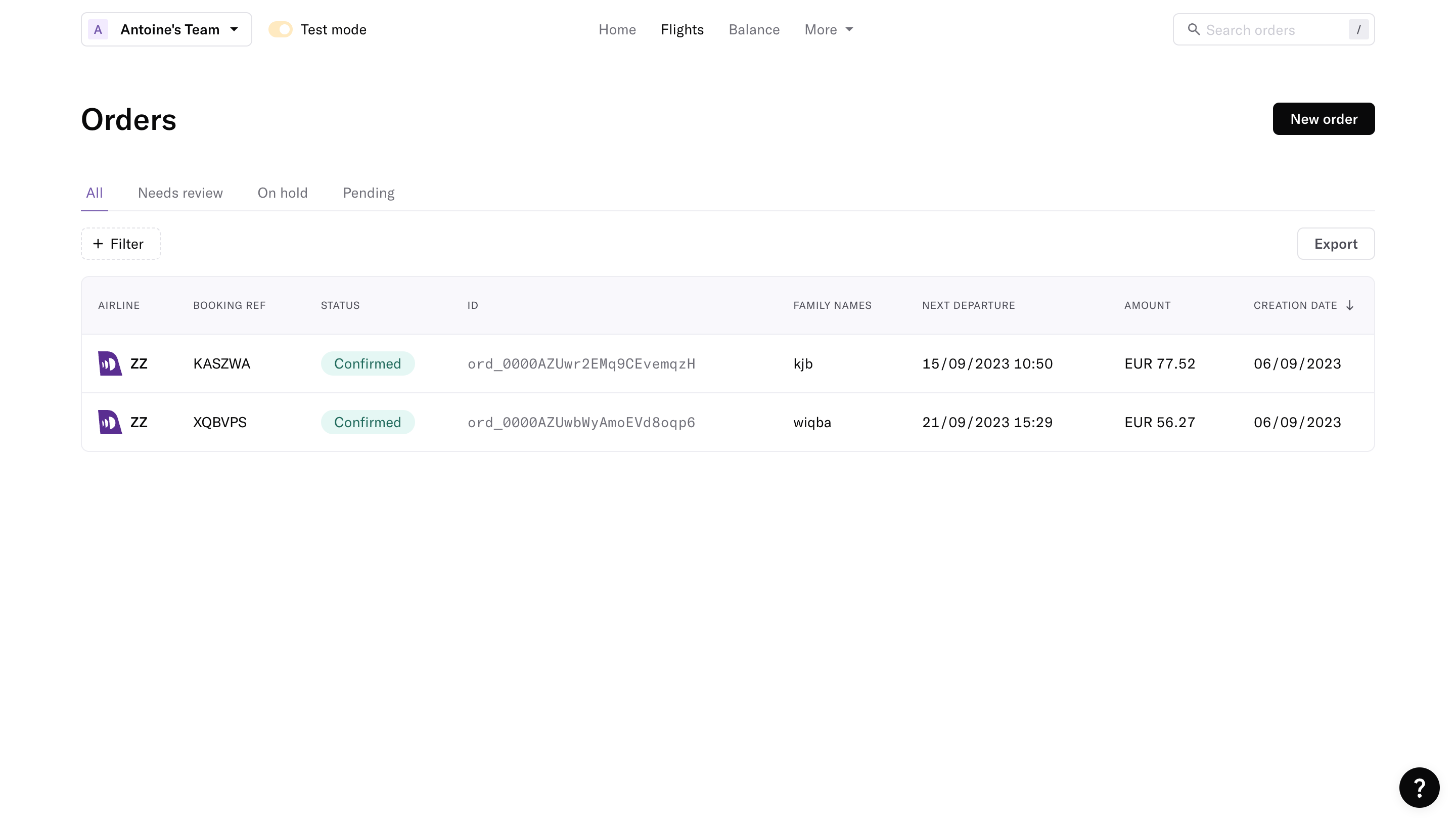
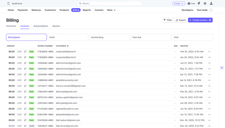
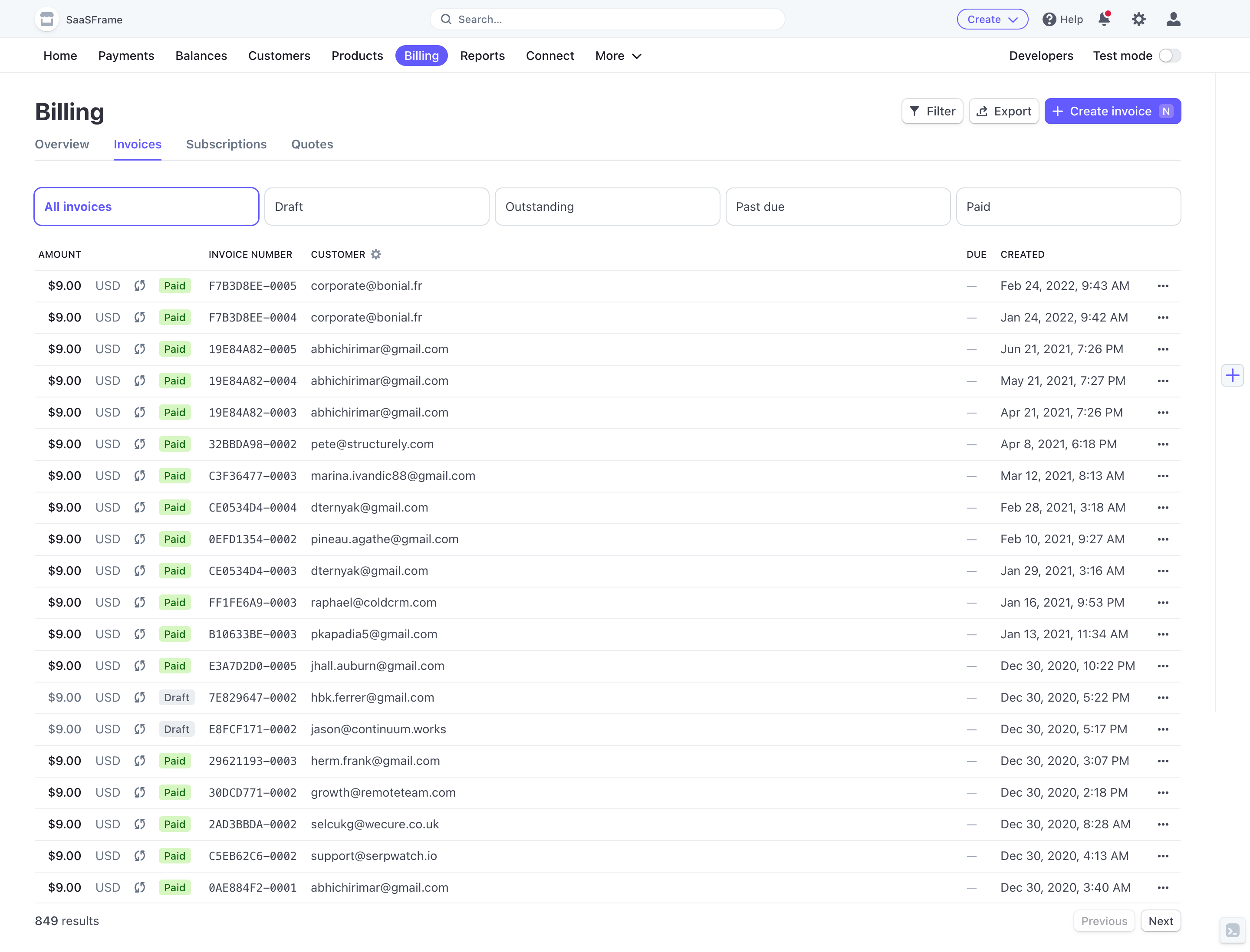
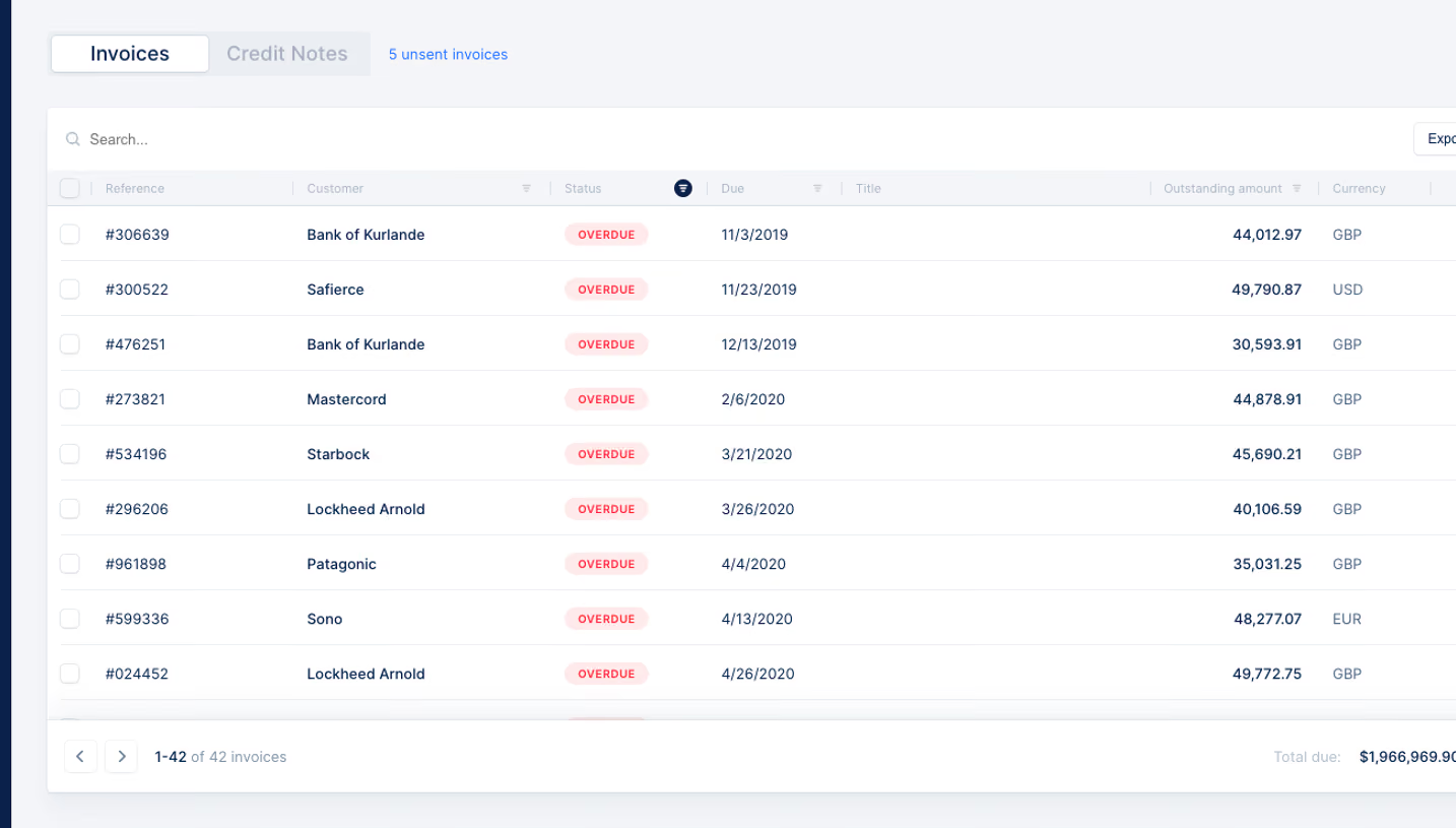
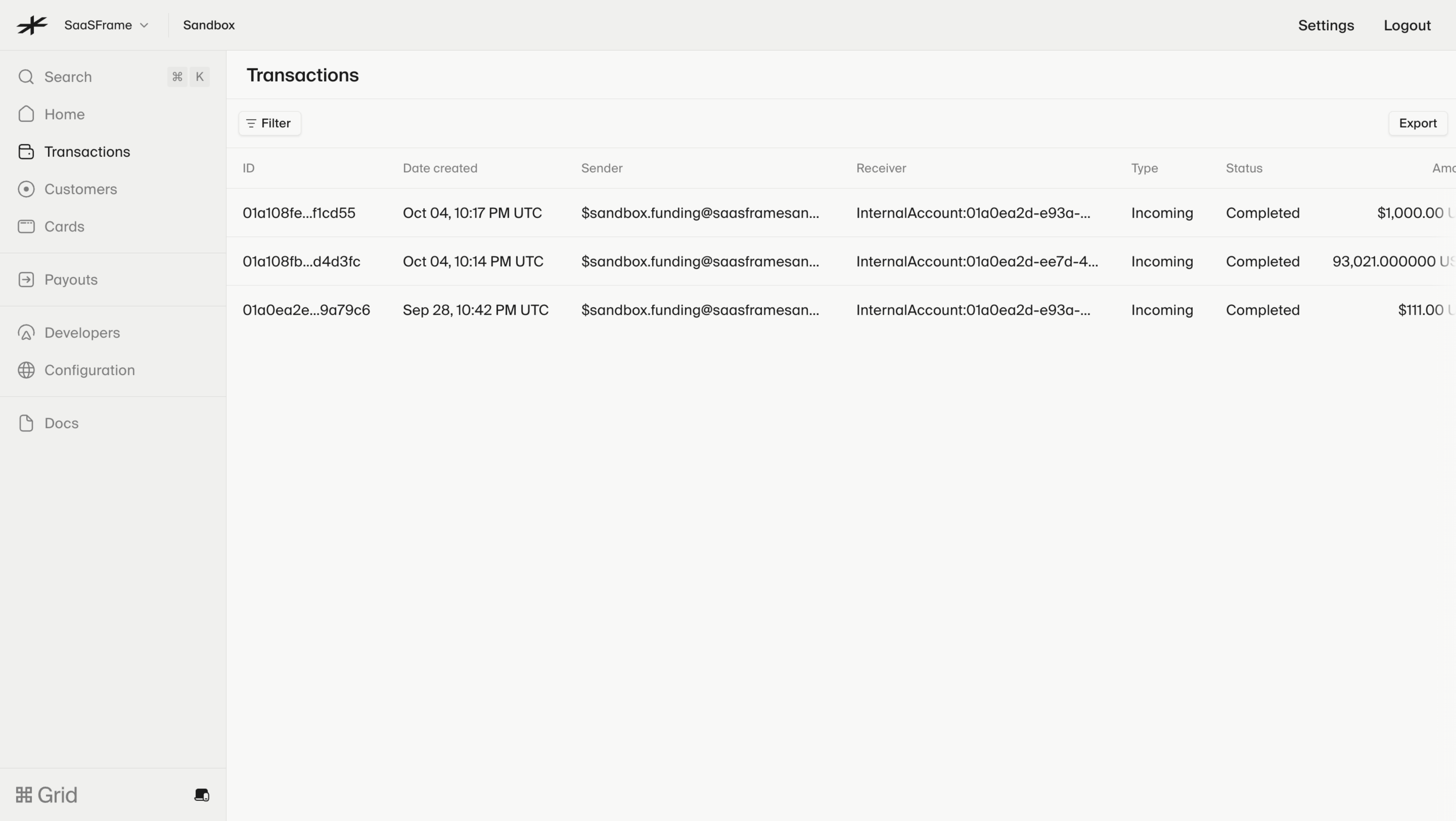
The Lightspark transaction-history capture presents records with identifiers, creation dates, sender and receiver information, type, status, and amounts. It includes filter and export routes within a sandbox account context.
For this kind of history, alignment and scope are part of comprehension. A timestamp needs a known timezone, an amount needs a unit or currency, and a status needs a defined lifecycle meaning. The sandbox context also matters because it distinguishes the shown records from a live financial account.
Avoid treating visual precision as substantive certainty. A row can display many decimal places while the user still lacks the context needed to interpret the amount. Use the precision appropriate to the record and the task.
Make sorting and filtering explicit
Sorting changes order; filtering changes the record set. Users need to understand which operation is active and how to return to the default view. Show meaningful active criteria instead of hiding them behind a small icon.
Choose a useful initial sort for the task. Recent transactions may lead with time, while a directory may lead with name. A saved view can support repeated work, but its scope and ownership should be clear.
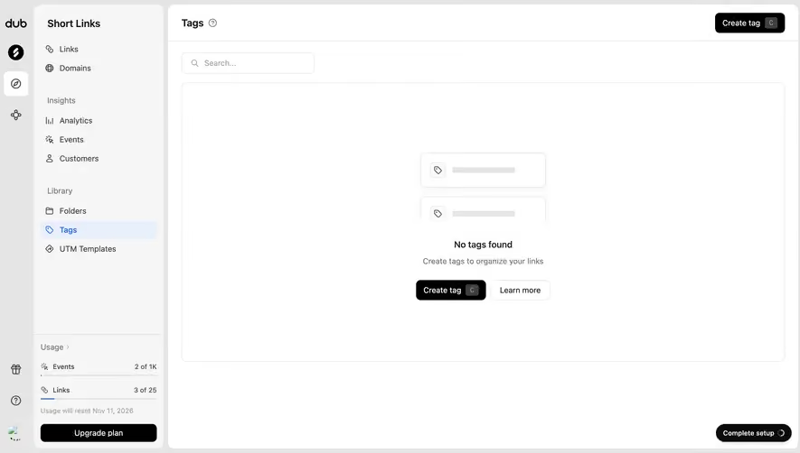
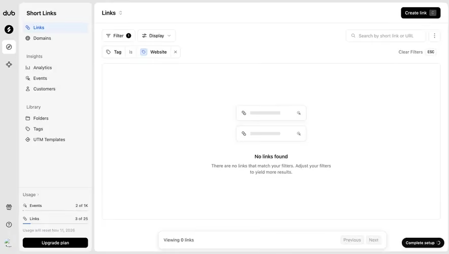
When filters produce no matches, distinguish that state from an empty account. Preserve the active criteria and provide a route to revise them. Clearing filters should not discard unrelated work or preferences unexpectedly.
Clarify row navigation and row actions
A row may open detail while an embedded control performs an action. Keep those targets distinct so selecting a checkbox or opening an overflow menu does not accidentally navigate away.
Use meaningful action labels and identifiable targets. A delete icon repeated across a table needs accessible names that distinguish the affected record. For bulk actions, show the selection scope, especially across multiple pages.
Keyboard interaction should match the intended structure. A simple data table with links has different requirements from an editable grid. Do not add complex cell navigation unless the product's interaction model needs it.
Explain counts, pagination, and selection scope
A record count can describe the entire account, the filtered result, or the visible page. Label the relevant meaning. A user exporting or selecting records needs to know which set the action affects.
Pagination and infinite loading have different consequences for scanning and return navigation. Preserve search and filter context when moving through records, and help users find their place after opening detail.
For select-all actions, distinguish visible rows from all matching records. A checked header control should not imply one scope while the operation uses another. Confirmation should include the actual affected set where the consequence matters.
Preserve information in loading and error states
A refreshed table should not make existing information disappear without explanation. If the old rows remain while new data loads, communicate that state. Avoid mixing rows from different account scopes during a switch.
Partial failure may affect one field or one record rather than the whole inventory. Present the relevant problem where it can be understood, while preserving trustworthy information. A generic empty table is a poor substitute for a reporting error.
After creating or editing a record, make the confirmed change findable. A toast alone may not help if the active sort places the new item far away or the current filter excludes it. Explain that relationship when needed.
Make responsive density purposeful
On small screens, preserve identity and the main decision first. Optional columns can move into detail, but essential comparisons should remain understandable. Horizontal scrolling is useful in some cases, not a reason to ignore hierarchy.
At increased text size, labels and controls must remain readable. Fixed row heights can hide wrapped content, while very small action targets create avoidable interaction problems.
Test real names, long URLs, empty values, localized dates, and large numeric values. Sample data with short identical strings rarely reveals the constraints that determine whether the table works in practice.
Frequently asked questions about SaaS tables
When should a table become a list?
Use a list when identity and navigation matter more than repeated comparison across columns. Preserve the relationships users actually need rather than the appearance of a matrix.
Should every column be sortable?
Offer sorting where it supports a meaningful task and the order can be explained. A control on every header can add complexity without helping users.
How should empty results appear?
Identify whether the account has no records, the filters match nothing, or data is unavailable. These states require different explanations and next actions.