Generate a new design based on this screen using your own content.
Thank you! Your submission has been received!
Oops! Something went wrong while submitting the form.
# Design from Reference: Unkey API Table
Create an original, high-fidelity visual design inspired by the reference. Prioritize composition, typography, colors, spacing, and component styling over technical implementation.
## Reference
- **Product:** Unkey
- **Category:** Table
- **Screenshot:** https://cdn.prod.website-files.com/5e9dc792e1210c5325f7ebbc/697b75f7975f777f0b09745f__OHzozH_Tbneitv1caRwShWMSO6pk4hWB2MHIpn4I20.avif
Analyze the screenshot first. If inaccessible, request it rather than guessing.
## Content
{{content.instructions}}
{{content.data}}
Preserve essential messaging and factual accuracy. Adapt structure and copy length for visual balance; never invent product claims.
## Visual Design
Use this context to reproduce the reference's visual language: layout, typography, colors, spacing, borders, radii, and distinctive elements. The screenshot takes priority if descriptions conflict.
## Direction
{{preferences.fidelityInstructions}}
## Output
{{output.instructions}}
Deliver a polished, cohesive design with precise alignment, hierarchy, and spacing. Produce the requested visual artifact, not just a description. If unsupported, explain the limitation.
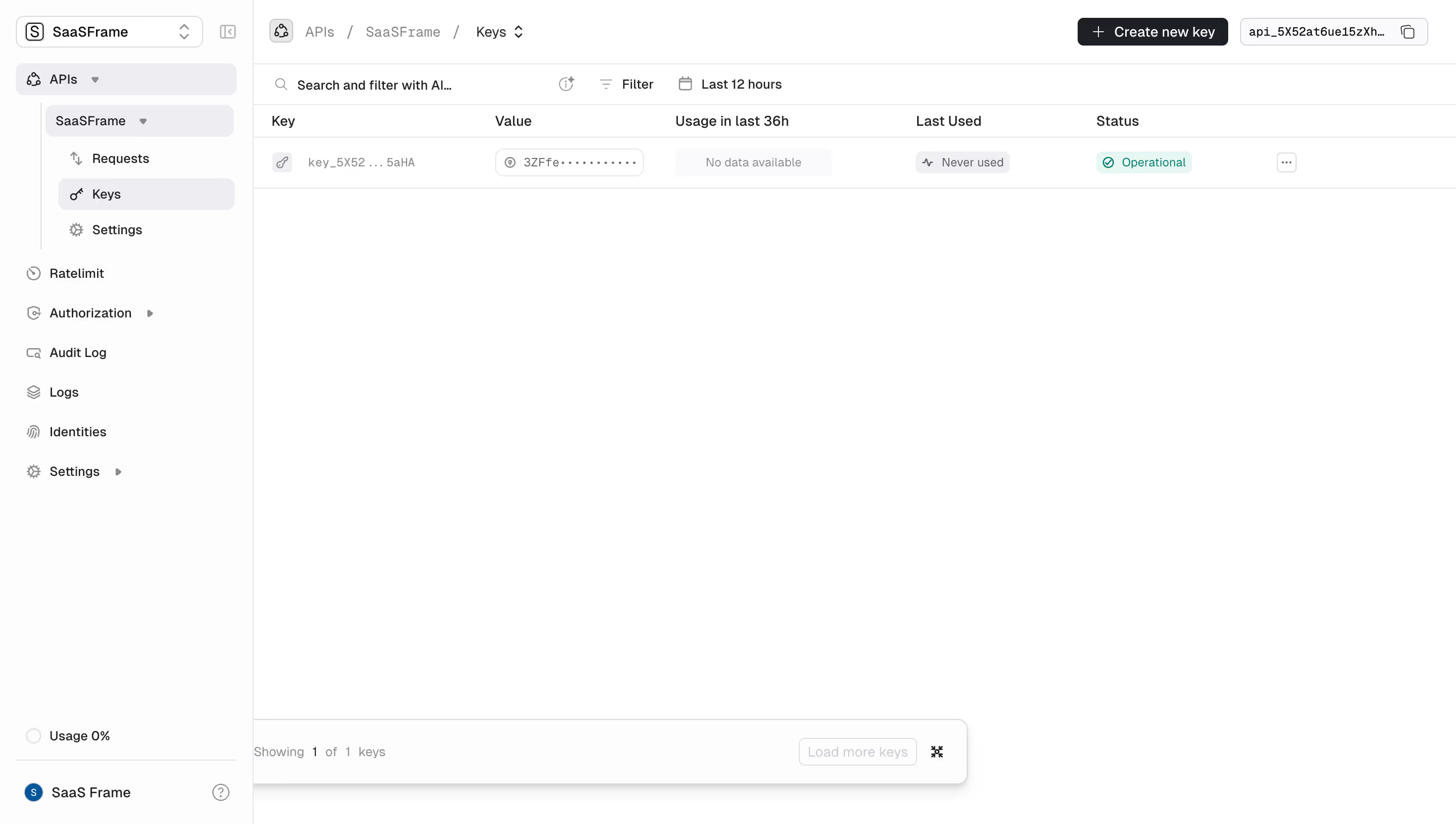
This is Unkey's dashboard for managing API keys, and it's a great example of a data-dense interface that still breathes. The left sidebar uses a quiet hierarchy with nested navigation under "SaaSFrame," grouping Keys, Requests, and Settings without overwhelming you. That subtle indentation does a lot of work.
The Table Tells the Story
Your eye goes straight to the key table. Six columns, one row, zero clutter. The masked value field with the dot pattern is a smart touch. Love the green "Operational" status badge pulling your attention to the most important info. The "Never used" label in the Last Used column is honest and useful. No fake activity here.
Restrained Color, Strong Structure
Almost entirely monochrome with that single green accent on status. Typography is small but legible, likely Inter or something similarly functional. The top-right API ID with the copy icon is practical. The "Create new key" button in black sits perfectly weighted against the white space. Bottom pagination feels understated but confident. Everything serves the task. Nothing is decorative for decoration's sake.