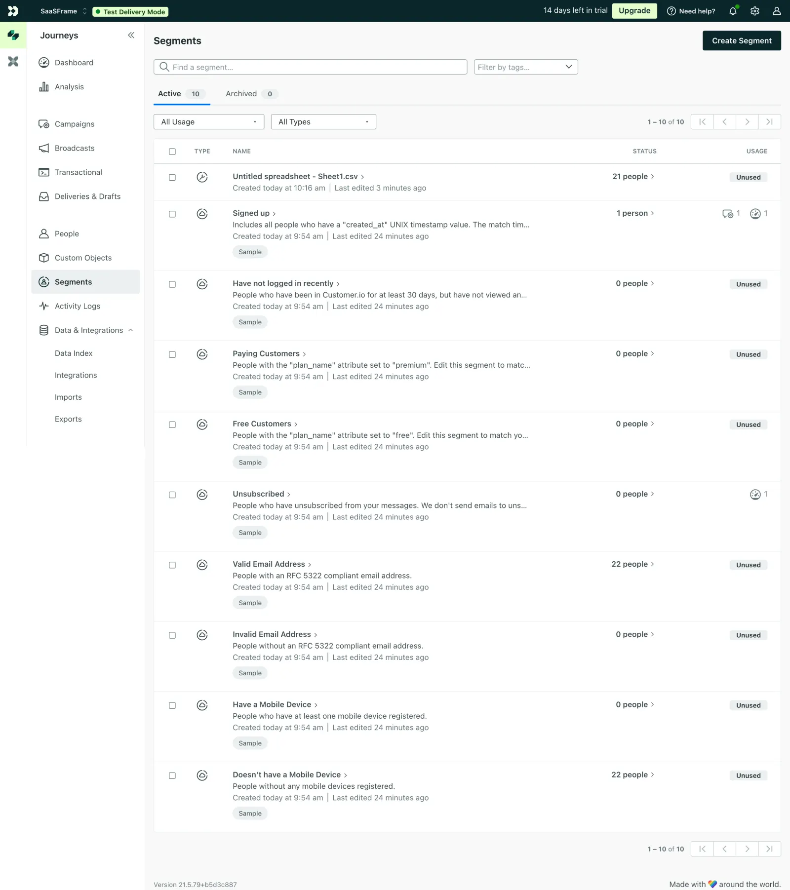
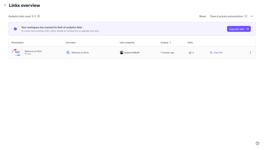
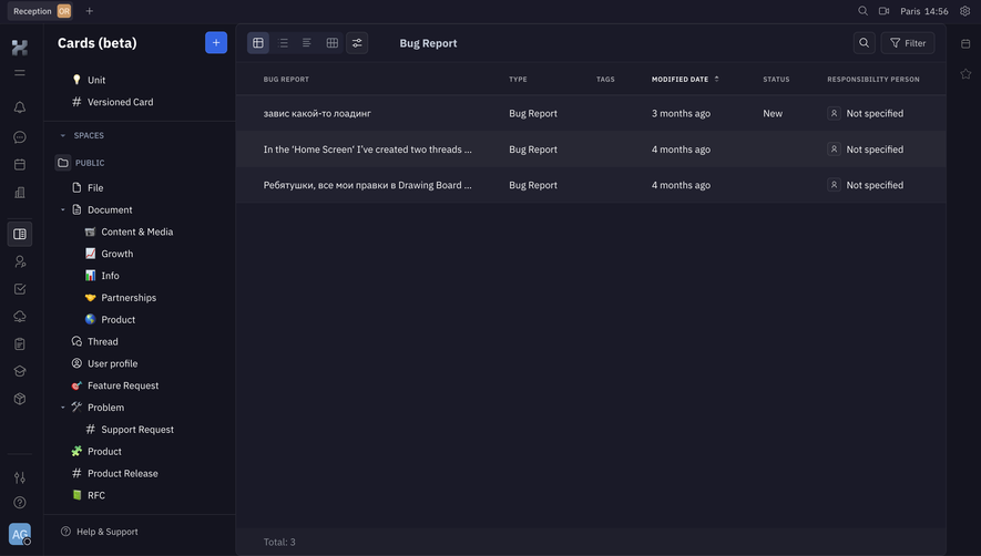
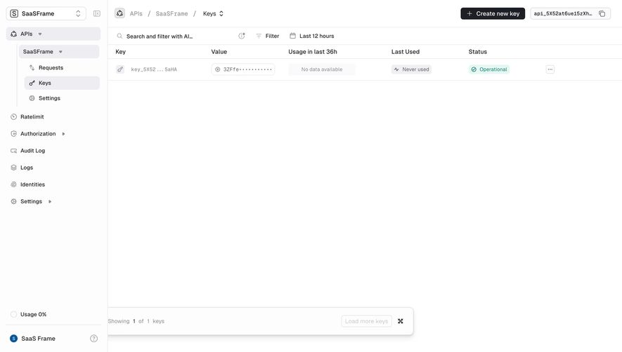
Customer.io's Segments page is a masterclass in functional simplicity. The left sidebar uses a dark charcoal background that creates strong contrast against the white content area. Navigation is tight, well-grouped, and the active "Segments" item pops with a subtle green highlight. That small green shield icon next to it is a thoughtful touch.
Data Without Drama
The table layout is dead simple. Name, type, status, usage. Each row has just enough info to scan without overwhelming you. The "Sample" tags in soft green badges help you instantly distinguish template segments from custom ones. People counts link out with a small arrow, which is a smart progressive disclosure pattern. Typography is quiet and consistent throughout. Nothing screams at you.
What Makes It Stand Out
That top bar with "Test Delivery Mode" in a green pill and "14 days left in trial" creates gentle urgency without being annoying. The filter controls up top with "All Usage" and "All Types" dropdowns keep things flexible. Everything feels deliberately restrained. It trusts the user to find what they need.
 SaaSFrame
 Customer.ioCustomer engagement for tech-savvy marketers