Design with AI
Generate a new design based on this screen using your own content.
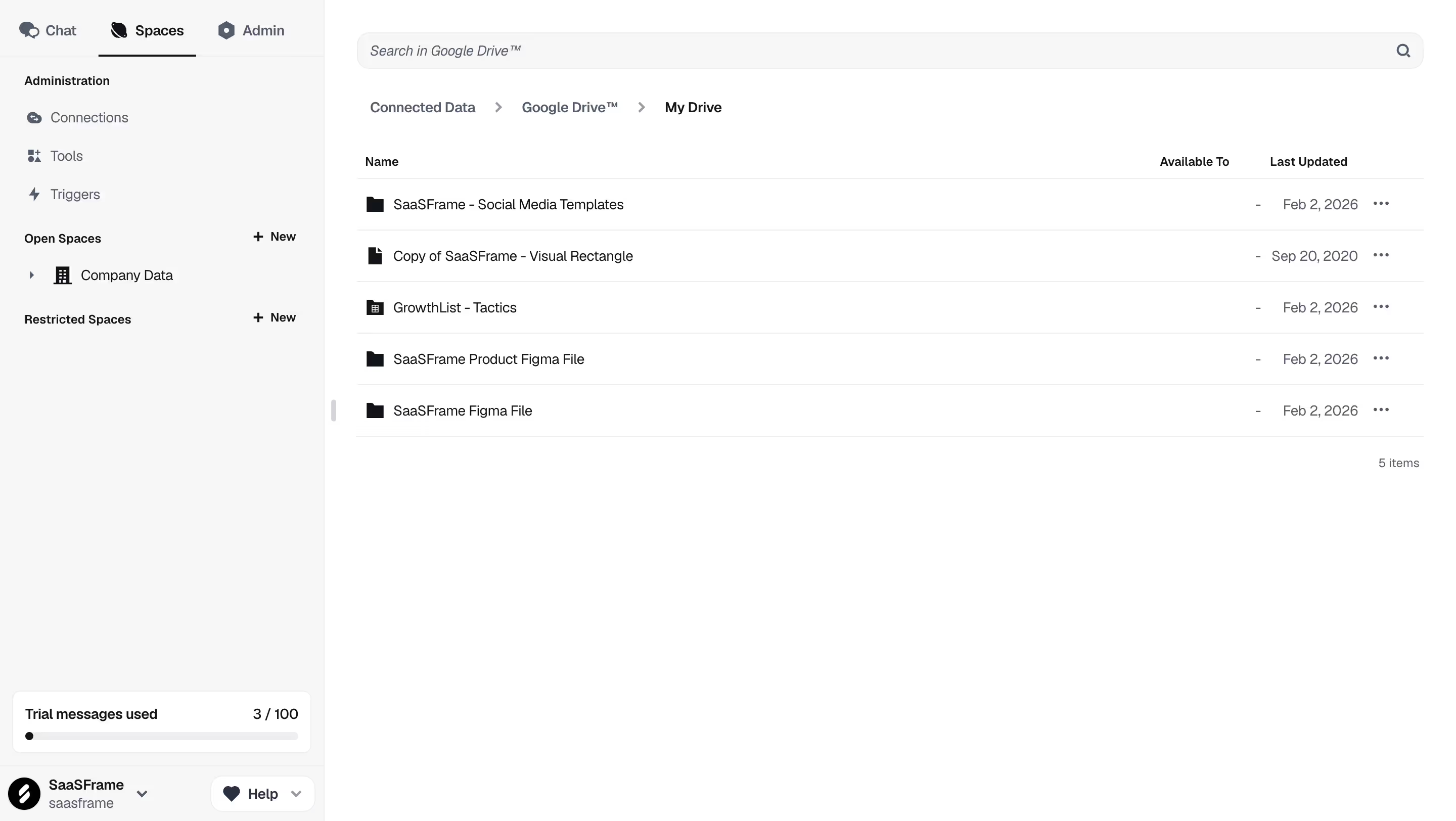
# Design from Reference: Dust Drive Connected Data
Create an original, high-fidelity visual design inspired by the reference. Prioritize composition, typography, colors, spacing, and component styling over technical implementation.
## Reference
- **Product:** Dust
- **Category:** Table
- **Screenshot:** https://cdn.prod.website-files.com/5e9dc792e1210c5325f7ebbc/6980862f601c5bdded8190fb_99x4evv9W7d6w7wJiUIos5bTlytEBFNCwrb5qw9pe_g.avif
Analyze the screenshot first. If inaccessible, request it rather than guessing.
## Content
{{content.instructions}}
{{content.data}}
Preserve essential messaging and factual accuracy. Adapt structure and copy length for visual balance; never invent product claims.
## Visual Design
### Overall aesthetic
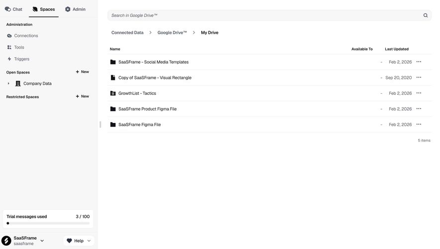
- **Character:** Restrained connected-data browser with pale navigation and a compact file table.
### Page composition
- **Canvas:** 2880 × 1624 screenshot px; CSS estimates assume 2× capture.
- **Structure:** Approximately 320 CSS px sidebar with Chat/Spaces/Admin tabs, admin links and space groups; main search, breadcrumb and five-row Drive listing.
### Information hierarchy
- **Priority:** Breadcrumb identifies the connected provider/folder. File names lead each row, followed by availability, update date and overflow.
### Typography
- **Family:** Neutral interface sans serif, exact font unverified.
- **Scale:** Estimated CSS body/navigation 14 px, table headers 12 px and breadcrumb 14 px medium.
### Colors & surfaces
- **Sampled palette:** White #FFFFFF, sidebar/search #F7F7F7, dividers #EEEEEF, dark text #111418, muted text #545D6C and secondary navy #2A3241.
### Components
- **Table:** Small file/folder/spreadsheet icons, thin horizontal rules, right-aligned dates and ellipsis menus.
- **Sidebar:** Bold section labels with New controls, collapsed company-data group, bottom trial-usage card and account/help row.
- **Geometry:** Estimated CSS search height 36 px, 12 px radius; table rows approximately 50 px.
### Visual rhythm
- **Spacing:** Compact upper content and broad blank lower canvas; approximately 32 CSS px main padding.
### Responsive
- **Observed:** Desktop only.
- **Adaptation:** Collapse sidebar, allow long file names to wrap or truncate with access to full title, and preserve overflow actions.
### Adaptation guidance
- **Preserve:** Clear provider/folder orientation and quiet file-list hierarchy.
- **Replace:** Use authorized connected files and actual permissions/update dates; do not reproduce reference filenames as user data.
Use this context to reproduce the reference's visual language: layout, typography, colors, spacing, borders, radii, and distinctive elements. The screenshot takes priority if descriptions conflict.
## Direction
{{preferences.fidelityInstructions}}
## Output
{{output.instructions}}
Deliver a polished, cohesive design with precise alignment, hierarchy, and spacing. Produce the requested visual artifact, not just a description. If unsupported, explain the limitation.