Design with AI
Generate a new design based on this screen using your own content.
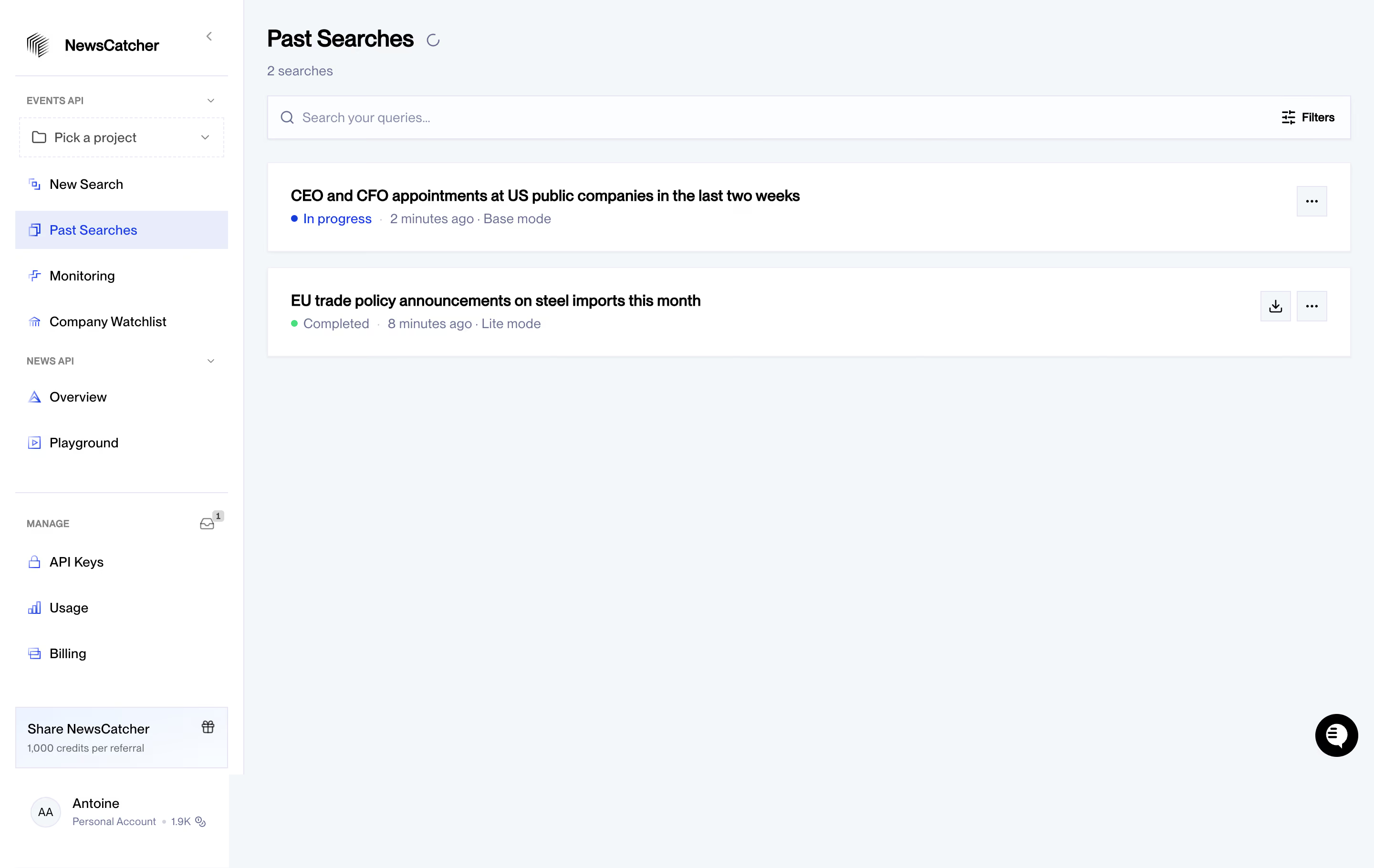
# Design from Reference: NewsCatcher Past Searches
Create an original, high-fidelity visual design inspired by the reference. Prioritize composition, typography, colors, spacing, and component styling over technical implementation.
## Reference
- **Product:** NewsCatcher
- **Category:** Table
- **Screenshot:** https://cdn.prod.website-files.com/5e9dc792e1210c5325f7ebbc/6acad332d5603a17eba5b532_6acad06fc910b3adf9e3187e_cms-0458e441dbdf171de702aaf2.webp
Analyze the screenshot first. If inaccessible, request it rather than guessing.
## Content
{{content.instructions}}
{{content.data}}
Preserve essential messaging and factual accuracy. Adapt structure and copy length for visual balance; never invent product claims.
## Visual Design
### Overall aesthetic
- **Character:** Clean developer dashboard with a pale blue-gray canvas, white navigation and compact search-history cards.
### Page composition
- **Capture:** 2880 × 1820 screenshot pixels; estimated 2× CSS scale.
- **Structure:** Sidebar occupies approximately 18% of width; main area has Past Searches title/count, full-width query search with Filters, and two broad stacked records.
### Information hierarchy
- **Priority:** Query titles are bold; status dots, relative timestamps and search modes sit beneath. Download and overflow actions align to the far right.
### Typography
- **Family:** Sans serif; exact family unverified.
- **Estimated CSS sizes:** Page heading 26px, query titles 16px, body/navigation 14px and sidebar group labels 11px.
### Colors & surfaces
- **Measured palette:** Canvas #F4F7FA, white #FFFFFF, search surface #FCFDFE, selected lavender-blue #E8ECFB, near-white #F3F6F9 and black #000000.
- **Status:** Blue indicates in-progress work, green indicates completion; subdued blue-gray metadata provides secondary contrast.
### Components
- **Elements:** Project picker, grouped API/manage links, referral card, profile area, search input, filter icon, status dots, square icon actions and floating chat button.
- **Estimated geometry:** Main padding 24px, cards approximately 92px high, 16px vertical gaps, thin pale borders and nearly square 2–4px radii.
### Visual rhythm
- **Spacing:** Compact toolbar and two cards occupy the top; extensive empty canvas keeps the short history easy to scan.
### Responsive
- **Suggested adaptation:** Collapse sidebar, wrap long query titles and metadata, and retain download/overflow access on each card. Mobile behavior is not shown.
### Adaptation guidance
- **Transfer:** Preserve the title/status/action hierarchy and quiet canvas. Represent actual job states with text as well as color.
Use this context to reproduce the reference's visual language: layout, typography, colors, spacing, borders, radii, and distinctive elements. The screenshot takes priority if descriptions conflict.
## Direction
{{preferences.fidelityInstructions}}
## Output
{{output.instructions}}
Deliver a polished, cohesive design with precise alignment, hierarchy, and spacing. Produce the requested visual artifact, not just a description. If unsupported, explain the limitation.