
Thank you! Your submission has been received!
Oops! Something went wrong while submitting the form.
Get SaaSFrame Pro
Monthly
$18
Quarterly
$48
Yearly
$180
Upgrade to access this feature
Browse all screens & flows
Filter and search screens & flows
Access Figma files
Access mobile versions
Bookmark screens & flows
Join now
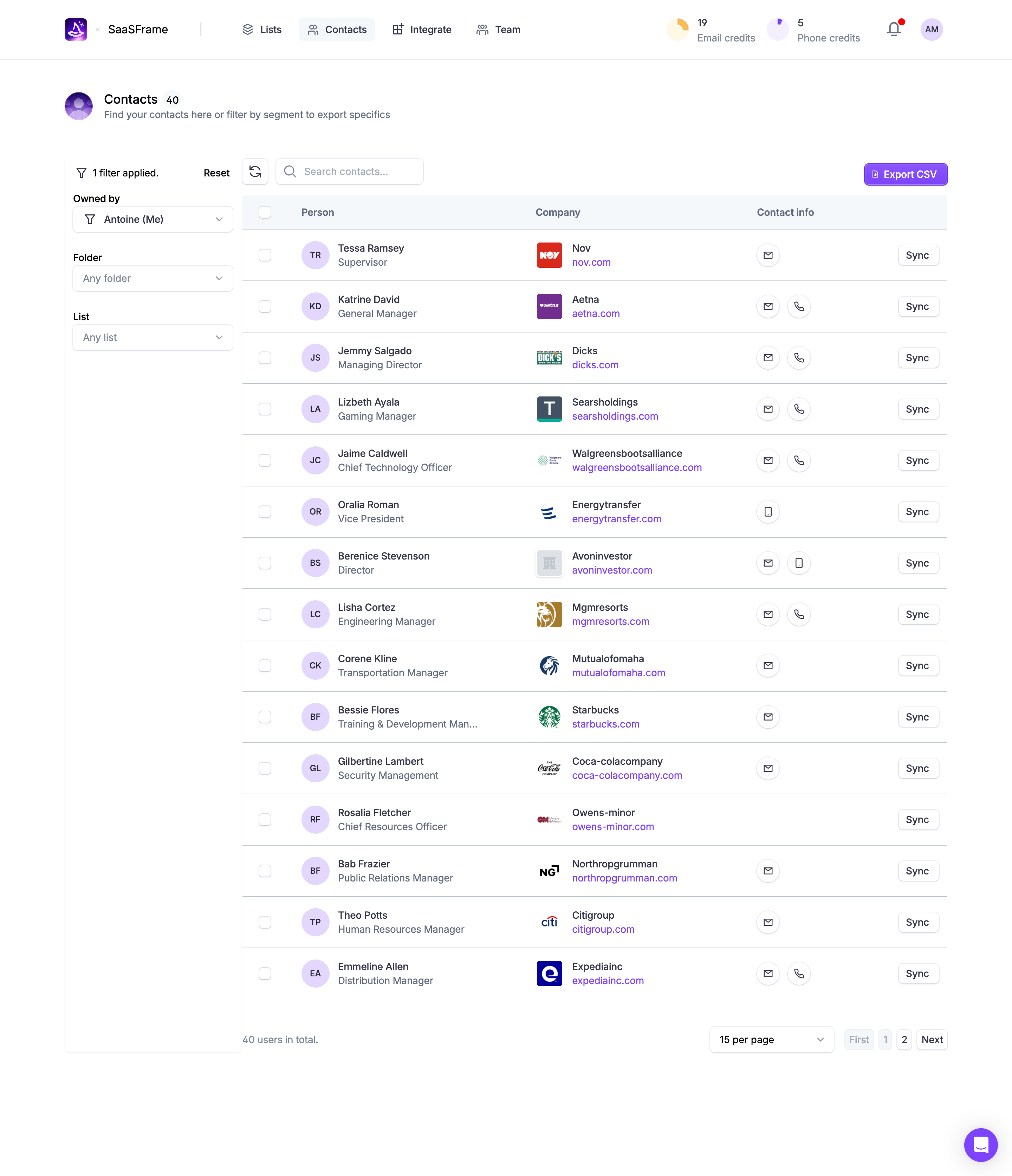
Wiza Contacts Table

Wiza
The future of prospecting
Designed by
No items found.

Bookmark
Bookmark

Design with AI
Thank you! Your submission has been received!
Oops! Something went wrong while submitting the form.
# Design from Reference: Wiza Contacts Table
Create an original, high-fidelity visual design inspired by the reference. Prioritize composition, typography, colors, spacing, and component styling over technical implementation.
## Reference
- **Product:** Wiza
- **Category:** Table
- **Screenshot:** https://cdn.prod.website-files.com/5e9dc792e1210c5325f7ebbc/6acad57686f1bee9c3650830_6acad4a51025e911ae518004_cms-d32cc75b534df9f7f05a3fff.webp
Analyze the screenshot first. If inaccessible, request it rather than guessing.
## Content
{{content.instructions}}
{{content.data}}
Preserve essential messaging and factual accuracy. Adapt structure and copy length for visual balance; never invent product claims.
## Visual Design
### Overall aesthetic
- **Character:** Bright contact-management dashboard with white surfaces, cool-gray rules and purple brand/action accents.
- **Presentation:** A filter rail and spacious contact table prioritize scanability, with pastel initial avatars and company logos adding visual identity.
- **Scale:** The source is 2880 × 3346 image px. Dimensions below estimate a 1440 × 1673 CSS layout at 2× scale; device ratio and zoom are unverified.
### Page composition
- **Top navigation:** A centered wide header contains brand/workspace identity, four product destinations and right-side credit counters, notification and account avatar.
- **Page introduction:** Contacts with a count badge and short explanatory line sits beneath, followed by a divider.
- **Filter rail:** A roughly 250 CSS px left column shows one applied filter, Reset and three stacked dropdown groups for ownership, folder and list.
- **Table workspace:** Refresh/search controls align left above the table; a purple Export CSV action aligns right.
- **Table:** Fifteen visible contact rows use checkbox, person, company, contact-method and sync-control areas.
- **Bottom:** Total count appears left; page-size selection and pagination sit right. A floating purple chat control occupies the lower-right margin.
### Information hierarchy
- **Resource scope:** The page title shows forty contacts; the table footer confirms the total while displaying fifteen per page.
- **Filtering:** The applied-filter count and selected owner establish the current scope before table scanning.
- **Row hierarchy:** Person name and company name lead; job role and company domain sit beneath in smaller/lighter type.
- **Contact availability:** Circular envelope/phone/mobile icons communicate available contact methods without exposing actual contact details in the visible table.
- **Actions:** Export CSV is the strongest colored action; Sync repeats as a small outlined row-level control. No export, sync or contact action is executed.
### Typography
- **Family:** Neutral sans-serif; exact identity is unverified.
- **Title:** Approximately 18–20 CSS px, medium-to-bold, with a small inline count badge.
- **Rows:** Names are around 14 px medium weight; roles/domains around 14 px regular, with muted roles and purple domains.
- **Headers/filter labels:** Approximately 14 px bold; helper and credit captions are muted regular text.
- **Truncation:** Long job titles visibly ellipsize while shorter rows remain single-line.
### Colors & surfaces
- **Measured base:** ICC-aware sRGB sampling yields #FFFFFF for the dominant canvas and #F4F8FA in pale header/selection areas.
- **Measured purple:** #873FFF appears in brand/action/link accents; #E7D6FF is the pastel avatar tone.
- **Measured foreground:** #34384A is a dark text tone and #636D81 a muted secondary tone.
- **Measured rules:** #C0C7D0 appears in table separators and neutral outlines.
- **Depth:** The layout is largely flat; the purple chat control has a soft floating shadow.
### Components
- **Credit counters:** Small circular pie-like symbols accompany numerical email/phone credit summaries in the header.
- **Filter selects:** Three full-width outlined dropdowns use bold labels above, chevrons right and a funnel icon in the ownership control.
- **Search toolbar:** A compact refresh square sits beside a search field with magnifier; the export button includes a document icon.
- **Table rows:** Approximately 72 CSS px high with thin horizontal rules and generous column spacing. Circular initial avatars precede person details; small square company logos precede company text.
- **Contact icons:** Small outlined circles contain envelope/phone/mobile symbols, spaced consistently within each row.
- **Sync buttons:** Small white rounded rectangles with pale borders align to the right edge.
- **Pagination:** A fifteen-per-page dropdown and First/page/Next controls sit below the table; the current/disabled states are paler.
- **State:** No rows are visibly selected and no detail drawer is open.
### Visual rhythm
- **Container:** Broad side margins center the dashboard content; table and header share a consistent right edge.
- **Row cadence:** Equal row heights, aligned avatars and repeated separators support rapid vertical scanning.
- **Column rhythm:** The narrow filter rail remains visually distinct from the wider table without a heavy divider.
- **Whitespace:** Large lower margins and roomy rows prevent the dense contact list from feeling cramped.
### Responsive
- **Evidence limit:** Only desktop is shown; recommendations follow.
- **Filters:** Move filters into a drawer or collapsible region on small screens.
- **Table:** Preserve meaning through horizontal scrolling or labeled stacked contact cards.
- **Toolbar:** Wrap search/export controls while retaining clear scope and selection information.
- **Actions:** Keep contact icons and sync targets usable, and prevent the chat control from covering pagination.
### Adaptation guidance
- **Reusable pattern:** Pair a compact filter rail with a multi-column contact list, availability icons and clear export/row actions.
- **Hierarchy:** Keep names/company identity stronger than roles/domains, and truncate long secondary labels consistently.
- **Privacy:** Describe contact information by role in reusable examples; avoid copying personal identifiers from the screenshot.
- **Accessibility:** Label icon-only contact controls, expose selected filters and table headers semantically, and provide visible keyboard focus.
Use this context to reproduce the reference's visual language: layout, typography, colors, spacing, borders, radii, and distinctive elements. The screenshot takes priority if descriptions conflict.
## Direction
{{preferences.fidelityInstructions}}
## Output
{{output.instructions}}
Deliver a polished, cohesive design with precise alignment, hierarchy, and spacing. Produce the requested visual artifact, not just a description. If unsupported, explain the limitation.


Category
Tech Stack

Added on
November 30, 2023
Similar screens



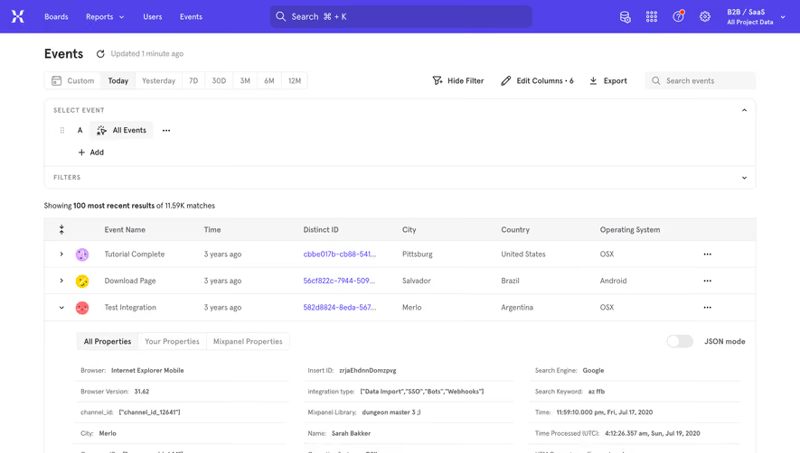

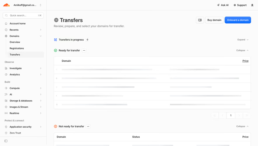

Upgrade to SaaSFrame Pro now to see similar examples.
Monthly
$18 /month
Billed $18 monthly
Browse all screens & flows
Filter and search screens & flows
Search text in screenshots
Access Figma files
Access mobile versions
Join now
Quarterly
$16 /month
Billed $48 quarterly
Browse all screens & flows
Filter and search screens & flows
Search text in screenshots
Access Figma files
Access mobile versions
Join now
Yearly
$15 /month
Billed $180 yearly
Browse all screens & flows
Filter and search screens & flows
Search text in screenshots
Access Figma files
Access mobile versions
Join now