Upgrade Prompt
132
Drive expansion revenue with contextual SaaS Upgrade Prompts. See how to place 'Pro' badges and 'Unlock' buttons at the exact moment a user needs a premium feature.

An upgrade prompt explains why a different commercial arrangement may be relevant to a user's current task. It can appear when a feature is unavailable, capacity is approaching a limit, or a team needs capabilities beyond its plan. Its role is to connect a product need with an understandable next step.
Start with the trigger. A user trying to access a specific feature needs an explanation of that access boundary. A user nearing a limit needs the measurement and consequence. A general promotional invitation needs a reason to interrupt the current workflow. These situations should not all use the same vague message.
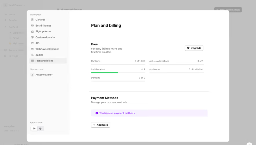
A useful prompt makes the offer, scope, and commitment clear. It should identify what becomes available, which account changes, and whether the action starts a trial, opens a comparison, contacts sales, or purchases a plan. The user should not have to infer these differences from button color.
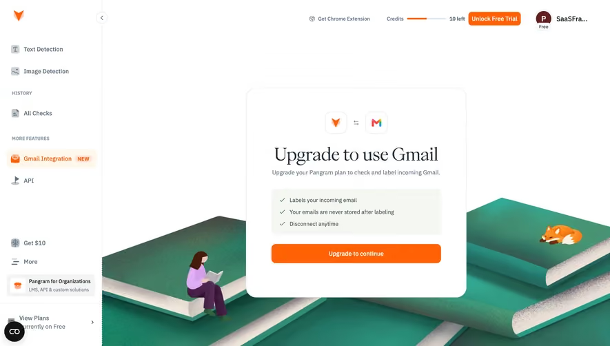
Narrative BI's captured Tracked Pages view shows a message that the capability is available on the Growth plan. Supporting copy explains tracking the performance of specific pages, and an Upgrade to Growth action follows. The surrounding navigation remains available.
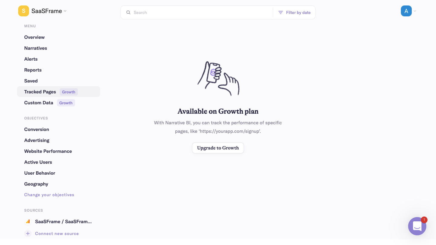
This approach gives the prompt a concrete reason: the visitor reached a feature that requires another plan. The message explains the function rather than displaying an unexplained lock. A comparable design should identify the actual requirement and avoid suggesting that an empty view means the user's data is missing.
The capture does not establish the current plan structure or what happens after the action. Its useful lesson is the relationship between feature context and commercial route. Verify the destination and resulting commitment separately in an implementation.
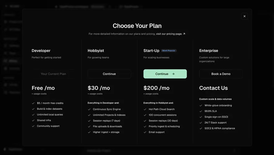
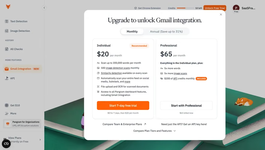
Arcade's captured upgrade overlay presents a Team option with collaboration, company-wide analytics, and customization benefits. It identifies a per-editor basis and annual billing, then offers a free-trial action with a payment-method statement beneath it.
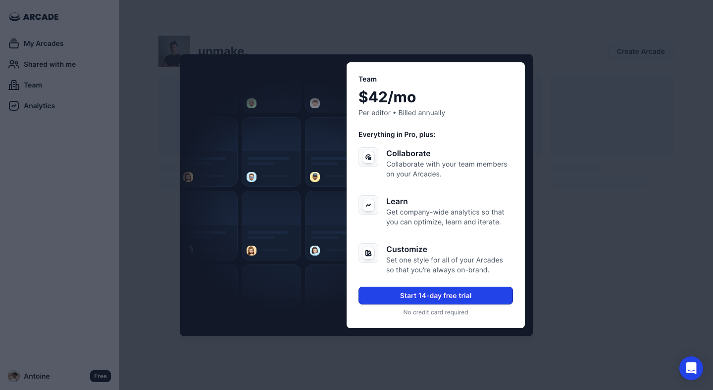
Read the captured amount and trial wording as historical content, not current pricing. The design principle is that a monthly-looking amount needs its billing basis, and a trial action needs an explanation of what it starts. A benefits list alone does not explain commitment.
Keep the offer connected to the user's task. Collaboration is relevant when someone needs teammates to work together; analytics is relevant when they need measurement. A broad plan card can summarize several benefits, but the triggering reason should remain clear rather than disappear beneath unrelated feature promotion.
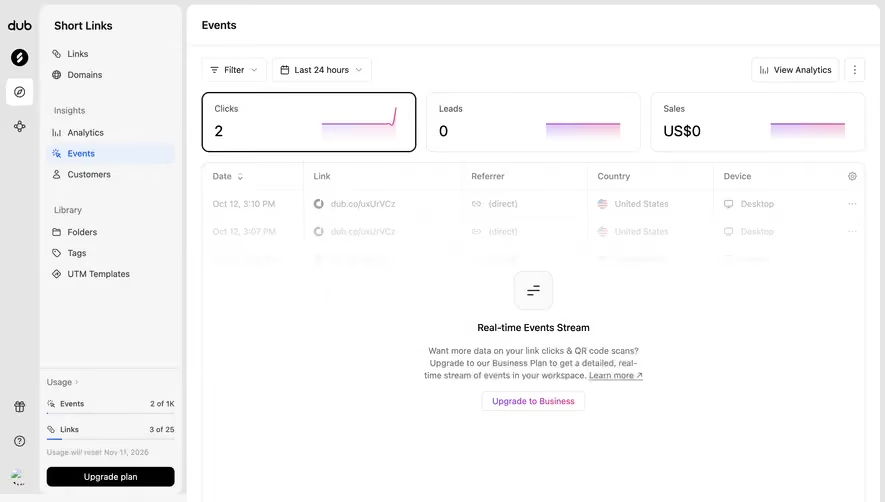
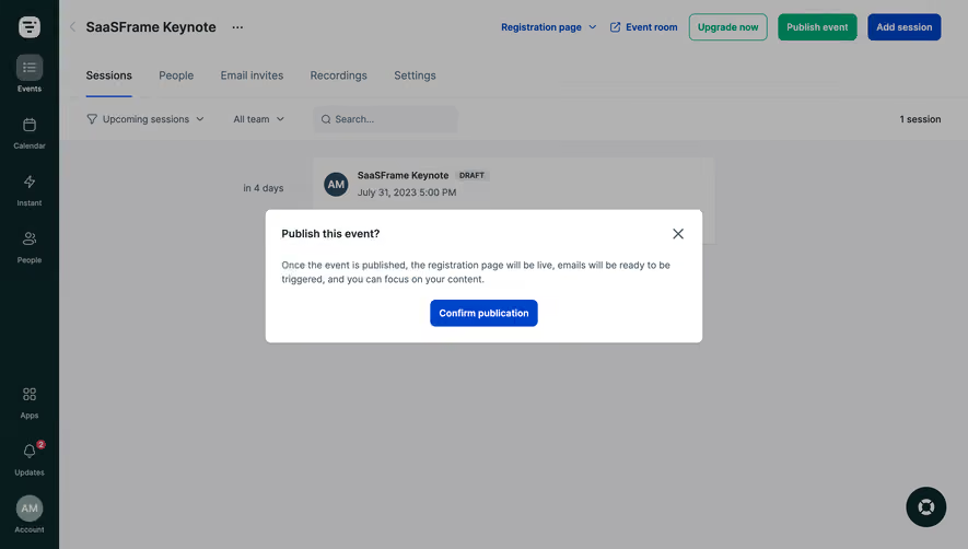
An inline explanation can fit a gated destination. A banner can signal approaching capacity without stopping work. A dialog can focus attention on a consequential choice, but it interrupts the current task. Choose the surface around the need rather than making every upgrade prompt a modal.
Keep the current work recoverable. A user who declines or closes an offer should return to a coherent state, with any draft preserved. If the requested action truly cannot continue on the current plan, explain that boundary and provide the available alternatives.
Do not present optional promotion as a system failure. A commercial message should be recognizable as an offer or access explanation. Users need to distinguish it from an error that they must resolve to restore basic product operation.
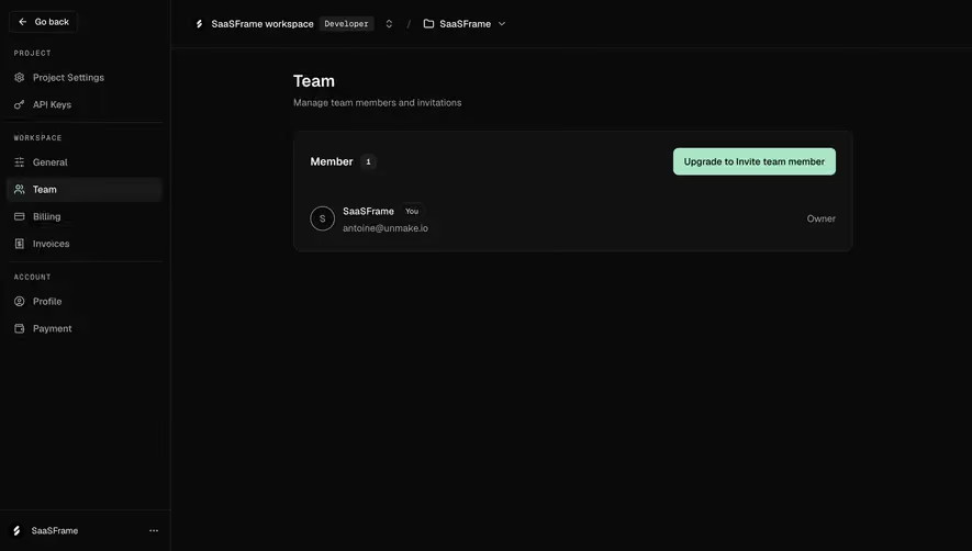
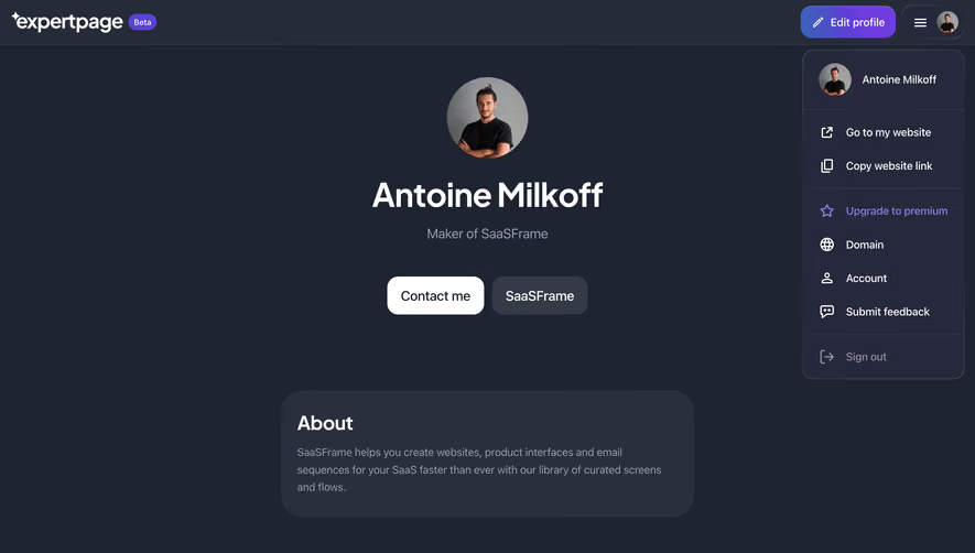
An upgrade may affect an individual, workspace, or organization. Identify that scope before commitment. In products with several workspaces, the account name can prevent a user from changing the wrong subscription. A general profile avatar is not enough when responsibility differs across organizations.
The person encountering a limit may not be authorized to purchase. Provide an appropriate administrator route rather than a button that fails after selection. If a request can be sent to an account owner, explain what information is shared and avoid implying that approval has already occurred.
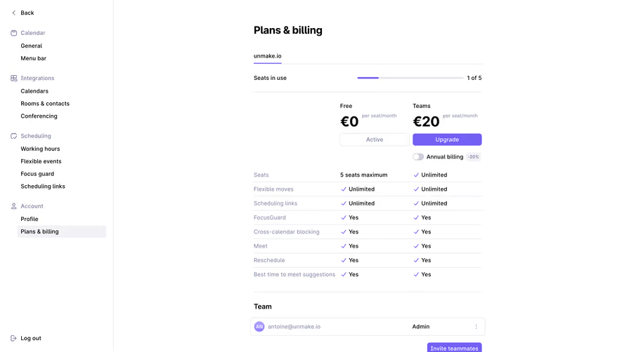
For seat-based offers, explain which people count toward the arrangement at the relevant point. Do not rely on a short per-editor phrase to answer every account-specific question. The prompt can introduce the basis while the review flow supplies the actual affected quantity and amount.
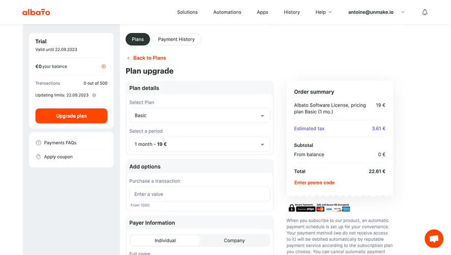
Starting a trial, reviewing a plan, and confirming a purchase are different actions. Use labels that match the stage. A prompt can lead to a detailed comparison, but it should not unexpectedly commit a purchase under a discovery label.
Explain material trial conditions where users need them. The relevant details may include duration, payment-method requirements, what happens at the end, and which capabilities become available. Use the product's actual rules rather than assumptions about how trials usually behave.
Before a paid change, show the account-specific consequences: timing, billing basis, access change, and any calculated adjustment where applicable. The prompt need not contain every detail, but its promise should agree with the next screen. Avoid a strong initial claim that the review flow later contradicts.
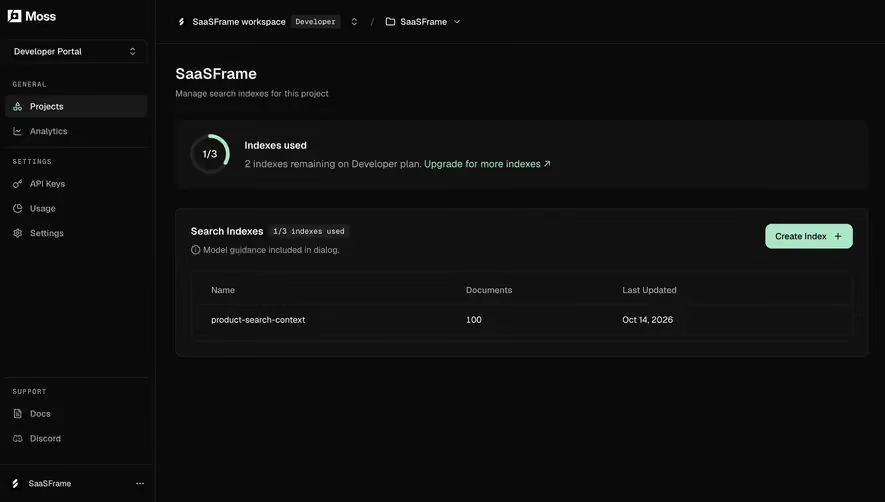
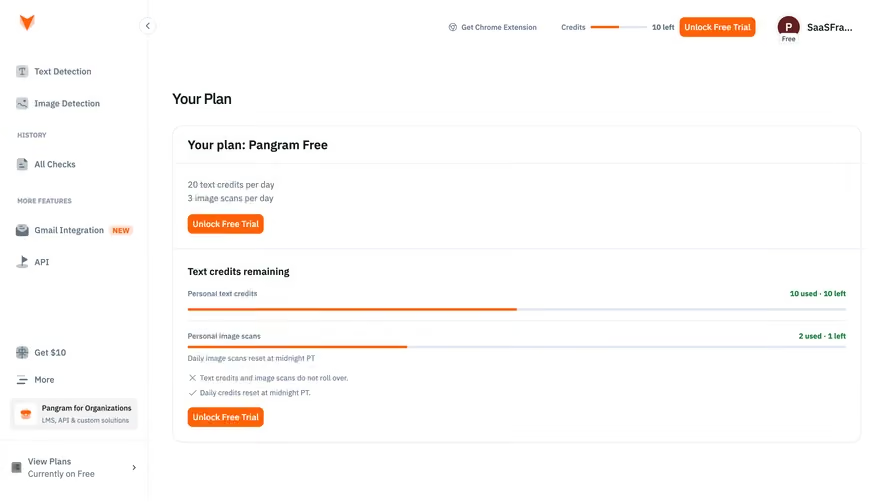
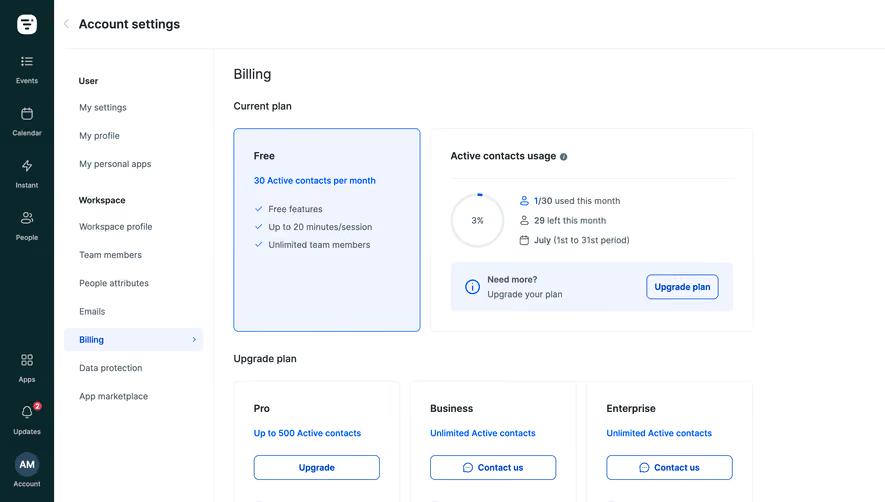
A capacity prompt should identify the measurement and period. Seats, stored objects, monthly consumption, and prepaid credits are different quantities. Explain what happens when the limit is reached and whether the user can continue through another route.
Distinguish approaching a limit from already being blocked. An early warning may support planning, while a reached limit needs a concrete next step. Avoid urgent language when the system is only presenting an optional opportunity. The message should reflect the actual account state.
Keep usage and offer data current enough for the decision. If another administrator changes the plan or frees capacity, reconcile the prompt. A stale offer that continues to block an available feature can undermine trust and create unnecessary support work.
Define when a dismissed prompt returns. Repeating the same modal after every navigation can interrupt work without adding information. A feature-specific access explanation may remain at the gated destination, while a general promotion may need a less intrusive recurrence rule.
After upgrading, update the relevant product state and explain when access becomes available. If processing is delayed, show pending status instead of leaving the old prompt unchanged. Users should not repeatedly purchase or start another trial because the interface did not acknowledge the completed request.
Handle failure with an appropriate recovery route and preserve context. A rejected payment, missing permission, or unavailable plan requires different feedback. Do not collapse them into a generic error that sends the user back to the original offer without explanation.
Ask users why the prompt appeared, what the action will do, which account changes, and whether they can return to their work. Include an unauthorized user, a dismissed offer, and a pending upgrade. These cases test whether the message supports a real decision.
Measure completed, appropriate upgrades alongside clicks. A high click rate can reflect curiosity or confusion. Review abandonment at the next step, repeated prompt exposure, and support requests about unexpected terms. The desired result is an understood commercial change that enables the relevant work.
Use this checklist:
Review accessibility as part of the offer. A dialog needs understandable focus and dismissal behavior; a banner needs readable content and usable actions; a gated view needs a meaningful explanation beyond a decorative lock. Long translated text and enlarged typography should preserve the commercial qualifications as well as the main action.
Keep the prompt aligned with the current plan catalog. A renamed plan, changed entitlement, or altered trial rule can make old copy misleading. Assign ownership for the message and its destination so product and billing changes are reflected together rather than maintained independently.
Consider timing within a task. If a user discovers the limit only after preparing a large amount of content, preserve that work and explain the available route. An earlier capability cue can prevent wasted effort, but it should not overwhelm people before the need arises. Review where the boundary becomes relevant and whether the interface gives enough notice.
For team offers, connect benefits to the collaboration model. Inviting another person, sharing a workspace, and granting an editing seat may be separate operations. Explain the relevant distinction before presenting a plan as the solution. Users should know whether upgrading alone enables the task or whether another setup step remains.
Comparison links can support evaluation when the prompt is necessarily concise. Keep the chosen capability identifiable on the destination page so users do not have to search a long table to find the original reason for the offer. Preserve the active account context and provide a clear route back to the interrupted workflow.
Review alternate resolutions when they are part of the product model. A capacity limit may be addressed by removing unused items, changing a setting, or selecting another plan. Present realistic choices without implying that upgrade is the only route if the system provides other appropriate actions. The message should help the user's decision rather than conceal relevant options.
Check successful access after the commercial change. The billing operation and entitlement update may complete at different moments. If the requested feature remains unavailable temporarily, explain that transition and provide a way to check status. A confirmation that leaves the old gate in place without context can cause repeated attempts and uncertainty.
No. Use a surface appropriate to the trigger and interruption cost. Inline explanations can work for gated destinations, while banners may suit capacity warnings. A dialog needs a reason to focus attention.
The relevant duration, access, payment requirements, and end-of-trial behavior. Communicate the actual product rules and make the action distinct from reviewing or purchasing a plan.
Explain the permission boundary and provide a useful administrator route where available. Do not let the user invest effort in a purchasing flow that predictably fails because their role cannot complete it.
Explore the SaaSFrame upgrade-prompt examples to compare feature explanations, contextual offers, and interfaces that support informed plan decisions.