
Thank you! Your submission has been received!
Oops! Something went wrong while submitting the form.
Get SaaSFrame Pro
Monthly
$18
Quarterly
$48
Yearly
$180
Upgrade to access this feature
Browse all screens & flows
Filter and search screens & flows
Access Figma files
Access mobile versions
Bookmark screens & flows
Join now

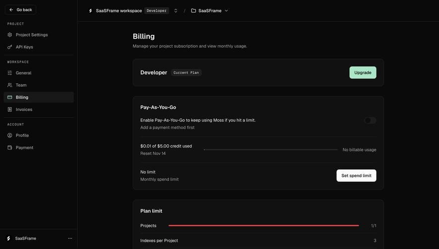
Moss Compare subscription plans

Moss
The retrieval layer for production AI
Designed by
No items found.

Bookmark
Bookmark

Design with AI
Thank you! Your submission has been received!
Oops! Something went wrong while submitting the form.
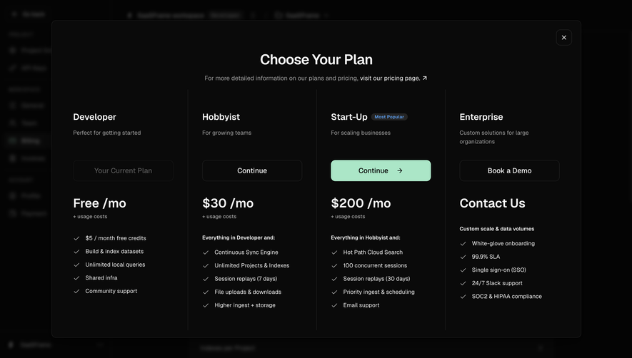
# Design from Reference: Moss Compare subscription plans
Create an original, high-fidelity visual design inspired by the reference. Prioritize composition, typography, colors, spacing, and component styling over technical implementation.
## Reference
- **Product:** Moss
- **Category:** Plans
- **Screenshot:** https://cdn.prod.website-files.com/5e9dc792e1210c5325f7ebbc/6acf525ac12562fc9004efe9_Pxr079myYBY5b_lzr1lLohN9TG1RRhpkLHX8tyTF24o.png
Analyze the screenshot first. If inaccessible, request it rather than guessing.
## Content
{{content.instructions}}
{{content.data}}
Preserve essential messaging and factual accuracy. Adapt structure and copy length for visual balance; never invent product claims.
## Visual Design
### Overall aesthetic
- **Style:** Dark subscription-comparison modal with four evenly divided plan columns, bright white headings and a mint recommended action.
- **Character:** Minimal decoration, thin separators and checkmarked feature lists create a practical developer-product pricing presentation.
- **Capture:** The image measures 2880 × 1624 pixels. CSS estimates assume a 2× capture, equivalent to approximately 1440 × 812 CSS pixels; actual scale and font identity are unverified.
### Page composition
- **Backdrop:** A darkened, blurred settings interface remains behind the modal.
- **Modal:** A roughly 1200 × 720-CSS-pixel panel begins around x120, y46, with a centered title and short pricing-page reference.
- **Comparison grid:** Four equal columns occupy the body, separated by thin vertical rules.
- **Column sequence:** Each plan has a name, short audience description, action, large price/contact line and feature list.
- **Dismissal:** A small outlined square X control sits at the upper-right corner.
### Information hierarchy
- **Modal title:** A large centered heading introduces plan selection.
- **Plan identity:** Bold names lead each column, followed by muted audience descriptions.
- **Recommended tier:** The third plan has a small popularity badge and the only mint-filled Continue button.
- **Current plan:** The first tier's action is disabled-looking and labeled as current.
- **Pricing:** Large monthly-price or contact text appears beneath actions; small usage-cost notes are secondary.
- **Features:** Bold introductory phrases precede checkmarked lists in higher tiers.
- **Captured content:** Visible names and prices belong to this historical screenshot; the design does not establish current commercial terms.
### Typography
- **Family:** A neutral UI sans-serif is visible; exact identity is unverified.
- **Modal heading:** Approximately 32-pixel CSS size, semibold, with around 40-pixel line height.
- **Plan names:** Approximately 20–22 pixels and semibold.
- **Price lines:** Approximately 28–30 pixels and semibold.
- **Descriptions and features:** Approximately 13–14 pixels with 20-pixel line height.
- **Button labels:** Approximately 16 pixels, medium weight.
- **Badge and notes:** Approximately 10–12 pixels, with the popularity label bold and blue.
### Colors & surfaces
- **Measured base:** Near-black #0A0A0A fills the modal.
- **Measured backdrop:** #040404 and related near-black values dominate the dimmed background.
- **Measured text:** Near-white #FAFAFA supports headings, prices and principal labels.
- **Measured action:** Mint #ABE6C7 fills the recommended-plan control.
- **Measured supporting surface:** #1A1A1A appears among dark boundaries/badges.
- **Text hierarchy:** Muted gray descriptions, checkmarks and usage notes contrast with brighter primary content.
- **Depth:** The dark scrim and blur isolate the modal; fine border and rounded corners provide its edge.
### Components
- **Modal frame:** Approximately 10–12-pixel corners with a thin dark-gray outline.
- **Title area:** Centered heading and muted sentence include a brighter external pricing-page link with arrow.
- **Plan columns:** Roughly 292 pixels each, with about 32-pixel horizontal padding.
- **Action controls:** Full-column buttons around 226 × 48 pixels, with 10-pixel corners.
- **Current-plan control:** Dark disabled-looking treatment reduces emphasis.
- **Recommended control:** Mint fill, dark label and right arrow provide the strongest route.
- **Enterprise action:** An outlined demo button precedes a large contact-based price line.
- **Popularity badge:** A small rounded dark pill with blue text sits beside the third plan name.
- **Feature lists:** Five checkmarked entries are visible per column, using aligned icon/text pairs.
- **State scope:** No billing-period toggle, checkout, selected upgrade result or expanded plan detail is shown.
### Visual rhythm
- **Equal grid:** Shared column widths and aligned action/price positions support comparison.
- **Vertical spacing:** Large gaps separate descriptions, actions and price lines; feature lists use a compact repeated row rhythm.
- **Separator rules:** Thin vertical lines extend through most of the comparison body without horizontal table gridlines.
- **Emphasis economy:** One filled mint control stands out against otherwise outlined actions.
- **Backdrop quieting:** Blur and darkening remove competition from the underlying account interface.
### Responsive
- **Recommendation — comparison:** Stack plans or provide an accessible horizontal comparison when four columns no longer fit.
- **Recommendation — hierarchy:** Keep plan name, action and price together in each responsive unit.
- **Recommendation — modal height:** Allow scrolling on short screens while keeping close access available.
- **Recommendation — features:** Preserve full feature text and checkmark alignment rather than shrinking type.
- **Recommendation — state:** Communicate current and recommended tiers with explicit labels as well as color. No mobile state is evidenced.
### Adaptation guidance
- **Preserve comparison order:** Keep audience, action, price and features consistent across tiers.
- **Highlight one route:** Reuse mint emphasis for the recommended plan while retaining a clear current-plan state.
- **Keep commercial content separate:** Treat names, prices and feature wording as captured data requiring independent maintenance.
- **Maintain restrained structure:** Use thin separators and spacing rather than heavy card frames inside every column.
- **Define progression separately:** Checkout, sales booking and upgrade confirmation are not shown.
- **Support modal accessibility:** Label the dialog, manage focus and restore it after dismissal.
Use this context to reproduce the reference's visual language: layout, typography, colors, spacing, borders, radii, and distinctive elements. The screenshot takes priority if descriptions conflict.
## Direction
{{preferences.fidelityInstructions}}
## Output
{{output.instructions}}
Deliver a polished, cohesive design with precise alignment, hierarchy, and spacing. Produce the requested visual artifact, not just a description. If unsupported, explain the limitation.


Category
Patterns
Tech Stack
No items found.
Added on
October 14, 2026
Found in 1 flow

Similar screens
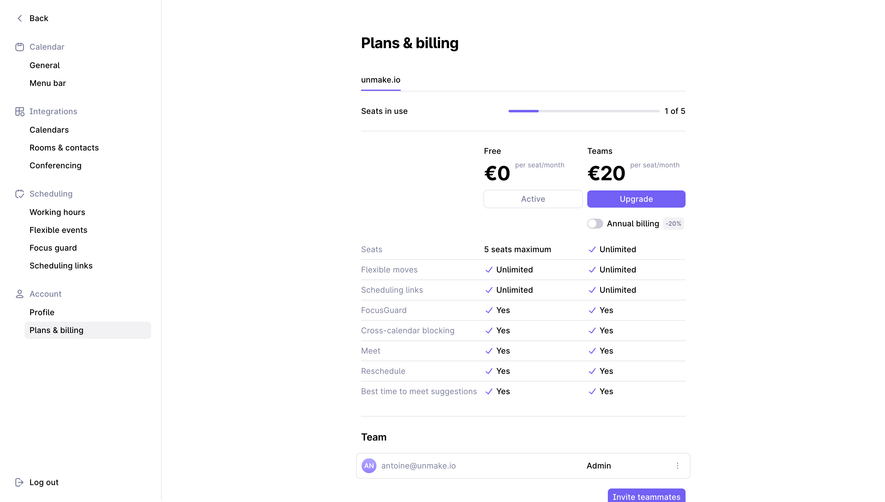


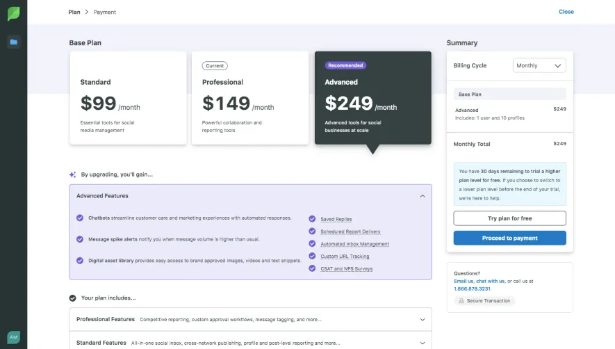


Upgrade to SaaSFrame Pro now to see similar examples.
Monthly
$18 /month
Billed $18 monthly
Browse all screens & flows
Filter and search screens & flows
Search text in screenshots
Access Figma files
Access mobile versions
Join now
Quarterly
$16 /month
Billed $48 quarterly
Browse all screens & flows
Filter and search screens & flows
Search text in screenshots
Access Figma files
Access mobile versions
Join now
Yearly
$15 /month
Billed $180 yearly
Browse all screens & flows
Filter and search screens & flows
Search text in screenshots
Access Figma files
Access mobile versions
Join now